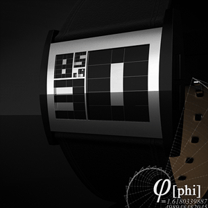
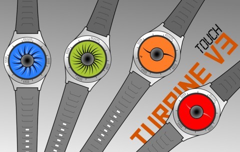
September 3rd, 2010
Design submitted by Tomek from Poland. (14 years old).
The interface on this concept watch design is like the display of an ECG showing electrical activity. The time is shown very simply; hours 1-12 on the top line, 10 minute groups , 10-50 on the center line and single minutes 1-9 on the lower line. The high and low points of each line indicate each hour and minute.
It’s quite a novel idea to apparently be checking your heart rate when simply glancing at the time. Just remember that at 1:00 AM, its only a watch you are not really about to flatline!
Read the rest of this entry »
September 2nd, 2010
Watch Design submitted by Frank Rovekamp from Spain.
Based on the concept of a 3d cube image within the display, each visible side of the cube shows an element of time. The left section of the blue side shows the first digit of the hour (0, 1 or 2). The second digit of the hour is shown on the top of the cube in yellow (0, 1-9). The two right hand columns on the blue section show the first digit of the minutes (0-5) and the red side shows single minutes 1-9. You can see an example at the bottom that shows 15:55. Read the rest of this entry »
September 2nd, 2010
Design submitted by David Brophy from the UK.
The interface of this watch design displays hours in yellow read diagonally from top right to bottom left: 1, 2, 4, 8, 16. A combination of numbers indicating the current hour. Minutes are displayed in red from bottom right to top left 1, 2, 4, 8, 16, 32. A combination of numbers indicating the current minute. Grooves on the strap match the lines running across the face.
Of course the concept behind this is Binary time telling, but in a wonderfully fashionable way. Chic geek I think they call it, but anyway, theres no denying its an attractive display with a mathematically minimal way to tell the time.
Read the rest of this entry »
September 1st, 2010
Watch Design Submitted by Akinori Nemoto from Japan.
The display uses various shapes to represent time. Triangles on the right hand side show hours in binary form, for example; 1 + 4 = 5 o’clock. 5 groups of 10 minutes are shown around the edge with green lights and single minutes are shown in red in between. There is also a flashing indicator for seconds in the upper left part of the display. This concept would have changeable covers so that you can customize your watch. Read the rest of this entry »
September 1st, 2010
Watch Design submitted by David Brophy from the UK.
Watch the Rainbow. 2 red lights, 4 orange lights and 6 yellow lights represent 1 hour each. 8 green lights represent 4 minutes each, 6 blue lights represent 3 minutes each, 4 indigo lights represent 2 minutes each and 2 violet lights represent 1 minute each. Read the rest of this entry »
August 31st, 2010
Design submitted by Jeff Beamish.
This watch design is based on a digital VU meter for audio equipment, where the coloured bars are the low, mid and high frequency indicators from the EQ display or VU Meter. Hours (12) are the low bars on the left, 5 minute groups are in mid bars in the center and single minutes are the high bars on the right. Input indicators low and high show am/pm and the track number is the date, read as month and day. Read the rest of this entry »
August 31st, 2010
Design submitted by Gabriel Balas-Baconschi.
This watch design is based on the masonry symbol. Since they are like an organisation in shadow, I think the black colour is great. The compass has 12 LEDs, which show the hours and the square has also 12 leds, each one for 5 minutes. The letter G from center, is divided into 4, each part for one single minute. In the top of the compass, there is a circle, which care show am/pm. The outer circle, is made like a star, each line for one second. I think showing the seconds looks very dynamic. Read the rest of this entry »
August 30th, 2010
Design submitted by Maciej Mandrysz.
This watch design is inspired by postapocalyptic games, and robotic board. With a metal case and a leather strap, the time is displayed using green LEDs which appear to shine through the metal lens. Hours are shown in the upper right part of the display with circles, rings and lines. Groups of ten minutes 10-50 are shown with bars in the upper left part of the display. Single minutes 1-9 are shown along the bottom in digits. Read the rest of this entry »
August 30th, 2010
Watch Design submitted by Maciej Mandrysz.
This idea is a combination of an old pocket watch and new technology. Thanks to some kind of LCD display and bigger size, it can be used as an MP3 player or can display other information like weather, or simple pictures. Read the rest of this entry »
August 30th, 2010
Watch Design submitted by Iskender Asanaliev.
ON AIR Wrist Watch design shows time in an extraordinary minimal way. The LED display shows minutes with numbers and its position shows us the current hour. The display also functions as a light and set button. If you push once, the LED display lights up. To set the time you just need to push in the center of the display for 5 seconds and the LEDs flash, you then push the upper or lower corner of the display to set the hour and the left and right corner to set minutes. Read the rest of this entry »
August 30th, 2010
The following images are variations on the Night Vision concept from August 9th. A different interface layout shows hours with the outer ring of dots, in the same position as hours on a clock face. Groups of five minutes are shown in the inner ring with lines in the same position as minutes on a clock face and four single minutes are shown beneath the 12:00 o’clock position. The variations here show different colored cases. Let us know how you feel about these. Read the rest of this entry »
August 27th, 2010
A strong looking concept with an asymmetrical shape. The brushed metal finish runs through the case and strap. Twelve vertical cuts are made in the case through which green digital tube LEDs display the time. Hours 1-12 progressing along the top from left to right, increments of 5 minutes progress across the bottom from left to right and four single minutes are shown in the far right column. Guide numbers are embossed onto the case above and below the display. Read the rest of this entry »
August 24th, 2010
A metal bracelet style concept that displays the time in a cryptic language. Can you translate? Hours are shown with small lit up shapes at the top and bottom of the interface moving in the same direction as hours on a clock. You can see the outline of the shapes as a reference points. Minutes are displayed digitally in the center. The digital tube LEDs are hidden within the layout of shapes which are just visible beneath the long, curved smoked lens. Read the rest of this entry »
August 20th, 2010
Black and silver combine to give this design a minimalist metallic look. When the button is pushed to initiate the time display, red LEDs appear through three windows in the face showing hours, groups of five minutes and single minutes 1-4.
Very simple to tell the time & yet a mystery to those who don’t know how. Its a minimal watch design, somewhat reminiscent of a safe tumbler, hence the Lock-up name tag. Its a watch design that caters to people who appreciate the simpler days of 70′s LED, but with some modern styling. Can an LED watch ever be understated?
Read the rest of this entry »
August 18th, 2010
The focal point of this concept is the center of the glass lens which is chamfered at a 45 degree angle around the central block of metal. The overall shape of the watch is simple, featuring sharp lines and delicate grooves. The user-selectable multi-colored LCD interface is crisp, clean and simple; hours are shown in square blocks and five minute groups are shown as lines outside the square blocks, in the same position as hours and minutes as a clock face. Single minutes 1-4 and seconds are shown in the central zone. The time can be read instantly because of the always on LCD screen.
Read the rest of this entry »