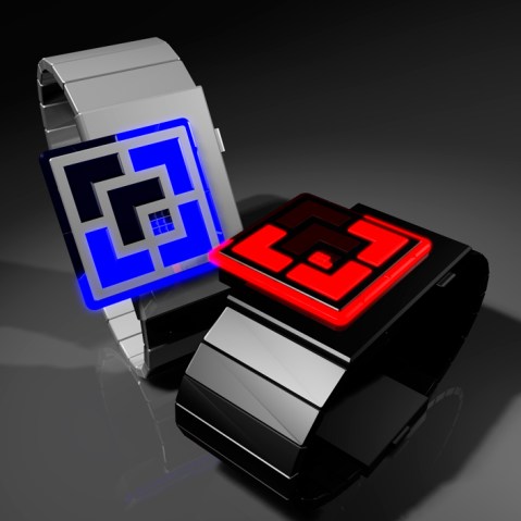
Design submitted by Laszlo from Hungary.
This watch design can be bright enough to light one dark room when all LEDs are lit up. The whole of the square watch face is designed with single colored LEDs divided with thin lines. Continue reading

Design submitted by Laszlo from Hungary.
This watch design can be bright enough to light one dark room when all LEDs are lit up. The whole of the square watch face is designed with single colored LEDs divided with thin lines. Continue reading
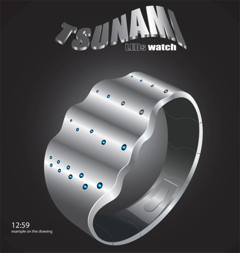
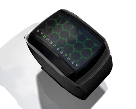
Design submitted by Patrick from France.
Inspired by ocean waves, this watch is beautifully designed with curves and small bubble-like LED lights. A slight pressure on the center of the watch face activates the LED animation to tell the time. Continue reading
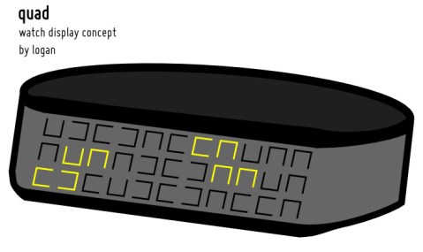
Design submitted by Logan from the USA.
This watch design looks like a metal ribbon with randomly oriented C-shaped holes, some pointed up, some left, some right, some down (four directions, hence the name Quad). The orientation of the 33 C-shaped holes has been carefully chosen so that the four digits of the time can always be displayed using two C-shapes per digit. LEDs shine through the holes to show the digits. The style is like Shinshoku or Fire, but you don’t have to do any math or counting to read the time. Continue reading
Design submitted by Andy from Ukraine.
This watch design shows time in roman numerals which is not as easy as digital numbers but still gives a clear display of the time. Just know the equivalent of four letters (I, V, X, L) and you’re good to go. Continue reading
Design submitted by Laszlo from Hungary.
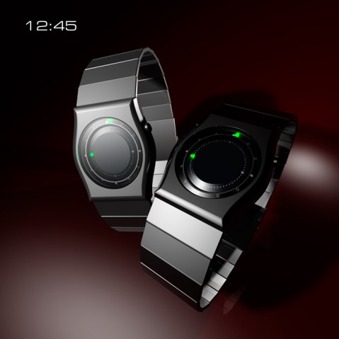
72 hidden LEDs illuminate the two integrated plates enclosed 28° with the backplane. Twelve are for the hours and the remaining 60 are for the minutes. The external plate indicates the hours and minutes for the internal plate. Continue reading
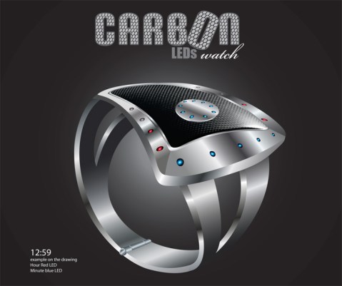
Design submitted by Patrick from France.
A combination of carbon fiber and steel, this LED watch displays time in a very unique and luxurious way. Continue reading
Design submitted by Logan from the USA.
Logan describes this watch concept as Pimpin Aint Easy that evolved on an alien world. The method of reading the time is basically the same with our classic Pimpin Aint Easy watch. The digits on the left light to show the hours and minutes/5. Continue reading
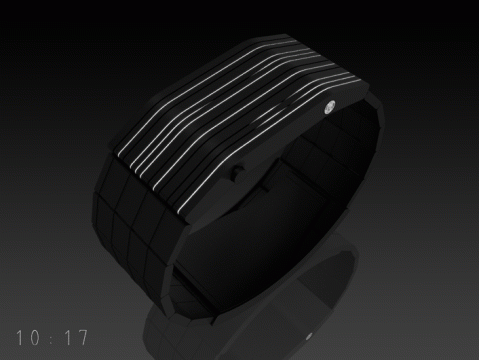
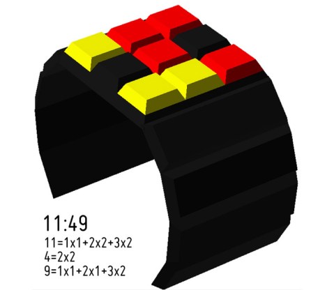
Design submitted by Sam from Germany.
Sam says: “This was a spontaneous idea. I looked at my Playstation 2 (the biiiig old one) and saw the gaps. I imagined, how it would look if the gaps are lit up. Then I thought about how to tell the time in lines. Continue reading
Design submitted by Logan from the USA.
Logan says “The inspiration for the design was to find a method of displaying the time that fit in a small square matrix (in this case, 3×3), with no wasted elements. Continue reading

Design submitted by Genghis from France.
Genghis says “While looking at older entries, I realized that a lot of classical patterns or symbols were used, but not the infinity symbol. My initial idea was to use one circle for hours and the other one for minutes. But there were problem with the display in the “cross” area. The solution I found is a display with a gradient. It works for each display of time. This is easy to read and gives an unique looking to the watch. Electronic ink could be a good technology for this display and the watch is designed for both men and women. Many colors choices are possible.”
