
Design submitted by Justin from the UK.
Justin says: This idea began from a desire to make an analog watch but by using LEDs rather than traditional hands. I wanted to make something futuristic looking and something that had a theme, I went for a microchip as a starting point and the rest of the design grew from there.
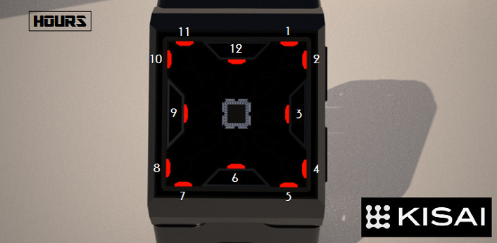
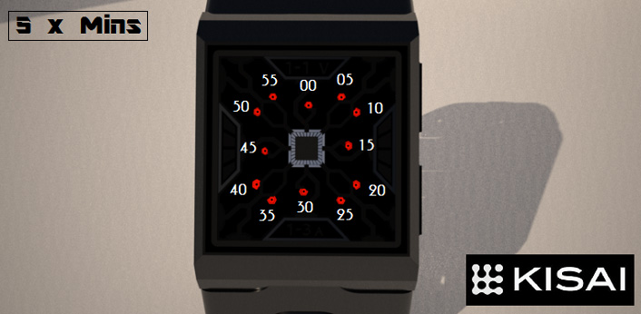
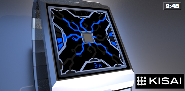
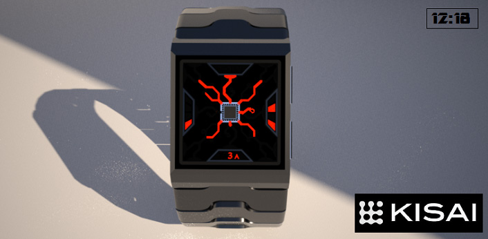
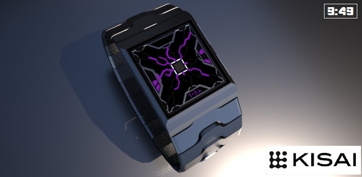
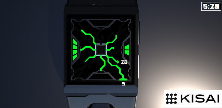
Time is told in a similar way to an analog watchface. Hours are located around the outer edge with blocky LEDs and the 5xMins are located a little further in by little round LEDs.
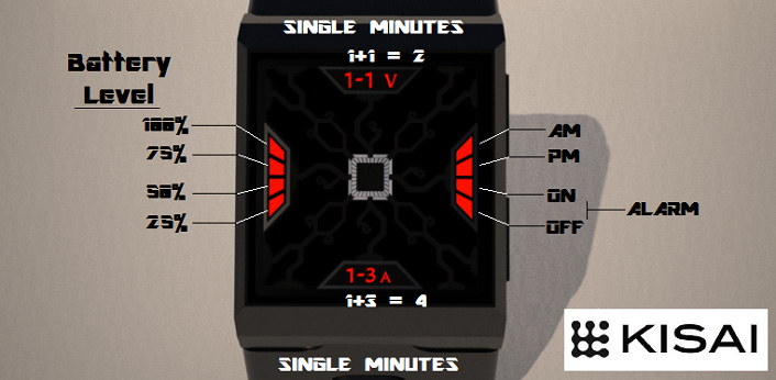
The single minutes are located at both the top and bottom of the face, these are displayed as Volts & Amps (in keeping with the electrical/microchippy theme).
1 minute appears as “1V”…2 minutes appear as “1-1V” (adding these together would give you 2 mins). At the bottom, the 3rd minute is displayed as “3A”…the 4th minute is displayed as “1-3A” again by adding 1 & 3 would give 4.
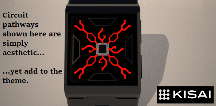
Telling the time is as simple as just locating the lit LEDs around the edges and adding the 1xMins together. The circuits leading up to the time indicators are there for aesthetic detail and do not actually indicate anything…but they look cool….I hope.
Im hoping those with a penchant for the futuristic style will like this watch, also those who like an easy watch with a touch of crypticness. Maybe even gamers, with its bright electric theme will be drawn to it.
It’s bold LEDs will be a draw for most people, that and the fact its such an easy way to tell the time and also that it has such a distinct theme built around it. There could also be an animation possible with this, similar to one of those plasma balls where the electricity could snake across the screen from time to time which could attract attention and admiration.
I hope you like this watch and I welcome your thoughts.


Thanks for posting this Toky, this may very well be my last design for quite a while so hopefully it’ll be a nice and well received submission.
LikeLiked by 2 people
Very nice. The way you have used the silk screen & extra pathways for visual effect works well without confusing how to read it. Its still simple to pick out the hour/min hands.
I particularly like the 5th image (9:48) in blue with silver silkscreen. That combination is really striking.
LikeLiked by 2 people
This is a great looking design. I can practically hear the buzz and crackle of the electricity. The silkscreen elements work well, making it look cryptic at first glance, without detracting from the overall readability. I’d gladly add this to my collection
LikeLiked by 1 person
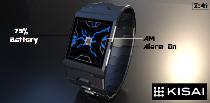
I like the power indicator (this feature is rarely used & I’d like to see it more often) & the AM/PM/alarm indicators. Adding a bit of math for the +1/+4 minutes & using decorative letters is interesting. I like the symmetry.
The hour/5 minutes reading are good. However, I feel like the 5 minutes dots should be slightly bigger/more visible.
LikeLiked by 1 person
Nice looking design with plenty of opportunity for funky animations. I think that the 5 minute “o” s could be slightly bigger/clearer (but I’m nit-picking) Cant fault anything else. Best of luck and I hope this isn’t the last Justin design we see on the blog 🙂
LikeLiked by 2 people
Animations would always be nice.
LikeLike
A great design that is quite easy to read when you know how. I see Pete’s point about the size of the 5-minute “o”s being quite small, but I’m sure that would be checked and fixed if necessary in the final design before production. :). 5*/y (oh, we can’t do that anymore, can we!)
LikeLiked by 1 person
Cheers guys, in retrospect yes I agree that the 5x mins indicators should be bigger. That being said though the main idea is there so it’s just a minor detail which could easily be tweaked with. Cheers for the support.
LikeLiked by 1 person
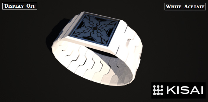
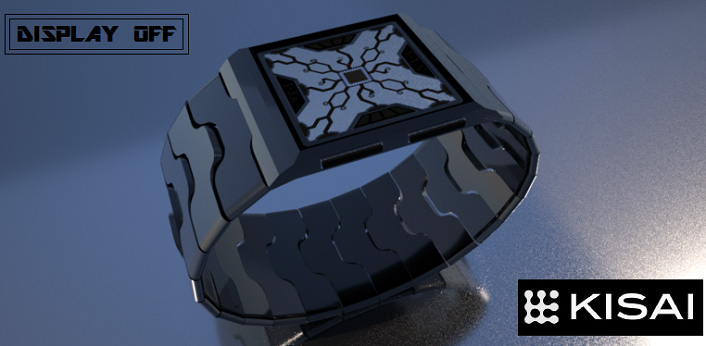
I like the electro look. The first impression of this watch rocks – that’s quite important. I like the mixture or important elements and decorative ones and how the blend into each other. The off display is cool too.
LikeLike