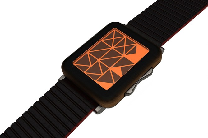
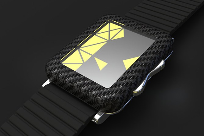
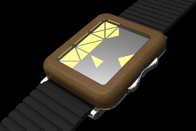
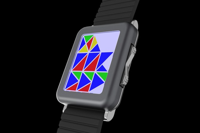
Design submitted by Gordon from the USA.
Gordon says: This is a mash-up of an old watch design body and a new display of mine so lets call it “Mashup”.

View the others here to see the origins.
https://blog.tokyoflash.com/2014/06/cubex-watch-inspired-by-modern-custom-interiors/
https://blog.tokyoflash.com/2011/06/fun-colors-led-watch-design/

This may appeal to watch purists that like tech but don’t want all the tech of a smart phone on their wrists
I hope you find this original, other than the knock off of two of my previous works.


The mash-up does look good, Gordon, and the images look so realistic. Great stuff. I do miss the asymmetric case from Cubex, but this would probably be more comfortable to wear.
It would have to be a monochrome version for me – I’ll have the one with the black strap in the 7th image, but am also tempted by the wooden one.
Good luck and 5y.
LikeLike
Nice upgrade Gordon! Like Nev I did like the more geometric form of the original but this is also nice. I kind of think that the display better suited the more cubey shape but thats a subjective matter. This version has a more user friendly shape which will probably more uni-sex than the original. I like the wood, carbon and the dark metal versions. It would be nice if the lens or display had a geometric texture or grid lines or something to give the display a more technical look?
Either way 5/Y and best of luck sir!
LikeLike
Thanks guys. Pete, I was going for simplicity I figure the wearer will pick up the time faster over time (pun intended) while others will have no clue
LikeLike
I like your earlier incarnation better, Gordon. It felt purer from a design standpoint. I do however dig the rocker switch on this one.
LikeLike
Thanks, glad it appeals to you
LikeLike
test
LikeLike
Nice design man, it’s not something I would buy though, I preferred your original concept.
It feels like I’m missing a limb every day this blog is off lol. Can’t wait for it to come back online.
LikeLike
I like the buttons though, I’d imagine them to have a clicky feel when pressed.
LikeLike
Thanks, looks like I got in under the wire. Wonder what they are cooking
LikeLike
Hi Gordon, beautiful work, even if I have weak for the line of Cubex.
5*/Y.
LikeLike
thanks Patrick!
LikeLike
Test test 123…
LikeLike
EVERYTHING IS A TEST……
LikeLike
WHAT’S UP WITH CLOSING THE BLOG DOWN??
LikeLike
According to comments on the TF Facebook page the closure is due to lack of man-power and concentrating on bringing new products to market. Hopefully after the Christmas rush things will go back to normal x^^x
LikeLike
Hopefully so… I was just getting ready to submit something!
Thanks Pete 🙂
Regards,
ALinCAL
LikeLike
Tgif
LikeLike
damn, 3 weeks on page 1. I guess they figured my watch was so epic that they didn’t need the blog anymore. lol, just kidding but it is nice to be left on top until they turn the blog on again. I can only hope that they are busy tooling up some kick ass new technology watches
LikeLike
Hopefully all the previous designs wont have been submitted without a chance of production. That would be devastating having done all that work for nothing. Until the blog comes back online i havent felt the need to even pick up my pad n pencil for fear of nothing coming of it.
Fingers crossed we get some good news/blog back after xmas.
LikeLike
I like the model 3-5. The 4 colors display is nicer tho.
I prefer the Cubex unusual shape. The buttons are much nicer (even if I don’t see them fitting on the Cubex).
The time-telling method is good.
LikeLike
Thanks Mak!
LikeLike
❗ Welcome back, blog 🙂
As for the concept, I liked the cubic one more. I still like the time telling with its simple shapes.
LikeLiked by 1 person
This is another test…new blog huh…very nice!!
LikeLike
Welcome back, blog. As for the watch, while I agree the display concept was created in the spirit of Tokyoflash, but I see this kind of design (display and physical watch design) is very vulnerable to you know, how to put it in words, you know how recently announced Apple Watch looks and capable of. A suggestion from me, try alternative design like using LED module + unique lens for the watch face or opt for other display tech like e-Ink with curved display along the strap. Have to put extra work to make our design unique and exclusive, hmm.
LikeLike
*to keep*
LikeLike
Sorry for using your submission as a tester for comments matey…this is simply a wordpress/comment tester…..so, umm…..test. lol
LikeLiked by 1 person