Design submitted by Patrick from France.
Patrick says: It is a project inspired of the “Rotate-Watch” and the “Koinshidensu-Watch”.
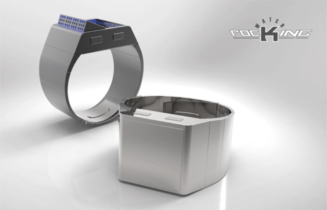
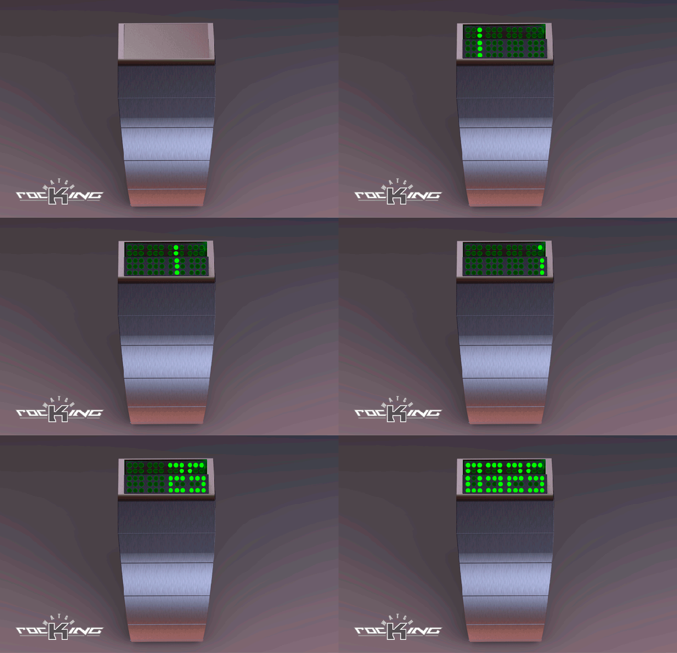
The “Rocking-Watch” makes coincide enigmatic pieces of LED, so that they form readable figures. It is necessary to look at the watch perpendicular to its vision and to make it swivel, towards outside, in line with arm, until the figures are formed to give the hour. Several animations are programmable. AM-PM – Display the hour and the date – Mode of alarm – Unisex design for small and large the wrists.
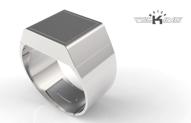
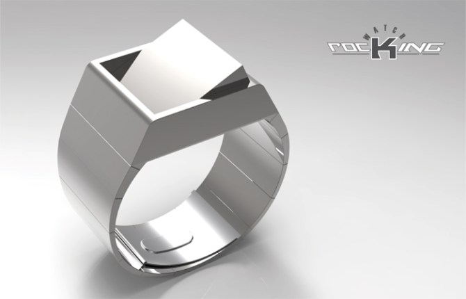
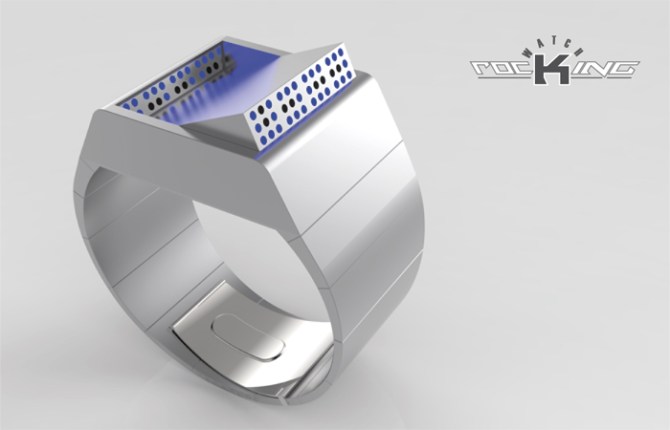
The “Rocking-Watch” is intended for an audience who want to be different and loving animated LEDs.
The “Rocking-Watch” with its particular activation will surprise many people.


SWEET!, now that’s thinking out of the box 5y
LikeLike
Hi Gordon, thank you for your nice comment and your vote.
LikeLike
Very clever reveal function. I love the way this watch can be so minimal and unassuming, but then transforms into this 2-tier readout!
It’s a top notch idea, I hope it does well. I would definitely buy one.
The straight edges & drilled holes of the flip part are perfect & have a very cool look. The case & strap I think might benefit from some more thought. The watch looks quite thick & I realise that is due to the tilting block, but perhaps a wedge-shape block could help to reduce the thickness?
This watch Rocks! 😉
LikeLike
Hi TF Studio, thank you for the comment sympathetic nerve and positioning on Blog.
For the reading, I thought of making only 3 vertical points instead of 5 presented here, to reduce the thickness of the case, but that could be a version for the girls, because the whole “compact block of metal,” and a nice rotation, clearly visible flap, I like that.
LikeLike
I NEED THIS WATCH!!!
LikeLike
Me too! ah ah ah
Thank you Vince for the nice comment and the vote.
LikeLike
Very nice and very clever Patrick! Looks a bit like a mobile missile launcher. Would be cool in stealthy black and a camo version too! Fine work sir! 5/Y best of luck! 😀
LikeLike
Hi Pete, thank you for your comment and your vote.
This effect “Stalin Organ” is completely unintentional, but a matte black version would be also good.
LikeLike
WOW!!!! What a fantastic watch!!!- I really like it just how it is…. very unique & easy to read – I would DEFINATELY buy this in a silver …. Here’s hoping they make this one for you Patrick, very well done.!!
LikeLike
PS- I’m a girl & the thickness doesn’t worry me- it’s what makes it work (& look great) 🙂
LikeLike
I am agreeably surprised that the relative thickness of the case does not disturb you, but a finer version can be made easily.
LikeLike
Karlene thank you, I’m glad you like this model.
LikeLike
Tout simplement génial. Quelle astuce de montrer que ce bijou est en fait une montre.
LikeLike
Lola thank you very much.
LikeLike
Wow! Classy!!!
LikeLike
Thank you very much Sylvie.
LikeLike
I think this is my favorite of your designs, Patrick! I guess the pivot point is located closer to the rear, to allow for less LEDs than at the front? If it was in the center, you’d have to have the same height of LEDs front and back, yes?
LikeLike
Hi Xian, thank you for your appreciation, your question and your vote.
If I move the axis of the pivot, the amplitude of the angle of correspondence of LEDs will be different. What I did, I inclined LEDs behind, in order to have the same angle of vision that those ahead, thus the reading becomes homogeneous. Having first 3 levels of vertical LEDs on the front and two on the back, does not alter in any way the overall legibility of the time, nor design (3 levels on the back would oblige a more important swivelling and of this fact the case would be even deeper).
LikeLike
Style!
LikeLike
Alma thank you, I’m glad you like it this project.
LikeLike
It’s a great idea and well presented, Patrick. I like it.
The case depth may not be a problem. Other TF watches are fairly deep (OTO is 1.6cm) so this may not be very different. If people think that is a problem, would be interesting to see it with only 3 vertical points, to reduce the depth.
Anyway, good luck and 5*/Y.
LikeLike
Hi Nev, thank you for your comment sympathetic nerve and your vote.
When I drew this watch, the thickness of the watch challenged me, but I found this block interesting and always in the standards of a possible manufacture, and if I reduce this thickness, the watch changes completely and becomes a jewel of woman, then it is a different watch, to think later on.
LikeLike
Very nice work Patrick, I would like make the following suggestion that as well as the: Time, on the current Rocking Watch it could have a secondary LED display on the other side of the rocking face which would display the: Date.
LikeLike
Hi Andrew, thank you for your comment and your vote.
If I understood well, would it be necessary to turn over the watch to read the date?
But with a simple pressure on a button on the side, can you also have the date without turning over the watch?
LikeLike
My Idea that the watch could “Rock” in the other direction like a light switch.
Displaying the Date the top LED screen & the Time in the Lower (Current) LED Display.
LikeLike
Yes Andrew, I understand, but to read the date, you must return the watch.
LikeLike
For brilliance in conception, you get my 5y!!!
LikeLike
Hi Dzign555, thank you very much for your nice comment and your vote.
LikeLike
This watch rocks! Simple, cryptic but solvable, clever. I would like a dark metal. It would be great in gold too. 5*/YES
LikeLike
Hi Sam, thank you for the suggestions for colors and the vote.
For this presentation, I wished to remain very sober for amplified the effect of surprise, but out of darker metal and why not in gilded, it’s great!
LikeLike
Concepts with user-moved parts seem to be a tricky proposition, from what I’ve seen earlier. They very easily fall into being either a snagging accident waiting to happen, or too subtle to be anything other than a gimmick. This includes my own submissions in this category, I’ll hasten to add…
This, though, is good. Very good. It’s a simple mechanism, but it fits so very well with both case and display that it doesn’t look boring; it just looks right. The simplicity also means that it would probably stand up to some actual use. A moving part, however cool, is no good at all if it breaks after a month. The thickness of the case is considerable, but it doesn’t bother me; it also fits somehow. As does the white colour.
The design reminds me a lot of some of Philippe Starck’s work. An inspiration perhaps?
I really hope this gets made as I think it could become a bit of a classic. Great work Patrick!
There’s just one thing; make it mechanically solid. I imagine the rocker clicking into the open and closed position without a sound but with a strong tactile feedback that tells your fingers that it’s ‘OPEN’ or ‘CLOSED’. =)
LikeLike
Hi Anders, thank you for your judicious comment and your vote.
I agree with everything you say, the depth is not as important, maybe it’s an optical illusion, but I do not think this is the problem, except, perhaps, for the mechanism?
Stark is very good, but for this project, something of sober, that I simply try to do (we all are influenced by what one sees around us, even unconsciously, but not directly for Stark, in this case).
LikeLike
Hey Patrick! This is a really neat idea. 5Y for sure. 😀
LikeLike
Lloyd thank you, I’m glad you like it this project.
LikeLike
Thank you all for this great adventure and thank you to all those who voted for my projects without having a finished product, but the goal was to participate.
Thank you to TF for this good idea of seeing time differently, although we remain a bit like orphans.
With very soon, I hope?
Patrick from France
LikeLike
Undoubtedly one of the most promising pieces (at least for me).
Y*Y*Y*Y*Y* Good luck Patrick 🙂
LikeLike
Hi Jose, thank you for your comment and your vote very friendly.
I hope we will have the opportunity and the pleasure of seeing your beautiful projects here or elsewhere …
LikeLike
I like the “Click Watches” feeling (mainly the Click Wall collection) of the hidden display which convert into a driver watch. I like the dot matrix/drilled holes display. The company logo can be engraved on top, to get a less plain look (which is OK too).
It took me a while to understand why some pictures have 3 rows of lights on the display & the animation have 5.
By making a part of the bottom of the case transparent, the block would require less tilting. It could be 1 row of lights on the back & 4 in front (2 under the transparent part & 2 over it).
Before realizing that it had 2 rows of lights in the back, I was going to suggest to place the pivot axis at the end (where there’s currently 2 rows of lights) & use 2 springs under the display side. (the same transparent part can be added. It would be 2 rows in/out & 3 rows out/in)
I would buy.
LikeLike
Hi Matt, thank you for your interesting comment and your vote.
Your idea of a transparent panel, with the pivot axis moved to the back would be the opportunity to design a new project and I’ll be interested to see it.
There is also a way to make three rows of LEDs instead of 5 (see the numbers in my “Crystal LED watch” https://blog.tokyoflash.com/2014/03/transparent-crystal-lcd-watch-puts-digits-right-onto-your-wrist/). As I expressed in a preceding comment, this version would be more for the women, with a finer case, but to have 5 lines of LEDs, with this more massive case, likes to me well, with possibilities of animations more important, it is a deliberate choice (if this project interests TF, I would make a version with 3 lines of LEDs).
LikeLike
https://blog.tokyoflash.com/2014/03/transparent-crystal-lcd-watch-puts-digits-right-onto-your-wrist/
LikeLike