Design submitted by Andrew from the UK.
Andrew says: I decided to create a watch that uses old fashion / calligraphy styled digits.
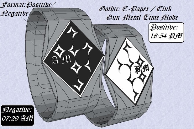
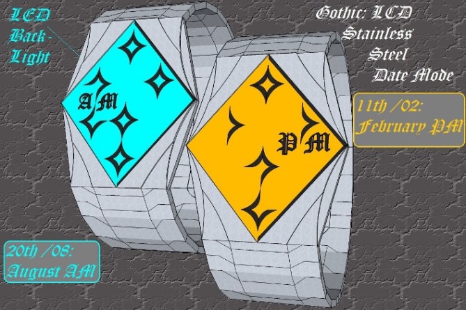
This lead to the “Gothic” wristwatch design. Which uses a: LED, LCD or E-paper / E-ink to display the time Display. Constructed in either: IP black, Gun-Metal or Stainless Steel This watch has three display modes: Alarm, Date & Time (Default).

Each digit is constructed from two curved / arched Diamond shapes which are divided into four equal quarters (See Diagrams Provided). The only the top diamond is required for the numbers 0 & 1, where as the both the top & bottom shape/s are required to create the numbers 2-9. The display is read Right to Left: Hours / Day then top to Bottom: Minutes / Months.
Goths, Heavy Metal band rockers / musicians & festival goers.
Steam Punks & fan of retro styled watches.
The Watch case shape Style of the digits & format / layout of this watch make it stand out from the crowd.


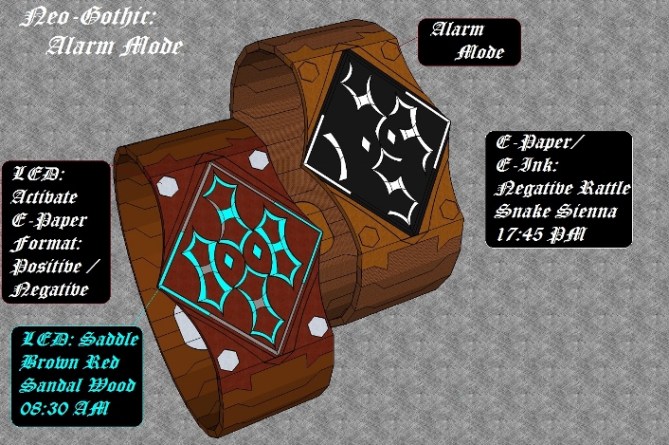
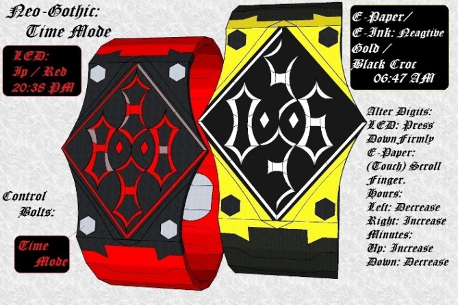
UPDATE: additional images progressing the concept. Neo-Gothic.


I like the epaper and black versions, not keen on the coloured screens (too much colour for this watch).
The numbers are very different – quite an achievement these days. They are also easy to read. I love them.
The only thing I’d change would be to drop the am/pm from the date format, which I find confusing. I know you’re giving extra info, but personally I just like seeing the date in that mode. Maybe just me, though.
Good luck and 5y.
LikeLike
When I created this concept I could not decide which display technology looked best LCD / LED or E-Paper / E-ink so used all three do that TF fans could decide which movement version/s they prefer most. I tried to make the digits uniquie but at the same time easy to read. I accept that perhaps the AM / PM indicators do not need to be present in Date mode so they could be turned off / Removed. So Thanks Nev for your input & continued support & the 5 star vote.
LikeLike
Hi Andrew, I am of agreement with Nev, AM PM is not also important to permanently keep it on the screen. To help with the reading of the figures, I would gather the elements, to facilitate and make denser the reading, something of more compact.
5/Y, an idea to be still more worked.
LikeLike
If the AM/PM letter are a real turn off for people I am willing for them to be removed. A compacted version would suit women: Rock Chicks as an elegant but edgy wristwatch. Thanks for the 5 Star vote of support Patrick.
LikeLike
Hi Andrew. Personaly I prefer e-paper, but LED looks good too. The AM/PM indicators are for me useless since the hours are on 24hrs mode and I’d put the 7 bars on the same side (right). Anyway 5y. Good luck 🙂
LikeLike
Other people have mentioned that the AM / PM maybe unnecessary as thus is a 24 hr Time display.
I not so sure about the bar suggestion thought I will have to give it some thought.
LikeLike
I agree with Nev regards the uniqueness of the digits. They look very fresh to me! I would be tempted to make the 0 and 1 full height as I find them a little unbalanced being smaller than it’s opposing digit etc. the gothic theme is not to my taste but I imagine there is quite a market for such a product. Best of luck sir 😀
LikeLike
Making the 0 /1 digit full height is perhaps better. Thanks Pete for you honest input & opinion about the balance / style of this concept it will only aid me in the future.
LikeLike
Nice number style!! The gunmetal one with black display and white numbers looks already elegant, but the gothic idea screams for a bit less modern look. I think, what about used looking metal and leather and wood to give a certain steampunk feel to it? The old english letters fit in nicely, they could be smaller, to not disturb the overall image too much. Maybe a little diamond shape would suffice… I would say Definitely worth keeping these digits and this watch shape in mind. Good luck Andrew!
LikeLike
Awesome idea Samukun a leather strap / cuff version / wooden of “Gothic” would appeal more would appeal to steam punks / rockers. I have no issue with reducing the size of the AM / PM indicators if that would improve the overall look.
I wanted to create old fashion digits rather than futuristic one’s. The shapes I came up with seemed to to be the best way of achieving it.
LikeLike
I like the steam punk watch idea!
LikeLike
Thanks TF for adding The Neo-Gothic Wrist Watch Leather Strap Edition to this existing Posting I Really appreciate it.
I created Neo-Gothic in response to the comments I received on the Original “Gothic” watch concept.
LikeLike
The original numbers in the gothic watch were great. The modified ones in the Neo-Gothic version have lost their appeal for me. Keep the original look, please.
LikeLike
Nev I wanted to make sure that the style of “Neo-Gothic”: shape: Diamond Case, Leather strap & Digits stood out improved version of”Gothic”. The Neo-Gothic Digits are full height instead of two separate four part shapes. As suggested by Pete. However the Digits used for “Gothic” could easily replace the digits used in “Neo-Gothic” If that is what the public prefer.
LikeLike
Maybe both could be included as options on the same watch. For me the Neo ones are too obvious / less weird, so maybe they could be the easy option.
LikeLike
I can easily see Both Gothic (Hard) & Neo-Gothic(Easy) digital styles being included in single a E-ink / E-paper Screen. However I do not think that may not be possible with a LED display.
LikeLike
I prefer the “Neo Gothic” case/band. The red/black is nice. I have a slight preference for the original digits but 2-in-1 with E-Paper would be good.
LikeLike
Dear Makkovik thanks for your support & highlighting you favorite style / color. Your not the first person to suggest that that both the: “Gothic” & “Neo-Gothic” digits Should feature in a single watch display. This could be achieved with a E-Paper / E-Ink screen that display the digit in different as level of difficulty: Gothic: Hard & Neo-Gothic: Easy which I fully support. Furthermore this watch could also have Medium level of Digit style difficulty. This Medium Level which would have a blends subtle of both “Neo-Gothic & Gothic” digits styles.
LikeLike