Design submitted by Matt from Canada.
Matt says: I present GRID 2.0
It’s a remake of my Grid watch submission ( https://blog.tokyoflash.com/2014/08/grid-watch-merges-cryptic-digital-time-reading/ ) based on a few suggestions:


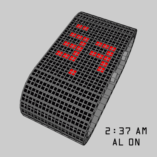
1) The display is a vertical rectangle (sized at 36.5 x 44.5). Hour & PM/AL/date positions have been rotated.
2) It’s now using 2 colors. (Instead of 4)
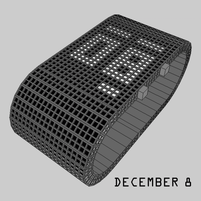
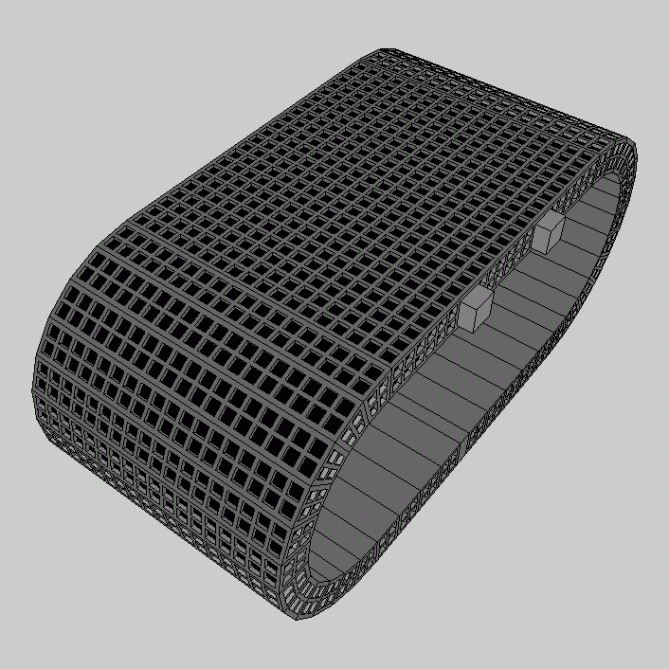
The band width is the same than the case. The band and the sides of the band and case have matching grids over matching lenses. When off, it look like a simple wristband!


How to tell the time:
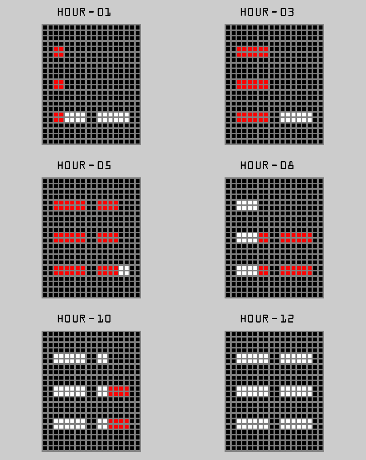
Hour = the two 6×2 blocks on the top. They are each divided in 3 squares.
Reading order = left to right.
Red lights = 1-6
White lights = 7-12

I did an animation showing 3 methods to display it:
1) Red +1, up to 6. Then, white +1, until 12.
2) Red +1, up to 6. Then, 1 white light replace 1 red light, until 12. (Basically: Red = 1 & White = 2)
3) Red/White ribbon: Similar to option 2: Between 1 and 6, 1 red light replace 1 white light. From 7 to 12, 1 white light replace 1 red light.
Minute = The 2 big digits at the center. (The 1 use the central column.)
Features (PM/Alarm/Date) = The 3 lines (or 2 lines and 1 block, for the alarm) at the bottom.
Reading order = PM at the left; Alarm at the center; Date at the right.
The color of all the LED’s matches the color of the current hour. Any 2 colors sequences can be used.
It’s possible to add animations like chequered sequences with 1 or 2 color(s), or line by line. Big/small blocks & any direction are possible.


The first version was an interesting concept, but would be difficult to wear – this version solves that problem. With the reduction to 2 colours, I think I’ll be able to remember the sequence, so that problem is also solved. So, version 2.0 is now a viable product for production.
As you pointed out on the original, it is reminiscent of the wonderful Shinshoku, which I love but missed buying and had to buy a clone. This version is even more so, which also enhances it for me.
Great stuff – good luck and 5y.
LikeLike
TY, the version inspired by the Shinshoku is https://fbcdn-sphotos-a-a.akamaihd.net/hphotos-ak-xfa1/t1.0-9/10569087_757968324259600_3296548819574698760_n.jpg
I’m working on it this week & in the 1st half of September, I’ll do the 4th/final one. (same case/different display)
LikeLike
Hi Matt, improved interesting version.
5 * / Y.
LikeLike
This is a huge improvement over the original version for me. Both esthetically and time reading wise. In the right material I would consider buying! 5/Y Best of luck sir! 😀
LikeLike
This looks interesting, especially the ‘grid over grid’ version in the last few images. I can imagine that’d look pretty cool in reality.
I’m not too fond of the bracelet style (case and strap matching), but for this a differentiated case might very well ruin the look of the mesh.
I like the time telling; it’s a very compact and clever way of showing hours, I feel, and showing the minutes as digits is probably the way to go for ease of reading (it is for me anyway). =)
Best of luck with it!
LikeLike
TY.
About the last 2 pictures: The “grid over grid” is like that because I didn’t like having squares that would be too big, specially vs the other model.
I saw many possibility & did a few of them. (1-2 per presentation)
Other options include:
The grid over the band links can be removed. (& keep the borders)
Or side grid. (like the original)
Or both.
It can also be flat with the black part. (would look like inlays, like the Nixon Rotolog)
It can be half-circles between the borders.
Or cylinders between the borders.
Any of them is OK with me!
I’m currently working on a new band/case. The grid is replaced by engraved lines:

Horizontal cylinders may be added between 2 squares.
LikeLike
Agree with master Pete.
Y*Y*Y*Y*Y*. Best of luck Matt 🙂
LikeLike