Design submitted by Andy from the Ukraine.
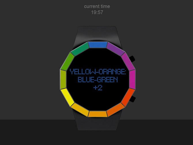
Andy says: My idea is based on popular watch Kisai Kaidoku. I decided to use text time message, but to use unconventional text style, to use color spectrum

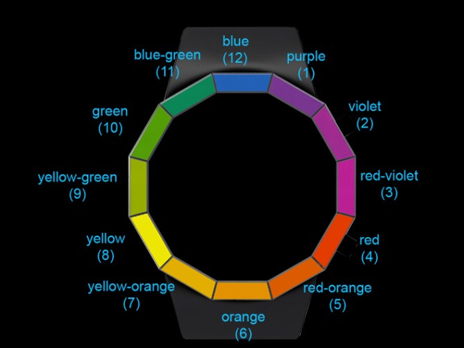
For time tell you have to use color spectrum, placed at the case. As an example blue color means 12 hours/0 minutes, orange color means 6 hours/30 minutes. When appear at the screen blue: orange+2 it means, that current time is: blue (12): orange (30)+2 minutes. And we have 12:30+2 = 12:32
Peoples who like unconventional design, bright and cheerful things
New look on tell the time, unconventional using colors to tell the time.


Cool colourful concept Andy! and pretty unique too I should imagine. I think I would need a sticker on the bezel with the colour descriptions initially as it would be easy to get confused with the colour shades initially. Maybe this could be an interchangeable bezel, when your proficiant you put the non-markered bezel in place.
Maybe a mono-chrome version would be possible too for those who are not that fond of bright colours, maybe with various hatching or patterns etc. Best of luck sir! 😀
LikeLike
Maybe you are right, Pete, but I used stardart spectrum color names. Thanks, Pete!
LikeLike
Hi, Andy. I would argue that you should change the name ‘purple’ to ‘violet-blue’ or ‘blue-violet’, as purple is ‘the one not like the others’ as Sesame Street used to say. This would make it easier to remember, as every other color is hyphenated/ a combination name.
LikeLike
Blue-violet definately, as the other combo names start with primaries yellow and red.
LikeLike
Maybe you are right, but I used stardart spectrum color names. Thanks, Xian
LikeLike
Clever idea, Andy and I like the way you have presented it too.
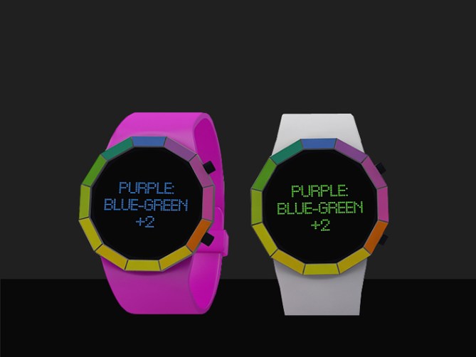
With the black face and the dark strap, it looks good for my wrist. The bright coloured straps, although not my style, will still have their admirers.
Good luck and 5y.
LikeLike
Hi Andy, Sorry for the late comment. Actually I was sure I had commented before, but must have accidentally missed the all important ‘submit’ button 😉
This is a unique idea, I don’t think I’ve seen a time-telling method like this where you have a kind of built-in cross reference. It should appeal to people who like a cryptic/puzzle element.
The rainbow surround is a strong point for me which gives a striking look.
LikeLike
Thanks for you deep analyze, Tokyoflash!
LikeLike
It’s an intersting way to split up the obvious analog time telling into harder to tell digital time.
• I think three-letter words would look more stylish (prp,red,ora,yel etc.)
• I think you should use single words instead of mixed words like purple-red. There are nice words for those special colors, like amber (amb) for yellow-orange. Then people would just have to learn the colors. It’s hard but it’s clean.
• Maybe framing the rainbow-ring in black/white/chrome would look more elegant, less toy-like.
• I would put red on top, being the beginning of the visible light spectrum (that’s just a minor point)
• The usage of a pixel matrix would allow a lot more than just words. If there would be another reading mode or just something else, that justifies the production of such a display, the watch would gain more “depth”.
5*/YES for the idea and a possible ideal interpretation of it 🙂
LikeLike
Thanks for you deep analyze,Sam!
All you items are correct and I agree with you.
LikeLike
Thank you,Nev! Good luck
LikeLike
Hi Andy, this watch reminds me of Sam’s “Spectrum”. It is a good idea while putting aside the problems of people with color recognition?
5 * / Yes, the idea is always good.
LikeLike
I love the idea & the overall look. I like the pixels-based texts. (1 note: The : at the end of the 1st row seem unnecessary)
I have a problem with using shades of colors! It’s about differentiating them. On some picture, like the last, the 4 & 5 look identical.
I strongly believe that finding another trick will make it readable!
I like that all the letters are used. You don’t have to figure what the acronym is!
LikeLike
By “trick”, I mean “there’s nothing to change on the overall look”.
LikeLike
It seems a very appealing concept, a rainbow, which combined with colorful words, they tell you what time it is. Really well done. Y*Y*Y*Y*Y*
Good luck Andy 🙂
LikeLike