Design submitted by Sam from Germany.
Sam says: I was scribbling around for a time display, that would be cool as tattoo or graffiti, some sort of iconic symbol that would draw it’s justification from the look first, then by the hidden meaning.
The idea of stacking numbers isn’t new, but there are many ways how to do it. I chose a 12-5-9 time format and gave the numbers of each category different proportions. This is where the name PLUS comes from, because the first and the last digit have the opposite proportions and form a cross.
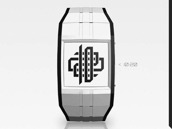
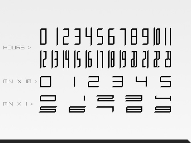
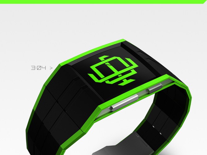
While the cross layout was an easy decision, the look of the numbers, the balance between them and the way how to make them distinguishable was highly experimental. So in the latest version the numbers have a thin border that helps figuring out the stacking and reading order – hours on top, minutes x 10 in the middle, single minutes on the bottom. So next to the different proportions, the stacking order tells which numbers mean what. I’ve added some 45° angles to the numbers, but only the bottom-left-to-top-right direction, to create a dynamic effect a little bit similar to italic typefaces.
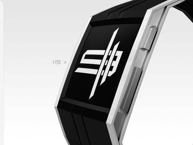
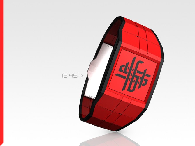
The watch follows the style of the numbers. It’s rather simple with some sharp edges and 45° angles. Thanks to epaper it’s flat. The 11th hour’s numbers are extended as grooves in the straps while the whole watch is framed by number-colored lines.
I suggest epaper with a color film because colors are fun and epaper has a nice artistic appearance that fits to the tattoo and graffiti image that I have in mind.
The PLUS colored epaper watch would be for fans of symbols, icons, scribbling, graffiti and cryptic-at-first-but-actually-simple displays.


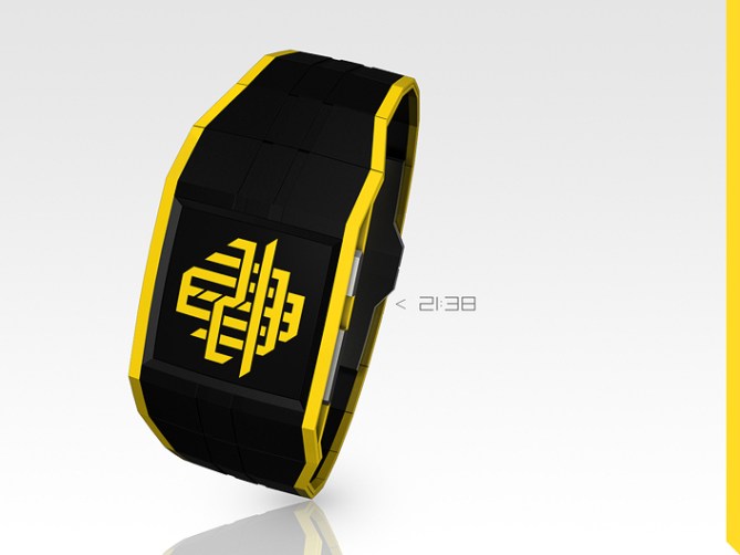


Excellent iconography at work here. It works on so many levels ~ as you mentioned “fans of symbols, icons, scribbling, graffiti” but also tribal art, tattoos, alien symbols, it even has a slight military feeling. You can take from it what appeals to you.
Beyond that, the concept works brilliantly. Its very easy to read, just the perfect balance of cryptic & readability (& fun).
I love the graffiti/tattoo association that you ended with – An electronic tattoo seems so apt for our electronic lives these days.
LikeLike
It’s fantastic when can people draw their own associations from a display. I can’t think of all of them so I’m lucky when I reach more people than imagined. Being distinctive but also open enough for interpretation… okay afterwards I see it too, but while working on it, I didn’t see the forest for the trees. I just followed my intuition. Same with the balance between cryptic and readable. Again I must say, being able to let watch fans look over the concepts is great. I enjoy it while it’s happening 🙂 Thanks for posting and thanks for the nice analysis!
LikeLike
**************************************************
YES!
LikeLike
Woah 50 stars, thank you, thank you!
LikeLike
Pazar…
Ik ben gek met tattoos..
LikeLike
Een gekke geek? Dit vind ik leuk 😀
LikeLike
Hi Sam, for my part, I see an oriental symbol.
First, I had a slight problem reading, but when we focus on the different layers, reading becomes evident.
5 * / Y, still a great job.
LikeLike
Thanks a lot Patrick! Oh yes, I see moorish arabesques (arabesques mauresques) now…. pretty nice image too. Very good – another area of arts that the watch implies. I’m glad that you experienced the ideal tokyoflash effect with this display.
LikeLike
Superb! I’m speechless, I’d totally purchase it even though I already have a lot of watches. That’s the type of designs that makes you want to have it instantly wrapped around your wrist. Sam, you make my consumer’s heart flutters with this one! =p
LikeLike
Dawww, how nice of you :3 I’m glad the concept pleases. Good sign!
LikeLike
The day I mentioned I was planning to do a tattoo inspired design and you said you already had one in the works will haunt me forever! I wish I hadnt mentioned it and carried on regardless! lol
Still the only consolation is that it probably wouldnt have worked as as well as this or “Aeon” 🙂
Very fine work sir, a sure winner! best of luck! 😀
LikeLike
Oh yeah the tatt topic is in me for a while. Not easy to build a watch around a display idea 😉 Cool that you mention the Aeon. I actually think about going less utopic, more feasable. We’ll see. Since the Aeon can’t be topped, such a more realistic concept would have hard times. Here, with the Plus, I fought between limitations and the look, just like with Rorschach. It’s cool when the “hard work” has an impact like right now. Thanks a lot for the compliment sir and the luck!!
LikeLike
sweeeeeet!!!5y
LikeLike
(^^)/
LikeLike
Very nice, Sam. I trust 3:54 has a special meaning for you…must have hurt getting it on the wrist 😉 Very convincing artwork!
LikeLike
Aaactually I randomly picked the tattoo from the 1-9 hour times to show one of the more simple symbols 🙂 But if this story continues, 354 might become important… By the way, someone really got some of my Monolith concept numbers tattooed. Quite an honor. Thank you for coming by!
LikeLike
Dear Tokyoflash,
Make this watch, I need it.
The end
LikeLike
That’s a proper story: Intro, main part, Outro. I like it.
LikeLike
Wood version????? ;D
LikeLike
You know Tokyoflash too good hehehe
LikeLike
Brilliant idea Sam tattoo style cryptic/ numbers arranged by stacked them in layers one top of another creating another awesome & unique concept. Hopefully another of your wristwatch designs that will become a reality soon.
LikeLike
Mmm nice summary Andrew. Thank you for the compliment and the hope!
LikeLike
Another great design, Sam.
The fact that they do look like they are stacked makes me want them to look more so. Epaper can’t really do this, but a 3D effect would be possible in a TFT version. I know that doesn’t fit with the tattoo / graffiti idea, but it would be cool.
Of the images here, the blue on black wins for me, but I wait to see the final version on sale.
So, shopping list is now:
1 x Collider
1 x invader
1 x Vein
1 x Plus
Please stop designing watches that have to be made – not good for my bank balance!
LikeLike
Right now your balance should be balanced but you want that changed, thanks for that hehe
While the 2D illusion might work with epaper, a real 3D effect is pretty hard to achieve. Such a display would be able to do so much more than just showing the time, that’s a whole new concept and another price range. Just like making things holographic. Phones and TVs will go there but watches… Oh the future is a nice place to dream of.
Already waiting for the final version, thanks for the advanced praise 🙂
LikeLike
Absolutely great design there. It looks like some amazing art work 🙂
Thoroughly enjoyed looking at it. I will surely buy if this watch becomes available.
LikeLike
Thank you masti! Truly appreciated 🙂
LikeLike
This one isnt for me im afraid…i simply dont like it!
Pffftt…only joking Sam…LOVE IT TO BITS!! Throws money in your general direction…want!
It looks really confusing but im able to read it in less than a second when i see it. Great concept…nicely delivered…can i borrow your mind for a week to make some awesome designs myself lol.
Oh and not that i need to tell you but….5*/Y
LikeLike
Oh that’s the epiphany mode, knowing about the confusion but seeing the meaning… and reflexively throwing money 😀 Thanks a bunch for the niiice comment and, not to forget, the support!!!
LikeLike
Very nice take on the stacked digit theme! I can’t really say much that other people haven’t already, just that I’m surprised how well the cues for the order in which to read the digits work. Some great design work there, and graphically speaking the slanted ends of the digits add a certain something. Good work, and good luck! =)
LikeLike
Hi Anders, thanks for the comment and the luck!! Hmhm, I’ve checked the stacked/overlayed/inside-out digits entries (including my three or four attempts) and I haven’t found something like this. I wouldn’t wonder though if someone already had this idea (and I’ve overseen it), because it’s one of those “obligatory” ideas that come up when you’re a watch geek. The execution of the idea was tricky and I’m glad it turned out pleasant. The slanted ends are a simple twist but they mean a lot. Without them the digits are rather boring I have to admit. The little gaps, the slanted ends, the little islands that sometimes appear, the slight extensions (vertical ones in the hours, horizontal ones in the single minutes), the different proportions, the balance between ink and air – so small ideas that are strong together.
LikeLike
VERY COOL SAM!!!
I LOVE THE TATOO CONCEPT!!
WELL DONE, AND GOOD LUCK… I WANT ONE!!
LikeLike
WOAH THAAAAAANKS *gets blows away*
LikeLike
blown*
LikeLike
The numbers are perfect. I would certainly buy this watch. I also like the detail of the double line wristband opening up in the side view to allow for the thickness of the watch body and the push buttons. The only point i am not sure about is the first piece of the wristband which reduces from the width of the watch body to general wristband width. I think a gradual reduction of the band width all the way around to the lock could look even sleeker and avoid a double kink from some perspectives. I hope it makes it to production. Good Luck
LikeLike
Hi Jan, thank you for your thoughtful comment! Very good point about the straps. The double kink is in a way a new look I’m trying, getting away from too clean looking watches, just to add some effect that lets the eyes stay there longer. I would find a gradual reduction ok, although it would be another language of shape. That’s not necessarily bad. Actually I should re-employ my wrist model that I made a while ago, to see how a watch would look on a wrist. Not everything is seen at the same time, so the effect of the sudden reduction is maybe not so strong in the end.
LikeLike
this watch would be a “must buy” one for me – most likely the black/cyan version.
I like the futuristic design and that the displayed ornament is easy to read if you belong to the initiated and quite cryptic if not.
Absolut klasse !
LikeLike
Hehe danke for this comment! You also found a favorite, great!
LikeLike
I just received my Polygon watch from TF. and like the Optical Illusion it suffers big time from the very glossy screen. my e-Ink Rorschacht not so much but has a highly reflective position too. so as I really, really hope this concept becomes reality, I would like to recommend to use (test of producibility) a matte, anti-glare screen instead.
LikeLike
Your words in Tokyoflash’s mind ^^
LikeLike
Fantastic. Kind of like Rorschach in its tattoo look but a completely different approach! Amazing work. I have Rorschach and would like to own this own day as well.
LikeLike
“like Rorschach, but different” is the best compliment the watch can get I think. Oh thanks for getting the Rorschach 😉 and for this nice comment!
LikeLike
I love the overall look & the dynamism added by cutting the corners of the digits. I like the “all-around” grooves. Using a color film over an E-Paper display is a very cleaver/smart idea.
Due to the stacking of digits, the reading would take a lot time/effort. Meanwhile, the nice wristband look compensate it. (& it’s not like I don’t have a few challenging watches. I Ex: my binary when drinking/being tired)
My favorite is the black/red. (the 1 before it is nice too)
LikeLike
Merci Makk for the comment! I hope it’s smart enough for a further step 😉 I also hope that the look baits the people who also think it’s a bit hard to read but encourages them to learn it. It’s a tricky balance.
LikeLike
I forgot to tell that I like that both hour digits are together, instead of 0-2/0-9.
I’ve seen a few “stacked digits” concepts. It’s the best that I’ve seen, even if some are less complex to read, by having dual-screen/big hour/small minute or stacked hour on left & minute on the right.
LikeLike
& you did some trial.
LikeLike
Yeah it’s a 24-5-9 time telling.
LikeLike
All “PLUS” on your wrist. It will leave a mark forever …
Things of the master Sam :). Great and nice work!
Y*Y*Y*Y*Y*
LikeLike
🙂 Thank you very much José!
LikeLike