Design submitted by Peter from the UK.
Peter says: Armour and Sci-Fi are two of my favourite themes which keep tempting me back time and time again. And so they have again, this time inspiration has come from Sci-Fi helmets from games and film.
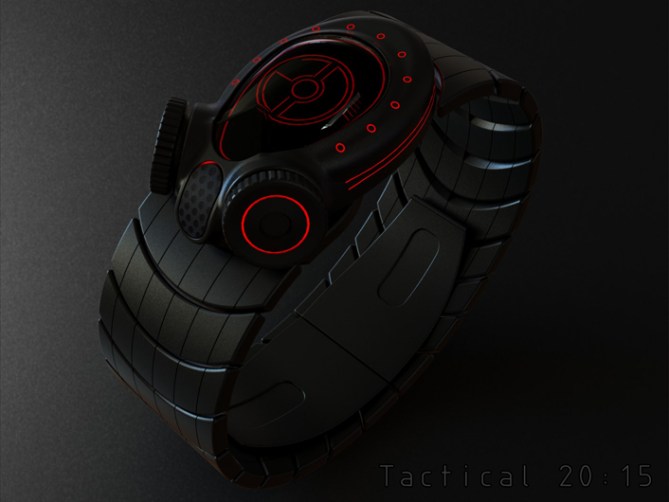

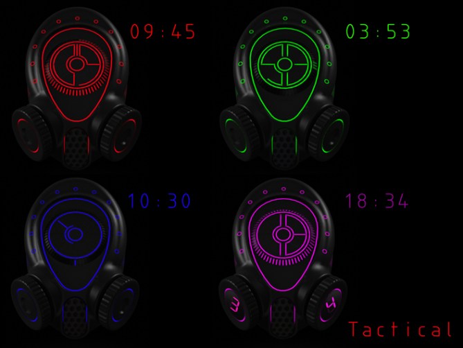
The main body is as a futuristic helmet/repirator like form featuring a large visor like display and two gas-mask like buttons/crowns for the controls.
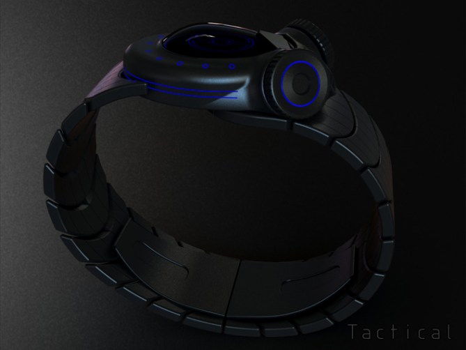
The time is told by a digital display (could be LED or LCD) with a digital/analogue hybrid layout. This layout allows for a variety of time telling modes, from fully analogue to analogue/digital combinations.
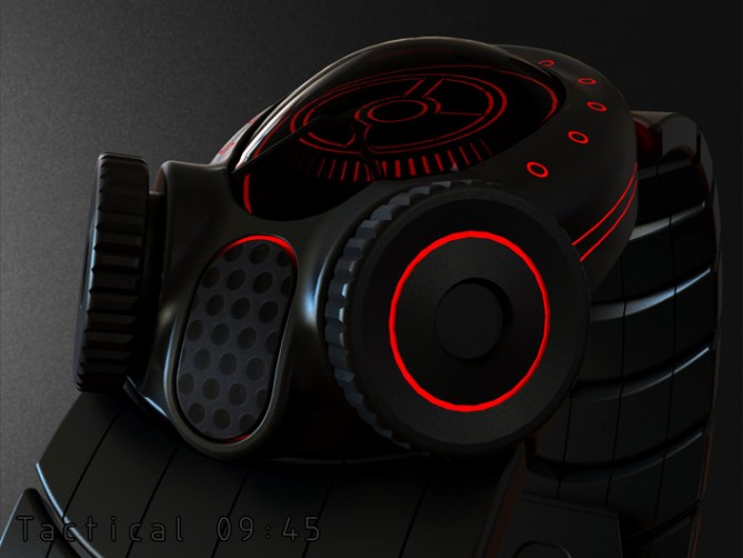
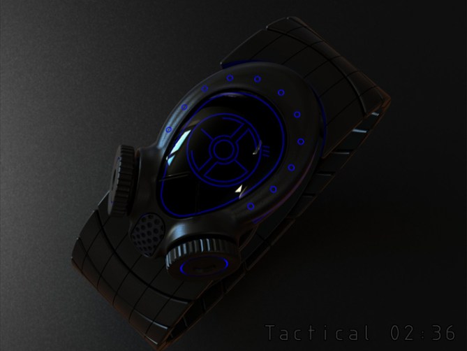
This design has a futuristc Sci-Fi look and theme which should appeal to film buffs and gamers alike. The armour/helmet look make appeal to the more adventureous and any stranded aliens that want a reminder of their spacey roots 🙂
The Sci-Fi looks and combination of the hybrid display and unusal controls set this concept apart from others 😀




Wow, this is totally out-there and awesome! You will scare small children with this watch – ha ha.
As an avid gamer this invokes memories of Metal Gear & Splinter Cell, sneaking around in the darkness avoiding search teams.
I love the way there are multiple time modes on this thing & the arrangement of lights – some decorative & some functional (you can’t always tell which) – that really boosts the feeling of complexity but not the difficulty.
Excellent & impressive work.
LikeLike
Cheers for posting and commenting Toky! Yeah this is a little out-there but hopefully not too bonkers for most. I like the gaming association, you mention some classics there 😀
Hopefully the display layout offers a few possibilities, cheers for the feedback! 😀
LikeLike
Sold
LikeLike
I’m glad you likey! Thanks a lot Vincent!
LikeLike
Makes me think gas mask! Great design!! I like it
!
LikeLike
That’s a good sign as it was inspired buy futuristic helmets and respirators. Glad you likey sir, cheers for the support! 😀
LikeLike
Pete is no exception to the rule of 5 stars and Yes!
LikeLike
Thanks a lot Patrick! 😀
LikeLike
Very impressive images Pete. I hate to say it but the gas mask look puts me off of it. If it was just a traditional watch look then i would be throwing money at you right now.
The actual time telling LEDs are great though, very nice!
LikeLike
No worries mate, cant win them all. Will have to go in with laughing gas next time 😉
LikeLike
Amazing design and fantastic images, Pete.
I like all of the time telling modes, but the last one (18:34), putting the time on the buttons, doesn’t seem right somehow. Would they be moveable (traditional) buttons or touch sensitive screens?
Not sure I would wear this one to work, but certainly want it – such a fun watch 🙂
good luck and 5y.
LikeLike
Hi Nev, cheers for the feedback! The last time telling example was a last minute thought. I’d like the buttons to be press able ones rather than touch sensitive. I thing the tactile quality would better suit the concept. Cheers for liking and the support sir! 😀
LikeLike
Tactical is excellently futuristic, I can see this appealing to serving / ex military armed forces personnel. Or PC / Console gamer’s that play solo / co-op military campaign shooters such as: Call of duty, etc.
LikeLike
You hit the nail on the head there Andrew! I could have put it better myself! Cheers 😀
LikeLike
pretty cool ,love the fish eye lens
LikeLike
Thanks a lot Gordon! I’m glad you likey sir! Cheers 😀
LikeLike
Awesome concept mister!
+ tactical,toxic,tremendous
+ colored lines on black yumm
+ nice mix of analog and digital
+ nice digits
+ definitely cool 3d display
– so literal, it can only be worn in matching occasions, which doesn’t stop crazies so nevermind ^^
5*/GOOD LUCK
LikeLike
hahaha Thank the lord for the crazies! They’re all I design for now! lol
Cheers for the pro’s and pro’s! 😉
LikeLike
Looks evil! 5y
LikeLike
Cheers DZ, my cute side died long ago! 😉 Muuuuaaahahahaha 🙂
LikeLike
How long does modeling a case like this take you, Pete? On a sidenote, did you enter or do know if any of our TF counterparts entered this?
https://plus.google.com/communities/100528130097464336279
LikeLike
Generally most of the designs I do take one/two evenings to model. The renderings then take the same again typically. I don’t spend too much time as I generally have a good idea what I want to achieve at this point.
Also there seems little point polishing a design too much because it might bomb anyway or the very details you spend ages polishing are the ones people suggest you change lol
I haven’t seen that competition myself and I haven’t heard anyone else mention it. Looks interesting tho, wish Id seen it earlier 🙂
LikeLike
Me too!
LikeLike
I like the overall look. It make me think about the novels “Metro 2033” & “Metro 2034” (post-apocalyptic era).
Based on the last picture time-telling: I prefer the purple & the red. Green is good. Even if it’s a radar analog, I don’t like the blue.
I’m a bit deceived that the dots are not used! They are simply painted!
LikeLike
Yeah sorry, the spots are just decoration on my examples. Thats not to say they couldnt be incorporated into the time telling if that was deemed an attractive addition. Im glad you likey! Cheers for the feedback and support sir! 😀
LikeLike
This one covertly ends today so just want to say a quick thanks to TF for posting it here and everyone who took the time to vote, comment, like and share. Cheers everyone 🙂
Pete from the UK 🙂
LikeLike