Design submitted by Sam from Germany.
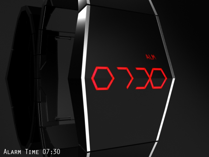
Sam says: This is the smart edition of my Xtal concept. People who saw it in the Design Studio Blog like the futuristic look, a combination of the simple shape and the cryptic numbers. Adding some smartness could make a good product.


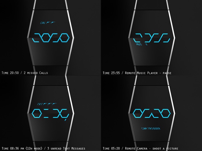
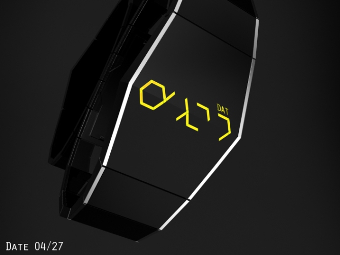
I placed all LEDs under a translucent black glass with an underlying screen that shapes their light to icons and letters. The time and date telling hexagonal numbers are dominating the display. An optional pm indicator appears under the right number. I think having 24h and 12h mode selectable would be cool. Additional indicators for date/alarm and each smart function are made of three letters. They should get memorized pretty quick.


Next to each smart function you can find one or more icons or words that inform the wearer about news or performable actions. Everything smart is kept simple to read and has been placed in a big hexagon picking up the 30∞ angles. I imagine the areas above and below the display as touch sensitive buttons. That would keep a clean design. But two buttons on the right side would work too, if they are made in a similar way to the case.
I like the imagination of a clean glossy surface with nothing seen on it and the revelations of something alien looking at a touch.


5exy! It’s really an ideal design to inherit the smart functions. There is a lot to consider with icons etc but it all fits tastefully within the original theme. Excellent work Sam 🙂
Smart functions is something we are very actively working on & you can be sure it will be a reality in the not to distant future 😉
LikeLike
YES.! Thank you for saying that. i’m seriously going to buy this when it’s released, Personally i’m not a fan of all the current wood watch designs so this is more sci fi future like 😀
LikeLike
Looks good, Sam – not surprising, as it is an extension of an existing, winning design 🙂
Smart watches are of no interest to me, so the functionality doesn’t excite me at all, but this is certainly one of the more appealing examples and the information is very clear.
The larger hexagon is really cool. I would want to try to get the watch to look like that! Easier at the top, if I responded to nothing on my phone and always viewed date or alarm! Harder on the bottom, though. Maybe an animation that lights everything up would fill my need. 😉
On the functionality side, I imagine it to be a bit tiresome to get to some of the actions (scroll down through function and then across to desired action), but that’s more about smartness being limited by the watch form (one of the reasons for my lack of interest), rather than anything wrong with your design.
For the user manual, when it gets made, worth highlighting that when the counts display ‘3’ it means “3 or more”.
So, 4* for the looks alone, but I would rather stick to the original Xtal and leave smartness on the phone.
LikeLike
Completele comprehensible Nev! Taste/Need aside (still appreciated of course), the points about the functionality are important. Setting a watch is sometimes a pain in the rear, but you do that how often? Once in 2 months? Accessing smart function should be way more fluent or if still rigid, at least shouldn’t have too many hidden levels to discover because that’s somethin to use several times each day. “3 = 3+” is what I thought too. Meaning, if it’s three, it’s about time to check the phone. So 4 aren’t needed. 2 is too small. Muchas gracias Nev!!
LikeLike
Hi Sam, personally I am not a fan of the smartwatch, but this watch is very beautiful, moreover her sister is already produced.
Which would be the additional cost, for this new contribution of technology?
5*/Y, it is a beautiful watch.
LikeLike
I believe the costs would be high because it’s not really established technology for watches yet. It’s still in the beginning. First the idea, problems later hehe. Thank you very much for the nice comment Patrick!
LikeLike
Nice subtle smart feature addition to an already popular design. The addition is subtle enough not to ditract from the appearance for those who the smart features are a bonus rather than the reason for buying.
Sounds like you have you finger on the pulse here, you must have a mole on the inside in true espionage stylie! lol
Best of luck sir, not that its needed! 😀
LikeLike
Yes I tried to not disturb the Xtal-look as much as possible. If there is something shown next to the time, it should be in hexa angles. Actually pretty simple decision with a nice outcome. As for the pulse finger, Tokyoflash would know better. I would still need the luck 😀 ThanX Pete!
LikeLike
This is excellent Smart watch & surely the a logical evolutionary step For: Xtal . I would like to make the following suggestions: that once the “blue tooth” is activated when the user receives a cell phone call the word “Call” Flashes on the display in either Xtal : Cryptic / hexagonal styled letters. Furthermore the user can answer the call on with the wrist watch transforming it in a blue tooth speaker phone. The voice of both answer caller / receivRe could be distorted when the digits are in Xtal: Cryptic Format or Stereo: Normal / Reveal Format.
LikeLike
I like the usage of the actualy time display for the annotation. That’s a really good idea, using the digits for letter. Not all letters would work but there is always a way. The speaker thing is fun hehe. That would be enough fun for a separate watch 😉
Thank you for the suggestions and the compliment Andrew!
LikeLike
One of your best Sam, made smarter. I think this is wise to show indicators on a smart watch, rather than try to make it a display device like a phone. Text is difficult enough for my 40ish eyes to read on my phone, let alone a smaller screen. Good luck!
LikeLike
Oh that’s a good point… a real smart watch that’s like the phone but smaller, or a simple notifier? Actually yeah, why spending money for a mini-phone if the real phone is in your pocket? Not sure… but the point is worth thinking about. Seem, a smart Tokyoflash watch would indeed find its fans.
Thank you for the smart input Chris!
LikeLike
Very nice stuff. I was so close to buying the Xtal watch but Tron swayed me with it’s always on illumination.
It’s a very good concept but I’d prefer a few more smart options on a smart watch rather than it being a notification centre on your wrist.
Good luck though.
LikeLike
Yeah that’s a clever twist, the always on illumination. More watches should have it.
I see the point about how smart a smart watch should be. I’m not sure where in the range of needs a notificator watch would be placed.
Thanks a bunch Justin!
LikeLike
I already like the watch design,and it has everything that a smartwatch.
Navigating through functions may be hard,my idea is an optical trackpad.
Also,call and message counts can be displayed on the time display.
LikeLike
Correction:everything that a smartwatch SHOULD HAVE
LikeLike
Hi deniz!
yes, navigating through the functions would be a tough task. I would like two touch sensitive areas on the case surface, above and below the LEDs. That would be easier than physical buttons. Maybe touching and swiping would work. Using the time display for other information is a good idea. Thank you for the thoughts!!
LikeLike
Surprisingly, I love it.
I like that the letters are tilted.
I like that it’s using touch screen tech. (1 comment on the pic with the wearer wearing a glove: gloves make touch screens unusable since it’s using electric current made by the body. (at least for smart phone). This is based on what I’ve read, not experience, which may vary. )
The original is still in my “to buy” list.
LikeLike
Touch screen is a nice way to toggle between features, specially with this much features!
LikeLike
Hehe it’s not a glove actually, it’s just an abstract glossy black hand. I can’t make a realistic one and that would distract from the watch anyway. Yep, normal gloves are bad. You can stitch metallic fibers in the fingers tips of the glove (wherever needed), they conduct the “energy” from finger to screen.
Yeah, the letters had to make friends with the hexagon angles.
The original is nicely accepted in the media. It’s a nice entry watch for Tokyoflash newbies but already really stylish.
LikeLike
Metallic fibers sound good. I’ve heard of using electric wires but I’d be too afraid to scratch the screen!
LikeLike