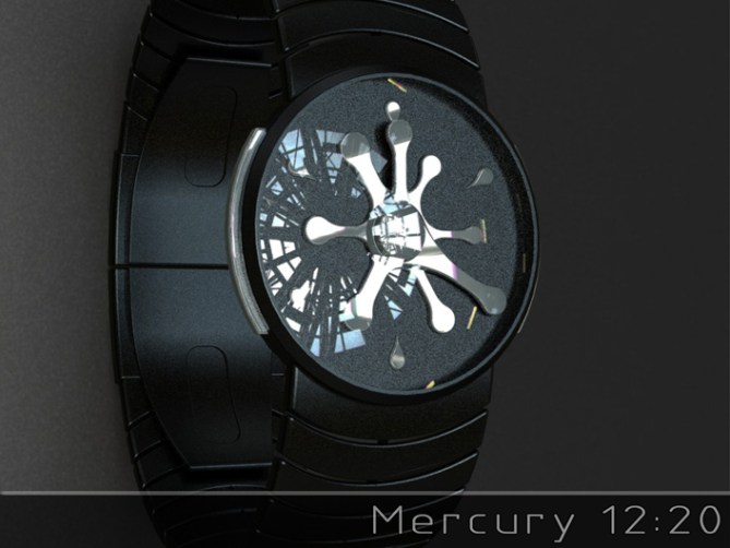
Design submitted by Peter from the UK.
Peter says: I wanted to come up with a back to basics analogue design with a hint of sci-fi which would be easy to make and traditional in its time telling. “Mercury” was born.
The time telling is traditional analogue using off the shelf movements. This twist in this case is that the hands and markers are organic in form and look like that they are a splat or splash of liquid metal or some kind of gelatinous alien lifeform.


This design is traditional analogue in concept and function with a sci-fi or arty twist. This should appeal to a wide range of people form sci-fi fans and artistic types right through to children.
The organic liquid metal look combined with traditional analogue time telling and some fun lighting sets this design apart from others.


Another instant classic from Peter, well done!
I prefer the models without the coloured lines, in particular the 2nd to last image showing the white watch where the hands are just a darker colour.
How do you envisage this working on the black model? as I can’t clearly see if those hands are different. That black/silver model is stunning, I think it blows some other brands art/fashion watches out of the water.
LikeLike
Cheers for posting and commenting Toky. The lines on the hands are to suggest a glowing core to the semi-transparent hands. On the chrome looking hands they could be mirrored semi-transparent plastic which would allow a subtle glow in poor light. It’s not a significant detail if feasibility was an issue. Cheers again! 😀
LikeLike
Another fantastic design, Pete.
I had the same concept in my head, but knew my design skills were not up to it, so it’s great to see it done by a master.
Lots of options on the display here. I agree with TF that the ones with no lines look best, as that makes it look more like a real spill.
I do line one with lines though: 2:10 green on black, as the large ends with very thin lines remind me of images of black holes consuming stars (yeah, I know, back to my fixation on stars n stuff).
Another must have, so an obvious 5y. Good luck.
LikeLike
I’m glad your likey Nev! I very nearly didn’t submit this one as I wasn’t entirely happy with my images. I think the concept is far better than my attempt at realising it. Luckily the peeps on Facebook thought it was worthy of submission so here we are. Cheers for the feedback and support sir! 😀
LikeLike
Pete should develop “the watchmaker dictionary of curiosities.”
I agree with TF and Nev on luminescent markers, they should be completely invisible during the day.
I think my keyboard is locked out of at 5 stars and Yes? ah ah ah
LikeLike
haha yeah thats a good idea Patrick, “101 weird watch ideas!” lol
Cheers for the stars and the support sir! 😀
LikeLike
Stunning! Wow! 5y
LikeLike
You are too kind sir, I thank thee! 😀
LikeLike
Cool. This reminds me of a game from miniclip called sling:). Nice watch Pete. 5y
LikeLike
Thanks a lot Valentin, I will have to check out the game you mentioned. Cheers for the support! 😀
LikeLike
Mercury: has a Fluid almost organic feel this is a another excellent executed analogue design Pete. Great work & Good Luck.
LikeLike
Fine words sir, I couldn’t have put it better myself! Cheers for the support sir! 😀
LikeLike
very nice design and renderings!!
LikeLike
You are too kind sir! Cheers for the support! 😀
LikeLike
Cool design, the purple one looks funky.
LikeLike
Thanks a lot Justin! Cheers for the support! 😀
LikeLike
I prefer the green hands (4th & 5th pictures. The 6th look too dark! ). The silver one is OK too. ( I wonder how you tell the actual time with it. )
The display is nice & I love the 6 “water drops” & the splat in the background.
It’s too bad that I can’t read analog watches like that.
LikeLike
The time telling is traditional analogue but if you struggle with analogue, the hands looking like the background splat wont help matters 😉 Hopefully this will be the design that makes you want improve your analogue skillz 🙂
LikeLike
I meant that the silver hand / decorations version use 1 color vs 2 colors / luminescent hands for the other examples.
LikeLike
The silver hands could also be illuminated like the other variations. They could be a mirror tinted plastic material that would have a subtle glow in dark light conditions 🙂
LikeLike
Time is ticking away for this concept so just want to say a quick thanks to TF for posting it here and everyone who took the time to vote, comment, share and like!
Cheers everyone!
Pete from the UK 🙂
LikeLike