Design submitted by Justin from the UK.
Justin says: The idea for this watch came to me while doodling (again). I wanted to have a watch that used simple to read numbers and that also had a cryptic mode. There seems to be a desire for both nowadays and so I began with that frame of mind.
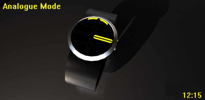
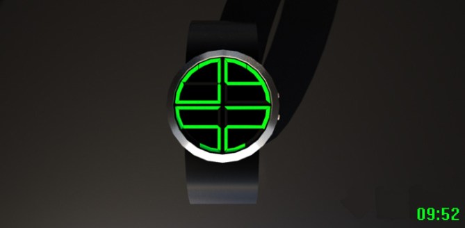
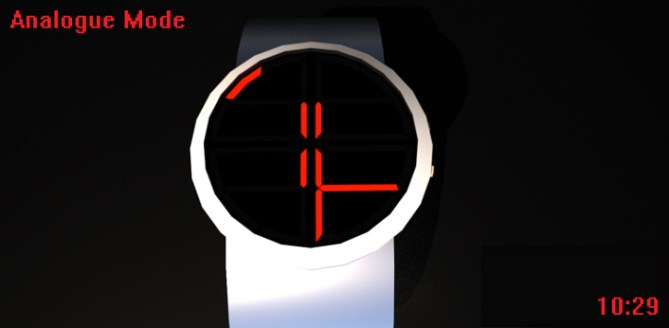
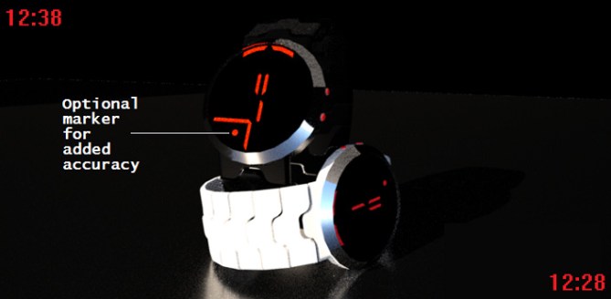
In one mode, you have a simple numbered display, hours on the top & minutes on the bottom. Then, when you switch modes, it turns into a cryptic analogue display. On this mode the hours are found around the outer edge, the 10xMins are located on the next set of LED’s in & finally, the single mins are displayed in the center.


Due to its ease of use and bright colourful display I could see many people wearing this…and then you have the cryptic mode, this should appeal to the hardened Tokyoflash fans out there who like a little challenge.
This design stands out due to its bright and bold LED’s, the easy digital mode and also its cryptic “analogue” format.
Date can also be displayed (Day & Month), animations are also sure to catch attention and if a smoked lens is placed over the time display hiding the LED’s then its mysterious visage would be questioned until a button is pressed.
Hope you like it.


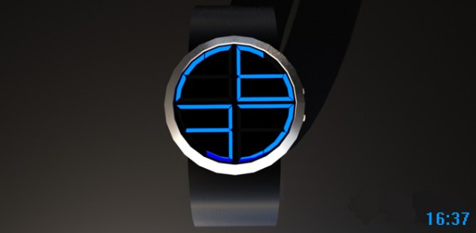
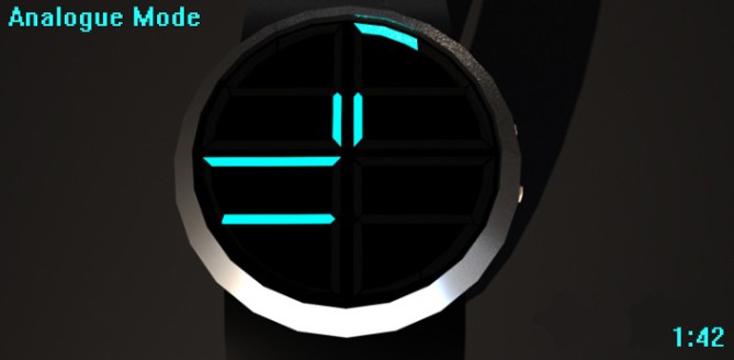
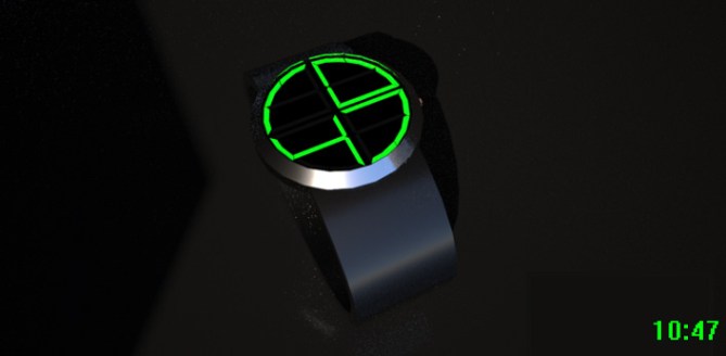
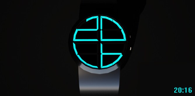

UPDATE: Here you will see Duo with a brand new strap (for extra wow factor) and more importantly an additional marker to help people locate the 00-55 minutes more easily. It is my wish that these lines and dots are customisable (turn on or off) to increase/decrease the difficulty on this mode.

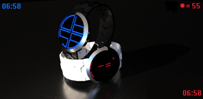


It’s a clever way of getting 2 very different ways to tell the time into one display although perhaps the analogue version has suffered a little, as it is not too easy to grasp. Of course I understand how to read it, but I would likely find myself getting confused on occasion.
Having said that, what does work well here is giving the option to have both a cryptic & easy way to tell the time in one watch. So if you’re the kind of person who likes to decipher some alien code but at other times just wants something simple – this watch covers both for you 🙂
LikeLike
Hi TF, glad you like it and thanks for posting.
It was no easy task trying to find an LED configuration that could manage both digital and cryptic. With the cryptic mode, for me I understand how it may be confusing to read sometimes but once you grasp the fact that both 3 and 9 are the only numbers out of 12-3-6-9 not to share LEDs (ie 12 is kind of shared with 11 & 1) then it makes it easier to understand.
What is it that hinders you if I may ask? Maybe some tweaking can be done to improve it?
LikeLike
Love the analogue concept. The digital part of it is a lot like other designs, however.
5y
LikeLike
This is a brilliant concept. Having both analogue and digital is an old thing, but on this watch, you have brought it bang up to date. I love the way the analogue cardinal points are highlighted. I wasn’t too sure about the double line breaks for the other points at first, but now that I have watch the animation a few times, they work for me. I love this watch.
LikeLike
I like the concept of a display that can show both digits and analogue using the smallest number of segments. Its a tricky little bugger but rewarding when you find a nice solution. This has a cryptic but easily understood methodology! 🙂
The outlook is very simple so the devil will be in the fit and finish if it became reality. Best of luck sir! 🙂
P.S I have a design with a similar-ish display layout submitted (back in June) called “Tactical” so please dont think there is any link if and when it stumbles onto the blog.
LikeLike
Cheers D thanks for the support!
Darren – thank you so much for the kind words. Very happy that you gave it a little bit of practice to understand and appreciate the analogue format. Like I said, once you get used to the layout it’s actually very simple to read. Cheers!!
Pete – if I can make you happy and appreciative of my design then I’d call that a big plus in my book!! Don’t worry, I know you and your multitude of designs well enough to know there is no plagiaristic intent. Looking forward to seeing Tactical.
Thanks for the support buddy!
LikeLike
The analog part is a bit confusing due to the restriction coming form the segmentation BUT the initial crypticness looks good and the hidden logic is comprehensible. The 10:29, red on black, metallic case – yummy. The digits aren’t brand new, that’s right, big BUT again, having 4 numbers in a circle isn’t such an invention that noone ever can use this… at least as conceptual idea. In the real world the laws are a bit more serious though… The good thing is the layout you planned to fit in analog-ish time telling. This is quite nicely thought through. Not perfectly (which watch is?), some little tweaks maybe needed here and there I think. Generally a mixture of cryptic and simple is great. Good job Justin! Supportive 5*/YES
LikeLike
Cheers for the support Sam. Thanks for the feedback. Red on black has to be my fav look out of all of them.
Which exact things are you suggesting to change with the analogue part as I could easily tinker with them when I finish work later in the hopes for an update tonight.
I was toying with the idea of having dots indicate the 00-55 minute segments but was worried this may look a little bland. I dunno…maybe a few dots here and there is was would accompany the lines of LEDs nicely.
Thanks for the vote!!
LikeLike
Appealing update Justin!!
Actually it’s not easy to tell what to tweak. I’ve tweaked a lot and realized that it’s often better to go some steps back, maybe until the beginning. I have to admit, I didn’t do so everytime… Sometimes though it’s just a little thing to change. Here the analog time telling is based on the digit led layout and HAS to be difficult and cryptic of course. But what about allowing diagonals for example? Imagine the classic 7-segment-led-digit. Now put diagonals in the the two squares. This allowes another number style (side effect, but worth exploring) and maybe gives some helpful segment positons for analog time telling, if applied to the round number styleof this watch. That’s an example for stepping a bit back and redo everything until being presentable. Then I would have to sleep over it for a night to see if it’s still ok next day. If not, I punch a pillow and go back again hehe. A good idea in the end is a straight walk-through from sketch to product in retrospective. While working though it’s wibbly wobbly. Adding a dot indicator feels a bit like a quick fix and is totally comprehensible (I would try working with what I have first) maybe helpful for the time telling but not consistent with the rest of the display design. Why suddenly a dot… But there IS no rule, it’s just my little input biased by my own taste 😉
LikeLike
Thanks for the input Sam, always good to get good, honest feedback from a veteran blogger. I went for the dot because, putting the dot in amongst all the lines of LEDs reminded me of the alien language from the tv series V. If you haven’t seen it then check it out and you’ll see what I mean.
I’ll admit it was abit of a quick fix but one that seemed fine to me. I do see what you mean about adding extra lines but I thought that by adding extra lines/hands for the analogue mode would then make it too simple to read. Maybe I should try them out and see how it looks as deep down I know I won’t be happy until you lot are happy lol.
I have plenty of time off work now so I can either re-jig this design and hope for an update or (the better plan) simply go back to the drawing board and make it a new submission and hope that it hits the mark.
I still want to keep the circular design though as I’m quite smitten with how it looks. It’s just a case of finding that happy place between the two modes.
LikeLike
The analogue part IS confusing, until you understand how to read it, but isn’t that often the case with TF watches? It’s certainly one of the things that attracts me, so I’d definitely want to use this “cryptic mode”. And I agree with Sam that 10:29 looks great!
I quite like the digital numbers – I’m partial to circles, so that works for me, but I probably would use it much, as the analogue mode is so good.
Only thing that might be worth tweaking, from my point of view, would be the strap, which is a bit bland, but TF are great at the finishing touches on the watches, so I’m sure that would be covered.
Put my name down for a red on black one – 5y and good luck.
LikeLike
Cheers for the support Nev. I’m happy you like the cryptic mode and yes you’re right, crypticness is what TF is all about!! With regard to the strap, I was unable to devote lots of time into this one as kiddywinks tend to sap whatever free time you may have so I tried to put most effort into the most important part…the watch itself.
That being said, when I finish work I’ll slap a nice strap onto it and tinker with the cryptic mode a little to see if I can away those who aren’t fully happy with it.
Watch this space…
LikeLike
If this concept becomes reality, which I very much hope it does..Can we get a wood version that’s similar to the Nightshine wood, where the LED’s Pop through the wood face?? 😀
LikeLike
A wood version would look really nice with this I think. A nice juxtaposition of tech and natural materials.
Thanks for the support and the vote!!
LikeLike
Great update, Justin.
The new strap really enhances the overall look. Just shows what a strap change can do to the images. It shouldn’t be important as the case/ strap are just there to demonstrate the watch face and can be adapted by TF, but reality is that viewers now want to see the final product in these images. You have to tell me how to create better straps in Sketchup, as My submission clearly shows I need that knowledge!
I prefer the original look for the minutes, so would configure the watch that way, but recognise that some people would want it easier to read, so good update there too.
LikeLike
Hi Nev…glad you like the update. For the straps I simply create an individual segment then simply copy paste and rotate to align it with the curvature. I use a guide in the form of a giant circle/oval so I know where to place the segments. It’s probably best to browse online at different strap designs and then pick one and add your own twist to it.
LikeLike
DUO NOW HAS AN UPDATED AND IMPROVED SUBMISSION!! Please check out the newest Duo entry…
https://blog.tokyoflash.com/2014/07/duo-led-improved-updated-version/
LikeLike
1 thing I like is:
When off, it look like a standard digital.
When on, it’s an unexpected result.
I like the reading order: out > in.
I like the dual lines for the 5min. I like that it give the impression to be a vertical rectangle in a round case.
I like the + 1 to + 4 minutes & that at, let say, 3, there’s 3 ON.
I’m still not sure about the dual lines for the hour. (at least the 12 lines are used & not 8 like the other version)
I’m not sure about the additional marker. It confuse me more than it help me!
I prefer this one!
LikeLike