Design submitted by Sam from Germany.
Sam says: This is a parallel development of a more feasible version of the ITO idea next to the ITO•E. I called this version ZION.
ZION uses colored segmented e-paper to display sharp numbers, aligning them vertically. The number style is reflected in the watch geometry – some sharp angles here and there, some small decent details, and looking generally simple.
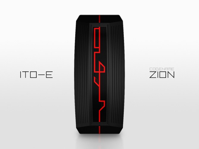
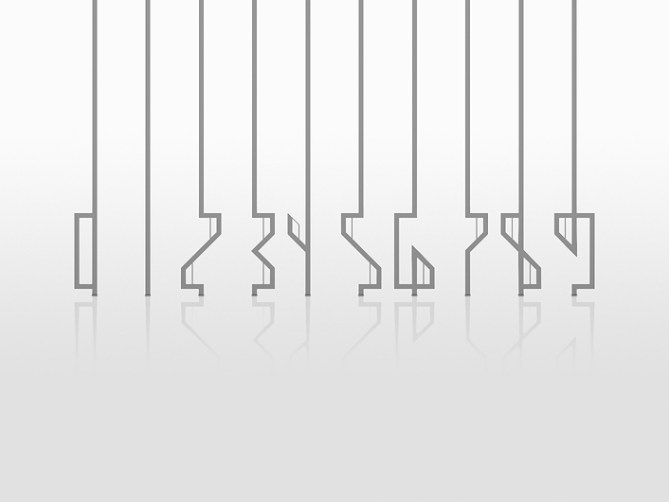
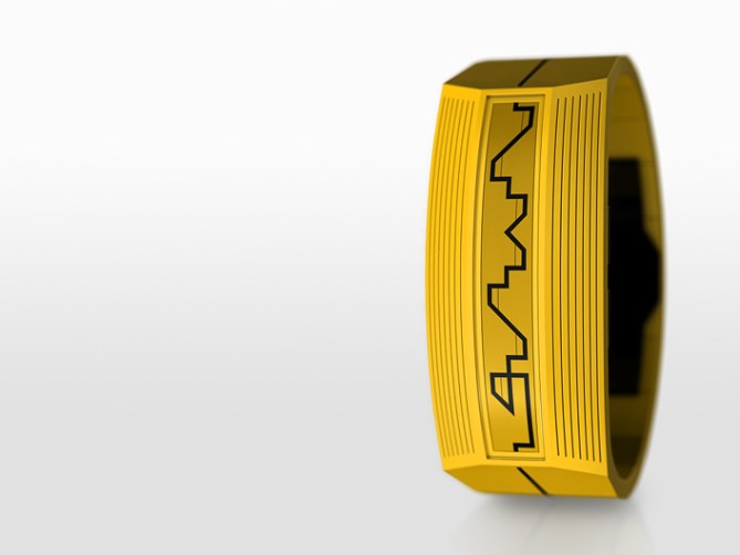
I suggest acetate case and straps not to only have black watches but colorful ones. The all-around-the-wrist line is a little cheeky this time. It penetrates the case where the display line would do so if being continued. Letting the line perform this way, creates another sort of continuity compared to a line that has to “climb” over the display border.
The combination of always-on e-paper and a similar looking element outside the display and the mixture of simplicity with humble details makes ZION an interesting piece or wristwear.
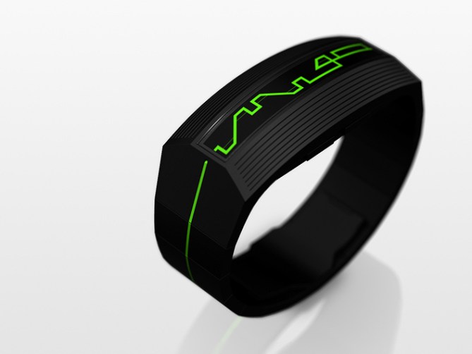
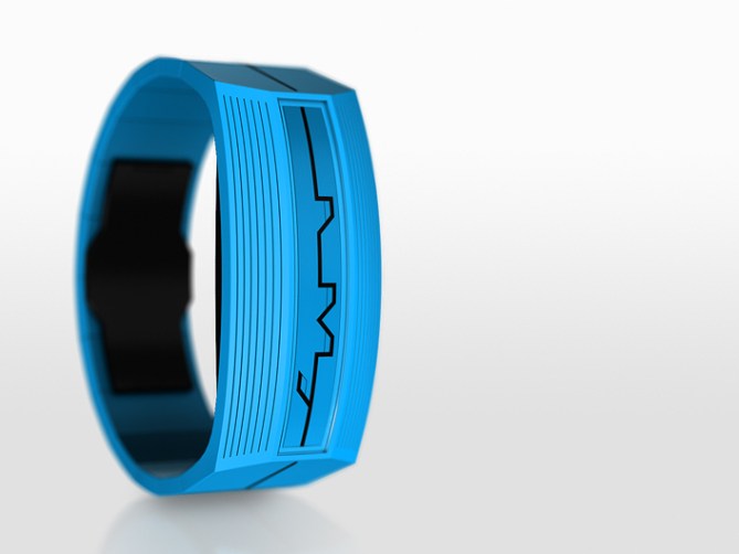
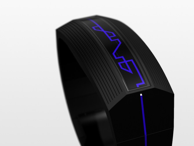
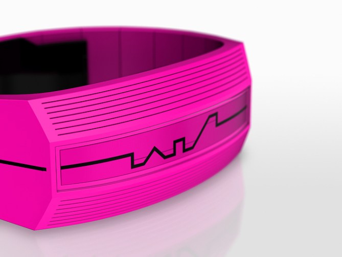


I have a difficult time deciding if I prefer Ito-E or Zion. I love the curved numbers on Ito-E but the sharp angles & bright colours of Zion are equally tempting.
It’s the kind of watch which would lure me out of my comfort zone in terms of colour. Although I like unusual watches I am not very adventurous when it comes to the case/strap colours. Here though that yellow one (& blue one) make me embrace the summer vibe 🙂
LikeLike
Zeh summah! Yep, a sharp attempt this time. Diversion, diversion. I know the feeling about the colours. I would fancy a monochrome aesthetic once in a while hehe.
Thanks for the comment Toky!!
LikeLike
Hi Sam, I like this very modern version. For me, I chose the blue nets and black case.
5 * / Yes, another great work Sam
LikeLike
Nice choice Patrick! Thank you for your comment and your support!
LikeLike
Classy! 5y
LikeLike
Thanky, DZ!
LikeLike
Nice, Sam! Have you ever designed a concept where the digits cause a ripple effect to be animated outward, as if in a pond? For some reason this series of yours reminds me of that.
LikeLike
Hey! That’s a concept I’ve been working on!
LikeLike
Thanks^^ Ripple effect… ripple….effect…. I went close to something distantly similar with my RESET and my SHIFT concept. I wonder though how the ITO series reminds you of pond ripples. Nice imagination…
Nev, crossing my fingers 😉
LikeLike
I think your design reminds me of a Giger counter, and in turn that glass of water in Jurassic Park…
LikeLike
Sorry–a Seismometer (richter scale), not a Giger counter.
LikeLike
Another very polished design, Sam, resulting in another set of “finished product” images.
This one doesn’t grab me like ITO•E. I liked the smooth (curved) lines on that watch and find the sharper numbers less attractive. I also prefer the wrap around line to be continuous as in ITO•E.
I’ve been thinking about the 4 for ITO•E, and, here, think a horizontal line connecting the stray line to the centre would still look like a 4 rather than a 9. What do you think?
Anyway, although it’s not my favourite, it’s still great, so 5* from me.
LikeLike
Thank you for the support and you view of things Nev!! Comprehensible: number shape, wrap-around line.
Ah, I see the idea for 4. Hm imagine this and now mirror it vertically (upside down). That would really be close to a 4 (in both versions). With the current number creating matrix this wouldn’t work though. But it can be done with some little tweaking. I also actually thought of horizontally mirroring the 7 to get to the 4… Quite a nice little challenge this number 🙂
LikeLike
I’m in agreement with Nev on this one. I prefer the curvey numbers and more subtle form of the ITO-E. Not to say that I don’t like this version. I can totally understand exploring all avenues, especially when it is so feasible. Best of luck either way, I’m sure one version will tickle TF’s taste buds! 😀
LikeLike
Thanks a bunch for le opinion buddy ^^ Yes, exploring stuff is something you also like 😉
LikeLike
Am want
LikeLike
Okidoki ^^
LikeLike
I prefer the ITO-E case/strap. However, I prefer the digits reading here. It’s a lot cleaner, specially with the extra-thin vertical lines present in the digits # 2-9. & they look a bit alien-like.
I’m not sure about the 1. Specifically about what it look like when there’s a 11 (at any position). Having it “all off” at 11:11 would be nice! It could also be like the 3 without the <.
This one have the best digits readability, off all the ITO series, but ITO-E have a better case/strap. Combining both would be nice & a possible sale.
4*.
LikeLike
Thank you for the detailed insight Makk!! Maybe both concepts can be combined. The 11:11 has to be a single line in the ITO series. It’s just one time (or two with am/pm) each day but it’s THE name giving all-around-the-wrist twine. Within this numerology, a 3 without < would work. I do like forcing the numbers close to their original look though, working with the restrictions the line layout has. That's why the 4 is a little difficult. Maybe the thick lines can give a tendency but alone they are too cryptic, and the additional thin lines create more details, making the numbers distinguishable… ^^
LikeLike
The 3 is OK. I was using it as a reference to explain the way I would have liked the 1 to be.
I’ve changed my mind about the 1. Having 2 x 1’s following each other is rare & I prefer a single line at 11:11 over a zig-zag line, which would be centered.
I’d simply take the display of this one & integrate it in the ITO-E case. (the top & bottom can be curved or flat)
LikeLike
I meant “wouldn’t be” not “would” (the “zig-zag)
I’d like to add that I love the 8!
LikeLike
Argh >,< reading abilities are definitely an advantage
Cool you see the situation about the 1 🙂
The cut out of the ITO•E would have to be adapted to the number style of the ZION then. SOme 45° angles, or flat would be worth testing.
LikeLike