Design submitted by Justin from the UK.
Justin says: I was browsing through a friends mathematics coursework and saw graphs, bar graphs, charts and numbers etc and I noticed how easy it would be to assign the basics of time telling to one of these simple looking forms.

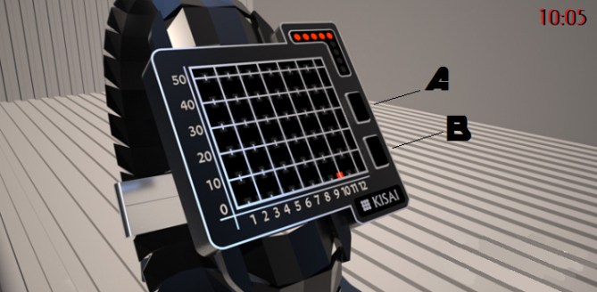
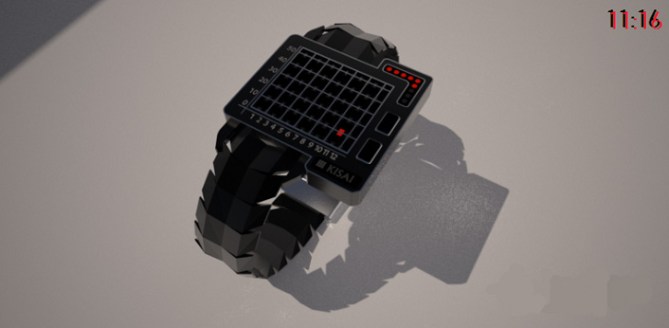
Graphikal has the hours & 10 x Mins arranged on the edges of a graph/grid and the 0-9 minutes found in the top right corner. Upon pressing the buttons (found on the top rather than the side) LEDs will indicate both the hours and 10 x Mins and cross over on the grid.
It is where these LEDs converge that will be the true indicator for the current time.


I mostly tend to stick to symmetrical designs but I felt like being a little adventurous with this one. A number of LEDs could light up the time on the grid…one could illuminate the point of convergence, many could light up from the numbers and reach up to the convergence point or my favourite (simply because more is more lol) a full set of bars running across the grid.
Science buffs or maths geeks may find this one for them although as usual id hope many more would want one.
I think this design stands out due to its bizzare shape and simple yet confusing time telling method.
A number of random animations could be possible with Graphikal, if the crazy look doesnt grab attention they surely would.
Hope you guys like Graphikal.


If you are tracking Aliens or avoiding Terminators – this is the perfect watch for you!
Very easy to read & a completely different, but logical, way of representing the time.
I think you are right in saying it would appeal to scientists/mathematicians. I am neither but it certainly does have a sci-fi movie association which attracts me.
LikeLiked by 1 person
Thanks for posting the design TF!! It may not be to everybody’s tastes but I wanted to make something a little weird this time.
Glad you like it and although it looks slightly like another watch (I never knew sea hope existed, great minds huh lol) I hope it’s enough of a difference to be contemplated as a possibility.
Justin
LikeLike
Looks great, Justin, but this graphical display (including the animation to get to the convergence point) has already been used in the Seahope Scope watch, so I’m not sure TF would produce this. This looks much better, but still very similar.
In the hope that TF would go with this, here’s a 5y to help it along.
LikeLike
Hi nev cheers for the support. I had no idea sea hope even existed…facius palmus el maxico lol.
Hopefully it’s that much different that it stands a chance. That scope watch was released ages ago by the looks of it so maybe it’s time for something new to take its place…you never know.
Cheers for the vote bud.
LikeLike
They still have a version on sale, but it is a very chunky looking watch, whereas your looks much sleeker.
LikeLike
I like the techy and scientific look and the straight forward time telling. If made in the right materials could look really expensive and should keep the geeky population happy! Best of luck sir! 😀
LikeLike
Cheers buddy, I agree, if the right materials are used this could look amazing. Maybe even make a compass for it so the vertical line always points north? As you turn (accelerometer) it could scan the area as such.
Or maybe even use it to track your phone via gps? Think of a marker on a computer game directing you to your next mission/target etc. Oooh maybe you could sell this watch with it’s own gps tracker device (key ring size) that you could attach to your car keys!!
LikeLike
A very interesting & simple way to Plot Time Justin.
LikeLike
I’ve seen a few watches that are using this time telling method & usually like them. I like that it’s using 12-5-9.
I like that the hours are on the horizontal plane & that the 10 minutes are on the vertical plane. I like the “corner arrow” for the 1 minute. I like the buttons position.
I’m not sure if I prefer having 2 full lines or having them stopping at the current H/10M! I don’t like having a single square since we need to figure out what it’s aligned with. (Having the 3 modes in one would be good & feasible)
I have 2 minors problem with the overall look: 1) The band is too much on the left. (which is a sad reality with all the watches using this time telling method) & 2) I would prefer having a true rectangle case. Having useless spaces over & under the H/10M isn’t a problem. (it could have inlays of another color/a different finishes)
LikeLike
Reblogged this on justinthepel's Blog.
LikeLike