Design submitted by Matt from Canada.
Matt says: I wanted to do a watch with 2 vertical scales & give it a futuristic look.


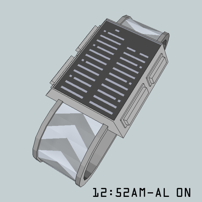
Both side of the case are angled at around 26 degrees, or at 45 degrees where the buttons are and flat under. I made a picture (diagram/buttons options) explaining different possibility for the buttons. My 1st idea was to use a touch screen with 4 decorative, clickable, buttons, to give it the futuristic touch of combining current tech with decorative elements from the past.
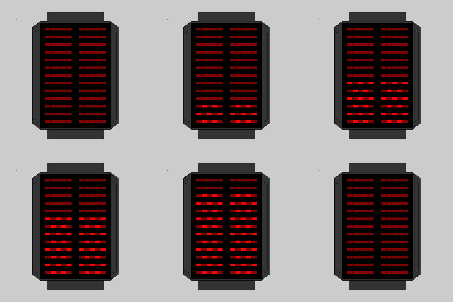
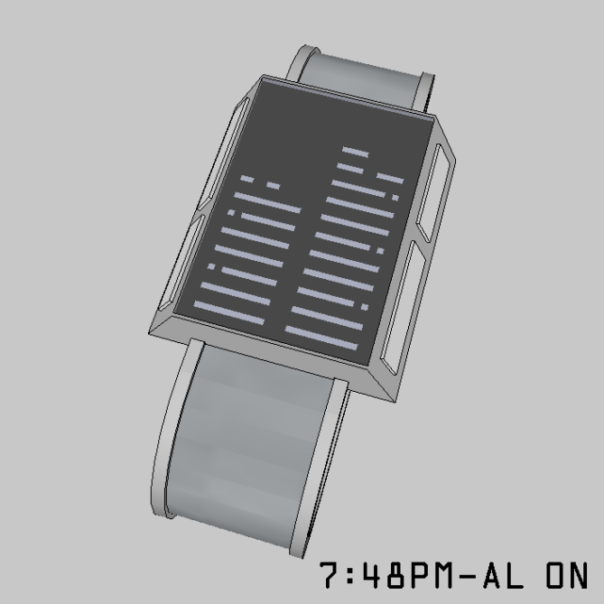
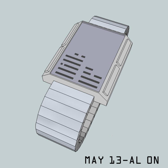
Now the time telling: The reading method is the 12-11-4. The left column is the hour and pm/alarm/date, on top. The right column is the minute: 11 x 5 min under and the +1 to +4 over. Each column is composed of 13 rows and each row is divided in 5 areas. As the time passes, the scales are filled up from the bottom toward the top.

This example use the LED version: Each 3rd hour / 15 minutes have the 2nd or 4th light off. They look like exclamation point, with the point toward the outside. The single minute are divided as 1 & 2 on the bottom row and 3 & 4 on the top row. They each use 2 lights and the one in the center is off at 2 & 4. The “feature” line alternate between 1 on and 1 off. The “feature” line and the single minutes are always immediately on top of the hour/5 minutes. (The same principles applies to the LCD)
Fans of sci-fi and peoples who like scales reading or who use scales measurements in their work would wear it.


I like the vertical scale like this. An old watch called ‘Latitude’ did something similar & it was really nice to use.
I also like the chunky semi-industrial feeling that is typical of 70’s sci-fi
As a concept its good but I think it needs more work to really grab attention.
Your submission included lots of variations in the strap & display, its nice to see your imagination flowing! but keep in mind that for blog readers too much variation might get confusing. I am a bit confused on the time telling myself as some the images don’t seem to match the diagram with the +1 – 4 dots
LikeLike
Is the “latitude” a Tokyoflash watch?
My imagination overflowed for the band/button/case/strap. I had other ideas with a more flat rectangle case, similar to the Kisaï Upload, that I didn’t make! (like 4-5)
All the images match their text.
Eventually, the cost of production will force an option, which is ok.
LikeLike
‘Latitude’ was not a TF watch but we used to sell it many years ago. I forget the brand now, but quite well known.

Here is an image of it. Very different from your design of course, but the same arrangement of time telling; which I think can be very intuitive once you start using it.
LikeLike
TY. I’ve seen a few with similar arrangement. (Storm’s Circuit MK2 & 01 Ibiza ride. Both are 12-5-9)
I’ve just realized that the 4 single minute could use 1 row. It could be L 1/2/4/5. It would be less confusing.
The pm/al/date light could use the full width or be removed & the case would be less high.
LikeLike
I also had the idea to make it as a horizontal display, but the display rotation was confusing. The best solution would be: The scales would go left to right. The hour would be flipped vertically to get 2 row of ll!ll!. (point under like the minute) the +1 to +4 would change: 1st column: bottom = 1; top = 2. 2nd column: bottom = 3; top = 4.
LikeLike
Hi Matt, the positive point is that I can read the hour, for against on the wrist, that will be complicated, if the concentration is not intense, because there is much feature. Perhaps would it be necessary to vary the thickness of certain features? (3-6-9 for the hours and 15-30-45 for the minutes)
5*/Yes, for search and the encouragement.
LikeLike
Ty for the encouragement.
The 3-6-9 & 15-30-45 are the !
Varying the thickness might work. Combining both might also work. Because of the floating minute 1-4 & features lights, I didn’t like varying the thickness & found the ! idea. An example of why, with LCD screen: If a +1 is at the 15 line, is it thickness short or high?
LikeLike
Ok Matt, I had not understood the segmentation to indicate 5-10-15 …
The “1” short remainder, because it is the 15, the 30, the 45 and sometimes the “60” or 0 or 12 which remains visual markers.
LikeLike
Agree with TF about the watch casing, I like it. But it seems there are various ideas for casings?
LikeLike
The original idea is the 1st picture & the 8th, the one after the animation. . The buttons can be clicked, but don’t do anything to the display since it’s a touch screen.
There’s various possibility for the band/buttons/casing. I’d like to have it the most futuristic possible & I like the 70’s sci-fi. (a lot of my designs take that decade in consideration)
LikeLike
I think some confusion comes from the second image which is showing the 4 individual minutes and the date/time/alarm/Pm indicators all being at fixed positions on the display, whereas the examples have them ‘floating’ just above the last lit part of the hours/5-minutes. Either work for me.
I guess the variety of options are to give both us the chance to indicate preferences and TF a choice of build options, which is not a bad idea.
Personally, I find this very similar to older style watches in the TF museum, but a touch screen interaction brings it more up to date, so would prefer that (without the ‘decorative’ buttons), but that’s just my opinion. I would then go for a black, metal bracelet.
Good luck and 5*.
LikeLike
That image is about the buttons options 1st. I prefer floating indicators & 1-4. They will look fixed at 12:56-12:59. Without it, at 1:06pm, 1 light per corner would be on, which is bad.
You are correct with your guess. I’m glad you understand it.
LikeLike
TY for posting it. For more examples & the inspiration for the band/material , you can check my facebook page: https://www.facebook.com/media/set/?set=a.714138721975894.1073741868.316409365082167&type=3
Some texts are missing here, probably for being too long. The 1st example:
For the colors/finished, I was inspired by the Nekura collection. It has a polished silver case and stainless steel band. I did 1 picture with arrows etched on it. They alternate between 2 shades of grey and between polished and brushed metal.
I’d like to know which one is/are preferred.
I have no idea which band/strap/display is better. For the buttons options: if it’s made, it will probably be the less expensive, which I don’t know.
I always do LCD & LED examples. I prefer LCD. But the cost of production may force an option, which again I don’t know.
LikeLike
I did 3 new pictures with a new display & I’ve just sent them. For now, click on the link to see them.
LikeLike
I think vertical scale LED watches will always been in fashion so there is a market if it can be made to look cool enough. I like the “!” makers on the 3, 6, and 9 positions. Its a clean and simple way of speeding up the time telling. I like some of the animation variants too. Potential here if the styling could be more dynamic. Best of luck sir! 😀
LikeLike
TY for your input.
The styling/finishes I want is like TF Nekura. Other are ok.
I have the impression that the 70’s style that I like might be bad for all new design.
Soon, I should do 2-3 new concepts, inspired by this one, with a standard rectangle case, even if these 70’s cases would work. (the new cases would work with this concept)
I’ll add the finishes texts at the bottom of the pictures, to get the submitted text shorter.
A comment from TF on my crown watch gave me the clue that they would like this one!
LikeLike
I agree with Pete in all cases but I have to add, that at first if was “just” a bunch of rectangles… hence the late comment. The time telling method is not suuuper innovative but it’s nice how you manage the PM, AL, D indicators and the four additional minutes, letting them always be on to of the stack. With the right materials (I have a thing for epaper lately) it could look really nice. The case should not be angular. You have a clean design language on the display so the case shouldn’t be too different. A mere cuboid or even a unibody bracelet-style watch would look more fitting. Thumbs up for scales and rulers. Good luck Makk!!
LikeLike
Hi. Don’t worry about late comment. There’s still 3 weeks to do it! & I always comment in the last week of other projects.
It may not be innovative, but it’s a rarely used time-telling. The PM/AL/D & min 1-4, not having # engraved & the ! make it different.
I also made 2 new displays, to modify the min 1-4 & PM/AL/D to simplify the reading a bit.
E-paper would be ok, specially with colored E-paper.
Unibody, like the “pimp” collection would be ok.
Something like the “Futara Mugen/Zero-G”, in the watch museum, would be nice for the 2nd LED buttons.
Another option I had was a rectangle with full width/almost full width band & add a colored rectangle around the case, like TF Optical Illusion. The sides of the band could be links in the same color. Similar to TF Kisai Logo/your X-tal (which I like all the dual-colored bands)
I feel like the case/band is the hard part on this concept! So many choices.
Having angular sides made it hard for me to figure the buttons. (but I felt like a straight rectangle would have been bad with my software)
LikeLike
I agree with master Sam and master Pete.
Best of luck Matt 🙂
LikeLike
I’d like to thank TF for posting it, the few of you who took the time to comment & vote. Eventually, I might do a 2nd version with a more standard case & would probably use the new +1 to +4 & PM/AL/date.
If another designer is interested in making it, I’m OK with a collaboration!
LikeLike