Design submitted by Peter from the UK.
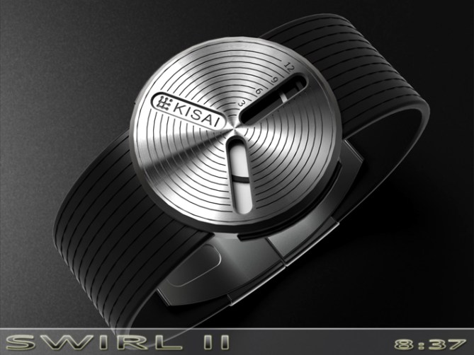
Peter says: I was making a working clock of my original SWIRL watch concept as a little project and realised that the concept could be made easier to read by dividing the time telling into two or three displays rather than the single one on the original version, SWIRL II was born.


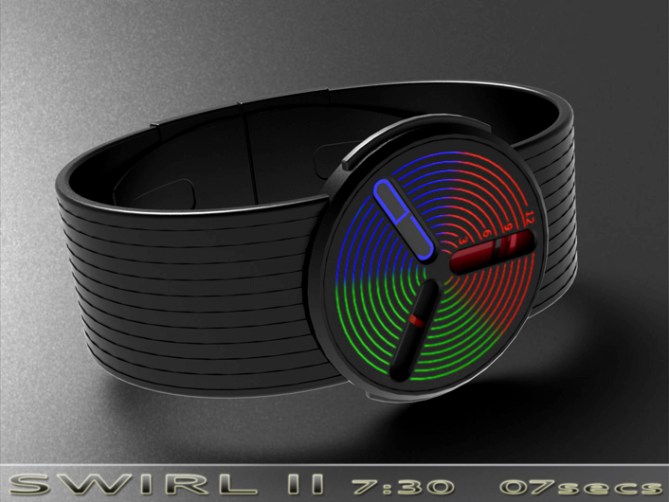
Like the original version the time is told by two or three spiral hands that travel up the bar shaped window as they rotate 360degrees. This time around the time is divided into two or three windows, one for hours, one for minutes and one for seconds. To achieve this the backgrounds behind the two or three windows are opposite colours to the opposing hands. So the hour hand would be practically invisble as it travelled over the mins or seconds backgrounds. This can be made even more effective by having the backgrounds at different levels, so the hour hand might pass behind the background of the minutes for example.

To get the seconds hand to appear invisble over the hours and minutes I have made it clear, then where it is over the seconds background it would be partially illuminated to make it visible. This could be done by using black light reactive paint on the hand and having a low power black light in the seconds portion of the display.
On the two window versions I have shown one with the third window position used as a branding zone and the other uses a digital display to show the seconds.
This concept should appeal to the same groups of people as the original concept as well as a few others that maybe found the original version either too difficult to read or found the face too simple.
The simple analogue movement combined with spirally goodness seperates this design from others! 😀


Modifying the original to have 2 or 3 windows is an excellent upgrade, it’s much easier to read & I think it compliments the overall design too. I still really love the transparent model in the original, but I expect that could work here too.
The 3 window version has a few possibilities doesn’t it. The digital readout could show mins for precision reading, or seconds, or even something else.
It’s a clever way to use analogue. Good luck with it!
LikeLike
Cheers for posting and commenting Toky! Yeah hopefully the extra windows does help with the reading.
I think a transparent version with two or three windows would be possible. The face could be split into levels so you see only see the relevant hands in the appropriate areas or the watch face could be split into two or three coloured areas with the hands in the appropriate opposing colours etc. Could look interesting 🙂
LikeLike
Good update! The three windows make it easier to keep track of hours/minutes)seconds, as well as improving the visual balance of the face. I think my favourite is the two-window version with the Kisai logo making up the third…
Making the hands ‘invisible’ in the other windows would be a neat trick, which I suspect might have been partly inspired by one of Sam’s designs (of which I can’t recall the name). I don’t quite see it working, though, as one hand needs to above the other, and where they cross the illusion will be broken. Also, it would be difficult to match the colours of the backgrounds and hands well enough to really make them unnoticeable.
Having said that I think it’s a good-looking and intriguing concept, and one I think will appeal to a lot of people. Good luck sir!
LikeLike
Yeah I don’t think the hands would be truly invisible but stealthy enough for the design to work. I agree there will be periods of hand overlap but that’s no different from a regular analogue. Hopefully these minor issues don’t out way the positives of the concept. Cheers for the fine feedback sir! 😀
LikeLike
Hi Pete, I like the original version and one with 3 windows, but like my preceding comment, a translucent version would be really good.
5*/Yes, dedicated!
LikeLike
Yeah a transparent 3 window version would be cool. Maybe a Mark III version will be on the cards in the future 🙂
LikeLike
The Swirl 2 is excellent sequel Pete the multiple displays are only an improvement. I torn between the Dual widow with Logo version & the analogue/ digital seconds version.
LikeLike
I imagine the logo version is by far the easiest. Im not entirely sure if a thin LCD could be fitted above the hands, but that said I used to have a analogue watch with a LCD in the glass (for phone numbers) before mobile phones were common place. So these things must be possible. Cheers for the feedback sir! 😀
LikeLike
I love your original concept, Pete. I’m a sucker for the 120 angles, so this like many of your other designs appeal to me. I rather like how the original shows multiple hands in a window, for comparison as well as the dynamic. I find the changing distances between them interesting and very unique. I like the colored hands against stainless steel background and face, as opposed to colored/painted bg/face. Good luck my crazy friend!
LikeLike
Cheers for the feedback Xian. Id be more than happy if any of the swirl variants saw the light of day. Fingers crossed the finished article would push your fun buttons 🙂
LikeLike
As with the previous version, accuracy is not an option (unless you use the digital display for minutes as suggested by TF, but I don’t think that looks as good). So, this is a great “weekend watch” for me.
Most of the images look good, but I love the last but one with the colours of the rings changing as you move out – stunning! I’d have to buy that if it was made!
Good luck and 5y.
LikeLike
Extra markers could be added if accuracy was an issue. The hands would be read from one edge of the windows for consistency. Id be happy if was your weekend watch of choice! Cheers 😀
LikeLike
I like that the readability is improved a lot. I prefer having 3 cut-out windows over it. My favorite is the 6th picture. ( black w red inlays in the display & gray inlays in the band )
The digital seconds or name are OK, I just don’t like the position/angle. ( Also: Shouldn’t it be on the right w the min on the left? Unless it’s because of the direction that the disks turn! )
The display could be rotated 45 degrees counter-clockwise ( to get the 3 cut-out windows showing as a Y ) & the hours could be in the left / minutes in the right / seconds under. This would leave the bottom window free for a digit over digit seconds / letters over letters word. ( I’d be more interested in that. )
I feel like the 15-30-45-60 should also be engraved &/or the digits could be engraved on lenses in the cut-out parts. Or these rings could be thinner.
I’d buy one.
LikeLike
Hi Makko, Cheers for the thoughtfull suggestions. All of your suggestions would be possible, There is no set position for the windows from a technical position, its purely a subjective issue. Extra markings would be an easy addition as would scaling of existing markers. It would be all to play for if TF chose to develope the idea further. Question is has this been popular enough to grab their interest, we will see I guess. Cheers again for the feedback and support sir! 😀
LikeLike
Subjective issues are 1 of the thing I find hard when designing, if not the hardest.
I currently have a design in progress that have 11 possibility because of the position of the digits, analog reading order & a decoration presence / length. I took a few hour to choose the one I had the best feeling about & will send a slideshow containing the other 10.
Soon after, I found another design for the analog part. Multiplying it’s 4 possibility by the 4 digits positions that can be applied give me a total of 27 designs. & then, there’s the question of the size of the digits!
I’ll probably send them both, as 2 submissions.
LikeLike