Design submitted by Sam from Germany.
Sam says: Since my first ITO design (my second blog entry) I thought about alternatives, especially when it comes to feasibility.
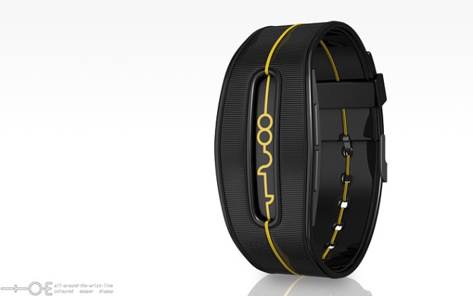
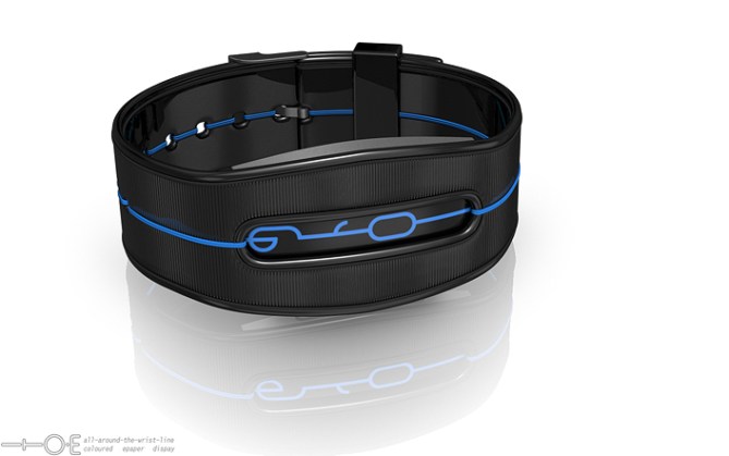
Adapted to what’s possible today, the ITO•E uses a color filmed segmented epaper display embedded in a structured silicone unibody.


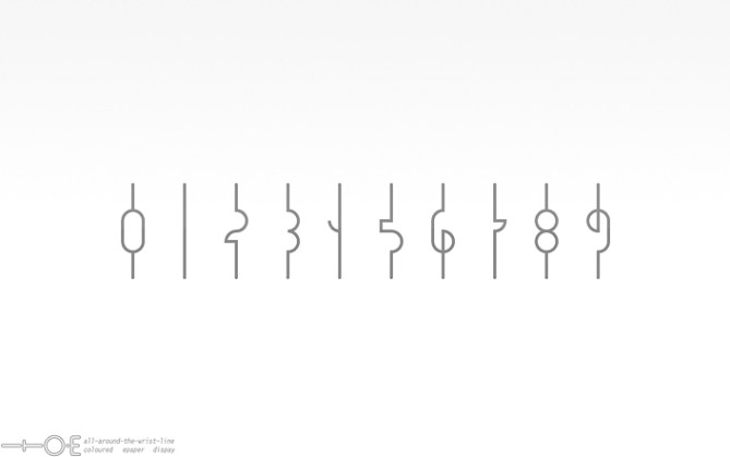
Segmented epaper limits the number styles to a countable amount but there is still a lot of fun to have here. I chose a mixture of circle segments and right angles for the numbers this time. The all-around-the-wrist-line is part of the silicone straps. Both, display and line are always seen clearly.
ITO•E is a watch for people who like arts, sci-fi, artsy sci-fi, steampunk and crazy elegance.


UPDATE: Alternate display versions.


Sick! now maybe a white or purple one as well 😀
LikeLike
Thanks for the comment! Stay tuned for those versions 😉
LikeLike
This is my favourite of the ITO series. The digits are beautiful & elegant. The narrow window, the continuous line, the tactile grooving ~ it all comes together wonderfully. A definite 5Y from me, I wouldn’t change a thing.
LikeLike
Wow cool thank you Toky 😀
LikeLike
It has a Bioshock feel to it. A steampunk band with those letters would look awesome for a specific market that like to combine steampunk with modern technology. Excellent concept. When can i buy?!
LikeLike
Oh damn that’s right! The typeface used in Bioshock also has these halfcircles. Cool side-effect I didn’t plan but welcome. Good that you mention steampunk because this watch started in wood, continued in metal and ended up in what we see now. Thanks for the nice comment! You can buy…. ah I can’t put Tokyoflash under this stress. Vince, noone knows when. All the concepts in this blog have to go through a lot of consideration.
LikeLike
Hi Sam, I have a weakness for the first version, but I like the general idea still.
5 * / Yes.
LikeLike
That’s completely reasonable monsieur 😉 I tried a less utopic look this time *crossing fingers* Thank you Patrick!
LikeLike
beautiful watch and outstanding renders!!!
LikeLike
Thank you!!!
LikeLike
Excelent, Sam. I just looked at the original concept–that one lended itself to some cool animation possibilities between changing of the digits. Not sure that holds with this version, but I like it all the same. As I just skimmed the original entry, were you planning on using animations?
LikeLike
Cool you like this one 😀
As for the original version, I didn’t know anything about the technology back then. The only way to get this look and animations is an oled screen (or similar). But then this screen could show anything else too. The all-around-the-wrist-part is really something for the future. The animation would be a morphing from one number to the next… either directly or with untangling the twine first. Would. Be. So. Cool.
Using some sort of segmentation brings this concept super close to reality and that means other limitations too.
LikeLike
Good lookin’ watch you have there Sam. =)
Not much to say about this one, it’d be difficult to change anything about it without mucking up the whole thing. As per usual with your stuff, I might add…
The overall styling’s not really for me, but I can certainly appreciate the finer points of the design.
The close ribbing of the strap material is a very nice effect, it works very well and should look cool in reality as well. Tall and narrow stacks of digits rarely float my boat; they tend to look too thin for me, but this one is one of the best I’ve seen yet. The proportions, punch and weight of the digits make it work, I feel. Good work well done!
LikeLike
Thanks for the nice words and your personal insight! The digits were a nice time of trial and error ^^
LikeLike
I am so glad that you are using a light background – I can see all the detail on this (unlike Ion)! Thanks.
Overall I like this, but am not too keen on some of the numbers. 6 & 9 look a bit weird, but do still allow a continuous line. 4, however, seems to break this with the extra line to the left, so that spoils the flow for me.
As usual for your designs, the case and strap look great and it looks like a finished product, unlike the early draft concept I had on the blog a couple of weeks ago. The attention to detail and design skills really show. Great stuff.
It’s different enough to your other line based product (Online), so should be able to sit alongside this (if it hasn’t sold out or has come to life again in wood or acetate). Good luck and 5*.
LikeLike
Yeah, white is honest, black is mystical 😉 White is also more stylish. According the the latest entry, grey is also very smexy…
Good points about the 6, the 9 and of course the 4. Yes *bows head* the 4 is outside the rule. Having one number ouside the rule wasn’t a problem for Xtal *wink wink* but it’s still a thing to handle with. You are welcome to try a 4 with the rule giving segmentation here
Very wise thinking of the similarity to existing watches. Would be a shame if I kick myself out of the competition hehe.
Thanks alot for the thought-through comment and the support Nev!!
LikeLike
I love this one. 5Y. If there was a white or light blue-colored one(not the line), I’d definitely throw money at the screen.
LikeLike
Oh interesting 🙂 I will see what I can do. Thank you for the support so far Zsolt!!
LikeLike
I would buy this so hard…! I love the line going all the way around. It looks fantastic is every color.
LikeLike
Thanks for the appreciation, Me 🙂
LikeLike
This watch is really awesome!! I would like to buy this one
LikeLike
Thank you James for your comment!!
LikeLike
Very cool design Sam. Make a dark grey/lime green numbers and you can have a blank cheque lol.
5/Y all round the wrist lines FTW!!
LikeLike
IKR!! Yummy, lime green :3 I think grey and line wouldn’t work technically sinde one part is always black, the other one white with color film. As long as lime green is on board, it should be nice 😉 Thank you for the support!
LikeLike
This is a very cool and totally makeable re-visit of ITO concept.
Cool display, cool textured strap! Whats not to like? 5/Y best of luck sir! 😀
LikeLike
Thank you Pete! Glad you came by 😉
LikeLike
This is AWESOME! I would so buy this
LikeLike
1st: I like having an “illuminated wire” around the wrist. ( On the 1st idea blog entry, I said I didn’t like the band. In reference to both that line & the sides. Now, I love that kind of sides & use it on my design, when appropriated. )
I like the single piece rubber looking strap with lines “engraved”. (it could also be a textile strap, but the result would be less impressive) I like the cut-out window.
I don’t like the continuous line digits. It look to much like cursive writing, which I’m bad at reading. ( OK it’s less bad than a previous design by you: https://blog.tokyoflash.com/2010/10/solar-powered-watch-design/ )
By searching for the others ITO concepts, I found the “ZION”. I was surprised that it’s more recent than this 1 &, obviously, still open to comments. I’ve compared all the ITO concepts & reviewed the ZION at the same time as this one.
This one have the best case/strap but the ZION digits readability is better. Combining both would be nice & a possible sale.
4*.
LikeLike
I agree with Toky master Sam.
Best of luck. 🙂
LikeLike