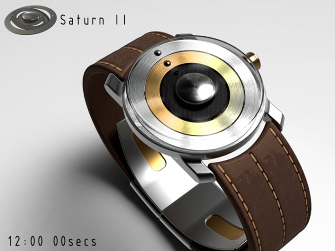
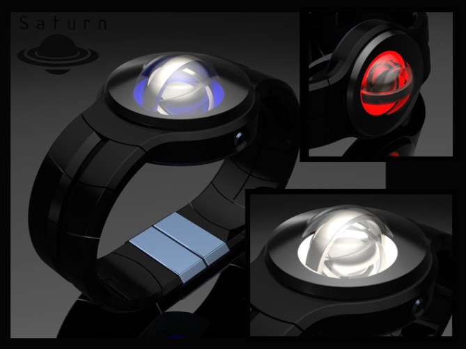
Design submitted by Peter from the UK.
Peter says: This is Saturn II, a re-design of my original Saturn concept. Saturn was one of my first concepts submitted to the blog. It never made it onto the blog presumably due to being a little adventurous from a technical perspective.
This version is a lot simpler than the original but still retains the original’s feel.


Like the original conept this design is inspired by the rings of a giro, which kinda look like the rings of Saturn, hence the name. The original had a 3D movement where the rings rotated in a perpendicular axis to a traditional analogue watch, this made it less feasible.

This version is more like a conventional analogue disc watch. The discs in this case are in the shape of rings connected to the hub. They are essentially bent at a subtle angle so when they rotate they are all at different angles giving the giro look. The time telling is traditional analogue, with pressed in dimples to highlight the time. The watch is also backlit to add a little dramatic effect.
This concept has an industrial steam-punk like look which may appeal to people who like complicated analogue timepieces. It may also appeal to people who are into spacey themed products.
The 3D looking discs and steam-punk feel combined with traditional time telling and industrial looks set this design apart from others.


[Original Saturn concept, October 2011]


This is superb, definitely one I would be eager to wear. The brown leather with brass disc is a really nice look – The steampunk ethos is well captured here.
It seems to me this would be quite easy to make & the only challenge would be to select a movement which can have the strength to control metal discs. The black version could probably be plastic discs & so no problem there, but the metal one has a special look to me.
Well done on the solution to those off-set orbits!
LikeLike
Cheers for posting and commenting Toky! I’m glad you likey, I must admit the one with the brass looking ring is my favourite too, probably because it’s the most vintage looking which suites the theme. I think the discs could be laser cut out of very thin sheet metal (like shim steel) or pressed which would allow them to be very light weight but retain some rigidity. Like you say the black option could easily be plastic (ideally with glow in the dark rings) for extra effect. Fingers crossed there is a shred of feasibility here! Cheers 😀
LikeLike
Nice watch Pete!!
LikeLike
Thanks a lot Gordon! 😀
LikeLike
I think I prefer the first one! Oh well, they’re both awesome. 5y
LikeLike
I really liked the original but the rings rotate where the movement should be. So the movement would have needed to be off-set and quite small to make it work. There was also a pocket watch version which allowed the rings to be seen top and bottom 😀
LikeLike
Hi Pete, there are long, I proposed a “Saturn 7” (never published, I think the animation was too heavy to send over the Internet?), It was much less beautiful than this wonderful version.
5 stars and Yes.
LikeLike
Im sure your design would have been better than mine sir! 😉 Cheers for the support sir! 😀
LikeLike
Very interesting design. If you use exclusive materials for that watch, I would pay more than the average price for a kisai…
LikeLike
Sounds like a fair proposition to me Andreas, I hope you get the chance to buy one day! Cheers 🙂
LikeLike
The Saturn 2 runs ring around other plain analogue design concept Pete. The Original Saturn concept: October 2011, may have been A bit too ambitious but is still superb.
LikeLike
Thanks a lot Andrew! Yeah ambitious is probably the right word for the original. I have a better understanding of what is possible now which hopefully helps, that said I still like to do the occaisional ambitious project from time to time.
Cheers for the support sir! 😀
LikeLike
WOW!! As someone who LOVES mechanically watches this is a definite YES for me! If it is possible to make such a watch automatic then that will be just superb!
LikeLike
I too like a bit of the mechanical from time to time, there is somthing comforting about be able to see phsyical parts and see how stuff works on occaisions. Not to say I dont like the magical quality that comes form electronics of course. Hopefully this will one day become reality and find its way onto your wrist! 😀 Cheers
LikeLike
Good work as always Pete! Nicely scaled back from the original concept while retaining the flavour (the flavour of awesome)… There’s not much I don’t like about this, the only detail I can find is that the glass sides don’t quite work for me. I realise it’s to show off the slanted rings, but I’d prefer a bevel on the periphery of the face which rises to meet the edge of the glass (which might very well be domed), if that’s understandable…=)
On the subject of movements, and TF might be able to chip in here; if the rings were balanced (probably extra weight on the ‘high point’ to offset the tounge which connects it to the movement), would the movement still need to be that strong? I can see how it would be necessary for a heavy lopsided watch hand, but if it’s balanced to the center then it should only need to overcome the friction to rotate it…?
Anyway, just an idle question… Best of luck mate!
LikeLike
Im having trouble imagining the case shape you suggested there, but suffice to say I would be flexible regards the case/glass shape. I was originally going to dome the lens but it looked quite chunky at the model stage. The shape I ended up with (the petri dish) shape looked the most slim line at that time.
I would have thought that the discs would be no more difficult to move than your traditional analogue discs, they could be very thin. The shape could be played with if balancing was an issue.
As ever my fingers are crossed that any technical issues could be solved if the design was chosen for development 😀
Cheers as ever for the feedback and the support sir! 😀
LikeLike
Yeah, I didn’t do the best job explaining, so…=) Not a big deal either way.
As the saying goes: when there’s a will there’s a way…
LikeLike
Feel free to model the shape and link to it, I’d love to see what you mean and if it could improve the design more the merrier! 😀
LikeLike
It’s a superb design, as always, Pete, and following mine yesterday highlights how far behind I am with 3D and rendering skills. Oh, well.
I think this would make a great addition to the TF range, which currently only has 1 analogue watch – this is very different.
Not being an engineer, I wonder about the mechanism for rotating / pivoting the rings, especially the largest ring for seconds. Would this be a mechanical weakness and increase the risk of breakdown? Hopefully not a real concern.
A bit too mechanical for my tastes, so I’d not buy one myself, but I think this should get made for everyone else, hence 5*.
LikeLike
Cheers for the feedback Nev! I see your point regards the seconds hand. Depending on the movement the size of the hands could be reversed (largest for hours etc) It would depend on the order they mount to the spigot. The largest ring ideally needs to go on first so that the smaller ones hide the rest of the disc if you know what I mean.
Its all up for tweaking anyways. I would be interested to know if it is feasible that is for sure. Cheers for the vote even tho its not for you! 😀
LikeLike
Pretty ingenius, Pete! If each disc is indeed clear of the other, as you’re showing with their connections to the hub in the exploded view, this would be something I don’t remember seeing. I really don’t see how TF CAN’T make this.
LikeLike
sorry for the additional comment–again..My fav is the gold/silver/leather by far!
LikeLike
They are pretty much analogue discs with the bulk cut away and then the outer part bent up slightly. They just stack like regular discs one above the other with the rings clearing each other. It looks pretty straightforward to me. I assume its the weight that would be the sticking point. Fingers crossed there is no reasons why they cant 🙂
LikeLike
Truly a little jewel ^^ My favorite is also the steampunky leather/brass version. Really nice twist, not having the rings all coplanar everytime. Maybe plastic with fake metal coating might by light enough for an analog movement *crossing fingaz* good luck 5*/はい
LikeLike
Thanks a lot Sam, the steampunky one seems to be the favourite so far. I guess when you think about spacey themes, star-charts, celestial models etc you thing of instruments made from brass and leather.
Yeah metallic looking plastics would be a lightweight and presumably cost effective solution. Steam powered mechanical fingers crossed, 乾杯
LikeLike
The brown/silver/gold one looks so classy, yet bold. The contrast of the ring colors really make it noticeable. I think that is where the black concept falls short (for me). It would be nice to see a black one with alternating silver and black rings, or with gold and black rings and a gold stitch on the band.
LikeLike
Like colour suggestions ME! I like the sound of a gold and black combo, could be very classy indeed! 😀
LikeLike
I love the overall look. I like the balls as indicators & gyro. I agree with the possibility for steam-punk look. Hence, the colors should be different shade of brown/finishes.
The black/gold/silver (pic 8-9) is nice, but the ball on the black should be in another color, to be more visible, & I also love the red version (pic 1 & 2).
I would buy, even if the time-telling is a bit hard for me. It would be nice in my collection!
LikeLike
Cheers for the feedback Makko, yeah there are a few tweakes that could be made to improve the appearance and time reading. Im glad you like the overall scheme. Fingers crossed you get the chance to add to your collection one day! 😀
LikeLike
Like Sam Phenomenon concept (next blog entry), not having markers make it hard but markers could be bad, even if not as bad as with Sam concept. (it could be 12 marks on the hour ring/each ring, or 5/11 symbols, to follow Jose idea)
Now, I WANT one!
LikeLike
Great review master Pete.
I love the overall design, especially the steam-punk version, to which I would add some decoration on rings (crypto signs or something, not have to mean something).
Great job as always master. Good luck. 🙂
LikeLike
Nice suggestion on extra detail on the rings. Could be glifs or aztech symbols as they often refer to star charts and cellestial bodies. Cheers for the great feeback and support Jose! 😀
LikeLike
Aztec/Mayan symbol would be nice! I’m also into that. Mostly theirs history/mythology.
LikeLike
The planets are nearly in alighnment for this concept. So all thats left to do is thank TF for posting it here and everyone who took the time to comment, vote, like and share. Cheers everyone!
Pete for planet alpha! 😀
LikeLike