Design submitted by Patrick from France.
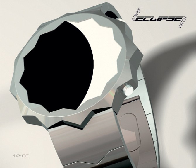
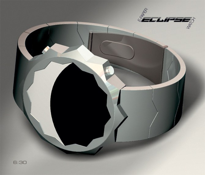
Patrick says: I tried to draw a different watch that is like no other, at least I hope? The dial of the watch “Eclipse-Watch” is the sun and the moon is black pellet.
The “Eclipse-Watch” is a watch e-paper.

The hours are on the left side of the dial and the minutes on the right.
The peaks and valleys of the star to the left indicate the hours of “1, 2, 3 … 12” and to the right of minutes “5, 10, 15 … 55 and just prior to the axis vertical symmetry to indicate 59 minutes “see explanation file 5.
Programming is used to indicate the date, alarm. The dial is backlit for night.

The “Eclipse-Watch” is for women and men who like astrology and the original watches.
The “Eclipse-Watch” with its atypical form will surprise your entourage, and following your explanations, it will be also allured by the facility of reading of time.


Hey patrick, nice simple and elegant design. At first its quite confusing but given enough time and a little brain training you quickly get used to it. I urge anyone who is initially put off by this to just give it a few more minutes of effort because it is quite creative.
It isnt something i would buy purely because i like flashy colourful styles on my wrist but i gave you 5 stars based on the imaginitive side of it.
Two word verdict….cleverly simplistic.
LikeLike
Thank you very much, Justin.
LikeLike
Very creative idea & well thought through. The way the single minutes can be read on the slopes of the peaks & valleys is nice.
I always try to think of some other possibilities when I see a watch design, but i think you nailed it pretty well here.
I wonder if the Hours 1-12 start at the top & go down the right side.. & the minutes go up the left side: does it make a difference? For me, I might find it slightly easier ~ what do other people think?
LikeLike
Thank you TF, for your interesting comment. Did I put myself the same question “hours on the right and minutes on the left”, in my opinion doesn’t that change large thing, that could be a programmable choice?
LikeLike
Nice design and very clever creation.
LikeLike
Lola, thank you for your appreciation and your vote.
LikeLike
TF, thank you for this new publication.
LikeLike
There have been a few watch designs in the past that have tried to tell the time with an arc that joins the hours to the minutes, most of them have had a subtle floor in the fact that they try to use a standard analogue layout. Which meant that there could be mis-reading (which end of the arc is min or hours etc) and when there is 12:00 situation you either end up with a blank screen or a very small arc. Splitting the minutes and hours up as Patrick has done does away with those issues and makes the time telling more interesting. I especially like the peaks and valleys which are very helpful, They could even have markers on them for accuracy too. The peaks and valleys give the case an iteresting form too. I think they would need softeneing a little if it went into production but that is a very minor detail. Nice work sir 5/Y 😀
LikeLike
Hi Pete, thank you for your comment and your vote. You understand better why I spoke markers on your “Type-X”, it was more for my current project.
LikeLike
A great, minimalistic design, Patrick. I like the hours as you have shown them, but wouldn’t object to the change suggested by TF.
There is still a display challenge with the following times: 12:01 – 12:05 would have very small arcs, 11:01 would too and 12:09 may be a problem getting the arc around the 5 minute peak. I guess it may be possible to have a very rounded arc (I.e. > 50% of the circle showing) to overcome most of these, but 12:01 may still look strange. This would need some modelling to assess how it looked.
Assuming these minor challenges can be resolved, I think this would be a great addition to the TF range and certainly one I would buy. My collection is already quite large and just received another one, so maybe I need to stop looking on the main site and just stay on the blog!
Anyway, good luck and 5*/Y.
LikeLike
Hi Nev, thank you for your comment and your vote.
Indeed, the size of the Moon (arc) and the depth of the valleys with the peaks were calculated for the 1:59 or 12:01 are readable enough, I tested on my screen.
LikeLike
Salut Patrick.
Un intérêt commun pour l’astro? En tous cas, super boulot, j’aime beaucoup.
I take this opportunity to tell to all of you that I updated my Constellation design a few days ago in case you didn’t see it.
Nice evening and well done compatriot 🙂
LikeLike
Merci Delphine pour ton appréciation et ton vote. Je suis souvent dans la Lune, c’est peut-être pour ça ?
Hi Delphine, thank you for your appreciation and your vote. I am often in the Moon, this may be why?
LikeLike
Nev made the comment I wanted to make. I played around with this type of time telling and didn’t find it outstanding enough yet. But it’s a good start. I would prefer a simple circular display with subtle markers. Good luck!
LikeLike