Design submitted by Justin from the UK.
Justin says: I was toying with different shapes and decided that a square would be easier to work with this time. For those who know my work (few though they may be) you may have seen my “Mad Scientist Sketch-Pad”…this is a Frankensteins monster of that pad…


For some reason I always seem to lean towards the analogue end of the watch-face spectrum and this is no exception.
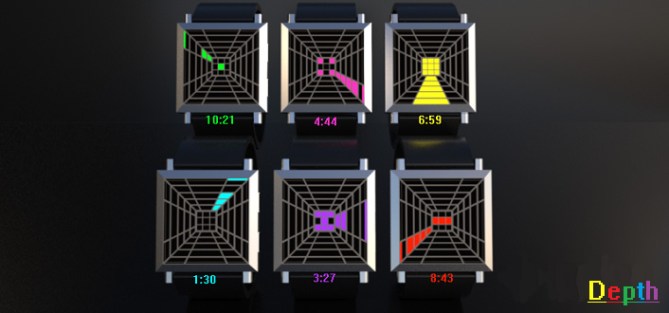
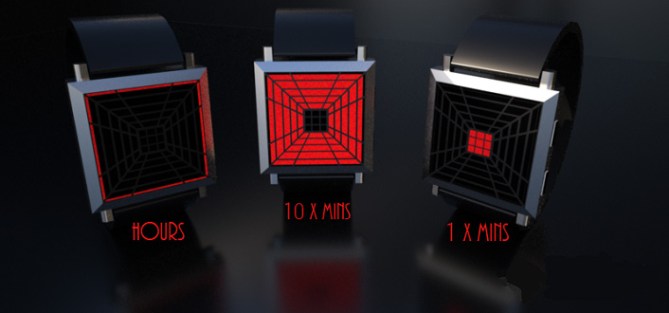
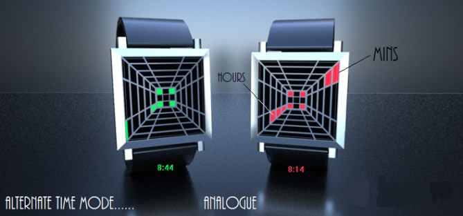
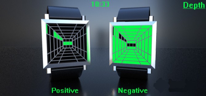
This is a 12-5-9 watch & the hours are found at the typical 12-3-6-9 locations, the 10 x Min blocks are found in the sections surrounding the centre and count from the inside to outside (ie. the 50 Min marker would be adjacent to the hour marker whereas the 10 marker would be next to the 1 x Min markers).
Speaking of which…1 x Mins are the 9 squares in the center.
I would like to think that this watch has a unisex appeal to it. I would like to see my design on many wrists (who wouldn’t) but I honestly can’t call this one as I have had both male and female friends both say they would like to wear this. The proof would be in the ratings and comments that follow…
My design stands out…or at least I hope it does…because of its bright and colourful nature, when its off it looks weird and folk would question its ability to tell the time.
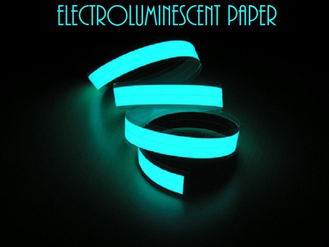
When its on, the EL Paper display (yes im going for EL paper this time as I think this type of design would be great for it and EL paper would be just awesome) would be very eye-catching.
The time telling method I hope is unique enough for consideration…if not…back to my mad scientist pad I thinks.
Hope you like Depth…vote nicely.



Good job Justin. EL paper is very cool stuff, I hope we can start using it sometime soon. I am not sure why we haven’t… I will ask.
Time telling is easy & versatile, possibilities for some interesting animations.
Overall it doesn’t excite me too much, but thats just my personal taste, I am sure others will think differently.
Its similar to Andy’s Room watch https://blog.tokyoflash.com/2014/05/room-watch-uses-3d-walls-to-show-time/ which perhaps spoils my appreciation a bit.
Nevertheless, good luck with it! 🙂
LikeLike
Cheers for posting TF…glad you like it. It was never intended to be similar to Andy’s design and I hope that the rating doesn’t suffer as a result. The look is similar but the method of telling the time is quite different, hopefully different enough for this visual familiarity to be overlooked when judging and deciding on a rating/comment.
It would be nice to see an EL paper watch, and had there not been a size limit on gifs I would’ve loved to show the many cool animations I made. But still…fingers crossed as usual.
Happy voting.
LikeLike
Hi, Justin! Maybe ideas lives in the air or maybe you change my Room watch 🙂 Good luck!
LikeLike
Yes, the watch of Justin resemble that of Andy and a little the “Slices e-paper”, and that of Andy resemble “Space Digits”, that becomes complicated to resemble to nobody? It is also the challenge.
I vote 5/Y and with that of Andy, to be equitable.
LikeLike
i subconsciously copy peoples ideas all the time. It’s a disease of the blog, then theres times when you innocently think you have an original idea only to be found its already been done after you submit. i appreciate the work thats gone into this and i don’t for any reason believe that Justin has copied Andy, its just an innocent coincidence.
as for the watch…visually it looks great, i prefer the rounded edges on Andys but the method of time keeping is solid and would fit in perfectly with the rest of the TF designs. good luck!
5Y
LikeLike
The tunnel like theme is a popular genre that has been seen a few times in different guises over the years, as has digital analogue time telling so its impossible to say if anyone copied anyone and in what chronological order. The simple question is if TF decided to develop a watch with a tunnel like looking display or digital analogue time telling would they pick this one over ones that may have preceeded it? And thats for TF to decide.
Nice looking wach with simple time telling, if it was made and I had the funds to hand I would conisder buying, nuff said. 5/Y Best of luck sir! 😀
LikeLike
Thanks for the support guys. I was quite disheartened at first that my work would be considered plagiaristic of any kind. I’m quite proud of my “inventions” and am able to hold my head up high with pride when one gets published on the blog as it is born from creativity and not merely borrowed or stolen from another’s work.
As always with styling watches you are bound to overlap when it comes to designing such items. I try to stray away from being too similar to others ideas but sometimes this is unavoidable, I have tried to add my own flair to Depth and to keep it as unique as possible. After all…what’s the point in doing a carbon copy of something else or making it way too similar to another previous submission? If they weren’t picked for creation then what’s the point in me wasting my time and energy in sending in a “duplicate” watch?!
Ok rant over lol.
Thanks for your votes guys, glad you like it and as always I hope it stands a good chance of being picked. Hopefully my next submission “Centrifuge” will be more unique and able to pique more interest lol.
LikeLike
Hi Justin,
Although I noticed a similarity to the Room watch we’ve been running this blog long enough to know that co-incidence happens quite often, so I was aware that this was case with your design. With over 1000 designs on this blog its inevitable that us humans will find a way to compare or pigeon hole.
I was happy to post your design & I think most people can look past similarities & find the uniqueness.
Don’t feel downhearted, you are in company of people who all had a similar experience ~ I think Peter’s Inverse watch a few days ago is another example.
Good luck!
LikeLike
Thanks for the “pat on the back” guys it means a lot. It just seemed that the focus was taken away from the design a little but hey ho pip and dandy (yep…I’m a dwarfer) I’m sure there’ll be many more instances of creative crossovers in the future. Ill not let that get in the way of bringing to life my Sketch-pad of wonders lol
Anyhoo…back to business. Did you find out why the production team haven’t made any EL paper watches yet? Did you ask, what did they say and lastly…is there a certain direction they wish us designers to go in with regard to that particular material?
Sorry for all the questions, I’m really making you earn your money today lol.
LikeLike
It happens all the time. I usually search through the blog to see that I don’t copy someone else design, and even after that some people will tell you yours look similar to a previous design. It happened to me a few weeks ago when I was told my design looks similar to Heather’s design. Its a good and bad thing to study other people’s designs, because your brain will copy ideas without you realizing it. Then there’s the moment someone post something new on the blog and you think why didn’t I think of that. hehehe. Good luck with your idea!
LikeLike
Regarding EL paper. We had a watch in progress using EL & LCD but due to an unrelated issue it didn’t get further.
I spoke with one of the engineers & he told me that EL can be segmented like LCD or used in strips for a simple on/off highlight. The segmented version requires power consumption not suitable for regular watch batteries, but the simple on/off version is OK. So it seems like it can’t be used for time telling, only for illumination.
LikeLike
Ok thanks for the response TF. I appreciate the info. This will help with any future designs I or anyone else may have.
Cheers
LikeLike
Hi, Justin. Ever play Welltris, a Tetris clone? Looks like this. Would you consider a version where the width of the cells down the walls, are of equal width? Either that, or increase the center square’s dimensions at the bottom to coincide with the width of the center cells. I think it would tie together better.
LikeLike
Hmmm I know what you mean…having just done a quick “Weltris” google search I see that that has a more distinct 3D effect seeing as the walls are more equal in size. If this ever gets chosen for production I would certainly be open to ideas about minimal changes as long as the time telling method stayed the same.
LikeLike
I like this design, and very easy to read.
Like Christian, I think standardising the cell dimensions would be worthwhile, but that would be the only change.
As I indicated on Andy’s “Room” entry, similarities to the “Space Digits” basic design concept is not an issue, so sharing space on the range with that watch should not be an issue, but the similarities with “Room” may mean only one would get chosen, which is a shame as both are great. “Depth” is simpler to read, but “Room” has the added feature with seconds displayed. If I had to choose it would be very difficult, but I think “Room” would win due to the extra feature (sorry). I hope both could get through, so good luck and 5*/Y.
LikeLike
That’s ok bud no need to apologise, this is a challenge after all and there will be winners and not so winners lol.
Thanks for the support and commenting.
LikeLike
I like the idea & the way the display is divided. I’m not sure about the single minutes. When on, they look a bit to randomly placed. I’d prefer a 1-3, 4-6 & 7-9. Or they could have the 2 options.
LikeLike
Reblogged this on justinthepel's Blog.
LikeLike