Design submitted by Peter from the UK.
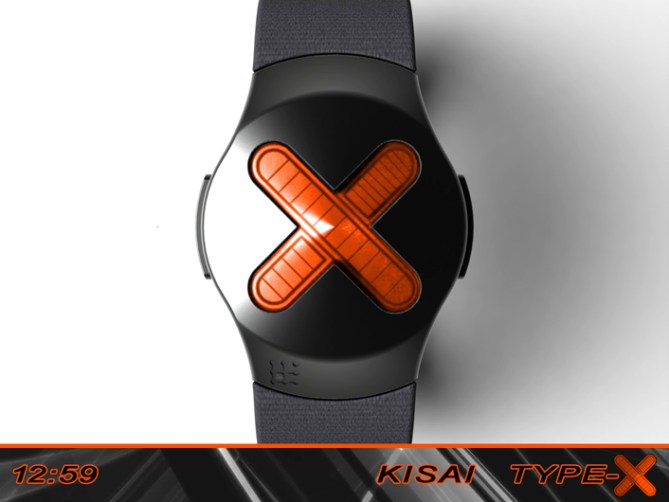
Peter says: This is “Kisai Type-X” a back to basics 12-5-9 design.
I didn’t have a particular inspiration in mind when I decided on an “X” shaped LCD display, but in retro-spec I wonder if I was subconsiously influnced by the “microsoft x-box” logo or the drones in the “Oblivion” film.
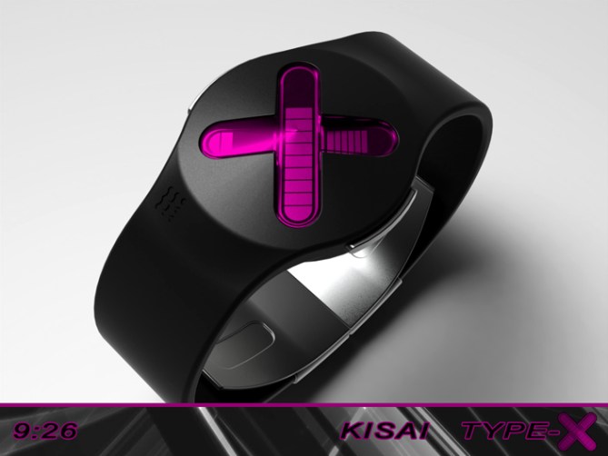

This design features an “X” shaped display that shows the time in a 12-5-9 format.
This display could be LED, e-paper or LCD, I have chosen LCD for my examples as it seems tp best suit the layout. One line of the “X” shape displays the hours, the other line divided into two by the hours displays 5 x 10 min groups and 9 single minutes.

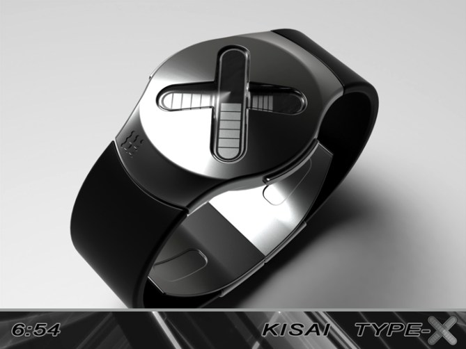
This design is very simple, minimal and elegant which should allow it to appeal to a wide audience. The design would suit a variety of materials and finishes allowing it to range from sporty to formal and everywhere in between.
The simple “X” shaped display, intuative time telling and minimal form makes this elegant design stand out from the crowd.
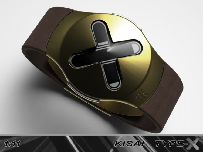
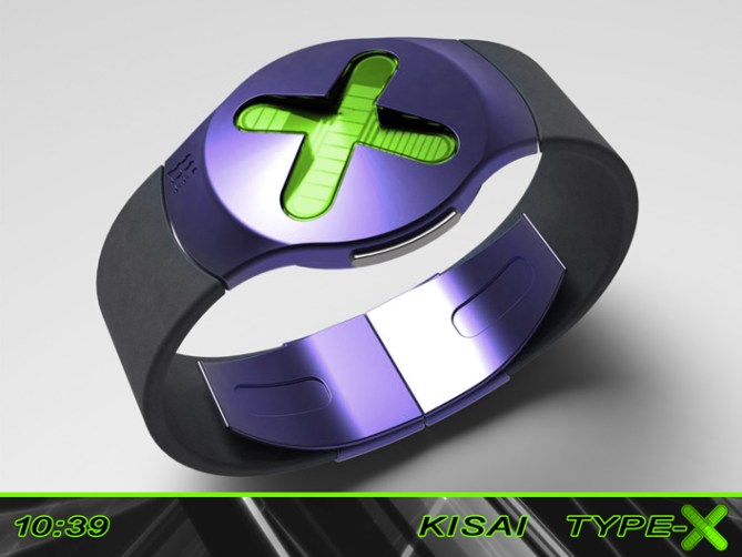




Very nice, no fuss, X-shaped design. I guess both X-box & PS owners could relate as they both feature an X on the controller.
I must say I prefer the separated strap version in the lower images. Some of the combinations are really tasteful ~ even the purple/green/grey which you would think would be loud, is actually very complimentary.
Its a tough choice for me… erm, either gold/brown or grey/orange… or the purple… ha ha, oh damn it!
There is good potential here for a simple design that has wide appeal. My father used to wear the ‘Matrix Latitude’ watch (http://www.poshtime.com/watches-archive/435.031.jpg), he has very conservative tastes but he liked that one because it was simple & easy. I could see this having a similar effect on people who find most of our watches too strange.
LikeLike
Thanks for posting and the feedback Toky! 😀
I’m glad you likey this one, I must admit its a favourite of my more recent stuff because it is so simple yet still looks unusual enough. I think we often forget that a lot of people are conservative and needs a little persuading away from traditional digital or analogue. Which is often tricky if you have to explain the time telling over and over. I often show my friend and work colleagues my submissions and you be surprised how many of them have never heard of the 12/5/9 time telling format. So this design may act as an entry level design for the uninitiated 🙂 cheers again! 😀
LikeLike
Your father had great taste! I myself prefer the conservative LED designs. Somehow, they have that stylish appearance. If made from high quality materials one can see them with other more higher value analogue watches.
LikeLike
Nifty! 5y
LikeLike
It’s been a while since I heard the word nifty (or read it for that matter! lol) cheers for the likey and the vote sir! 😀
LikeLike
Hi Pete, I have somewhat the same problem with my projects. Is it necessary to add reference marks of reading?
Nice watch!
5Y.
LikeLike
Markers..Interesting question. I dont knwo if its totally nessesary as this design is so simple. Maybe like some of my other designs the 3rd, 6th, 9th and 12th should be subtly different so the reading is super quick and easy.
I usually like the idea of etched numbers in the face but this design has such a clean look that it might be spoiled.]
I will knock an image together and see what it looks like 🙂 Cheers for the vote 😀
LikeLike
Yes Pete, I completely of agreement with you, I often privileged the purification of the drawing to the profit of figures helping with the reading, but a small mark up to 3,6,9 and 12? (not inevitably on your model presented here)
LikeLike
Another advantage of not having markers and maybe using different size blocks is that at the moment the three areas fo the display could fill/animate in a number of ways, but as soon as you add physical markers to the case or lens you limit the display. I will still do a visual to see how it looks tho to explore all options 🙂
LikeLike
I am of agreement with Lewis and dzign555, one does not need a marker for this watch which is very beautiful, it was a reflexion which I had with myself for my projects, with your point of view Pete.
LikeLike
I have added a couple of new images to the Type-X Album, one shows number markers on the case and the other shows subtly different blocks at the 3, 6 and 9 positions 😀
LikeLike
Pete, they is less good with the figures, one should not anything change with your design.
LikeLike
NO MARKERS!
the black and orange is right up my street. love the simplicity.
5Y
LikeLike
Thanks a lot Lewis, that sounded very consise 😀 Cheers for the likey and the support sir! 😀
LikeLike
hi pete…lovely looking watch, just in time for those X-men fans out there lol
LikeLike
Lucky timing on my part there as this was submitted a couple of months ago before I saw the adverts for the new film lol. But then I could have travelled in time to warn myself of the realease, very topical lol
Cheers for the support and the association 🙂
LikeLike
I don’t think this one needs markers. I love the grey one with a blue screen.
LikeLike
Cheers for the feedback DZ, I will post and image with markers in due course and see what the consensus is 🙂
LikeLike
Another great looking design, Pete.
The debate around markers is interesting. I think markers would probably spoil the appearance of the watch, but for many (like me) it will be too hard to read the larger numbers as it is. There are other ways to help, such as slight gaps or the different sizes for some numbers (as you indicated), or using different colours / brightness settings. I’m sure something is possible.
So, 5* for a great design, and a hopeful Y (once I can read it).
LikeLike
I think I agree, I like the clean look on this one. Some design look nice with markers as it can a technical looking element. This is smooth and clean and is probably best left un-cluttered. Different size blocks or like you say tone difference may work well or maybe some kind of hatching (diving the blocks to get different desnsity)
Sounds like I may have to have a little play 🙂 Cheers for the feedback and the vote sir! 😀
LikeLike
I have added a couple of new images to the Type-X Album, one shows number markers on the case and the other shows subtly different blocks at the 3, 6 and 9 positions – See more at: https://blog.tokyoflash.com/2014/05/type-x-watch-makes-its-mark-on-your-wrist/#sthash.6E1hhHyx.dpuf
LikeLike
Pete, the markings spoil the appearance, so that is probably not the way to go. The hatched blocks do really work either. I would go for slight gaps after 3, 6 & 9 to help readability. I’m sure that if TF went for this (and I hope they do), they would be able to solve this.
LikeLike
Cheers for the second look Nev, did you spot the digital mode version? With a simple division of the existing blocks a digital mode is easily possible. The division would also allow different styles of the 3, 6 and 9.
I like the idea of larger gaps around the 3, 6 and 9, I think there are plenty of possibilities if TF did choose to take this one further. Fingers crossed it appeals enough x^^x
LikeLike
Yes I did look at the digital mode version. For me it loses some of the appeal when changed over to that format. I think it needs to stay as close as possible to your original design. As you say, fingers crossed.
LikeLike
In reference to various peoples feedback, I have added a couple of new images to my facebook album.
One shows added number markers on the case and the other shows subtly different blocks at the 3, 6, and 9 positions 😀
LikeLike
This is an extremely exciting binary concept nice to see that tokyo flash have added to the Blog. Plus you have created some very striking material / color variation, I like: Black, Sliver, Carbon Black, Green & Brown, Gold.
LikeLike
Thanks a lot Andrew, I’m glad you likey sir! Cheers for the support! 😀
LikeLike
I think this is more for the younger generation, teens maybe. Great design though and I’ll say 5 stars.
LikeLike
I will consider myself young in that case 😉 Cheers for the vote sir! 😀
LikeLike
I added a digital mode version to the album, with only a small modification to the existing blocks the extra mode would be possible 😀
LikeLike
X marks the spot! You knocked it out of the park again Peter! This is absolutely one of the nicest, simple, elegant designs ever…Nice color combos too! (I vote for no markings) Best of Luck Peter!!
LikeLike
Thanks a lot ALinCal! I couldn’t ask for a better comment sir. I must admit to having a soft spot for this design myself so would be really happy if it was considered for development. We will just have to hope the gods of horology smile down on this one. Cheers for the support sir! 😀
LikeLike
Nice and simple and good looking concept Pete! Nothing to complain about. Even the colour combinations that burn eyes are working. That’s the advantage of a simple design: it can come in many disguises. Really nice detail: the way you let the one bar overlap, dividing the other one in two categories. Simply clever. Good luck Pete, 5x/yex
LikeLike
Hi Sam, I’m glad you see the concept with similar eyes to myself. This concept did run the risk of being too simple but the consensus would suggest I got the balance somewhere near right. This concept for me has a alessi or Phillipe Starck feel, so unusual enough for the TF hardcore but mainstream enough for Joe Average. Fingers crossed TF see it in the same way 😀
LikeLike
this watch looks sooooooo amazing and those colors are just the best. I want one NOW!
Great job thank you!
LikeLike
Thanks a lot Marcin! I hope you are able to get one some day! 😀
LikeLike
I don’t like reading the time in X but at least you got the reading order almost right. I would only start the hour from the top-left & end it at the lower-right side.
LikeLike
Something I’d like to add is that it would also work well with 1 light off. For the minutes, none off would equal 0.
I would prefer to have that option.
It would be good to have many options in 1 & everyone would choose his favorite.
LikeLike
Time runs out for this one soon, so all that’s left to do is thank TF for posting it here and everyone who took the time to comment, vote and share!
Cheers everyone! 😀
Pete from the UK [(X)]
LikeLike