Design submitted by Sam from Germany.
Sam says: The idea for Invasion came at the time when I worked on Vein. Both concepts share the idea of letting the end of a line represent an analog watch display number.

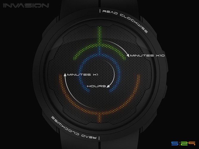
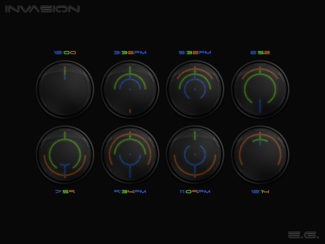
Invasion uses lines that start at the 12h or 6h position, representing 12h/0min or 6h/6min and continue in clockwise direction to any other number. Starting at the 12h position, these other numbers are 1,2,3,4 and 5. Starting with the 6h position, the other numbers are 7,8,9,10 and 11. Having this rule set up, I mirrored the lines across a vertical axis, creating a symmetric display. If the clockwise-reading-rule is not known, the display looks cryptically alien while the symmetry is gadgety eye-catching. If the rule is known, reading shouldn’t be a big problem after a short time.

I am proposing there colors for the display. Blue, the coldest color, shows the hours, that change the slowest. Green shows 10-minute-groups. Red, the hottest color, shows the single minutes, that change the fastest. A single color for all parts of the time could be used, but times using 0,6 and 12 alone or at the same time, are hard to decypher then. It is possible within the law of exclusion but that’s a bit too sherlocky. As for the original three-color-version, an alternative, non-symmetric display mode could be implemented to help reading in the first days. Date, alarm and any other three-digit-information can also be implemented easily.

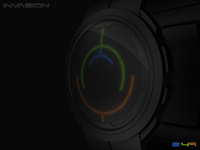
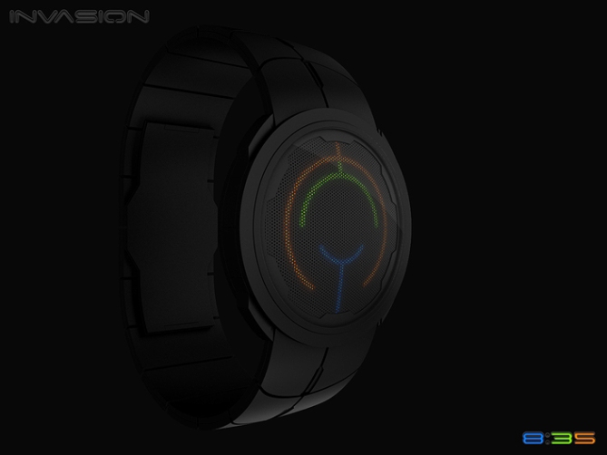
I liked playing around with methods of screening the LEDs and I came up with a hole grid. I like the technical look, a bit like a speaker or fan grill. I framed this grill with an edgy ring which outlines the analog display numbers to help interpreting the LED lights.
The Invasion is for the typical Tokyoflash fan who likes watches that don’t look like watches.


The iconography created by this design is quite stunning and it really does work to create an alien language of sorts.
The grill over the top is a nice touch completing the look & giving something you can be proud to wear. I love the overall mood & mystery of it.
The time telling itself is ingenious; cryptic but logical. Personally I prefer something easier, but of course that is for each person to decide themselves. Its no harder than many other of our designs. Despite that, its something you can get used to quite quickly & it becomes second nature ~ so I think the extra effort is well worth it for this remarkable object!
LikeLike
Thank you very much for this comment Toky! Nice nice *^^*
I’m never sure about the initial crypticness so I would always suggest an easy mode, which works great on the Rorschach btw. People distort their faces at first but when I show the easy mode, it’s a piece of cake in the end. It’s a fight between look and decrypting effort. Basically: fun
LikeLike
Another watch classic from the Samukun Studio! 5y
LikeLike
I thought of a problem with this – what about when you get dust and other things in the cracks?
LikeLike
Thank you DZ for the support.
Oh the cracks… you mean the straps? I think in reality they can’t be this sharp, more round and dust would just fly off by a soft blow 🙂 I think watches are either worn or stored properly. They are not like a remote control that’s used and placed in plain dust rain.
LikeLike
I think he means the holes on the face. But if the mesh is placed directly onto the glass lens then nothing can get inside.
LikeLike
Yes, I meant the holes…it was late at night.
LikeLike
True, watches are generally stored properly – especially if they have a cool place to live:
https://blog.tokyoflash.com/2012/12/tokoro-combines-clock-watch-collectors-box/#more-18335
😀
LikeLike
hahaha nice product placement there! lol
LikeLike
I’m sure you’re not complaining, Pete!!
😀
LikeLike
Hehe I actually put a glass on top to avoid exactly such comments xD Hey Toky, were holes a problem with the Shinshoku or the Fire?
Tokoro rocks 🙂
LikeLike
Sorry, I was looking for signs of glass on top, but didn’t see it.
Anyway, this design of yours really does look top-notch!
LikeLike
Thanks again DZ ^^
LikeLike
I feel like it’s a bit too confusing. If you had the tips point where the time is instead of the circle ends, it would be more intuitive and some other colour combinations or able to choose the colours would be nice.
The style of the watch itself however is really nice, and the little dots on the face might make an interesting idea for other ways to display time.
Good job overall but some tweaking would probably make it better 😀
LikeLike
Thanks alot for the insight!
I had thoughts about having the straight lines being the pointers, so I see the point here, but my initial rule of symmetry is dominant. If I had those straight-line-pointers on both sides, the final image wouldn’t look so stylish. So I have to insist on the not important lines and the important curve-ends. OR, an alternative display mode gets implemented. 23 more LEDs – no problem 🙂 The more, the better.
LikeLike
Outlandish … Watch By Blessed Designer … Vivid … Wizard Watch …
Sam … All Da Best … 🙂
LikeLike
Aww, thanks so much Ranjan ^^
LikeLike
Another great design, Sam. As usual, your attention to detail shows. I really like the hole grid and the framing helps a lot with reading the time as well as providing a futuristic look.
The 3 colour version is perfect as it is and would certainly get my money.
I think a monochrome version could work for those that like the watches very cryptic, or maybe this ‘cryptic’ mode could be an option selected as in Rorschach. For times with only 0, 6 and 12, it would be easier to read if there were small gaps between the different lines, but that may be slightly detrimental to the appearance.
Anyway, good luck and 5*/Y.
LikeLike
Small gaps. Yes they could work! I have something else in mind – you’ll see 🙂 But cool you thought about it. I would prefer monochrome but I liked to make a smooth entry to the topic for you guys. Thanks for thinking this through and for the support!
LikeLike
Yet another classic Sam design, looks fantastic as do your images. Loving the perforated mesh screen. The time telling is pretty simple when you know how but cryptic enough to baffle onlookers. For me the colours of the hands should be reversed, red for hours would feel more initiative. Minor details aside fine work sir 5/Y best of luck! 😀
LikeLike
No. Monochrome for you hehehe. Thank you Pete for your view, very appreciated, also for your support!
LikeLike
Hi Sam, I love this watch at any point of view, modern design, a pleasant reading, what class!
I have a little trouble reading with x10 minutes to 2:49 and the 11:45? I read 2:29 and 11:25? this is probably because I have not understood the translation? Thank you for your clarification.
5 * and Yes, the idea of the grid is just great, great job!
LikeLike
OK Sam, upon reflection, I realized my mistake, I confused minutes by x10 and minutes by x5, this watch is easy to use and really beautiful.
LikeLike
Oh I thought about making minutes x5 too and then 0,1,2,3,4 extra minutes. But then I would only use 12-12-4 LEDs. Now I use 12-5-9, so a little more balanced. Still nice how you read the watch 🙂 Thank you for the compliment and your mouse clicks 😀
LikeLike
the perforated screen is brilliant, Love this watch
LikeLike
Coolio grande 😀
LikeLike
Where you been, Sam?? I dig the screen. Wondering if it’s also possible to achieve the same appearance simply with individual LEDs, but guessing you’d need too many of them. It reminds me of a traffic light. Would you consider swapping yellow for blue? Guess that would alter the meaning behind your color choices though. It took me a little bit before I could read it, but it’s a cool way of always having a symmetrical display. Glad to have you back!
LikeLike
Hehe ^^ Busy in real life. Had more time to let some ideas settle in my head.
Maybe it would work with few LEDs and then round stencils on top to “form” then to circle segments. Cheap and effective. Ah don’t mind the color meaning. It was just a little rule to help memorizing, to make the first step for you all easier. In the end, other color combinations are possible. Yep, difficult at first but symmetric 🙂 Always on would rock mountains xD Thank you for the nice reception!
LikeLike
Another brilliant design Sam!! I would buy this one NOW!! I love the symmetry, the mesh (especially the mesh),
the method… all of it. I like the fact that, though you don’t show it, the ‘display’ would be hidden by the mesh,
and would appear dark and mysterious when ‘idle’, and until awakened. ME LIKEY!!!
Best wishes, and good luck!
LikeLike
Hi AL! Yeah you make a good point about the watch being mysterious when off! I thought I’d tease the people with it but was too lazy in the end 😉 Thank you for the nice comment and the support!
LikeLike
It’s a nice idea. (of the kind I would have liked to have) I like the starting positions, the mirrored effect, the round case. I love the bezel. I like that the lines are divided in segments. The grid is a nice touch, as long as it doesn’t block the off part between two segments! For a rare time, I love that it’s in LED. Having three colors is better that 1 & compensate having it almost always off. (even if my biggest problem with LED watches is that they are harder to setup)
I would buy.
LikeLike