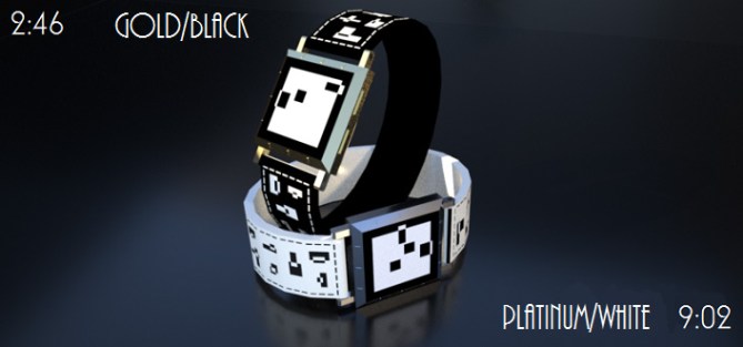
Design submitted by Justin from the UK.
Justin says: I wanted to create a watch with an artistic, minimalist look. LED watches are great but sometimes you need an elegant and stylish design on your wrist. I have tried to mix style, cryptic and easy into one. I came up with the E-paper based…Squared²

[]² is an analog watch at heart, the numbers 1-12 are found at the usual locations around the outer edge of the clock-face as are the 5 x Mins.
Single mins are recognized by the four squares in the center of the display.
Locating where the hour and minute “hands” will give you the time and adding the single mins will provide the accurate time.

This is one for the professional gentleman/woman. The more mature watch wearer should be drawn to this as it forgoes the typical bright and colourful displays usually found on many Tokyoflash designs and instead opts for a more subtle configuration. Coupled with the leather strap and gold or platinum finishes on the casing, this should attract and be attracted by those with quiet sophistication.

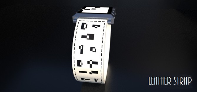
Despite the professional look and extravagant looking finishes on the watch casing, this watch has a nice comfortable leather strap which has minimalist etchings which should stand out too. I like to put effort into the strap as it is 50% of the watch. E-paper is very economical and a battery should last a long time, keeping those pennies in your pocket to jangle away making you feel as rich as this watch makes you feel.


Thanks for the submission Justin. A mature design with a simple theme. The time is pretty simple to read without too much counting required. Really like the simple black/white look and the name also!
LikeLike
Your welcome Tokyoflashy peoples. It was a pleasure making this one. A nice simple, cryptic and tidy looking watch.
I tried to focus on those people who shop on Tokyoflash, who wanted something a little more reserved (say for a wedding, at the office or just to suit that particular mood) who, at times feel like being less “in your face” with their attire.
Thanks for posting this one. Fingers crossed it is accepted and seen for the potential it could have.
LikeLike
I’m a sucker for Art Deco, as many of my submissions attest, and this scratches that itch nicely.
I like the clean look and stark colour scheme, and the display is (for me) a pleasant level of cryptic. Personally I’d have gone in a slightly different direction with the strap, but that’s a detail.
Good work Justin, and best of luck! =)
LikeLike
Cheers for your comment Anders. Glad you like the style, it’s a personal new fav of mine and a stark contrast to most of my other designs. I just wanted something abit more mature that would reach fans of the unique TF inventory but who weren’t big on the bright and difficult stuff.
Hopefully others will see this way of thinking and see this watch as part of a whole, a sane option in an insane selection of amazing technology.
Fingers crossed.
LikeLike
Yeah, when it’s good it’s mind-blowingly elegant (check out the substyle ‘streamline moderne’ if you haven’t already). The trouble just seems to be getting the level right, too much and it ends up looking old (not really a bad thing, but apparently not what most TF fans are looking for), too little and everything just looks angular and simple in a bad way, and nobody likes that… Good luck with it, it looks to me like it strikes a nice balance!
LikeLike
Thanks for the nod towards new styles, I’m always on the lookout for different forms of artistic inspiration and this is right up my street. I’m going through one of those moments…first it was futuristic and now I’m kind of travelling back in time abit lol.
I think if you can find a nice medium between old and new then it brings out a whole new genre of it’s own.
LikeLike
Nice looking design with a cryptic but easy time telling method. Its not my favorite of your designs tho, its just not for me Im afraid. I cant put my finger on why but it just doesnt hit my wowser button for some reason. I gave you 5* tho as I can see this appealing to others, best of luck sir! 😀
LikeLike
Thanks for the vote and the honesty buddy. As with all things in life, some will love, some will not. I think the reason why your not taken by this design is that there’s a lack of flashy lights and car related feel to it lol.
That’s ok though…coz like good ol’ mr Caine said…I’ve got a plan…
Thanks for commenting tho Pete. As always your views are most welcome.
LikeLike
your only supposed to blow the bloody doors off! 😀
LikeLike
Not a lot of people know that…
=)
LikeLike
Moy name…is moycle Caine…and oy…am a nosey neighbour!!
LikeLike
I really like the watch face and case, but am less sure about the strap.
I like the leather straps with just etching (e.g. Stencil), but the symbols on this in the opposite colour are a bit too much for me (and probably not subtle enough to be able to aim this at the market you describe). Use the shapes without changing the colour on the strap and it would definitely work. I think with this minor modification, this could be a real winner, so 5*/Y from me. Good luck.
LikeLike
Thanks for the feedback Nev. The strap can easily be changed, I’ve jut looked at stencils strap and that kind of look would be perfect for this and would add more subtle appearance to the watch. Luckily it’s just the strap that you would change and are happy with the watch/face/time telling as then I would be in trouble lol.
Thanks for the input buddy. Glad you like it.
LikeLike
Justin is well Pelly?
So 5 * / Yes, I do what I want.
LikeLike
Yes it’s justin/Pelly.
Thanks for the support Patrick. Not sure what you mean by “I do what I want”…erm…but thank you for voting.
LikeLike
I changed my profile name to Justin to avoid confusion with the design creator name up top and me personally commenting.
LikeLike
Justin it is your first name, of course.
I do what I want and I want to give pleasure, that made of the good to everyone.
There are good ideas in your project and when I vote it is always the maximum or at all. I am like that.
LikeLike
Glad you see the potential. At the moment I’m trying to add more of an artistic element to my designs and taking more time between each one. There may be the occasional one where it looks abit on the rough side but that’ll be down to my skills limitations on CAD.
I had a feeling you would like this one due to it’s arty look.
LikeLike
Nice work, Justin! 5y
LikeLike
Cheers D…glad you like it
LikeLike
A pretty intelligent design Justin.
With minimum practice is easy to read the time.
5 / Y and good luck with it!! 🙂
LikeLike
Thanks for your kind words my good man. Hopefully it does well, it’ll be an easy make for TF.
LikeLike
Reblogged this on justinthepel's Blog.
LikeLike