Design submitted by Justin from the UK.
Justin says: This is a re-imagining of BorderLine, a concept of my own creation. The method of telling the hours was well received and some felt that it was a shame that the minutes were robbed of this unique method.
So it has been reborn as…Glyph.
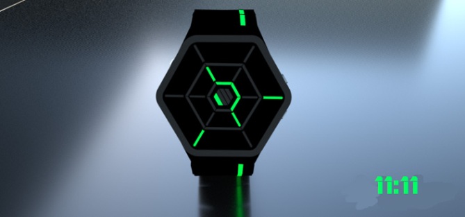
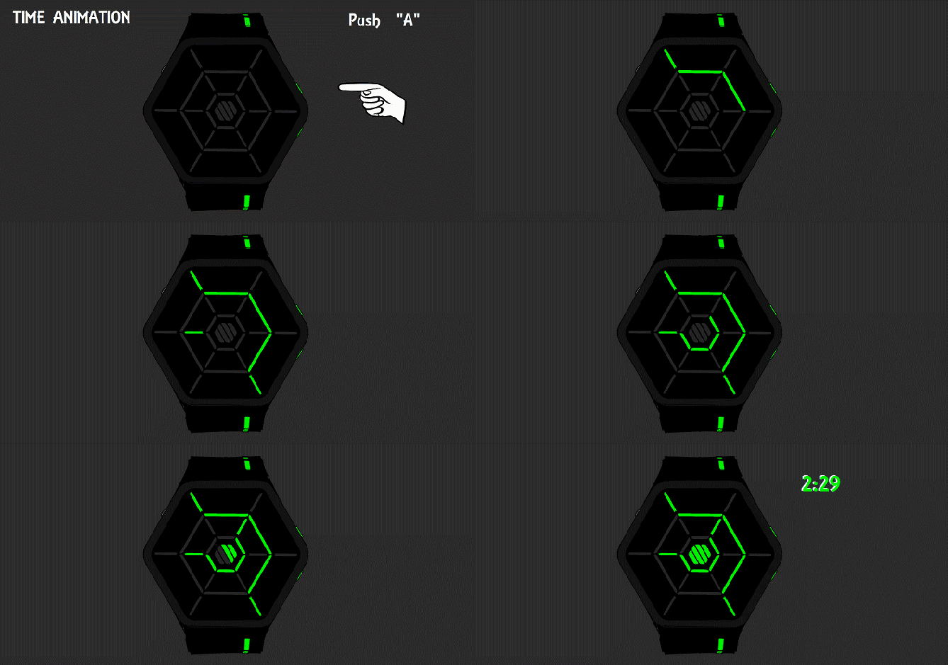
This is a very alien looking design. The LED’s act as the “hands” on this watch and rather than simply displaying numbers, they point to where the numbers would be sitting around the edge of a normal analog clock-face. Although this may be confusing at first, once the technique is discovered it is very easy to read at a glance.
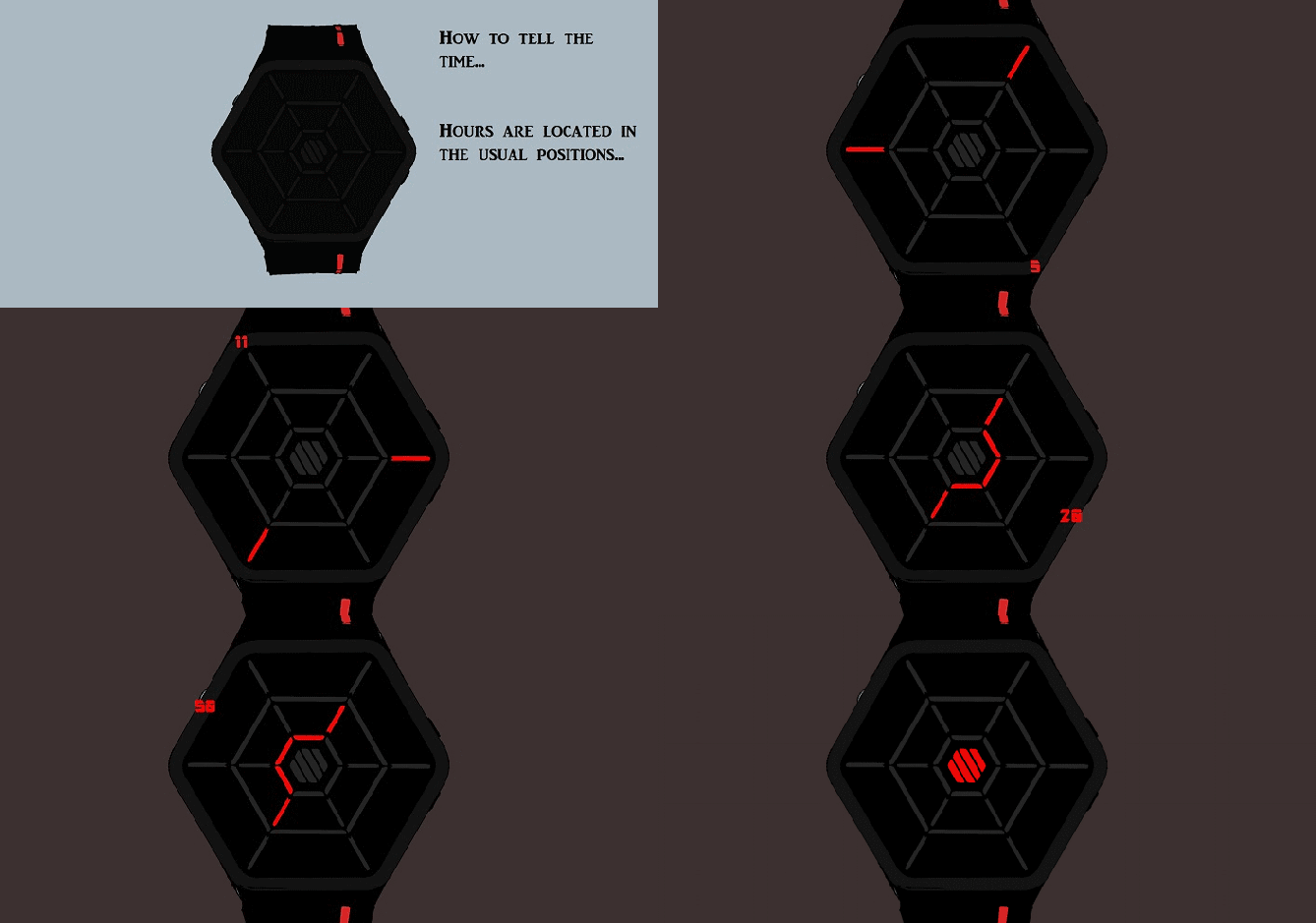


This is the kind of watch for those TokyoFlash fans who like their watch with a hint of bizarre and don’t mind putting a little effort into mastering a totally unique time telling method. If you like bright and colourful, but mysterious and fiendishly futuristic then this is for you.

What makes this watch stand out is the way in which the time is told. It has never been done in such a way. When the LED’s light up it is so easy to tell the time yet the configuration looks very alien and other worldly. If possible, an EL sheet would be cut up and spliced into the watch strap adding extra colour and flair.
Thank you for reading & I hope you like Glyph.




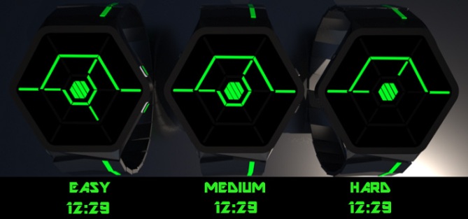
UPDATE: New time modes “Easy-Medium-Hard”





Great update to the original Justin. This really feels like a solid concept & the display comes together perfectly.
The name Glyph is very appropriate, it does indeed look like alien symbols.
The EL strap light is a nice touch too. There is very little I would even suggest to change.
Well, perhaps I have 1 question .. could the inner minutes pointer always use the centre hex to point? e.g.: when pointing to 05 mins; have the 2 ‘wings’ + the hex…. Hope that makes sense. It might be too much, just a thought.
LikeLike
Thank you very much TF, always nice to know the hammer hit nail if you know what I mean. So happy you like the changes. I was unsure what you meant at first Re: the inner minutes, but I think I get it, let me just clarify… Do you mean instead of having simply 2 LEDs pointing at an angle towards 05-15-25 mins etc, have the 2 LEDs but also have the inner hex LEDs lit up around the middle?? So it kinda looks like a little spaceship?
This might also make the display that little bit easier for those having trouble dealing with the new method. I suppose this could even stretch to the hours indicator too…an easy mode of sorts.
LikeLike
Also if need be, could I make some more renderings of this “easier mode” and have them added (sent by email of course)
LikeLike
Thank you for adding the updated pictures TF!! Hopefully this is what you meant by using the centre hex as an additional pointer.
I think it looks quite funky with the extra LEDs added and also adds modes that would enable the wearer to get more accustomed to the harder modes.
LikeLike
Hi guys, firstly a big thanks to Tokyoflash for posting my design. Secondly, I hope you guys like the improvements I’ve made and don’t have too much trouble reading it.
Any questions are very welcome, don’t be shy & you won’t have to wait long for an answer lol.
Any critisms will be taken on board with a glad heart (the whole reason this re-design is here in the first place is because I listened to you about my previous incarnation and improved and adjusted).
Hope you like it…happy voting!!
Justin Aka Pelly.
LikeLike
Good update Justin, it really looks like a TF watch.
I think I had the same idea as TF re the minutes; that the ‘pointer’ used when the outer two LEDs are in line could be used also when they’re not in line. So, when the minutes point at 15 for example, the outer segments would be connected with 4 segments of the hex. I think it’d make the reading more consistent, if nothing else.
Other than that I have nothing to add (or remove, which is even more important)…=)
Solid work, good luck with it!
LikeLike
Thanks Anders, glad you like it. Ill be doing some more renderings and adding the new LEDs later on after work so hopefully TF will be able to add them when they clock in later on. I think the way it is now could be seen as the “medium” mode. Adding those extra LEDs for easier use could be seen as the “easy” mode and simply removing some more of them could be a “hard” mode.
Ive been looking at it this morning and have a good idea of what to add/remove to make this possible…watch this space….hah…watch, geddit…..lol
LikeLike
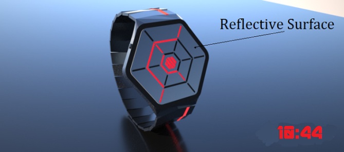
Yep, very good! I like the reflective one with red the most. The time telling is indeed very easy once you know it and looks really cool. The black display gif shows how different the display can look throughout the day – that’s a big plus. Good luck again!!
LikeLike
Thanks Sam, i was nervous about putting this one onto the blog, i didnt know if people would take to the weirdness. Luckily, at the moment, it looks like it is liked. (Although i have to question the really low rating!!)
The red/reflective is my favourite too.
Cheers for the support.
LikeLike
Hi Pelly, graphically it’s much better than “Borderline”. I have a small remark to the analog reading from the center are the hours and then the minutes to the outside, but it does not change much.
5 * / Yes beautiful project.
LikeLike
Hi patrick thank for your vote/support. Merci beaucoup.
Re: your change…do you mean that the inner hex/lines should read the hours (similar to a normal analog clock)
and the outer for the 5 x Mins?
If that is the case then i appreciate the feedback but allow me to explain my choices for the current configuration. Reading this watch i found myself reading it from the outside in…so i felt it was easier to have the hours on the outside then the mins on the inner as it just seemed to flow better. I guess if TF make this design then maybe they could add an option to reverse the hour/min order of the inner/outer LEDs to suit the wearer as everybody is different and has preferences and like ive always said….choice is a must.
Its just nicer that way.
LikeLike
Yes Pelly, it is as if the small needle gave the minutes, but it is really the only thing which challenged me (it is without interest) in this beautiful project.
LikeLike
Well I’m sure that if TF deem it worthy for creation then they can add a setting where you can choose which section (inner or outer) can hold the hours or minutes. Choice is always a nice thing to have.
Thank you for your kind words.
LikeLike
I think you are both right!
Patrick makes total sense to follow the established analogue standard of small hand (inside) for hours.
& yet because this watch is more cryptic, I find myself wanting to read from outside in with hours first.
Because the watch is not true analogue & is using LED symbols, I think the rules are open to personal preference.
LikeLike
I think for me personally I prefer reading the hours around the outer edge and 5 x Mins from the inner.
My brain just seems to process it easier this way.
I do understand peoples need to keep with what they know and wanting to read the hours as they always have done, from the inner section and I wonder how easy would it be for you guys to have an option to switch hours/5 x Mins from outer edge to inner section??
Maybe upon setting the time the letter H could flash up to indicate that these are the hour locations you are changing, then by simply tapping either A or B the relevant section (inner/outer) would flash so you could set them to your preference.
I’m sure the letter M could be created using the LEDs to indicate when you wanted to change the Mins location.
What do you think? Is this level of customisation something that could easily be done? Also how difficult would it be to make this a multi-colour LED watch??
LikeLike
Programming both ways would be fine, as long as the settings are not over complicated.
Different colour LED’s in the same watch is fine. Certain colours work best together due to the power requirements of LED. [red/green/yellow] all have the same power rating & can be used together
Other colours, white, blue, etc have individual requirements which makes power management difficult for mixing colours in a small watch.
Multi-LED (like Adjust) contain RGB in a single element & therefore this type would be best for full control. They are larger though so can’t fit as many into the watch.
LikeLike
Red Green & Yellow would be awesome!! I’d love this to be a multi-LED watch!
LikeLike
Looks pretty spiffy, Justin!
5y
LikeLike
Cheers D…glad you like it.
LikeLike
Looks nice Pelly and is defibately an improvement on the original, very cryptic time telling which is uber easy when you know how. 5/Y Best of luck sir! 😀
LikeLike
Thanks Pete, glad you like the improvements. Be sure to check out some possible alternate modes later on (if TF are able to upload them that is) as per requests and suggestions.
Defibately…sounds like you have a cold sir lol
LikeLike
Lunch and keyboards really dont mix it would seem! lol
LikeLike
Neither do greasy fingers and iPhones…thanks for predictive text lol
LikeLike
Nice new additional images, looks very cryptic and funky with a hint of TRON about it! cool! 😀
LikeLike
Cheers buddy, parts of it remind me of the predator wrist-thingy…especially “Hard” Red 3:47.
LikeLike
I’m actually quite disheartened at the score it’s getting!
3.3 really?!
Hmmm.
LikeLike
Info on price & purchase points please.
LikeLike
This isn’t for sale yet. It could be…I hope it is one day. If enough people like it and vote/thumbs up then it’s a possibility.
LikeLike
I really liked Borderline and was happy with the minutes being digital. This rework does, however, improve significantly on the original. The 5-minutes are as easy as the hours were on the original, but the hours (1,3,5,7,9,11) are harder as the lines are further apart, but that is not a bad thing – watches that are easy to read can be very boring!
I can see that some might like an “easy” mode, but what you have already shown (“medium”) is much better, I think. I’d like to see the “hard” mode, though – I might prefer that!
Voting not too bad (my 5 got it up to 3.5, so pushing it up with more good votes is perfectly feasible. Don’t get disheartened. It’s a great design that certainly should get made. Good luck and 5*/Y from me.
LikeLike
Hi Nev glad you liked the original and even happier that you are pleased with Glyph.
As I type this I am rendering some new images which show examples of the Easy-Medium-Hard Mode.
The mode that you see now is the Hard Mode (even though I had previously stated it to be Medium) that is because I am unable to alter or remove any more LED’s to increase the difficulty without making the design unreadable.
But that’s no bad thing because the Easy/Medium Modes, whilst pleasing many people, also looks very nice with the added LED’s lit up.
Hopefully I’ll have the renderings finished for TF to update this entry soon.
Thank you for your vote and support, it is most appreciated.
LikeLike
The Easy and Medium modes do make the time much easier to read. People may only use these to get used to the watch and would then progress on to the Hard mode. For me, the Easy loses some of the appeal with the extra line added, but can see the appeal of the Medium. I still prefer the Hard mode, but now there are options to expand the appeal to more people.
Great stuff.
LikeLike
Glad you like the difficulty variations. I can see how the extra line on “Easy Mode” would put you off a little as it takes away some of the fun and challenge of figuring it out for yourself.
Like you said though, it is meant to be used as a stepping stone of sorts so the wearer can progress on to further difficulties.
I think the Easy & Medium modes have their own upsides and downsides…the upside being that because they have extra LEDs lit then it looks more fancy. The downside, it looks less cryptic and does the work for you.
As always though, people will find their preference and as long as there is choice then there is more appeal.
Thanks for your feedback Nev.
LikeLike
I really dig this. A few things are, make the face small. I hate overly large watches. Nothing over an inch an a half diameter. That aside, black with blue lighting and I’m all set. The design is excellent.
Only other thing I’d love to see is probably my favorite juxtaposition when it comes to watches like these. I’d LOVE to see one where the system was placed into something more retro in terms of a casing and a leather type watch band. I just love the look of retro and high tech like that. Sort of like people that put extensive electronics in old pocket watches. It just looks so out of place and cool.
Anyway, my two cents. Great design regardless!
LikeLike
Firstly, thank you so much for your support and appreciation for this project.
Secondly, I understand your concern for the size of the watch-face. I know it looks a little on the big side in my renderings. In retrospect I wish I could’ve made either the strap bigger or the watch-face smaller to make it proportionately unified.
If this ever goes into production then I hope Tokyoflash understand that I will be completely on board with any minor changes they wish to make regarding strap size or watch-face size (technology permitting).
Maybe the strap could be widened so that it reaches the 2 far points/corners of the hex watch face, then the A/B buttons could be one on either side??
I cannot believe I missed out the Black/Dark Blue colour combo…hmmm, this is something I shall have to remedy.
I don’t think TF will add anymore pictures so instead please feel free to follow my Facebook account “Apex Wristwear” and ill be sure to add these after work tonight for you.
As for retro stylings mixed with futuristic tech, I am very curious as to how this design would look with a nice black or dark brown leather strap or maybe a pocket watch version with chain.
I think I might be compelled to create these too and put them on my FB page.
Thanks for the feedback and support Solomon.
LikeLike
Also if retro/future is your thing…keep an eye out for my next submission…Squared2
LikeLike
Awesome and cryptic! Would be very tempting for all Ingress players out there
LikeLike
This concept will appeal to looking for a semi cryptic analog wrist watch i like the fact you have created further color / display difficult variations added to this concept. Well done & good luck.
LikeLike
Eduard – glad you like it, thank you for your support. I can see the similarity in the Glyph watch-face and the Ingress logo. I understand that Ingress is rapidly becoming a very popular thing now it has lost it’s “invitation only” access. If Ingress players the world over take a liking to this watch as you have, then it could be very popular with the community.
Hah maybe even Glyph could be used to connect to a phone via Bluetooth and used as a sat nav compass of sorts lol.
Andrew – thank you for your support also. Glad you like the new difficulty modes and colour options. Who’s knows huh…fingers crossed.
LikeLike
I bet this watch would look nice in the “wood” variety. In a similar way to night vision…the EL strap would be awesome if hidden.
LikeLike
I wonder if a good party trick for this watch to have would be to spell out the name Glyph (as shown above)
Plus if this could be a multi LED, could the hour and 5xMins be different colours?
LikeLike
Also…how would people feel if the actual screen was all black, no markings except for the LEDs that were lit up? Given the shape of the watch it would be easy to distinguish what the time was. This way it would make it even more cryptic and sleeker.
Any thoughts?
LikeLike
One word (well actually two…) Beautiful, Awesome, Alien
Just the way I like it 😀
Ok ok it was three…
LikeLike
Heehee you can say as many words as you like about it!
Thank you for commenting, it’s always nice when non regulars to the blog drop by and take the time to leave feedback.
Seriously hoping this one gets made!
LikeLike
I prefer the original concept. Here, I like the 2nd pic style (red at 6:21) & the easy minute/standard hour ( the one in the middle of the green at 12:29 ). I prefer having 2 styles. I would prefer if the +1/+4 min where read left-to-right.
LikeLike
Thanks for the feedback makko, I like both concepts but this one seems to scratch that sci-fi itch more. I prefer the medium difficulty as it’s still cryptic and lovely to look at.
LikeLike
Well it’s nearing the end of it’s time now…voting has almost finished and I must say I’m very grateful for the feedback , likes and comments Its received.
I would absolutely love for this to be made reality and I sincerely hope TF consider it. Even if it means tinkering with the strap/watch case design…I’m all for that.
Well, that’s enough from me. Take care peeps and good luck to you all.
LikeLike
Reblogged this on justinthepel's Blog.
LikeLike