Design submitted by Andrew from the UK.
Andrew says: In the future humanity is extinct & only the artificial intelligence machines initially created by man remain. These Androids have created a time portal to travel in the past & try to save humans from their own environmental , political, historical mistakes. Cybernetic is inspired by Peter’s Edge wristwatch.

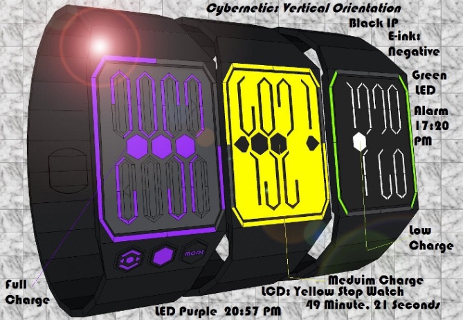
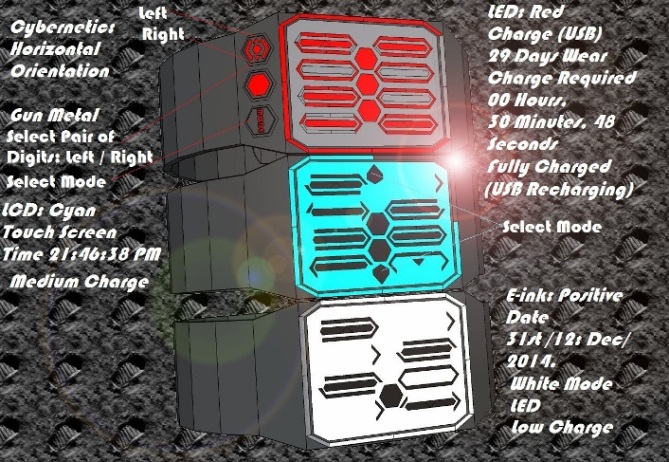
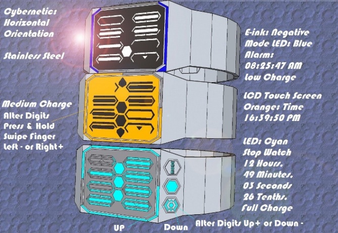
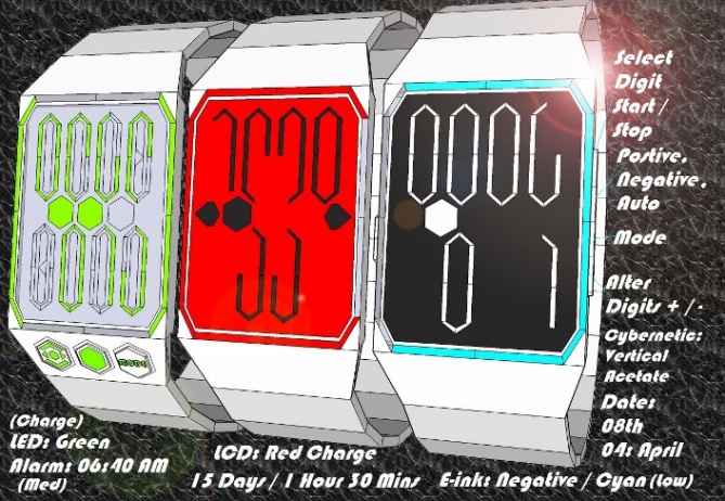
The display as a self re-orientating display controlled by motion sensors in the wristwatch. The display has twelve oblong hexagons in vertical Orientation only eight are used to display four digits. In Horizontal orientation all twelve are used to display six / Eight digits: Depending on the Selected mode.

The Display Also Features three Hexagonal Cells: Charge Meter.
This wristwatch will appeal to futurologists, Computer Technicians, science buffs & of course Fans of The Terminator Films.
This wristwatch as multiple mode / re-orientating display.
Furthermore is available in three different Display types: Retro / Skeleton LED,
Touch Screen LCD & E-ink Display than alter the color of the background / digits Positive: White/ Black Digits, Negative: White / black Digits or Auto: Black / White: AM / & Black / White PM. See Diagrams Provided for Further Details


I like the way this watch focuses on the battery charge, it really would be a concern if you were an android!
For us humans it’s less worrying, however it does still help transport your mind to the future… I wonder if there are ways to make it more relevant to us bio-units?
LikeLike
Thanks for the input bio-unit. If Tokyo Flash Japan feel’s a more organic display / wristwatch would be more successfully / appealing I have previous submitted & had published the Genome. In which the digits are oval / which from a DNA or double helix shaped chain/s – See more at: https://blog.tokyoflash.com/2013/12/genome-double-helix-dna-chain-shapes-show-time/#sthash.YXl3UaJc.dpufhttps://blog.tokyoflash.com/2013/12/genome-double-helix-dna-chain-shapes-show-time/
If this is not sufficient I try to improve on it or think of another more natural inspired / organically based Concept.
LikeLike
I was thinking about the function of battery life. So perhaps instead it might gauge how long until your next meal, or like some other watches, how far you have run. Just a random idea.
LikeLike
So are your looking for a sports / activity or biological monitor design concept, I’ll have put serious research / though in to that.
LikeLike
I am always impressed by the work of Andrew, with lots of details and explanations, perhaps too accumulated the drawings? This is certainly why the rating is too low. I do not want to give advice (only Sam would be entitled with 5 watches), but it would purify the drawings, try to make them more attractive and the note explode.
This work deserves 5 stars and Yes and I hope the vote will go up?
LikeLike
I appreciate the compliments about my work Patrick. I realize that their is a lot of explanations for each example & perhaps I could have limited the text a bit more. However I wanted make sure that it was clear how each display worked in the various display modes / orientations: Vertical / Horizontal. I try to make explanations of my Dispaly / watch controls more concise in future.
LikeLike
Or, you grouped explanations on one or two tables and you represent the project alone, more stripped? Good ideas also need to attract attention, this is just my point of view.
LikeLike
Hello Andrew,
my advice would be to concentrate more on improving the display of your work. the Ideas for the displays are great, i think this is receiving a low rating down to it’s presentation. Try to keep the presentation simple. images can be disregarded purely if they are too busy for the eye. if designing displays is your strong point then keep the focus on just that. theres no need for pattern backgrounds / Lense flares / pages filled with text. you can explain how the watch works in the description questions you submit with your design.
i appreciate the effort thats gone into this and it does deserve a higher rating.
LikeLike
I create my designs using 3D Google Sketch up then I export each example to GIMP add back ground / lighting then saved them to paint so i can add text. Finally I compress these files & add them to a zipped folder as per TF’s guidelines suggest. I will try to keep my explanations in my examples to a minimum & outline how the wrist watch / concept functions in the submission itself.
LikeLike
I like the display layout, it’s clean and simple without being boring. Showing the charge level is a nice touch, I can’t remember seeing that on the blog before… For those who are that way inclined I’m sure the styling could be jazzed up with bevels and 3D effects, as long as the display wasn’t compromised. Good luck!
I’m always impressed by the sheer amount of options your submissions contain, Andrew… I can’t recall seeing a design of yours that didn’t have at least three modes.
As the other comments have mentioned, that much information can be a tricky thing to handle. I’d second Patrick’s suggestion to focus a couple of images on explaining the display layout and modes (in a more schematic style for clarity) and leave the other images for showing just the watch in all its glory.
Quick tip: If you feel you need more than five images and 200 words to explain a concept, you can make a zip file with images and a text file and upload that using the first upload slot on the submission form. I would advise caution though, TF might not like to be sent 50 images and a short novel…
LikeLike
Cheers for the complements Anders S. I like to create wrist watches that have multiple functional displays: Alarm, Date, Time & occasionally additional modes such as stop watch / USB charge: so the user can view the amount of charge the watch has remaining: Days they can wear it before recharging. Furthermore in charge mode the display show the amount of time required / remaining in each recharge cycle.
I will take your good advice comments about images & text.
LikeLike
Hi Andrew, I’m very flattered that you used on of my designs as partial inspiration, Cheers 😀
I like the digits and the fact they can change orientation, it took me a few seconds to see them because the central dividing hexagons make them much more cryptic.
The charge/colour change feature is very cool. I think TF were suggesting that this charge indicator could be linked to the wearer rather than the styling being more organic.
So maybe it shows the wearer’s charge level (activity level or time since last re-charge (lunch or sleep etc lol)
Regards the presentation, I don’t want to preach to much as my work is far from perfect. But I do agree that maybe less text and more subtle backgrounds will make the images clearer. Most of the text can be fitted into the written part of the submission anyways, and you only need the odd image showing these features. TF would be able to sort out the finite details if they developed the idea further anyhow. Rambling over, 5/Y best of luck sir! 😀
LikeLike
BTW I agree that the rating is un-fairly low!
LikeLike
Thanks for the comment about the” un-fairly low” rating
LikeLike
Thanks Pete, The self / re-orientating digits allow the display to go for a simple four digits display to a multiple digit cryptic more complex layout, thus pleas fan of cryptic watches. Tokyo flash made a similar comment that perhaps this concept could monitor the wearer bio rhythms: hunger, sleep, pulse etc. I add text to my examples so that i can see at a glance what each example contain / how it works.
LikeLike
I like the two display styles between horizontal and vertical, but think that the way I read my watches I’d always get the vertical display. I think the charge indicator is great as it is and should be the watch battery charge indicator, but maybe with graduation within the blocks – It is always frustrating when a watch you are wearing dies on you.
The low score is a reflection of the small number of votes and one or two unfair low votes. My 5 (the 18th vote) took it from 2.9 to 3.1. The comments about the text in the pictures are probably right, but I think if you had one with just one or two watches and no text that TF could put on the blog front pages, it would draw more people in to your page and generate more votes.
Anyway, 5*/Y from me.
LikeLike
Thanks for the input Nev. I added the charge indicators so that the wearer can keep a eye on the charge / battery life so the watch dies not die on your wrist. The idea of having graduation within the Hexagonal cell has merit. The amount text reflects the complexity of this design concept, however I will try to minimize text in my examples the future.
LikeLike