Design submitted by Ignacio from Spain.
Ignacio says: I always dream with minimalist and cool watches, with no clock hands and very few elements.
Red Sector is one of those dreams, where simplex, technology and design are mixed to create a futuristic and outlaw watch.


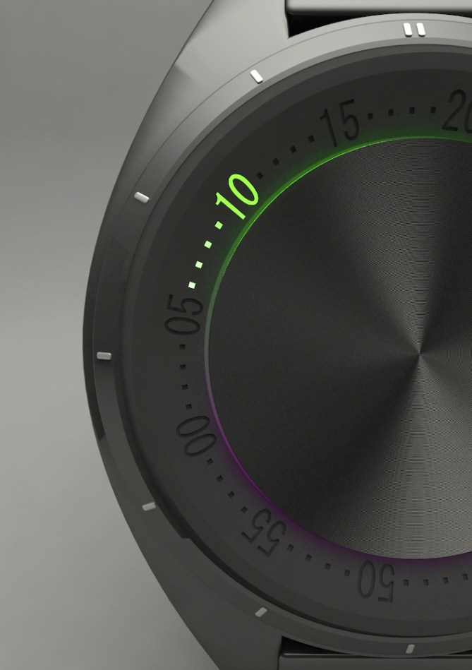
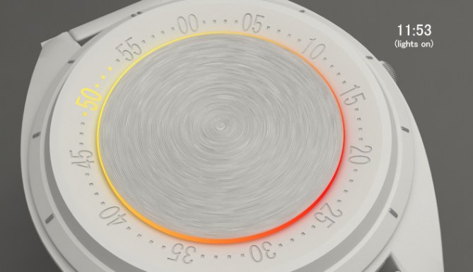
With Red Sector is very easy to read the time. Its minimalism and simplicity allows you to read the time, hours and minutes, with just one number and four dots.
The position of the lighted number shows you the hour, like an analog watch; while, the number itself plus the subsequents dots (clockwise) show you the minutes.
All of my friends that have seen the design, instantly liked it and wanted one! (And they are many with very different likes)
My conclusion, I see everyone who may like cool, futuristic, minimalist and functional watches wearing Red Sector.
I’ve tried to mix technology, design and minimalism in this watch. Using the technology itself, I could create this dreamt design graphically. If I made it well, the design itself should speak for itself. For the rest, I would let people will decide.


This really hits the mark for an unusual watch that transcends taste. At home on anyones wrist. You can’t argue with its elegance.
As for how to make it: Despite being analogue I think a regular movement could not be used as the LED demands electronic time keeping. Some sort of motor to drive the dial. Not something I am familiar with but nonetheless an inspiring concept!
LikeLike
interesting technical comment. It surely can help many of us in the future to come up with more “doable” ideas.
thanks
LikeLike
First of all, thank you very much Tokyoflash for sharing this design!
Secondly, I really have no idea of mechanisms. I sent an alternative to how I imagined how it could be done.
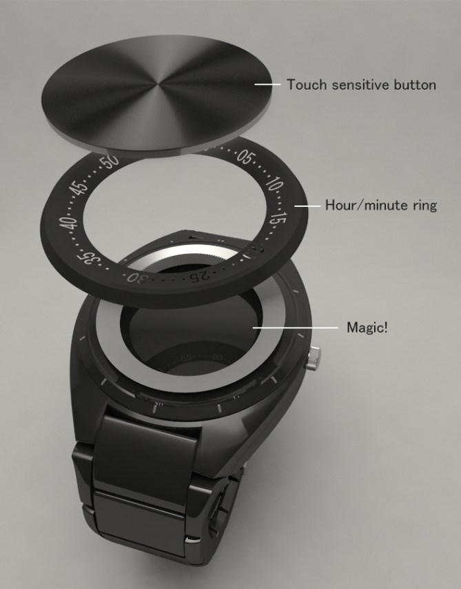
I imagined three leves: two analogue discs, one for minutes (like the hour/minute ring just up here), another one just below the minute ring that covers the third level, the LEDs level, which is static, and so the hours can be showed.
So I imagine 12 LEDs for example, in the position of the hours, covered by two analogue discs, one internal (hours) which reveals only a small angle of light, and one last external, superficial (minutes, wich numbers 00-55 and dots). The touchsensitive button would be just a normal button, with a transparent material around which would pass the light and get that effect.
Visually: http://imgur.com/zPNS4UM
I repeat, I have no idea of mechanisms. I don’t know if my vision could be made in reality. Just an idea.
Thanks again for the opportunity and encouragement. 🙂
LikeLike
That is smart thinking! It means it could be purely analogue.
If my brain is working correctly this morning ~ The hour disc (which masks the LED) would be a regular hour hand. The minute dial would need some special movement because; a) it rotates anti-clockwise, b) it does not follow a fixed hourly rotation (e.g.; the 00 marker does not return to the 12 o’clock position each hour)
It would rotate fully every 65 minutes i believe, so then i think each hour the 00 lines up with 1 o’clock, then 2, then 3.
If it can be done it would be a really unique watch!
LikeLike
Exactly! Although ti would not rotate fuly every 65 but 55 minutes, huh?
12 o’clock, next time we’ll see the 00 will be when it lines up with 1 o’clock, so it doesn’t fully rotate their 60 minutes, but 55 (if it moves from right to left).
As I see it, it would be two analogue discs: the hour one (normal movement) and the minute one (which rotates anti-clockwise and even slower than normal).
😀
LikeLike
Simple Great … Vivid … Love of Someone … 🙂
LikeLike
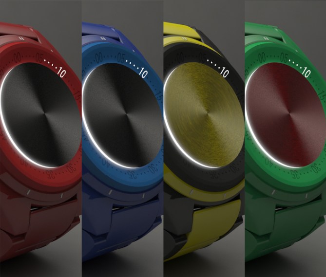
I really like the two-tone backlight, it feels very fresh! The time telling, while not exactly cryptic perhaps, is certainly unusual enough without being obscure. As for colour choices, you spoil us… The black and yellow looks interesting; the distribution of the colours works very well, I think.
I too have a thing for minimalism (to a point) and the understated, and this hits the sweet spot. Best of luck, I hope it makes it to production. After ‘Relativity’, of course…=)
PS. The ‘Magic!’ callout in the exploded view made me chuckle. =)
LikeLike
Cool! 5y
LikeLike
I havent got much to add that hasent already been said really. Great looking concept, beautiful graphics, great presentation! Hopefully there is a way to get around the technical stumbling blocks. One way would to be to make it digital and have an LCD display under the centre disc and bezel, the bezel could be the same shape but transparent. The digits and dots would then be made of dot matrix segments. I wont say too much more as I have a concept called “Perimeter” that has a similar ethos. 5/Y Best of luck 😀
LikeLike
beautiful watch and first class presentation 5y. I missed however what the nob on the side does,if it could be removed it would be a much cleaner look.
LikeLike
The nob on the side is because I have designed it as an analog wacth, not digital, so how do you change the time else?
Thanks anyways! 🙂
LikeLike
Nice presentation, and I like the indirect lighting from the dial. So if I understand correctly, there will always be 4 dots shown, and they move from the left of the x5 minutes to the right?
LikeLike
Hi Xian!
There will be 4 dots and a number, right. But they moves from right to left. It’s a more natural movement to me.
Thanks for the comment! 🙂
LikeLike
Very very cooool! It’s really amazing, awesome. I’ve liked! When can I buy it? Congratulations. Regards.
LikeLike
Wow very cool way to tell the time. Yes to the touch sensitive button. Yes to the rotating minute ring. And definitely Yes to the combination of hours and minutes into one thing. Also very nice usage of the ring 🙂 Good luck with this clever idea!
LikeLike
Definitely Yes to your comment Sam! 🙂
Thank you so mach for the comment!
LikeLike
This is a beautiful watch, the design and the logic are brilliant. When can we have it! 🙂
LikeLike
This looks great. For me, the black ring is best, as I wouldn’t want to see any numbers/dots other than those lit up.
I hope this gets produced – it is certainly very different to the other TF watches, so should get added to their collection. I would certainly go for it.
Good luck and 5*/Y.
LikeLike
Maybe a LCD version would fit better in TF’s watches catalogue. Even an e-paper version. But certainly thereby it would lose its analogue essence.
Anyways IMO this version would looks great next to the other watches! Diversity is strenght! 😀
Thanks for the comment!
LikeLike
It’s really amazing. Great …
LikeLike
Are there any plans of selling this watch?
LikeLike
I better ask: When will this watch go on sale? 🙂
LikeLike
I like the idea but I’m not sure about having the digits upside-down half the time.
I’m also conflicted with their position: I would prefer if they would stay aligned with the markers, but it would require a jump-hour movement to move once every 5 minutes. But moving at every minute is better, if you look at it for a long time. (if not, it doesn’t matter)
I prefer a black disk. I prefer alternating with colors vs 1 colors. I like the black/gray with red lights. (2nd from left in the 2nd last pic) Or replace the gray with dark red.
LikeLike
About your doubts:
The greatest confusion in my opinion this watch could create is confuse 05 with 50.
As analogic watch, the “center of the group of number and four dots” have an constant movement as the hands in a clock. (I think it’s more attractive a constant movement than the jump-hour movemnet.)
So, as example, at 6:05 (to 6:09) the number 05 and its consequents dots will be more next to the 6th hour than the 7th, in which case it would be 6:50 (to 6:54). At 6:30, the number 30 will be between the 6th and 7th hours.
About the colors, I must admit I have no idea about choose a really attractive color range. I try show you there’s posibilities, but TF will have the last word always 🙂
Thanks for the comment!
LikeLike