Design submitted by Matt from Canada.
Matt says: One day I saw a crown on a box. It was made of 21 slightly vertical lines and 5 unconnected dots.
I’ve choose to used the crown for the hours, with a 24H format. I’ve added 2 segments to it and I’ve replaced the unconnected dots by connected rectangles & used them as markers, at 1, 6, 12, 18 & 23.
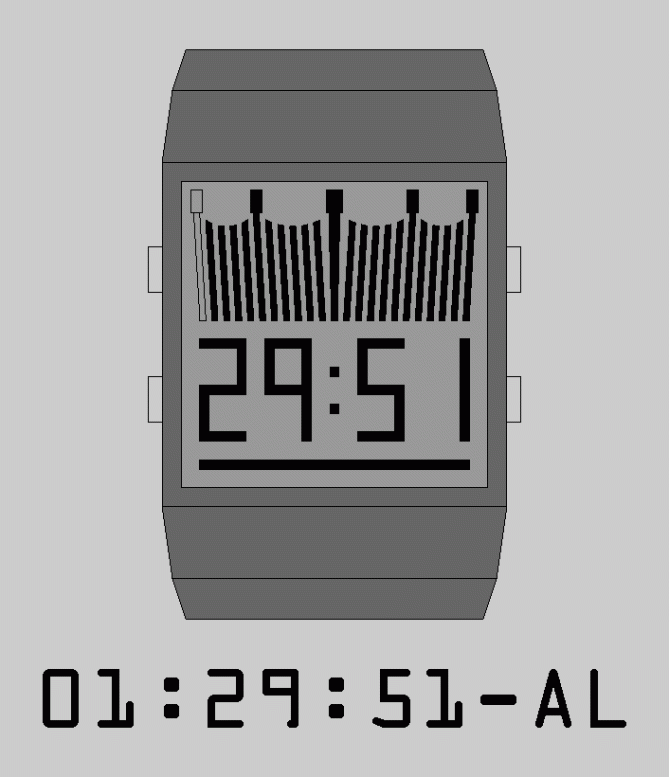
I choose to use digits, placed under the crown, for the minute/month & second/date. They are full for a better look but can be 7 segments.
I’ve added a straight horizontal bar under the digits, for the alarm indicator. When OFF, there’s no outlines.
The LED’s digits are 7 segments placed under a single piece of transparent material. The result is that you don’t see the lines between the segments and this keep the same look as the full LCD digits.
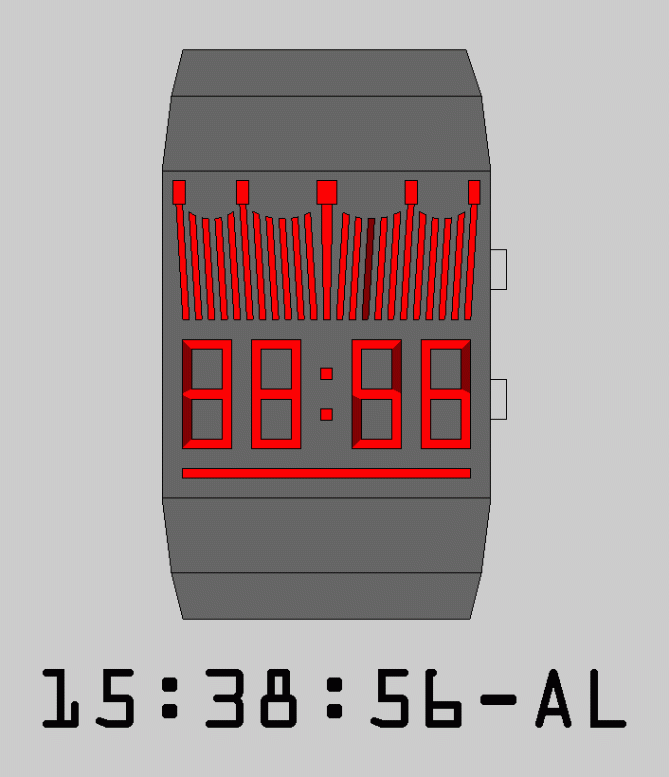
To tell the time, you simply need to check which light is OFF, or ON, for the hour. All ON/OFF = 00. Then, use the 2 digits at the left for the minute and finish with the 2 digits at the right for the second.
To tell the date, the minute are replaced by the month and the second by the date. When shown, the hour is at 00, or doesn’t change, and the 2 dots between the digits set are OFF.
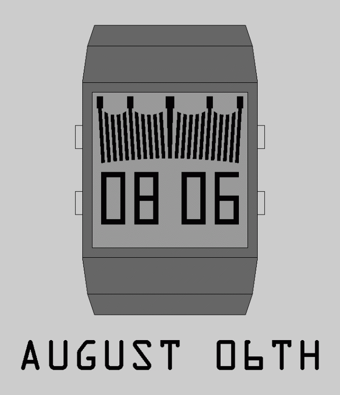
4 things make it stand out:
-The crown logo, which takes half the space.
-Using the 24 hour format on a horizontal scale.
-Not using the colon/double dots as part of the date indicator.
-Replacing the minute and second with month and date, instead of hour and minute, and having the hour at 00.
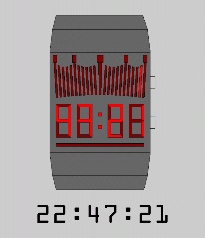
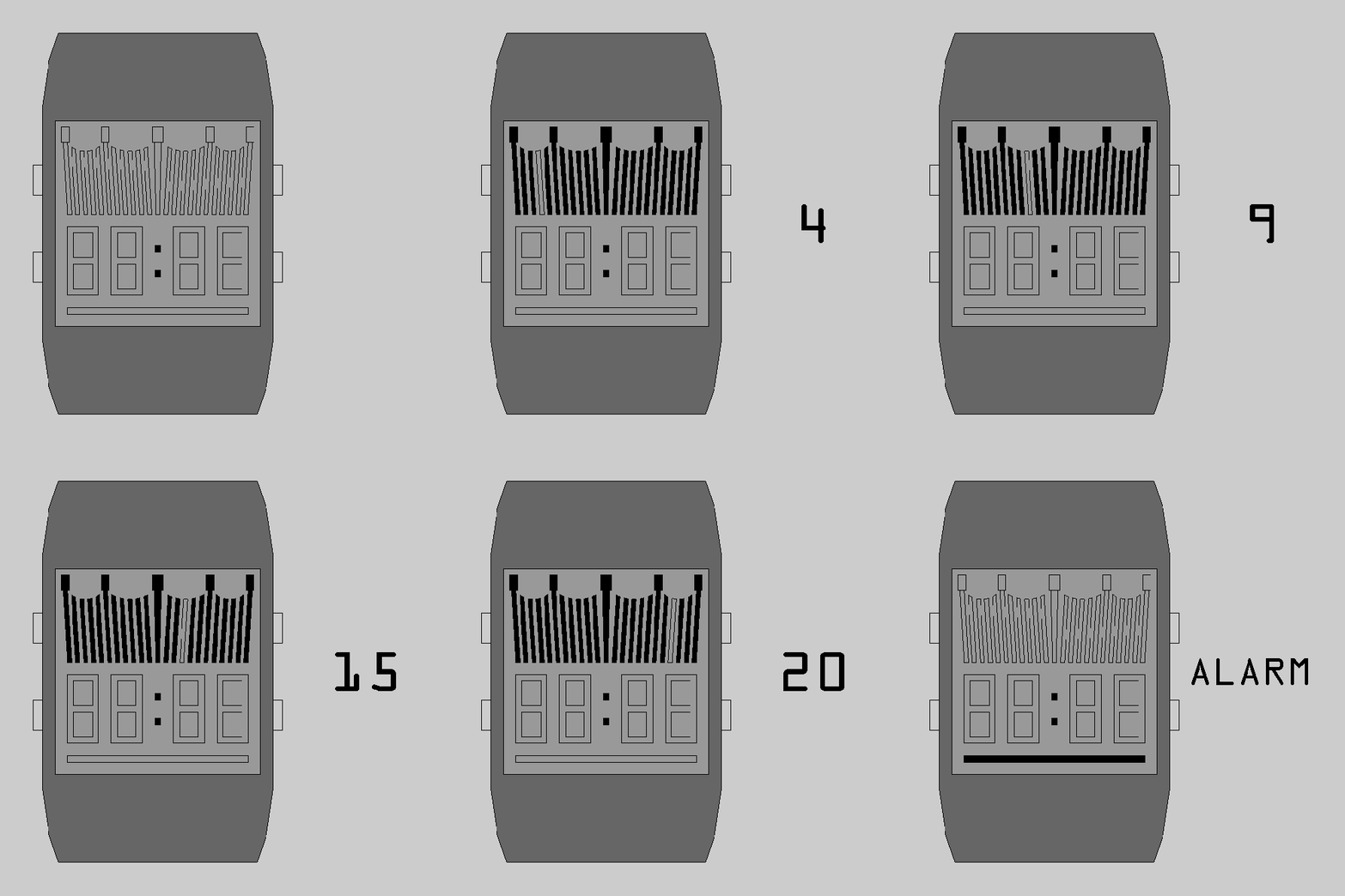


The illustrations are quite simple so for some people it might be hard to imagine the potential, however I think there is something here that could be very striking, funky, fashionable with a little design flair added.
The crown is rather nice. Not only does it give some bold iconography, but it lends itself well as a gauge to measure time.
I am conflicted about the crown having 24hrs. On one hand I like the fact that we are forced to think in 24hrs (depending on where you live, you might find this easy or hard) on the other hand 12hrs may be enough & allow more room for designing a stylised crown.
LikeLike
TY for your comments.
For the rendering, I’m using SKUP & finish the pictures with MS Paint because they are free & don’t take a powerful computer. The slideshow is assemble with Microsoft GIF Animator, another free software.
Because of the crown, I choose to not go with 3D pictures. I wasn’t sure about the bottom part, so I did 2 types.
I’ve just realized that vertical lines, aligned with the rectangle markers, could be added on the band. (maybe in the same color as the lights/segments)
Choosing 24 instead of 12 is a challenge since what a customer use is based on his “culture”/where he live. Digital and some analog watches can be switched between 12 & 24, but I don’t think it would be feasible here. I choose 24 to help with the positioning of the markers, which are integrated to the time and not simply engraved in the bezel. If made with the 12hrs format, the position/number of markers would change. & it will require finding an idea/position for the PM indicators. (maybe cutting the alarm indicator in 2. Or adding a curved segment at the base of the crown)
LikeLike
Thank you to Tokyoflash Japan Product Design Studio encourage everyone, it’s nice.
LikeLike
This is a nice idea, I quite like the fact it’s 24hr but I can imagine it working equally well in 12hr. Like Toky I think the crown shape should be made more of a stylised feature. Nice concept with much potential, best of luck Makko! 😀
LikeLike
I made the \, /// & ( cut-out between 2 rectangles and under the crown with SKUP. I might have found a new position for the rectangles on the 12H format:
Use 11 long bars & have the rectangles at 1, 3, 6, 9 & 11 instead of 1, 6, 12, 18 & 23, or at 3, 6 & 9. Also the “All ON/OFF = 00” would = 12. Or add a base to the curved based crown. I would split the alarm indicator in 2, under the colon/double dots.
What do you think?
LikeLike
Hi Matt, it is true to draw in 3D the comprehension of the project facilitates and flatters the eye for the vote. There exists the freeware “Blender”, for the 3D, even if it is complicated a little, there are many tutorials to learn it.
I like the reflexion of Matt in general and I vote Oui and 5 stars.
LikeLike
3D mean more work. The band & the crown, with the obligation of having 2 vertical lines touching. Depending on the project, I either do 3D or not. Except for animations, which are always viewed from top.
LikeLike
I tried Blender a while ago. I was a bit complex to use/learn so I choose to stick with SKUP/paint. (If I could, I would buy/use KeyShot)
LikeLike
OK Matt, I was talking about 3D in general, not necessarily for the project presented here.
Keyshot is a software “rendering” very easy to use and with HDRI Light Studio Pro, for the reflections of light, you can do wonders. I have neither the one nor the other, unfortunately.
I personally use Shark FX 8.0, because it also works on Mac, it is not free but not too expensive and easy to use.
LikeLike
Hi Makkovik, I too use Sketchup for my designs and in order to get the 3D renderings you see on mine (Justin from UK…see my previous borderline watch) I go to Sketchup extension warehouse and download the free “indigo renderer”. It has amazing results!! Try it.
LikeLike
Interesting idea! I agree with TF that there’s potential here… It’d be interesting to see how the crown and digits could be more integrated, for example.
On the subject of software, there’s a free bit of kit by the name of GIMP which works quite well for image processing, sort of a Photoshop light… I wanted to throw that out there since it hurts my illustrator sensibilities when I hear of people using MS Paint…=7
Good luck!
LikeLike
I tried GIMP a while ago. It was bit too complex. On the other hand, I have a lot of experience with MS paint. & I’m using the XP version not 7. I don’t like all the change they made. (mainly the new layout)
LikeLike
Others points about why I use Paint is that I use it to fix the proportions (like the position/size of the buttons), the sides of the band, change the colors and add the texts. In a few words: Touch-ups.
But yes the LED’s digits would have been made about .5mm under the case.
LikeLike
If it works for you and does what you need then I’m not going to stop you of course. I just have a certain antipathy towards it as it’s not very refined.
In any case, the style of images shouldn’t matter, though unfortunately it does have an impact. We’ll have to try to assess the underlying idea and basic look, and not be wowed by shiny renders, I think. Also, I think it’s a good thing that not all submissions have the same kind of images; seeing 2D or hand drawn images mixed with CAD and 3D makes the blog more interesting as a whole. Anyway, just my $0.02.
LikeLike
I’m working on another model. I was suppose to use 8 pictures viewed from top, but I realized that I can add 2-3 3D pics. I think I should always do that. But, on a previously featured models, I remember having to put move space between 2 segments to be able to do 3D pictures & someone wrote that they where too far apart/too small. *
Like I said to Patrick: I don’t like when 2 segments become 1. And it’s more work since you need to make multiple SKUP files vs copy the original paint file & adapt which segments are ON/OFF. And, in SKUP, it’s hard to always get the same angle for the 3D pictures.
And, in this model, there’s nothing special about the band. (vs, ie: my “speedometer”: https://www.facebook.com/media/set/?set=a.645991298790637.1073741851.316409365082167&type=3 The 5-parts band was long to do but was worth it!) It could be made like the “Kisai Keisan Black LED Watch” (in the “watch museum” section)
I used to always do a 3-parts band but it’s a a few extra hours/days of work. (sometimes after multiple fails) Now I choose accordingly to the model I do.
LikeLike
*= https://www.facebook.com/media/set/?set=a.499539460102489.1073741826.316409365082167&type=3
LikeLike
TY for all your suggestions regarding the concept/idea. TY TF to have taken the time to comment almost immediately after posting it.
I’ve redone it based on them. It is now completed & I’ve sent it earlier today.
LikeLike