Design submitted by Peter from the UK.
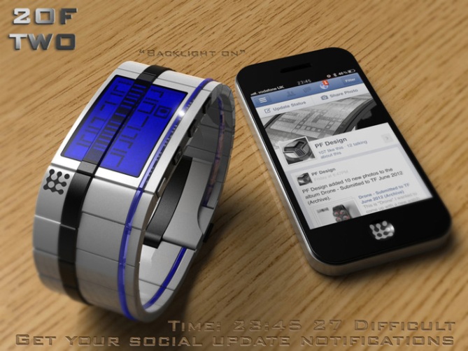
Peter says: The name is “Borgy” in origin, as the watch will be linked to a smart phone creating a small collective. The phone will be “1 of TWO”
The basic premise for my design is that the borders of the icons tell the time in an always-on column on the display. This column is easily seen as it is displayed inverted to the rest of the display and continues a contrasting stripe that runs through the strap. (I have used a metallic LCD with black background for my examples. This used in conjunction will coloured glass gives a nice contrast)
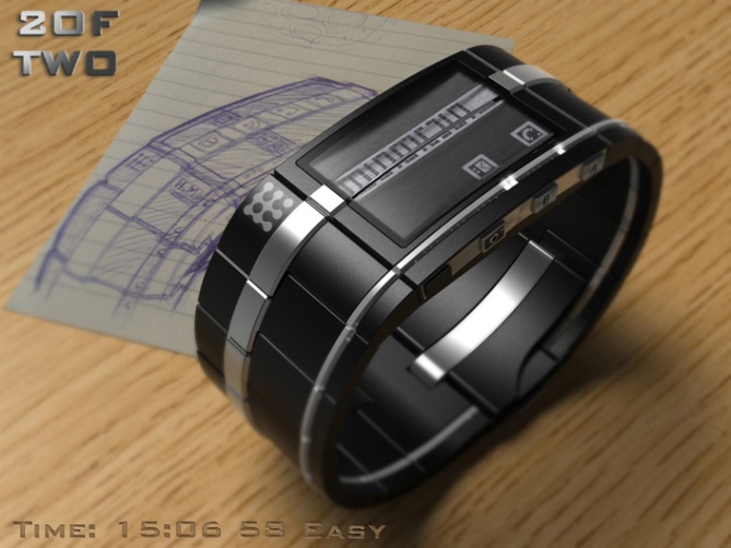

The date can be viewed in the same manner by pressing the “B” button in time telling mode. The time and date can be shown in three styles:
“Easy” which uses the borders and centres of icons to show the time in traditional digits.
“Medium” which is the same as easy mode minus the centres of the icons. This is more cryptic than the easy mode and can be used when navigating through the icons in other modes.
“Difficult” this mode uses three icon rows, the main time telling row and the borders of the rows either side. This is the most cryptic and striking of the three.
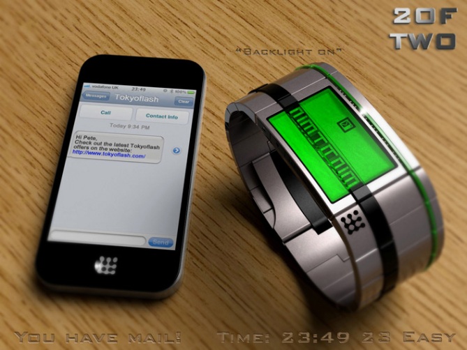
When a notification arrives the appropriate icon is highlighted on the far right of the display and the icon’s dots flash along with LEDs in a transparent strip on the right-hand side of the watch (as well as the vibration and audio alert etc)
The notification icons are hidden when not in use as a default but the wearer would have the option of showing these icons always on also.
When the notification arrives the row perpendicular to the notification icon can be highlighted, this could be manually done or automatically (optional). The row would have all the appropriate icons related to that main icon (e.g if the phone is ringing the phone call icon is highlighted along with the options icons: end call, silence etc) This is not dissimilar to the OS on the Sony PSP. The icon currently selected is inverted to contrast it from the others in that row.
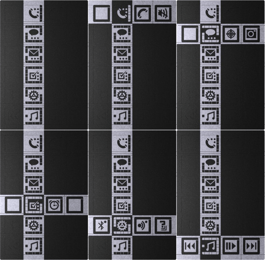


When the row is highlighted be-it automatically or manually the wearer can scroll through and activate the options with the “A” and “B” button.
When the call is over the LEDs would stop flashing continuously and flash every “x” mins there after until cleared via the watch or phone.
The icon row can be scrolled through at any time by the wearer using the “A” and “B” buttons.
Some of the rows include icons that can be activated, these icons have dots that are displayed when the feature is turned on. To turn one of these features on or off the “A” button is held on when that icon is highlighted. The LEDs on the right hand side could flash or progressively light up to show that a feature is “loading” or “being activated”. Pressing the “B” allows normal navigation to resume.

The music and camera controls can be accessed via either the on screen icons using the “A” and “B” buttons or the physical buttons on the sides of the watch.
When navigating through the icons the time can be shown or hidden depending on the wearers preference. This layout has spare icons which could be used for extra functions in the future.
The watch includes a backlight which could be set to come on when notifications arrive or when the wearer presses the camera button when not in camera mode.
This design includes a capped usb charging port on the right hand side of the watch, next to the camera button.

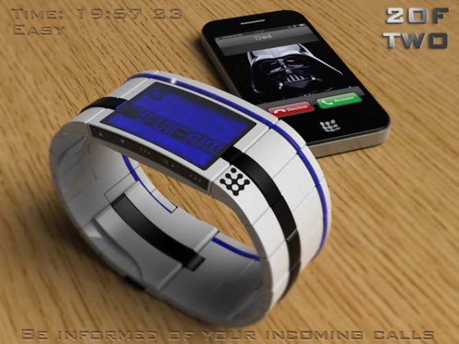


Damn, Pete. I’m giving you 5* on effort alone! You modeled an iPhone? How are you making all these textures? You’re a MADMAN. And Darth is your father? Noooooooooooooooooooooooo nooooooooooooooooooooooooooooo
LikeLike
Haha thanks! Yeah I did spend a little longer on this one than my usual submission. Cheers for noticing! Yeah I was hoping my daddy Darth would cool me Luke like in the film. Sadly he decided on Jabba the Pete! lol
LikeLike
Cheers TF for adding this design to the blog! 😀
LikeLike
Its late…im off to bed, but first i have to comment on how awesome this design is. Awesome stuff…your an artistic genius man!! 5* and “take my money”!!
Now….sleepy time…
LikeLike
Cheers for the support and the high five! I will happily shut and take your money! 😀
LikeLike
Yes, oui, da, si, hai, ja, yo for many reasons!
+ the lines around the wrist: the big one and the colored one… so damn cool!
+ the LEDs in the colored line
+ LED/LCD combination
+ the side buttons: they look high quality
+ different modes: diversion ftw
+ the medium numbers look cool 😉
+ nice three color/material combinations
+ nice columns-and-rows display function: well thought through
+ very nicely presented, really helpful video
+ nice kisai phone hehe
– have to stop drooling now cos work
oh man Pete, this is really close to being feasable I think. 5*
LikeLike
Thanks a lot Sam, Yeah I put a lot of thought into making it as feasible and intuative as possible while trying to still keep it visually interesting. Only time and technology will tell if it is worthy of reality. Cheers for the mightly fine feedback sir! 😀
LikeLike
Resistance is futile…=) Great work Pete, getting all those icons in there without it looking ridiculous…=) and the styling is equally brilliant. Other than that I can’t really think of anything that hasn’t already been said.
I am a bit surprised that the franchise-mixing (Trek and Star Wars) hasn’t been commented on yet, though… In my experience it usually gets the nerds up in arms. =) Must be the pure awesome of the concept that distracts them, no doubt…
LikeLike
Haha yeah I have kinda given out enough ammo for all out geek war! Fingers crossed like you say there is enough conntent to keep them distracted! Cheers for the supoort sir! 😀
LikeLike
the sketch OoO
LikeLike
yes I was sad enough to model a piece of paper with a curled up end and add a photo of the original hand drawn sketch lol 😀
LikeLike
Sad, or genius? Genius, definately, though in my experience the two often overlap…=)
LikeLike
Very, very nice work Pete, although I’m not a fan of “smart” watches.
What control of 3D, it seems that this watch is already on sale.
Yes with full stars everywhere.
LikeLike
Thanks a lot Patrick, i’m glad you like the images even tho smart watches are not your thing. Cheers for the support sir! 😀
LikeLike
You’ve put so much work into this one, it looks like the finished product. The whole package seems to be there – I’m very impressed. Further convinces me that any poor quality, 2D, non-animated entry from me would be pointless (ah, well).
I don’t go for smartwatches, but think this design is amazing. All 3 time styles look good – when the smart features are off, the watch would look great to me (but I’d be paying for a lot of unused features, so probably wouldn’t go for it).
Although probably not for me, it is a fantastic design, so 5* and good luck.
LikeLike
Thanks for the great feedback Nev! I’m glad you appreciate it even tho smart watches aren’t your bag.
I do think however that you shouldn’t be put off submitting your own ideas whatever the method you would use.
2D sketches are just as valid and quite often in my opinion more dynamic. Sometimes CAD images are too clinical and lose some of the concepts energy. I good sketch is worth more than any fancy rendering in my book.
Also I bet there are many blog regulars that would happily help you out with the presentation (a coop if you like) if the idea is a good one. Never say never Nev! 😉
LikeLike
I approve this message! =)
LikeLike
Not a fan of smart anything, but you get 5y for the design alone – outstanding!
LikeLike
I’m sure you are a fan of smart Ladies if nothing else! Cheers for liking the design even tho smart watches are not for you! 😀
LikeLike
No, I prefer them clueless…it’s easier! 😀
LikeLike
This design reflects the growing trend / desire for smart wrist watch concept. It updates the wearer to what going on in their social Collective.
LikeLike
Cheers for the insight and the support Andrew! 😀
LikeLike
I’m not a fan of smart watches. + I prefer texts over icons. I like the overall look, specially when the time is displayed.
LikeLike
Cheers for the feedback Makko! 😀
LikeLike
Time runs out for this one soon, so will quickly wrap things up.
Big thanks goes to TF for posting this design here and everyone who took the time to vote, comment and share.
Cheers everyone!
Pete from the UK 🙂
LikeLike