Design submitted by Sam from Germany.
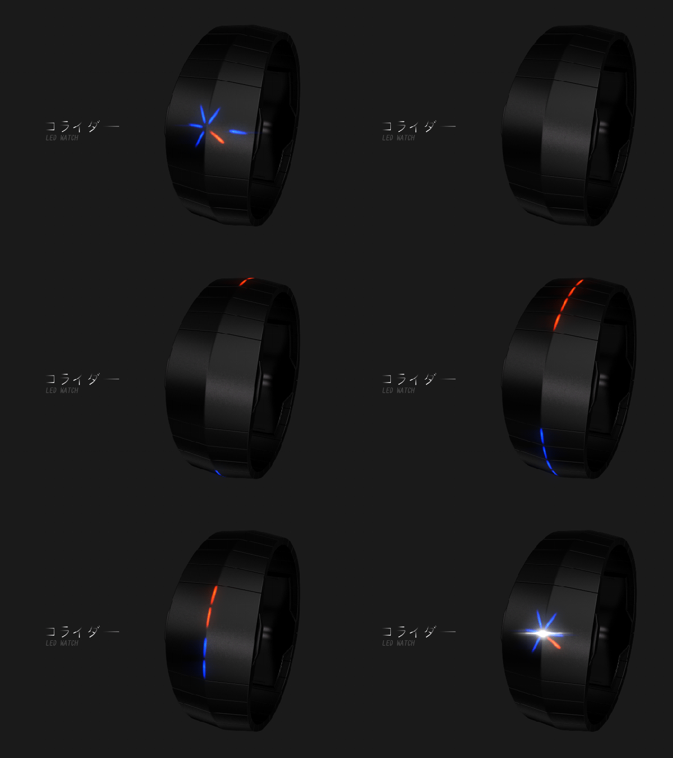
Sam says: The inspiration for this watch is a particle collider. The basic idea is to have two different types of particles coming from the straps and colliding in the case and explode in a pattern that tells the time.

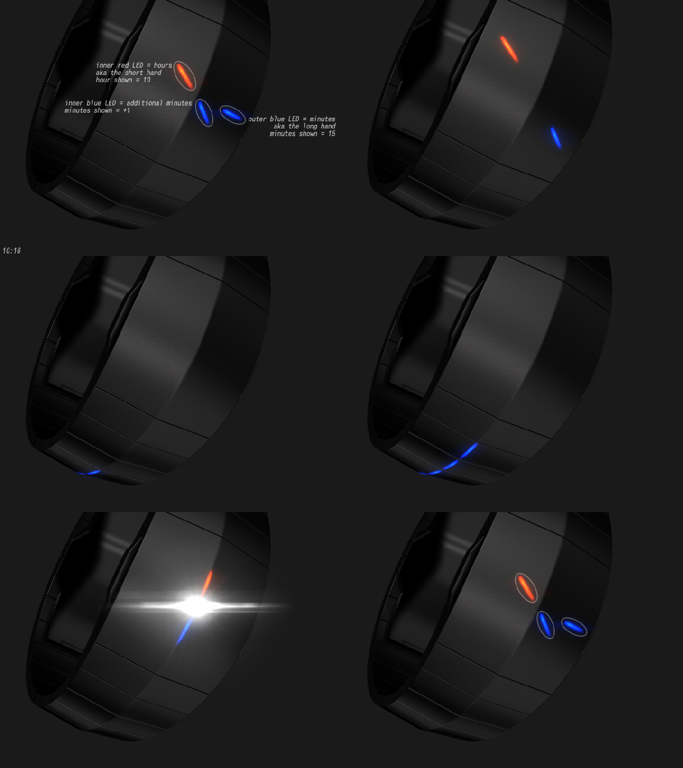
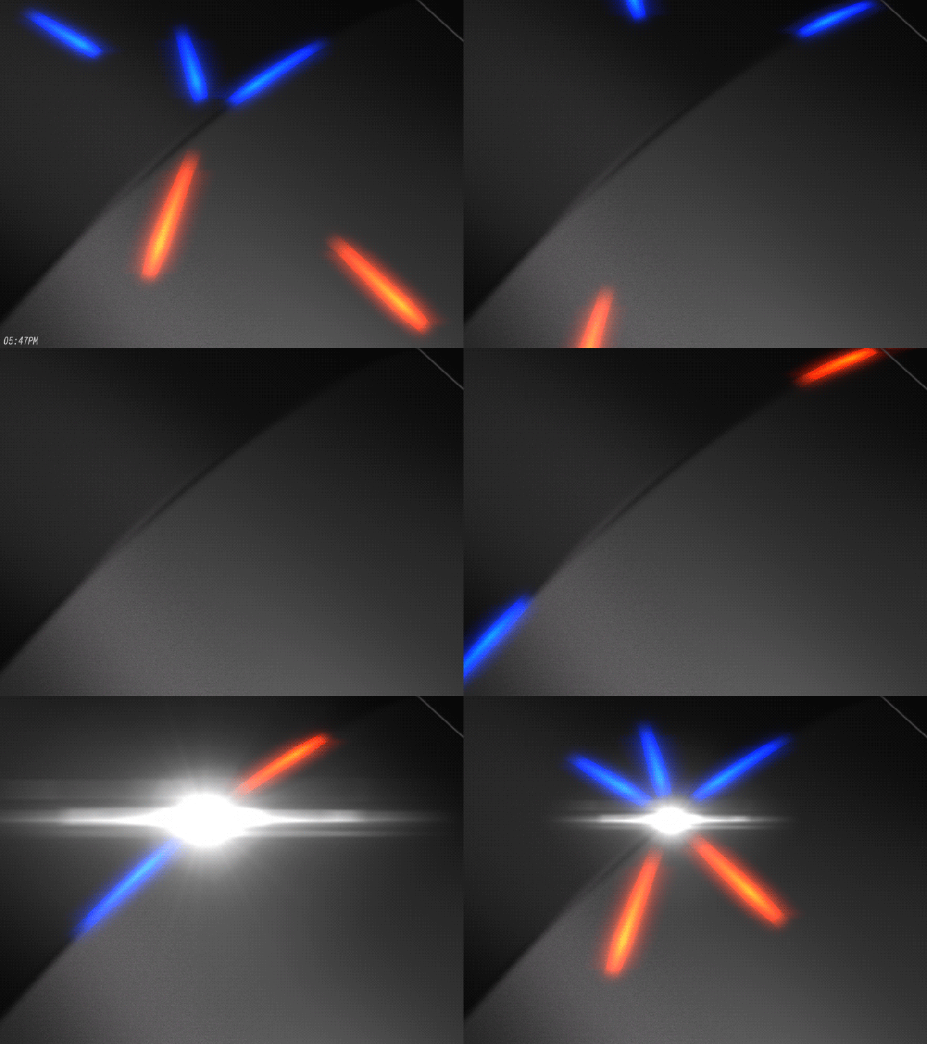
This pattern is based on an analog watch display and uses LEDs. The red ones tell the hours. On an analog watch the hour hand is shorter, so the important LED here is close to the center. An additional red LED which is further away from the center means it is PM. So all red LEDs belong to the hours. All blue ones belong to the minutes. On an analog watch the minute hand is longer, so the first LED to check for the minutes is further away from the center. This LED tells the minute in five minute increments. There are up to four additional blue LEDs closer to the center that have to be counted and added to the first minute value. That’s how the time telling works. The scatter pattern looks confusing at first, so keep the length of the hour hands in mind for the main LEDs and then look at the remaining ones. There is a white LED in the center, that flashes when both particles collide.


The blue and red LEDs will never overlap so there won’t be a magenta light. That would have added more diversion but would have been harder to decrypt. The main LEDs (hours, five minute increments) run on separate circles, as well as the secondary LEDs. The secondary LEDs are always placed on the opposite position of the main LED on the same circle. The most difficult part is making each LED position capable of showing both colors, but that has already be done (see the epic Adjust watch!).

There have to be two buttons pressed to emit the particles. I like this because it reminds me of those two keys that have to be turned simultaneously when things get serious. There is this edge running around the watch, always reminding the wearer of the particle trajectories and just making the watch look cool when being of. The center LED has to be as bright as possible to give a nice wow effect of the collision.
So that is the Collider LED watch concept.


I want this! Love it!
LikeLike
Thank you Alan for telling!
LikeLike
Seriously, is there a way for me to get notified of this is ever made?
I would buy this in a heart beat.
LikeLike
Wow you again 🙂 Yes you can click my yellow name. That will guide you to my little facebook page. There and of course on Tokyoflash’s page and maybe also here in the blog you will get the announcement. There’s a big IF though so let’s cross fingers.
LikeLike
Stop talking. Here’s cash
LikeLike
Directly guiding this to Tokyoflash ^^ Thanks for the comment Michael!
LikeLike
Sorry, Sam…not really my cuppa…
LikeLike
Don’t be sorry. Diversity is the spice of life 🙂
LikeLike
There are good watch concepts on this blog. There are some pretty great concepts. I peruse and admire both, but only occasionally vote on or truly desire for myself.
Then there are the incredible ones that I’d drop a chunk of my paycheck on in an instant if they were real.
Please make this real.
P.S. My only other suggestions: The PM indicator seems arbitrary, so I think it looks better without (most standard 12-hour watches don’t bother); also, in addition to the blue/red, a blue/green or cyan/yellow variant would be awesome.
LikeLike
Woah, nice one sir. Thanks so far… ok now to the P.S. part o.o
Nah, not arbitrary. You can see it like the additional minutes indicators, just that it’s +12h. If not necessary, ok, but here in the blog is often a need for pm-ness. If you set your watch, it’s important to know the exact time so the date doesn’t change at noon. A big fat YES to the color variations. I just kept it uniform in the images just to let the people get used to the color meaning. Too many colors would have confused more than the concept already does. But yeah, blue/green would be my 2nd favorite.
LikeLike
I only meant arbitrary as in its orientation when it displays. It seems to be opposing the primary minute marker, but I imagine this wouldn’t work at a time where the hour and minute are opposing (e.g. 12:30 PM, with the minute at 6 and the hour at 12, and presumably the PM indicator at 12 as well–which breaks the “longest hand” detail).
As much as few other people would notice, my biggest issue with abstract watch concepts is inconsistency in the display. I always notice, and always want their to be a strict set of rules for drawing the elements that make up the time display.
An example in this watch is the +minutes markers: Do they always start at the next (+1) clockwise position (e.g. 31 minutes is in the 6 position [long] + the 7 position [short])? Then +2 minutes in +2 clockwise positions from the primary. Maybe you’d have +3 minutes at the primary position (+0 offset), and then +4 minutes at the -1 clockwise position. That would be a strict set of rules, but this isn’t followed in your mock-up images.
Still loving the concept, and I wish you the best in bringing this to fruition! Just thought I’d share some food for thought for people like myself who can be both artsy and analytical.
Cheers!
LikeLike
Whew reading time ^^
The “long” hand is only shown as a far away LED, it’s not really two LEDs long. So two LEDs in a line don’t bite. If it’s 12:30 pm, there the outer red LED has to be seen as additional information to the “short” hour hand.
The rule is: The hour is the red inner LED. The five-minute-increment ist the outer blue LED. Additional information of each LED is shown in the same color, on the other lane and on the opposite position of what’s already shown in that lane to never have superpositions. So the additional minutes are shown on the inner lane in blue, never touching the red hours, and the additional hour information (aka pm indicator) is shown on the outer lane in red, never touching the five-minute-increment.
The minute markers are 1,2,3 or four, placed symmetrically on the opposite position of the hour hand, using it as symmetry axis. Where the additional minutes are is actually not important if they just follow these rules: inner lane, never touch the hour hand. The symmetry rule is just for fun, to give the display some sort of order in the chaos.
I agree with the issue on consistency in abstract watches. I struggled a while here. Now I have these two lanes that have to be recalled and the two colors. The position of only two LEDs is important (hour, five-minute-increment), the rest is counting (additional minutes) or just realizing (pm indicator).
Ok, writing down the rules makes them look difficult maybe. I hope this clarifies some things.
A big thanks for thinking this through! This is the end of a chain of thoughts and if there is a flaw, it’s always helpful to see which link of the chain is the weakest.
Choo choo ^^
LikeLike
Freakishly stylish (as usual I might add), charmingly low-res and with a well-realized physics theme? count me in!
I can’t really fault this one, to be honest, but if I really dig deep then adding up individual LEDs isn’t my favourite… But then the concept wouldn’t work any other way, so…=) I like the PM indicator (am I right in thinking it always appears opposite the 5-minute marker?), even if it’s not strictly necessary it does add some more red and a bit of interest, at least half the day… Best of luck Sam!
LikeLike
Cool, thank you Anders!!
Yeah, the low-res is fun because low-res can still cause fun these days. Sharing your thoughts about adding and the actual necessity (I hope that’s a word) in the display topic. Yes, the PM indicator is on the opposite position of the 5-minute marker. So they never meet. It’s also coming from a balancing idea which lies inside the scatter pattern… some sort of symmetry when particles collide and depart. You describe my thoughs about the additional red of the PM indicator. Nice 🙂
LikeLike
Hi Sam, very pretty looking watch with very funky animations. The time telling is even easy enough for me to read! 😉 my only issue and this is maybe because I am familiar with XtalIV is that this feels like it should be a second time telling mode of xtalIV rather than a separate watch in its own right. Combine the two and you have an all singing all dancing watch in my mind (and make it carbon fibre too!) much potential here there be ummmm! (Yoda like voice needed there) 😀
LikeLike
Had to search xtalIV to refresh my memory–although this latest concept is a cool idea, I did love xtalIV for the glyphs. What ever happened to that concept? Scored 4.9 out of 5.0!
LikeLike
Ow man, if it’s easy enough for you, it’s a good sign 😉 I mean you guys cover a wide range of interests/abilities and if you’re in the boat, woop woop. Nah, 2nd time telling mode to XtalV wouldn’t work. Ok 2in1 is cool but it’s two different themes. I’m a fan of this vertical ridge. I might use it more often in future concept I believe. Thanks a cluster for your comment Pete!!
Hi Chris! I have no idea 🙂 Maybe the XtalV is too close to the Xtal. I wouldn’t mind it crypticizing on my wrist though. Let’s see what the future brinx.
LikeLike
Hi Sam, a watch to be proposed to the employees of the CERN.
Superb animation, insane idea, what to say moreover?
5*/Y.
LikeLike
Oh the CERN people would love it I think. Or they say, it’s not physically correct 😀 Merci mille fois pour tes mots!
LikeLike
Wow I think that the idea behind this design / concept is amazing hopefully it will accelerate it in the rating / in it’s production in to reality.
LikeLike
Thank you Mr. Joy!
LikeLike
Awesome concept Sam excellent stuff!! Nice and simple and looks great too. It’ll be a difficult job for TF to build with the LEDs around the strap but if possible it will be so cool. Not sure about needing the AM/PM indicator though, kinda unnecessary if you ask me because if you don’t know if it’s morning or night…you got issues lol.
I might be wrong but one of the animations looks like it should read 2:48 instead of 2:46 as there are 3 blue 1xMin lines. Sorry to be picky.
Hope this gets made one day!! 5*Y
LikeLike
Picky is good!! Finding errors shows me, you understand it very well now. It has to be 2:48 indeed 🙂
I’m also one of those who know when it’s morning or evening. But if you are held captive in a basement, next to sawing your foot off to get free is knowing if you do it am or pm 😀 It’s also nice to not only have one orange LED there. Taste shmaste 😉
Sharing these hopes, knowing, it would be quite a challenge. Thank you Pelly!
LikeLike
I like the little *pop* after the time displays. Fun stuff, Sam!
LikeLike
Yay! Yeah, I wanted the time display to be a frozen frame of the collision. Actually the collision occurs and you don’t see anything. But then this particular frame gets frozen in time and you can analyze it. Once you’re done, the particle fraction proceed until leaving spectator perception (i made that up, it’s a term now, i’m so creative) so that’s basically two frames but enough to give that “pop” impression. Fuuun!
LikeLike
Another fantastic design Sam.
If TF can’t have the LEDs coming round the strap, maybe the case could be a little larger and they could start beyond the main display. ‘Seven’ had part of the time (individual minutes) shown part way around the wrist, so this could be done here too.
This is another one of your designs that should get made, as close to the original as possible. My collection is filling with watches based on your designs – doesn’t look like that’s going to stop! Has to be 5*/Y.
LikeLike
Larger case… that’s a good idea. It would suffice to cover like 33% to 50% of the wrist in the end. the rest would be a big bonus. An expensive and actually not realllly necessary bonus. But hey, function follows form 😉
Oh Nev, don’t make me blush talking about those watches *^^* It’s nice to know ‘my’ watches are liked out there. Thank you for the support Nev!!
LikeLike
Wow the resonance OoO Thank you all so far for giving me your support and suggestions !!
LikeLike
Hmhm, still in awe. b^^d
LikeLike
Wow … seriously Sam, this is amazing concept watch. Love the collision animation, but not sure if Tokyoflash can actually make it real though, but we’ll keep our fingers crossed.
LikeLike
Thank you Tuvie!! Nice you came by. It’s a design challenge for us hobby designers and also for Tokyoflash 🙂
LikeLike
this is just awesome, i want it NOW!
LikeLike
You words in Tokyoflash’s eyes. I join the choir. Thanks for the comment!
LikeLike
I would absolutely buy this watch! Please make it. 🙂
LikeLike
Thank you for telling! Every opinion counts ^^
LikeLike
I like the simple/sober look. I like the collision animation. It’s a shame that it would be too hard for me to tell the time!
& then, an “Eureka” moment: What about using 3 colors: red = H ; green = 5min & blue = 1min.
Anyway, it’s still a 5*.
LikeLike
Oh you know what? What about red/magenta/blue or green/yellow/red or green/cyan/blue. The middle colors would just be mix colors of the other ones. So if it is possible to have two-colored LEDs, the mix color is a piece of cake. I would have to think about if there is more efficient way to tell the time when mix colors are allowed. Definitely a good idea. Thank you Makk for the cool comment and the support!
LikeLike
I prefer green/cyan/blue & green/yellow/red. I’m glad you like the idea.
LikeLike
As a physicist, words cannot describe the love I have for this watch. I can’t wait for this one to become a reality.
LikeLike
Oh that’s cool Chris! Quite a statement 🙂 Thanks for the encouraging words.
LikeLike