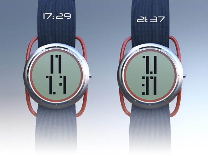
Design submitted by Igor from Serbia.
Igor says: I was inspired by boat windows and the evergreen NATO straps.
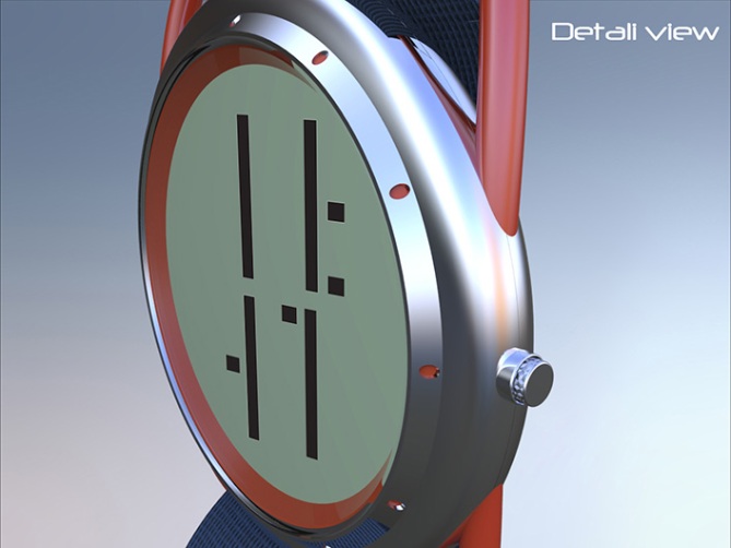
Scuba have a steel case, with an orange lug that goes trough watch case. On bezel are orange markers. The numbers are specialy designed for this model.
A target group would be amateurish water athletes, also young people who like a bit classic watch case and futuristic time telling.
I wanted to create a cool diving LCD watch that can be wearable on any occasion.


Тhank you TokyoFlash for publishing my design!
LikeLike
Nice looking watch with nice cryptic but very simple digits. The digits are very clear considering some of them are not complete (4,6 and 9) The only thing I dont completely understand is that you have complete 8 and 0 so why not the 4,6 and 9? Is it because they dont require two full vertical lines? Either way im nit picking. Very nice work 5/Y best of luck Igor! 😀
LikeLike
Hi Pete, thanks for support. I had problems with this digits, because the concept was dots and full leinght lines. If I added a dots on 4 it would look like 9, and if there was no line at 8 it would look like 3 and so on. You have sharp eye there mate. 😀
LikeLike
This is a superb design. I’m shocked by the ratings. I give it a solid 5y
LikeLike
Thank you dzign555 for support. If you have any objections, please write it. It means much to me, because further improving design.
LikeLike
Good-looking watch! I like the ruggedness and relative simplicity of it, and the strap is cool. =)
One critique I could give is that the numbers (which are very nice, by the way) and the case don’t harmonize very well. The numbers are all blocks, mostly vertical, and the case is basically a circle. The result is that there is a lot of empty space to the right and left of the digits.
Perhaps there could be a cover of some sort, to ‘fill in the gap’, so to speak? It might have a rectangular cut-out for the digits, and be possible to flip up, and there could be buttons, the date or alarm icons underneath.
Of course, this would be pretty similar to Pete’s Trylon concept, but I think it might fit with the sugged diver’s watch esthetics, and subtly reference so-called ‘half hunter’ pocket watches.
Anyway, that’s just my thoughts. Good work, and good luck!
LikeLike
Thank You Anders S for sharing your thoughts. Those are pretty good ideas actualy and I agree with you that there is a lot of empty space. I haven’t seen my design for a log time since I’ve send it and when it was here, I immediately saw problems. Anyway I’m happy for your critic because I will use it and try to make something of it. Thanks for support. Cheers! 😀
LikeLike
I like the design and the digits. The strap attachment looks right for the watch too.
The only thing I struggle with is the spacing of the digits for the hour. Apart from the last image, the digits seem too close together, making it hard to read. A gap, like on the last image, helps a lot.
Definitely worth 5*/Y. Good luck.
LikeLike
Thanks Nev for rating and support. I thought it might be cool to bring all digits close to each other, but after a while, when it got posted on a blog, I saw it was a bad idea. 😦
LikeLike
I like the overall look, specially the strap fixture. The 4, 6 & 9 are cryptic. A gap would be good. Or “2 space wide” # shouldn’t be centralized. IE: The 21:37 look like 7.1:37-the 2 or 7 could be pushed left or right.
I gave 4* & would consider buying one.
LikeLike