Design submitted by Justin from the UK.
Justin says: I wanted to design an E-paper watch as there aren’t many around. I just doodled at work one day and the numbers seemed to appear. I went for a simple yet bold style, one that would fit the E-paper technology best.

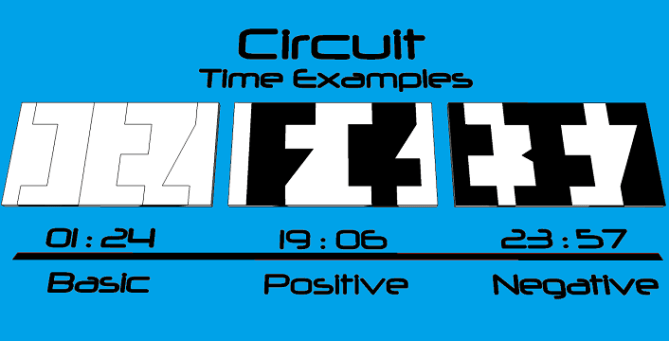
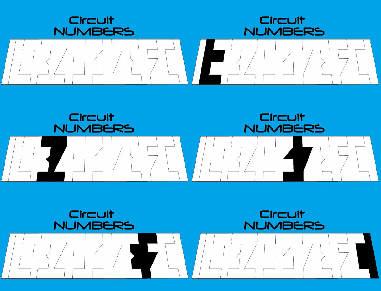
Numbers are drawn across the screen and the gaps are filled in. The simple numbers interlock and form unique shapes which, to the passer-by, look very confusing…yet the numbers are still very similar to regular numbers and very easy to see.

I think this design would suit a lot of people. I can see the technical types liking the circuit style and due to the ease of use I hope its appeal would be far and wide.
The confusing yet simple numbers give off a unique look whilst keeping things in order. The bold black and white watch-face and strap add to the style and I hope the strange shapes given off by the numbers will create mystery and intrigue through simplicity.


Ello again you wonderful watch loving people. It’s the newb again lol.
I hope you like my design and hope you share your thoughts and feelings on it as this is one of my favourites so far and would like to know what you think about it.
A massive thank you to Tokyoflash for posting this design for me and enabling me to share my ideas.
Anyhoo, enough of me…it’s chatter time….
LikeLike
Yyyyyyyep, bought, thumbs up! Nice black-and-white-style with cool all-around-the-wrist-fun and actually easy to read display. Cool numbers! I sketched for such a display but didn’t come up with such cool numbers. Good luck, 5*/YES
LikeLike
Lookin’ good! I like the stark black-white colour scheme, and the way watch and display fit together, with regards to both colour and shape. The digits should suit the display tech beautifully and they give an interesting graphic quality to the whole thing.
Plus, it’s always nice to see something hand-drawn. Sometimes a sort of 3D fatigue sets in, and it’s refreshing to see something else. Makes me want to break out the paper and pencil. Good work!
LikeLike
Wow thanks guys, a couple if great reviews to wake up to!! It means a lot to be coming from you guys too, veterans of this realm!
This one is my fav so far ( submitted another 2 so maybe keep your eyes peeled lol ) and I tried to give great consideration to expenses of production, ease of use to reach a wide consumer, unisex styling etc. basically I put my marketing head on and picked up a pencil.
Glad you like the hand drawn efforts, I was a little sceptical it would be appreciated here what with such amazing 3D renderings on offer……happily proved wrong. : )
LikeLike
Cool! 5y
LikeLike
Looks very cool Pelly! Very unique look and cryptic digits, me likey! I think I would need a easy/reveal mode for when Im tired or the beer goggles have been engaged. But apart from that im in! 5/Y best of luck sir! 😀
LikeLike
Thanks dzign555 and cheers Pete, glad you like it.
For those needing an easier method or reveal I made the “basic – positive – negative” modes but seeing as its E-paper I’m sure an animation could be programmed quite easily so the numbers (basic version) could be drawn down across the screen and then the top and bottom vertical lines could be removed to allow for a more separated number.
Any thoughts?
LikeLike
I like this. I was looking at the space between the lines at first and not getting it, but the digits are right there. Super easy to make I would think. Good luck!
LikeLike
Cheers Xian, happy that you like it and glad the cryptic appearance fooled you but was easy to master. As with any TF watch I feel there has to be a certain degree of WTF when it comes to your first viewing but it should get easier once you know the trick.
I’ve tried to make sure it retains a nice and confusing look yet bring in a “once it has been seen, it cannot be unseen” style. As for making it, I’m not too sure on the specifics of production costs for watch cases,straps nor the pricing of E-paper tech yet I’d imagine this to be a very easy and a low cost item to make.
As a late thought as well, it’d be nice to have an animation mode where by lines of circuitry cascade down across the screen, keeping with the theme.
LikeLike
Anybody have any thoughts on the design?
LikeLike
Another great design pel keep up the good work 🙂 I like the strap and the easy to read display I’d defo buy one when it’s made for real. I look forward to seeing more of your designs in the future
LikeLike
Thanks Slater, cheers for your comment!! Glad you like the design. Got a few more watches up my sleeve (pardon the pun) so keep your eyes peeled. Hopefully TokyoFlash see the positive votes and comments on this watch and see just how easy and cost effective it is to make this watch, it could make alot of people plenty of money i think.
Itd be amazing to see it created for real!!
Fingers crossed huh.
What does Tokyflash think of this?? Are they allowed to comment on designs or do they have to keep quiet during the voting process? Not sure how all this works being a newbie. Would love to hear what the actual company think of it, good or bad its all appreciated, at least then id know where the design stood.
LikeLike
Hi guys, quick update here…
I have recently created a 3D rendering of this exact watch. I would’ve submitted these renders here but when I sent this watch design to TokyoFlash the best I could muster is what you see above you.
So…with that in mind, I have taken it upon myself to create some tasty new images for you to look at in the hope that it gives you a fresh perspective on this design…Circuit.
https://www.facebook.com/apex.wristwear/media_set?set=a.1378285305776934.1073741827.100007864325316&type=1
Enjoy!!
Pelly/Justin.
LikeLike
P.S. I hope this is ok with Tokyoflash for me to provide links to this. Its still me and still my own design etc. I just dont wanna step on any toes or anything.
Thanks.
Pelly/Justin.
LikeLike
Circuit “Negative” Special Edition…
LikeLike
I think if you can do some tweaking to improve the numbers design to be more attractive and stylish it would make this design a hot cake. The idea is there and pretty good, so what left is some artistic element. Don’t worry, its still a good job from you and why not I give you Yes and 5*.
Hey dude I like your friendliness. Haha I think it’s good to have someone like u around. Cheers!
LikeLike
Hi Firdaus cheers for your response, kinda felt like a mental patient talking to myself for a while there lol.
Glad you like the design and ta for the 5*Y. I was thinking maybe I could jazz up the numbers a little by having them look more like lines on an actual circuit board, y’know, all parallel and right angled?! As opposed to just singular lines.
I do like to add abit more artistry to my designs and this was only my second attempt at a watch so there is much room for personal improvement I think.
It’s such a refreshing change to be welcomed into a forum…it’s much nicer than those orrible Xbox ones where you argue with 12 year olds lol.
Hope you like my forthcoming designs…they get better (I think anyway)
Peace out!! (drops the microphone and wanders off stage)….
LikeLike
It looks great.
My brain must be wired wrong though, as I find it hard to read. I usually like that, but find this to be too hard. Others seem to think it is easy, so it must just be me.
Certainly worth 5* though – good luck.
LikeLike
Hi Nev this is one of those “once it has been seen it cannot be unseen” moments. What will for you, as a bit of brain training is to simply zoom into the numbers on your phone/iPad whatever so that you can’t see the vertical lines on the top and bottom of the display…this should effectively reveal just the simple styled numbers to you. Then hopefully your brain/eye will click into place if you get what I mean lol
LikeLike
*what will DO it for you…
LikeLike
I would love to buy this one!! Simple numbers yet devilishly cryptic to the untrained eye…very cheeky indeed.
LikeLike
Thanks Debbie, always nice to get the perspective from the ladies. Glad you like it.
LikeLike
Well guys, another one is about to bite the dust an be part of voting memory. Hopefully it will make it, if not, it’s back to the drawing board. Fingers crossed and thanks to everyone for the support!!
LikeLike
Reblogged this on justinthepel's Blog and commented:
Circuit MK-1
LikeLike