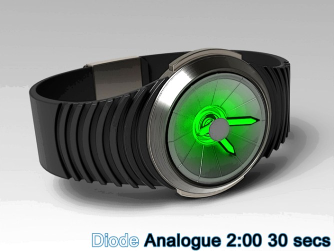
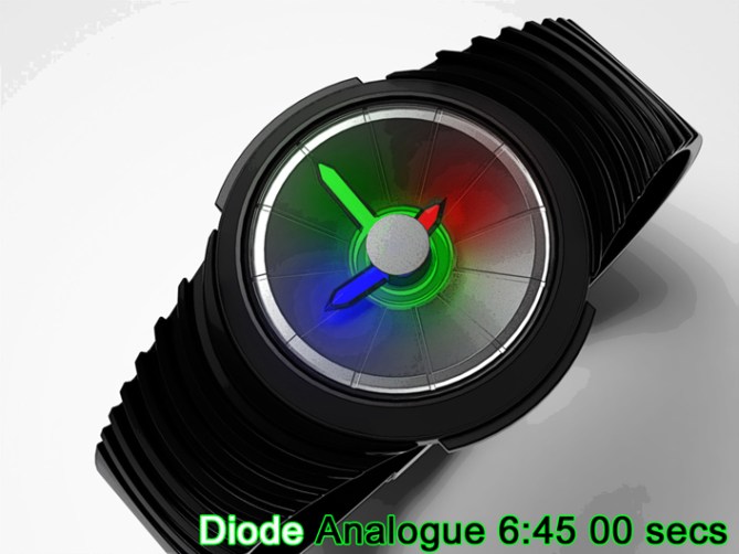
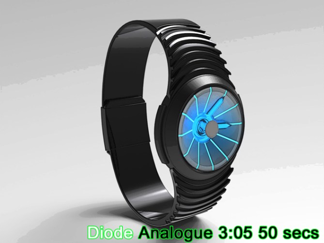
Design submitted by Peter from the UK.
Peter says: This design is inspired by the reflector and lens units found in torches/flash lights or LED lighting units. This shape has a modern and futuristic feel with an industrial purposeful look. I wanted to transmit this look into an analogue watch design.


The watch is a basic analogue watch with a conical face inspired by the reflector of the torch or flash light. This theme is taken further by the fact that the analogue hands can be illuminated rather than the face being backlit like a conventional watch. The watch hands would be lit by LEDs beneath the surface like the needles on car instruments.


The colour of which could be changed by the user as per “Adjust”
The time telling is traditional with the hands pointing out the hour, minutes and seconds. The order of which would be dictated by the conventional movement.

This design is conventional with a hint of futuristic industrial which should appeal to techies and engineers. The conical face and illuminated hands may appear artistic to some and could be describes as fun by younger consumers.
The shape of the display and colourful illuminated hands combined with conventional movement and construction sets this design apart form others.


Cheers TF for adding this design to the blog! 😀
LikeLike
Awesome design!! 5* Y
Traditional analogue but futuristic looking. Loving the RGB coloured one. Though saying that, if it can be a multicoloured watch like Adjust then i hope they include a purple, blue and white variation!
Ive held off from doing analogue designs for fear of them looking too bland but you’ve given me some inspirational food for thought. Nicely done.
Ps. How do you get your designs to look so realistic? Ill bet its not by using Sketchup? lol
LikeLike
Thanks a lot Pelly, I’m glad you likey!
I have periods where I have lots of digital ideas and then periods where more analogue ideas pop into my little brain. I think analogues can be just as interesting as digital designs, they are trickier because TF are restricted to existing movements, so feasibility is more of an issue.
I use solidworks and it’s built in render package photoworks 360.
They are very easy to learn and use, and give good results quickly.
Cheers for the comment and vote! 😀
Ps I sent you a message via Facebook. Check you “other” messages.
LikeLike
Hi Pete, this is an analog watch, so “always on” and with LEDs, it’s great!
5 * / Yes.
LikeLike
Always on lighting would be cool, if a power source that could cope with that is available.
Fingers crossed! Cheers for the support and the vote sir! 😀
LikeLike
In the words of Guybrush Threepwood; Nice! =)
Not much to say about it really, simple and stylish. Oh, and a very good-looking strap too! =)
Good luck mate!
LikeLike
I had to google that name Im afraid. I assume from the wikipedia description that your quote is the opposite of what he would actually say?
Either way cheers for the likey, the vote and the luck! 😀
LikeLike
It’s an oblique reference to the Monkey Island adventure games (brilliant, btw), where the player character (Mr G Threepwood) would, if you persisted in looking at unimportant stuff, default to the response ‘Nice!’ in various intonations…
I meant nothing by it, apart from the standard meaning of the word, I just couldn’t resist making a Monkey Island reference…=)
LikeLike
I must have somehow missed that game in my younger years. Im more of a shoot the alien in the face kind of guy! lol 🙂
LikeLike
lol good ol’ Guybrush.havent thought about him in a long time.
I’d definitely ‘walk to’ ‘look at’ and ‘pick up’ this watch though ; )
Sorry if it’s gone over your head Pete, it’s all complimentary that’s all you need to know lol
LikeLike
I played the Special Edition games last year, so he was relatively fresh in my mind. Not that a MI reference is often far away…=)
Don’t forget to ‘use’ it, too…=)
LikeLike
A lot of things go over my head to be fair so will take it how it was intended, cheers guys! 😀
LikeLike
Oh cool, I like the reflector idea and what you made of it. The single color LEDs are my favorites. The watch itself looks really nice the these details and the elegant shape. Crossing my fingers!!
LikeLike
Im glad you likey sir, I thank thee for thy kind words and support! Cheers! 😀
LikeLike
Great design, Pete. Makes an analogue watch look interesting.
I too like the RGB version best, as it will be easiest to read. However, I do like the blue and green versions too. if it is like Adjust, hopefully I can try all three combinations. Sign me up for one with a black strap.
Good luck and 5*/Y.
LikeLike
If the light colours can be changed it would be sweet, Then only the strap colour would need to be selected by the customer. Cheers for the feedback and the support sir! 😀
LikeLike
This is very illuminating analogue wrist watch concept I especially like the radial Back Light in the Black / blue & White / Green Examples.
LikeLike
Thanks for the glowing review and shedding some light on the concept! Cheers
LikeLike
I like the overall look. I like the LED’s in the hands and that the color can be change by the user. It would be good if red = hour, green = minute & blue = second. I also like the all white & all aqua blue.
LikeLike
You colour allocation of the hands sound intuitive which would help for easy decipher. If colour changing LEDs could be used then you could cycle through the combinations until you found the perfect one for you. Cheers for the feedback and support Makko! 😀
LikeLike