Design submitted by Sam from Germany.
Sam says: I am a fan of lines, that come from outside the watch case and turn into time telling things on the display.
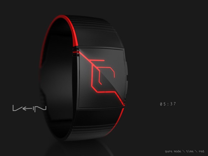
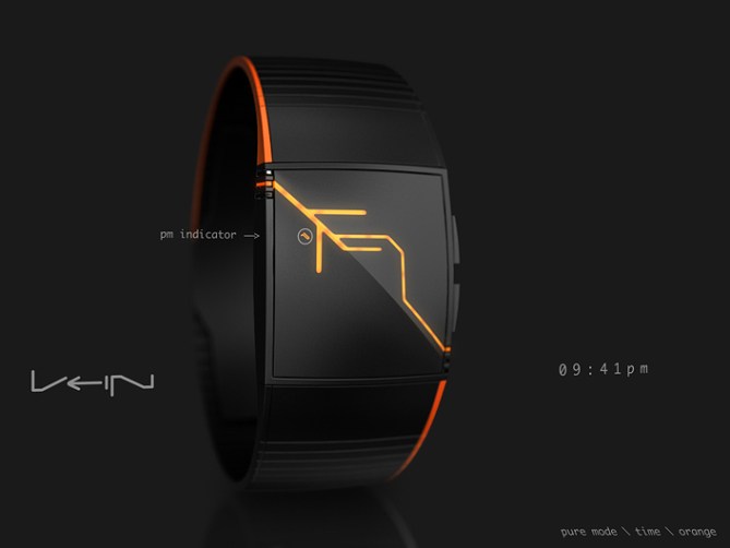

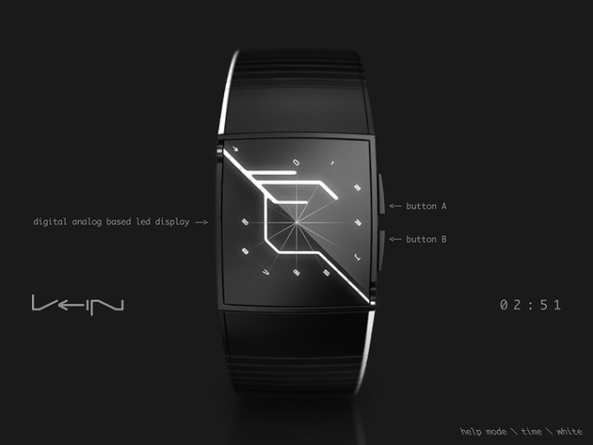
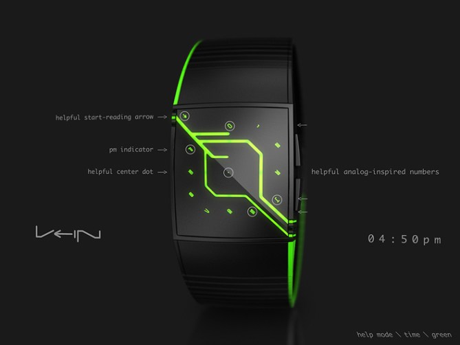
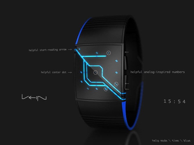
The Vein is a four digit analog display inspired LED watch concept. I am using the numbers 1 until 9 that are placed on the diplay just like on an analog watch. I placed the 0 at the 12h position. So 10 and 11 are not used. This is where the name giving vein comes into play. It starts from the top left corner of the display and then it splits up into four capillaries that end up in one number on the imaginary analog display. The numbers have to be read in the order in which the capillaries branch off. Those capillaries that run through 4 and 5 leave the display on the lower right corner.
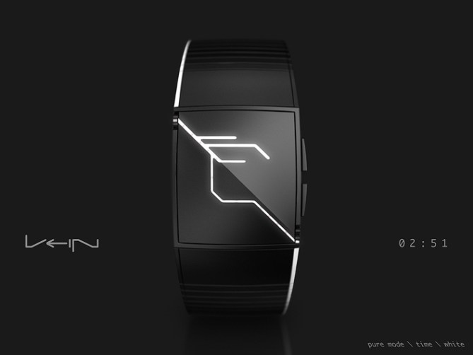
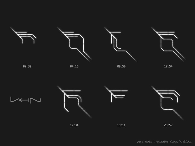
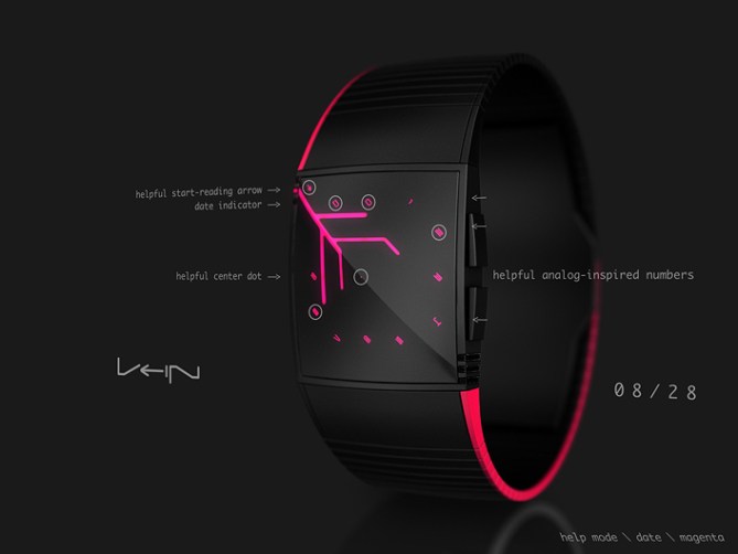
This time telling method is quite a task to read so I’m trying to ease things up with the help mode. In this mode, all numbers are lit up, a center dot helps locating the ends of the capillaries and a little arrow shows where to start reading. There is a PM indicator for the 12h mode and also a date indicator for the date mode. Indicators and numbers are turned 45° to follow the direction of the electro vein light flow. So actually I made them looking like they can stay on forever. The most pure mode would be 24h mode, without any numbers and indicators. No matter which mode, looking at all times of the day, there are very different displays possible that always look new.
So this is the Vein LED watch concept.


Very nice design, Sam. I like it. 5/yes and good luck.
LikeLike
Thank you Daniyar!
LikeLike
Hi Sam,
I think it will be the sixth!
😉
5*/Y
LikeLike
Hehe, not so fast 😉 Thank you for the support Laszlo!
LikeLike
Hi Sam, great watch futuristic design, not easy to read for me, but I’m not a reference.
5 * / Yes, as usual.
LikeLike
You give a tendency Patrick. And it’s good to know 🙂 Merci beaucoup!!
LikeLike
Looks very cool but the time telling is on the challanging side for my tiny brain. 5* for the looks! 😀 Best of luck sir! 😀
LikeLike
Thanks a bunch mister! Thinking about an easier alternative 🙂
LikeLike
Your Vein is brilliant & original concept. However for those people who are beginner to alternate wristwatches it may prove a little too brain popping / hard to read.
LikeLike
Yes, it could be easier 🙂 Maybe I can come up with a similar but earier idea. Thank you Andrew for the comment!
LikeLike
Another great design, Sam. I love it as it is.
It was hard to read initially, but that does get easier when you get used to it. It doesn’t have to be “easy to read”, that’s part of the fun of a TF watch. If you have to put some effort in, it makes it more rewarding.
I only hope that when it gets made (as it should), TF keep the coloured lines on the strap edges – I missed that on Online (had to go for Silver/Natural, as that was closest to your original concept).
Red or Blue look most appropriate (probably the latter for veins), but I love the Green, so maybe alien blood coursing through these veins!
Good luck and 5*/Y
LikeLike
Ok yes yes, that’s the right attitude 😉 Well I understand all sides but I’m pro fun side!
Yeah Tokyflash have to deal with what’s possible and affordable. Imagine an architect wanting all window corners round. Sounds like a simple thing. On the sketch board it is but in reality it causes so much more costs, it’s not funny anymore. In the end you pay like 50% for this little detail, even if you’re willing to pay this price. It’s a risk. As for the Online, I’m glad they kept the lines – could’ve been further away from the concept. In the end I got used to the grooves. An acetate version would work well with colored lines… oh… yes…
Ow yeah nice, pointing out the bloody topic hehe.
Thank you Nev for your perspective. I’m glad it’s close to what I intented.
LikeLike
Excellent concept design as usual. Would love to see this made and resting on my wrist. Excellent work once again
LikeLike
Oh thanks lem! Some little changes to reach more people then maybe maybe maybe 😉
LikeLike
Evil!
LikeLike
Mwahaha 😈
LikeLike
I would almost lay money on this watch going to production! 😈 👿
LikeLike
I’ve never commented on a design or on this site before, but oh man!
I love this concept, it just looks great and really unique.
Took me a minute or two to understand how it works but it’s nothing complicated or silly. Would get used to it quickly.
LikeLike
Well hi there 🙂 Thank you taking the time to figure it out and for sharing your thoughts!
LikeLike
You did again, Sam… 🙂
LikeLike
Hey, love the futuristic watch!
As with the others, I find reading the time difficult.
even with the tutorial given I cannot understand how the time is calculated!
LOVE THE DESIGN THOUGH!
LikeLike
I love this design so much! Even though it is hard to read at first that is one of the reasons why it is so good.I think it must be one of the best watches I have ever seen, needless to say I would buy it the moment it was made so I’m hoping it will be!
LikeLike
I like the theme. Very creative to incorporate vein design in a modern looking watch design. Time telling is like ‘you did again’. The result is ‘you did again’.
I’ll go with the blue one. With worrying about details later, I give this 5*Y.
LikeLike
Love how you are able to constantly come up with such awesome ideas, 5/Y 🙂
LikeLike
This is the coolest watch I have seen; I have bought a watch on this site previously but I would definitely buy this one as well, even though I can only wear one watch at a time: red, blue, and white, are my favorite for this watch’s design, in addition please do keep that colored line on the side it looks epic with that, please create; I must buy.
LikeLike
I hope this is available for purchase soon! 5*
LikeLike
I like the overall look. The time-reading is a bit too hard. If the “help mode” can be toggle on/off, which I think is feasible, it could be used like an LED watch: vein only = idle/standby, with digits = on.
I like the black/red & black/white.
LikeLike
I love this design and would buy one for sure…great job!
LikeLike