Design submitted by Sam from Germany.
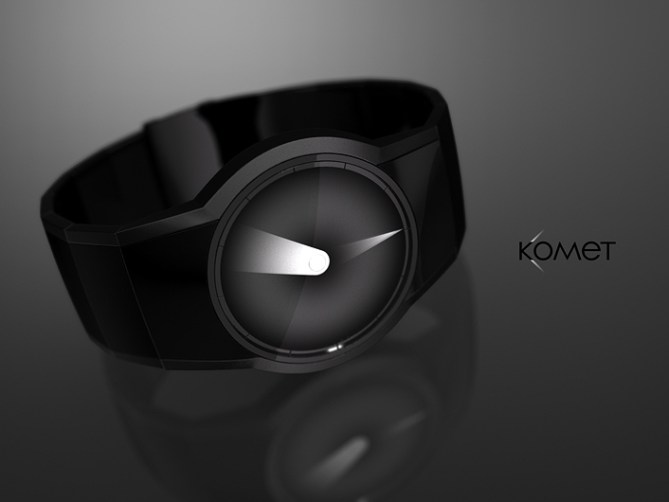
Sam says: I like minimalistic analog watches. They are so relaxed and can look so styslish. So I sketched for a simple but still diversified pair of watch hands. For this watch concept I am using two transparent foils with cleverly placed free zones and imprinted gradients, both placed above a plain white background that could be lit up, if technically possible.


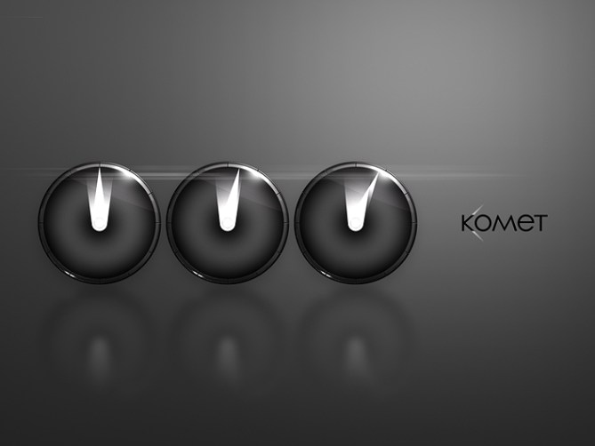
Time telling is easy if one likes it analog. The hour hand is bright in the center of the display and fades out towards the edge while expanding in width. So this hand is not precise at all, but that’s not necessary for the hour hand. The minute hand on the other hand is precise. The outer end is pointed and bright. The hand expands towards the center of the display and fades out. Both hands are the brightest in their narrow ends, which reminded me of a comet. The fading of the hands creates an interesting effect making the display look out of this world.
So this is the Komet analog watch concept.


Hi Sam, if you could lighting these two beams, it would be the best!
5 * / Yes, good simple and effective idea.
LikeLike
Yeah an EL backlight would be cool 🙂 Merci bien Patrick!
LikeLike
Certainly very stylish, as per usual!
I am a little unsure about the hour hand, though. I agree that it doesn’t require the same accuracy as the minute hand, but isn’t there a danger of… Hang on… No there isn’t, because you can tell the hour from the 5-minute markers along the edge, and the position of the minute hand. Scratch that, pretend I didn’t say anything…=) Good luck with it Sam!
LikeLike
You are thinking out “loud” what I was thinking about hehe. Thanks Anders ^^
LikeLike
Looks nice Sam, very minimalist and elegant. Kinda reminds me of my really old No-Sun Dial concept but in negative if that makes sense. This is probably much more feasible tho. 5/Y Best of luck sir! 😀
LikeLike
Thank you Pete! I had a short flashback when I made this concept but it’s so different from the light-and-shadow-concepts that my conscience kept being untouched 😉 It’s more feasable but it’s not that extreme, which is quite a factor…
LikeLike
Simple but very effective.
At first I found the third time in your set of three rather confusing as the overlap looked like there were 2 minute comets (one long and one short), but now I have got used to looking at it, it’s easy.
Might work with other colours, as long as the background is dark and the comet tail bright, but the black/white combination is probably best. Great stuff and 5*/Y, as usual.
LikeLike
Thanks Nev! Hmhm, I tried some colors but in the end I decided for a non-color aesthetic. Some more color testing could lead to some nice variants. I see the confusion you saw but in the end the only important element is the one that touches the border.
LikeLike
This is clean simple & uncompleted I don’t know why no one else thought of is sooner. Well Done Sam.
LikeLike
You mean uncomplicated I think 😉 Maybe it’s one of those simple ideas that one usually skips, like I did for a while. Thanks for the comment Andrew!
LikeLike
Very interesting, as it’s an original design, but which remains accessible to ‘normal’ persons. I saw there many very clever & creative ideas, but who can interest only one or two geeks or mathematicians. Reading time isn’t an activity you can take 5 minutes for (principally because if you take such a time in it, your train or girl is certainly gone). Your concept is very simple and beautiful, instead. 🙂 Do you have a page, where one could follow you?
LikeLike
Thank you for your review – sounds good. To speak for those who come up with complicated designs, it’s actually the first days it’s hard to read the time and for strangers it will always be hard without explanation. It’s part fo the fun. I try out everything more or less and check out what the blog people think 🙂 If you click my yellow name, you will get to my facebook page where I keep everyone updated about this blog and some additional things.
LikeLike
I like minimalist analogue watches, too! This one is awesome!! 5y
LikeLike
Thank you DZ 🙂
LikeLike
Beacon of art and light of sleekness, a watch design. Simply effective, for art lovers. 5 loves from me but don’t tell Britney hehe.
LikeLike
I like the overall look but the time-reading is not my cup of tea.
LikeLike
Comets are 1 of the few space thing I like.
LikeLike