Design submitted by Peter from the UK.
Pater says: Some time ago I did a couple of co-ops with Sam called “Origami” and “Mugen-Kido” which both shared a body and strap consisting of folded strip material. I wanted to re-use that principle in a more subtle futuristic manner than would have a TF old school feel.


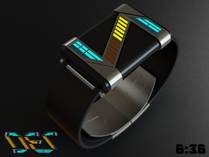
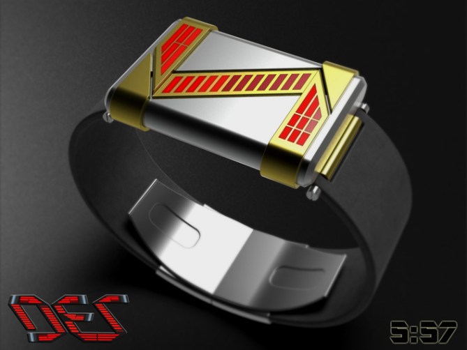
In this design the strip material makes up the structure of the case as well creating three zones for the display. This arrangement lends itself nicely to a 12/5/9 layout in LEDs.
The diagonal middle zone describes the hours, the top horizontal zone displays the 5 x 10 min groups and the bottom horizontal shows the single minutes.


The LED lenses have a mesh like look to keep things interesting when the lights are off. The result has a retro futuristic look that could be straight off the set of the original Star-trek series. Oh yeah.. you might be asking yourself what does the name DEZ mean. Well in a nutshell like the display it looks like a backwards “ZED” 😀

This design is very straight forward and easy to understand and should keep the old school TF fans happy. Th retro futuristic look should appeal to the geeks amongst us.
The simple geometry and metal strip structure framing single colour or multi colour sets this design apart from others.


Hi pete…
First time poster, long time reader.
Lovely looking watch there buddy. ***** and a yes from me. Im a fan of the cryptic at first yet easy to read once you know the trick kind of watches. This one ticks my box….giggidy.
A black one with white-purple-white LED’s would have me throwing money at you!!
Ps. I hope I get to share my designs soon, have submitted loads lol
LikeLike
Thanks for sharing your opinion Pelly, I’m flattered to be your first! Giggity giggity goo!
Always nice to bump into a fellow FG fan! 🙂
Black with white and purple LEDs sounds like a nice combo, if I get five I’ll knock one up! lol
Cheers for the support!
Best of luck with your submissions, hope we see one soon! 😀
LikeLike
I knocked up a quick photo-shopped image with white and purple LEDs like your suggestion 😀
LikeLike
Nice one Pete!
I have to admit not my favourite one of yours, but nicely styled, good display and looks very make-able. =)
If there’s one thing I’d like to try it’d be slanting the vertical divisions of the ‘5’ and ‘9’ LEDs, to make a transition between the vertical edge and the slanted ‘crease’ in the metal ribbon. If you see what I mean…=)
I’m not sure it’d work, but as it is now the rightmost top ‘9’ LED looks very long compared to the others.
anyway, that’s my $0.02. Best of luck mate!
LikeLike
It took me a little while to get my head around what you meant but now I get it. So the LEDs would run parrallel to the creases and be a similar size and shape to the hour LEDs, that would have more continuity through out. Nice suggestion sir, If I get a few moments I might try it. Cheers for the suggestion and the luck! 😀
LikeLike
Is this what you had in mind Anders? Its a bit of a squeeze to get 9 LEDs on the bottom row in this format.
Makes me think the LEDs need to go from slanted at one end to vertical at the other.
LikeLike
Not quite, your second thought there is more what I had in mind; slanted at the side of the crease, and vertical at the other end, but otherwise the same layout as the original. Unforunately I can’t come up with a good visual example of what I mean…=7
Also, re xian’s comment below, I think the issue there was the distances between the ’12’ LEDs compared to the ‘5’ and ‘9’ LEDs… Which I can sort of second, even though I didn’t notice it until I read the comment…=)
LikeLike
I might have another attemp if the mood takes me 😉
Oh I see what you (and Xian) mean about the gaps. They shoudl be the same size as the hours really, fair point well made 🙂
LikeLike
Like I said, I’m being nit-picky–but I know you guys are perfectionists like me too 🙂
LikeLike
If nit-picking is the only thing we can do then that says something about the quality of the concept, I think…=)
LikeLike
Hi Pete, last week I sent a watch with a reading in “Z”, it’s crazy?
Fortunately, the reading is not at all similar to yours, oufff.
I can only put that a 5 * and the Grand Yes, the reason cited above and because your project is great!
LikeLike
GMTA! hehe. That probably means Im a little backward then as I chose a backwards “Z”
Fingers crossed your’s makes the blog soon so we can see the pair together “mirrored” would be cool.
Cheers for the support sir! 😀
LikeLike
Zorro!!! Looks awesome, Pete. 5y
LikeLike
More like Orroz! 😉 Cheers for the likey sir! 😀
LikeLike
Oh yeah…weird! “Sorro” doesn’t have the same ring to it!
LikeLike
The display could easily be mirrored so that it was a Z shape, so if a Z based name was deemed preferable it could be done 😀
LikeLike
Hey, Crazy Pete! You know, I kinda dig the gold/silver/red version, which would usually be too Gaudi for me. I think it works in the proportions you show. To be nitpicky, is there a reason you used different spacing between the diagonal LEDs and the LEDs on the horizontals? Could the spacing be made the same?
LikeLike
I assume by spacing you mean the general layout of the LEDs, I think that’s the pretty much the same feedback I had from Anders so will knock an image together and see what you guys think 😀
LikeLike
Xian, see my link in Anders’s comment above for what I think you were suggesting 😀
LikeLike
I think the original looks good without any further changes. The different styles work well, whereas the slanted minute version just doesn’t appeal. Only problem will be the usual counting the hours – larger gaps after 3rd, 6th and 9th would make it lots easier.
I like the colour combinations on the first 3 images best (much more colourful than I usually go for, but this looks good). Definitely 5*/Y.
LikeLike
Cheers for the feedback Nev! Yeah good suggestion regarding the spacing, maybe the size or brightness of the 3rd, 6th and 9th LEDs could vary to help highlight too?. Thanks for the support and the vote sir! 😀
LikeLike
An interesting futurtitsic take on a 12/5/9 Binary Watch Pete.
LikeLike
Thanks very much Andrew! 😀
LikeLike
Well well well. What an awesome and sleek looking design. Your impressions make me impressed much. The time telling is classic, which is fine for TF folks I guess. The design is really good! I’m a fan of this. Hope we’ll have this in the list soon. Call it Kisai Z. May the industry be with you. Cheers! 5*/Y!
LikeLike
Most kind wordz sir! Im glad you likey and cheers for the support. Yeah the “Z” would fit in well with existing Kisai alphabetically named designs 😉
LikeLike
Pete I gave you 5Y a few days ago. 🙂 I really like the look of it. I would maybe prefer the straps to meet flush with the watch face and for seconds to be shown in the 2 large spaces either side of the Z as digits or whatever. Maybe they could be switched on or off too so you would have the choice of a minimal or busier look.
LikeLike
I like your suggestion regarding the seconds, they would fitnicely. Yeah the strap could be made flush for a slicker appearance. All is possible, fingers crossed TF see the potential 😀
LikeLike
I’m not usually into slick things and it really looks great the way it is. Just thought I’d mention it tho. 🙂
LikeLike
I like the overall look. I like the mesh over LED’s idea. I like that the central part is like & not |. The time-reading order is a bit to odd. I’d prefer tho switch the hours & 10’s minutes, as long as the LED’s are not to small.
LikeLike
I understand your point Makko, it would be more intuitive to read from top to bottom. That was my original intention, but I thought squeezing 12 LEDs into that area would have looked a little cramped. Also it seemed to make some kind of sense to have the two groups of minute arrays in the horizontal strips as it makes them clearly separate from the diagonal hours. Its all a subjective thing of course. I would be happy for them to be re-arranged if it made the concept more viable 😉 Cheers for the feedback sir! 😀
LikeLike