Design submitted by William from Norway.
William says: Recently, I have watched an Episode of The Simpsons in which a reference to the movie “A clockwork Orange” was made. This was the starting point of my inspiration for this project…
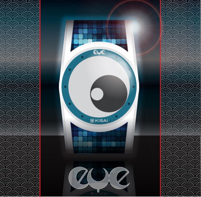

I have found a very basic but original way of telling the time and with the epaper technology, such an idea is now possible to adapt.
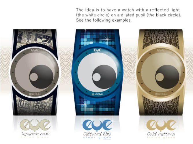
I want my design to reach as much people as possible. Therefore I came up with a broad range of variations. Concerning this point, you may not like all the different models I present here, but if you vote for this project, I would like you to vote positively for the model(s) you like rather than against the model(s) you may like less. thanks in advance! 😉

My design uses a principle that is both very graphical, simple to learn and extremely easy to get use to.
For all these 3 reasons, I would believe that my design is the kind of one that stands out from the others in its category.
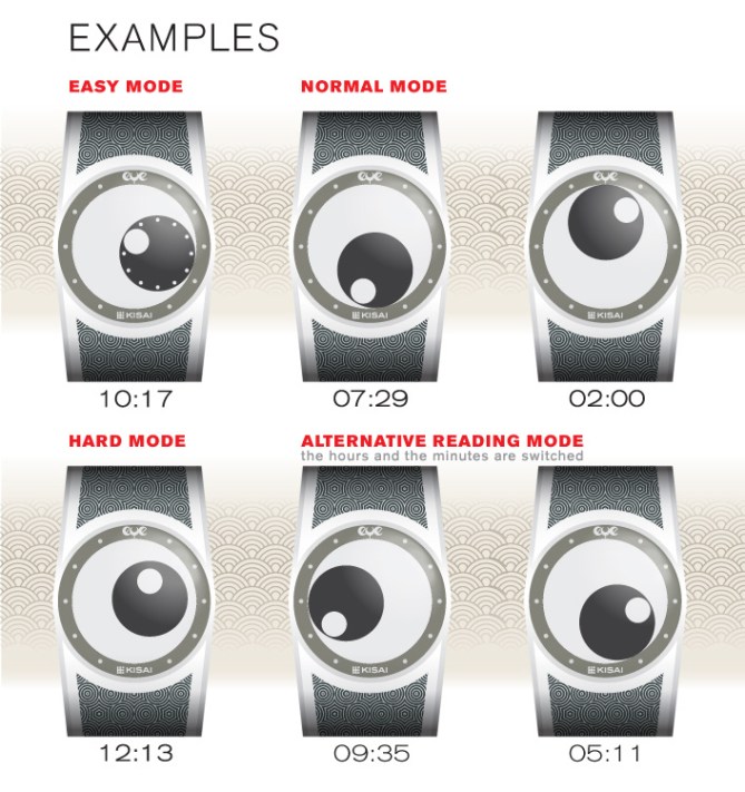


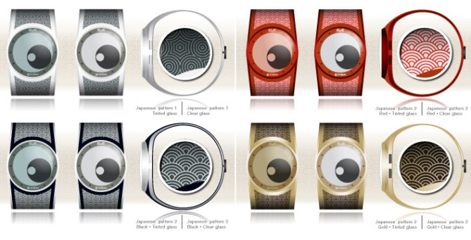
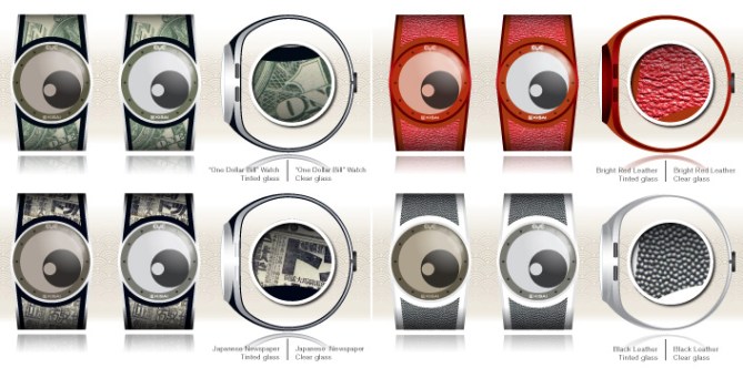

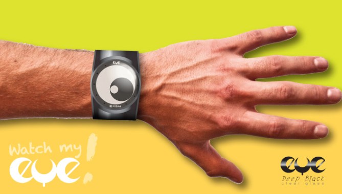


Nice work you put in the presentation of your concept William. I like the time telling method and the different modes you offer. Also nice material variants. It’s a minimalistic display so the strap can be pretty busy in style. Good luck!!
LikeLike
Great stuff! 5y
LikeLike
Thanks for the comments so far.
I think that this concept really have a potential in many aspects (original way of telling the time, graphic design potential,…). But now, I am not the one who decide and I must wait and see if my opinion is shared or not…
Really hard to present an eye candy project when you can no other program than Adobe Illustrator. 😦
LikeLike
Very eye catching design and presentation! It’s very striking and bold and would certainly grab attention. My only suggestions would be give the two circles a subtle point where they meet in the appropriate place for the time telling. This wouldn’t affect the look but would make the time telling clearer. Alternatively a subtle notch would have the same effect. These could be a separate mode or part of the easy mode for max clarity. Minor detail so 5/Y best of luck sir! 😀
LikeLike
same idea as “Ozone” watch
https://blog.tokyoflash.com/2013/09/simple-but-creative-ozone-watch-design/
LikeLike
Maybe…but this design looks better. And it’s colourful!
LikeLike
I really didn t know about this project. but I think I went some step further, for example the 2 systems are the same (circles and not a mix circle / line), graphic design, etx…
LikeLike
The thing that I interested with most of J designs and product, they know to make it kawai…. ~~ I can see kawai element in this design. The time telling is fine but the result is impressive. I would recommend this to TFJ. Good luck Willy! 5*/Y.
LikeLike
As Pete said, very “eye catching”!
With the right combination of strap and case colours, this would be great. Some of the examples would be too bright for me, however the last but one design would be perfect.
Good luck and I hope it gets made. 5*/Y.
LikeLike
Thanks for these nice comments. It is a nice feeling to show an idea that people appreciate. 🙂 🙂
Cheers 🙂 🙂
LikeLike
I like gloomy looks better, but this is definitely a nice idea.
LikeLike
Original, creative and sweet.
LikeLike
J’achète ! euh, c’est combien d’abord ? j’aime bien tous les modèles avec une préférence pour gliterred blue
LikeLike
I like the overall look. I like the “gold pattern” but would prefer in gray instead of gold.
LikeLike