Design submitted by Peter from the UK.
Peter says: As the regular blog users will know Im a bit of a petrol head. This design was inspired by a recent high profile concept car, which had a really futuristic dashboard consisting of two linked round digital dials. This watch plays homage to this awesome looking display. 
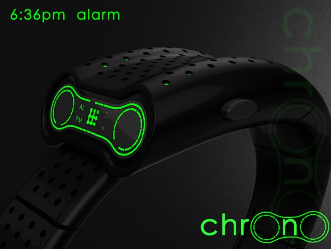
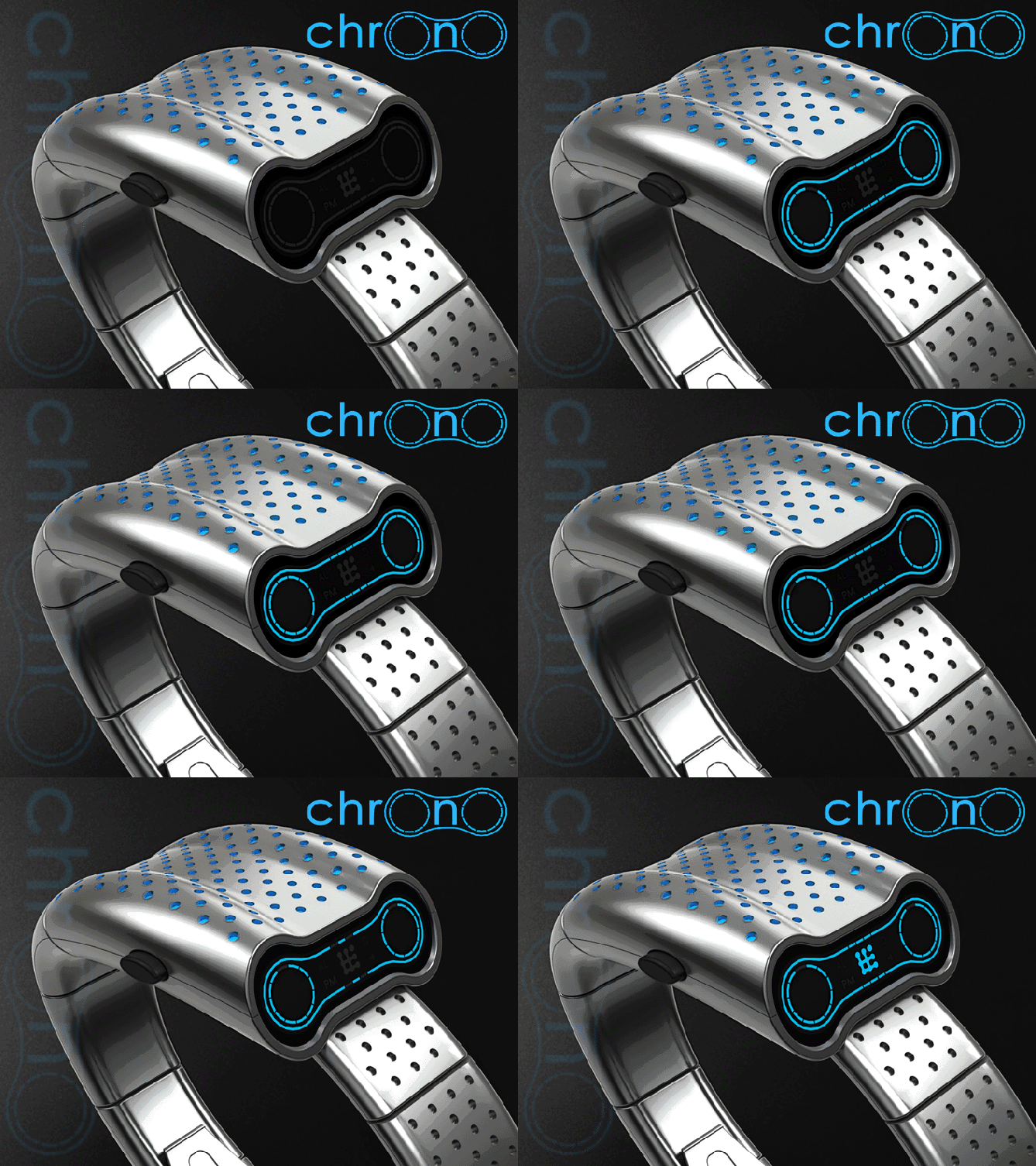
The time is told in a similar style to the famous seven using a 12/11/4 format. Two round arrays of 12 LEDs or LCD blocks display the hours and five minute groups. The single minutes are displayed by 4 LED or LCD blocks in the centre of display between the two round arrays. All of which are framed by a sweeping line which gives the watch a cute robot face look. Like a tron-esc WALL-E.

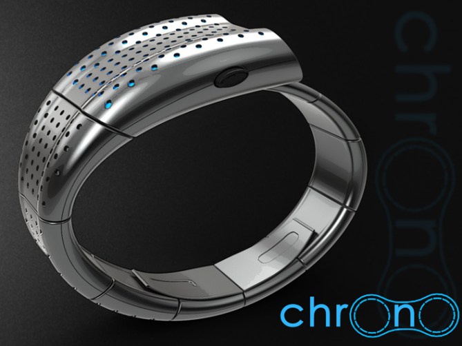
The body of the watch has a smooth, organic, bio-mechanical feel, this combined with its robot like face gives the watch a futuristic look that may appeal to the chic geeks amoungst us.

The flowing form lends itself to a mulitude of finishes which should broaden its appeal. The straight forward time telling format should make the design available to a wide spectrum of abilities.

This design stands out due to its flowing form, glowing features and futuristic look.


Cheers TF for adding this design to the blog! 😀
LikeLike
Awesome as always Pete 🙂
LikeLike
Most kind KV, glad you likey sir! 😀
LikeLike
Nice one, Pete…=) Cool looking concept this, and the display looks easy to read without being too obvious. But I’m wondering what car it’s inspired by. I’d guess the Jaguar CX-75, but it’s not very recent… Anyway, looks cool, nice to see a driver’s watch again. Good luck sir! =)
LikeLike
You hit the nail on the head, you know too much! I hope its not too literal as some folks take issue with that but it seemed a nice inspiration. Cheers for the support sir! 😀
LikeLike
I just happen to like that car rather a lot, it’s a shame it never reached production… I wouldn’t say it’s too similar. It reminds me that I’ve got some ideas lying around based on another car, which may or may not result in a submission at some point in the future…=)
LikeLike
I would love to get my sticky paws on one of the running prototypes! 😀
LikeLike
You and me both, and I suspect my paws would be rather more sticky as a result…=7 There’s just something about turbines…
LikeLike
Hi Pete, I love this style, it has an air of my “Four Dials”, but yours is much nicer!
5 * Yes, yes yes!
Remember: https://blog.tokyoflash.com/2010/11/four-dials-led-watch-design/
LikeLike
Hey Patirck, I dont remeber your design as it was before I stumbled acros the blog. The dial inspiration does creat a natural curvy form (form following function) which is cool. Fingers crossed their is room for some dash-board inspired designs on the watches page x^^x
LikeLike
Pete, I used your design to talk about mine, it’s not very nice. Your design is much more beautiful, I really do!
LikeLike
Its nice to see designs with similar ethos and also ones from a while back so don’t worry. Its was cool to see it! 😀
LikeLike
What’s this BS 3.3/5?
Looks evil – in a good way!
5y
LikeLike
Just another day in the office for the downraters by the looks. Glad you think its BS sir!
Yeah it has a psyco Johny 5 look lol 😀
LikeLike
Time telling is just okay, but the design is freaking fantastic, like the saga of fantastic design. Me wanty ant 5* yessy!
LikeLike
I’ll take 1 out of 2 sir! Glad you likey the looks, Im sure with TFs input the time telling could be made more epic. Cheers! 😀
LikeLike
pretty cool, reminds me of the wall-e the robot eyes. 5*
LikeLike
Yeah it does have a hint of Wall-e. I wanted to add a little robot-like sound to the animation as if it was talking to the wearer in a cryptic manner. 😉
LikeLike
A excellent design alternative concept for a driver’s / racing wristwatch.
LikeLike
Thanks a lot Andrew! Your support is really appreciated! cheers! 😀
LikeLike
I can see the “cute robot” look with the silver/blue version, but the black/green version definitely shows a darker side – much more appealing! I also like the face colour repeating in the case. Another “must have, Pete. 5*/Y
LikeLike
Yeah the black and green has a kinda “borg” like feel 😉 “Resistance is slightly tricky!”
Another very kind comment sir, I thank thee! 😀
LikeLike
Looks really great Pete! I gave you 5Y. Hope that boosts your score a bit mate. 😉
LikeLike
Thanks a lot Mushy, I need all the help I can get! 😉 Cheers for the support sir! 😀
LikeLike
Woah underrated Q.Q I realle liek this baby! In terms of feasability I think this display could also come on a flat display with a more traditional combination of case and straps. I’d still buy it. But Tokyoflash should try to move close to what you’ve created. Very nice concept Pete! The display.. so elegant and sci-fish and cool. Yes/5*
LikeLike
Yeah I did contemplate a flat more conventional version, which is still in my sketch book if TF decided they liked the display but needed to simplify the case to make it more feasible. I think it would work in either portrait or landscape orientation. Hopefully potential will be seen 😉 regarding the ratings, imagine the watch is rolling his eyes at it in the animation! 😉 cheers for the feedback sir! 😀
LikeLike
Chrono MkII – a more conventional version 😀
LikeLike
the new version may be my new fav. Great job, im giving you the coveted winner winner chicken dinner!!!!!!!!!!!!!!
LikeLike
Thanks a lot Gordon, Im glad you likey!
Is that a festive chicken dinner with all the trimmings? 😉
LikeLike
yes that includes gravy and a biscuit !
LikeLike
It looks to be a very angry watch to me…
LikeLike
Hopefully that’s a positive thing from your perspective? I would always choose angry looking products over cute! 😉 cheers for the comment sir! 😀
LikeLike
I like the watch overall look. It would be nice if all the small dots would glow in the dark ! This type of case/display is rare & very interesting. I prefer this one over the MkII because the reading is horizontal & the case rarity. I would prefer LCD. I like that the single minutes are using a small portion of the outline letting it always visible. I like that it’s 1 segment off.
At 1st, I was going to suggest to use 4 segments instead of 6 to ease the reading, but having a segment on between 2 off give a better look. This mean the 6s is better.
Finally, I would buy. ( black band with red segments/dots )
LikeLike
Hi Makko,
The intention is that the dots in the case do glow, being illuminated by a light inside the case or an luminescent material. The later is probably the easier, cheaper and would be on more of the time.
I’m glad you like the “drivers” watch configuration, they are a rarer layout so would be nice to see one on TF’s watches page (although Id be happy if they made my other version 😉 )
Yeah I had similar thoughts regarding the single minutes and decided it kept the continuity with the hours and 5min groups. Im glad you would consider buying if it made it into production! Cheers for the support sir! 😀
LikeLike
A light inside the case would be nice with LED’s, if they light-up at the same time!
LikeLike
http://www.tuvie.com/chrono-dashboard-inspired-watch-looks-like-wall-e/
LikeLike