Design submitted by Jose from Spain.
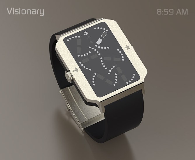
Jose says: I’ve always been the curiosity to ask me in formal and functional terms, would happen when I disassembling an analog watch to assemble it again but in a different way from the original, maintaining its features.Apparently when you see the VISIONARY display, everything seems chaotic, but it is not. This is the genesis of VISIONARY.
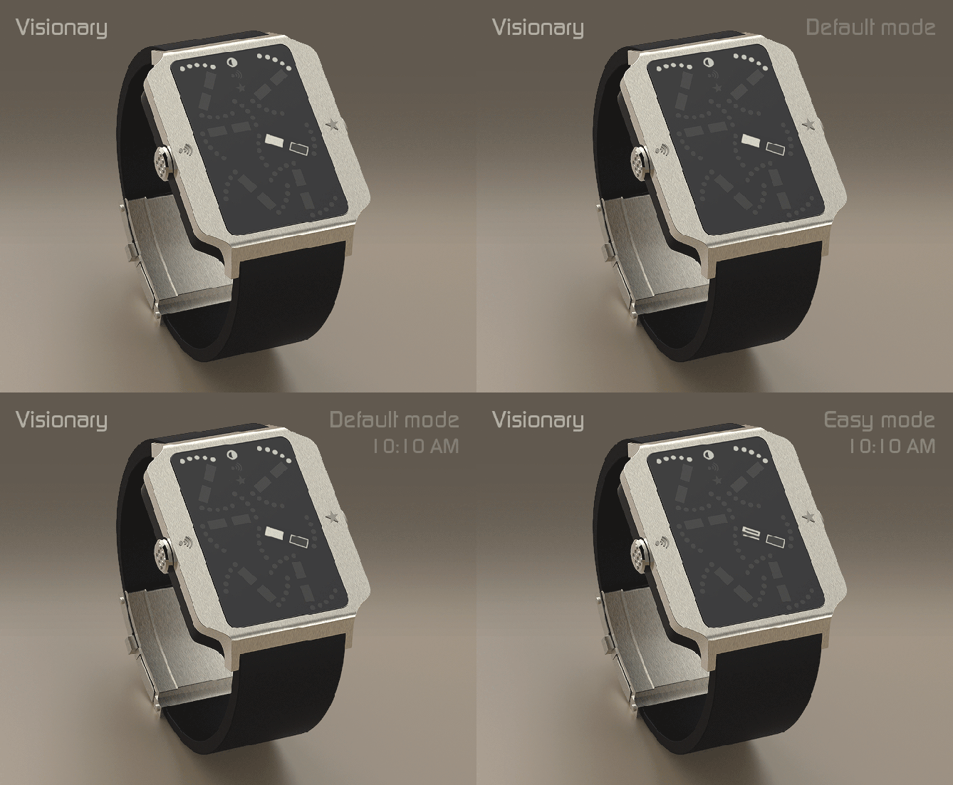
I agree with the thought “Our goal is to” change the way you think about time” (Tokyoflash). VISIONARY represents a formal deconstruction of an analog watch and proposes a new way to read and presenting the time and hopes to attract the attention of many people and all Tokyoflash Fans to become reality.
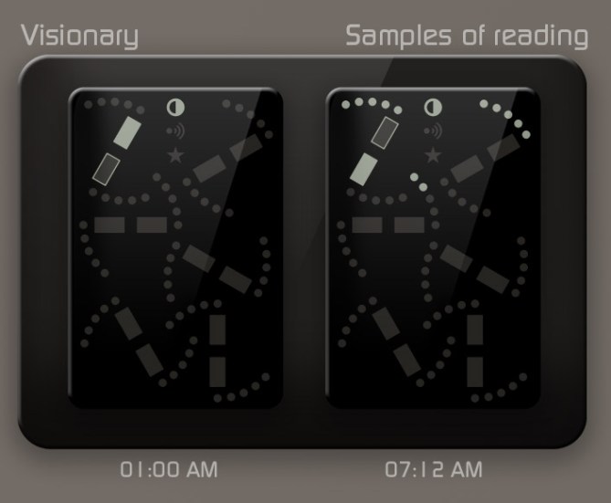
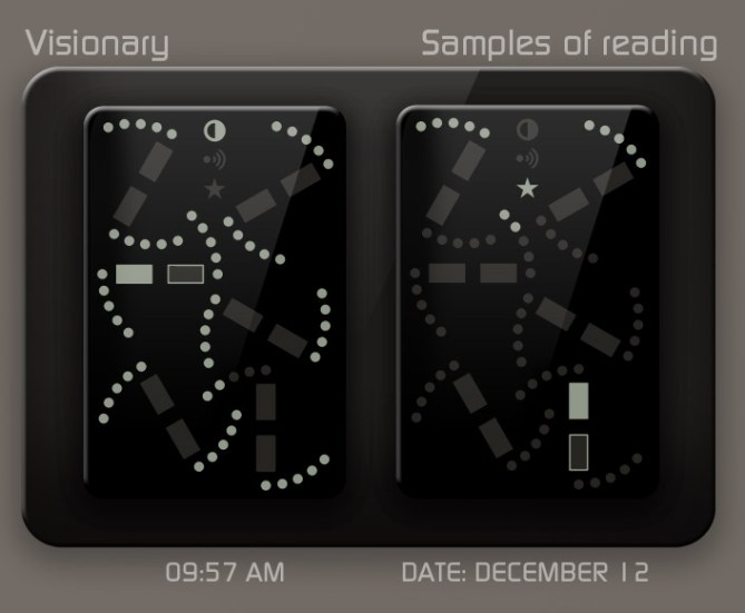
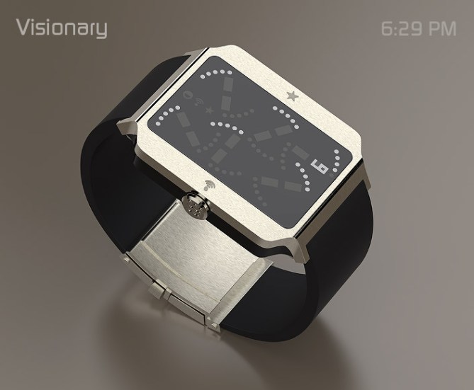
I thought to satisfy those who like the simplicity and who like the complexity to establish two reading levels: by default (with markings) and user choice (with numbers).
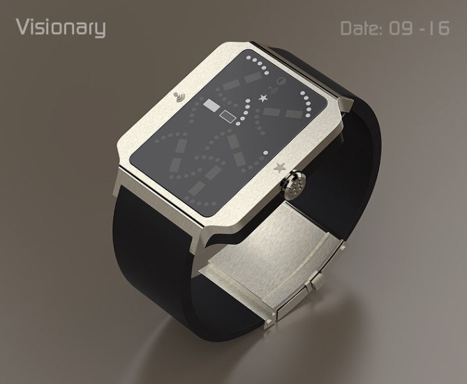
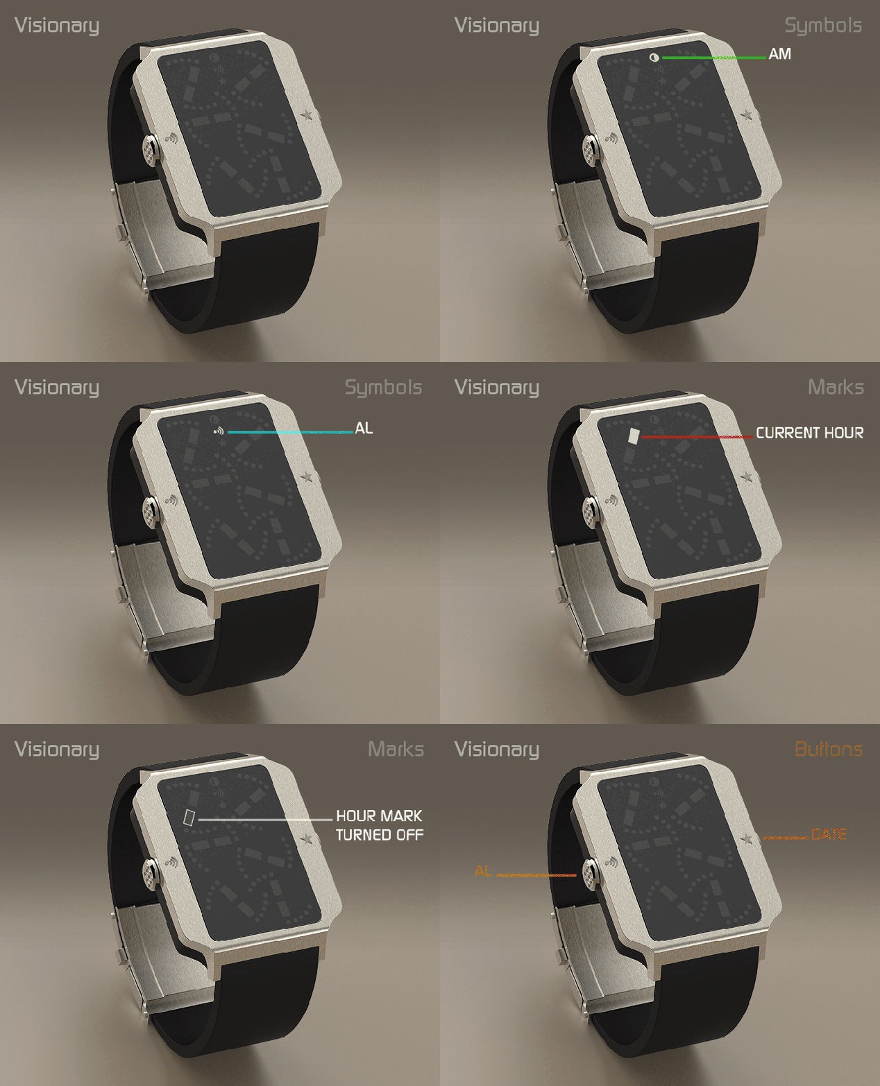
In addition to the hour and minute, VISIONARY offers you other features such as day of the month and the month and alerts you if you wish, through a alarm.
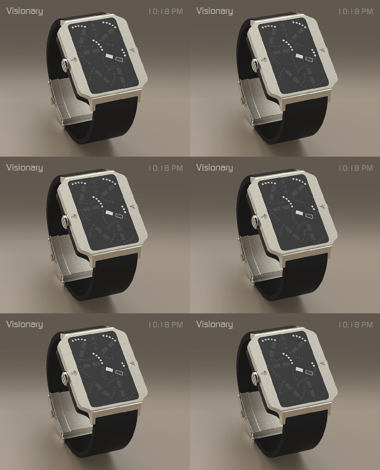
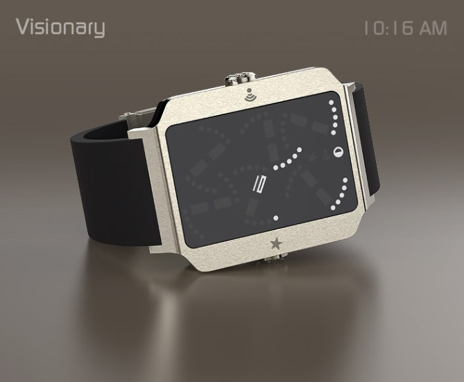
I can mention those interested for wearing unique pieces that go beyond the function for which they were designed (Tokyoflash Fans), those interested in fashion and new trends, interested in new technologies, lifestyle. So both men and women, according to the materials and finishes. In attached images are shown some possibilities with reference to the mix of materials: steel, acetate, titanium, etc.
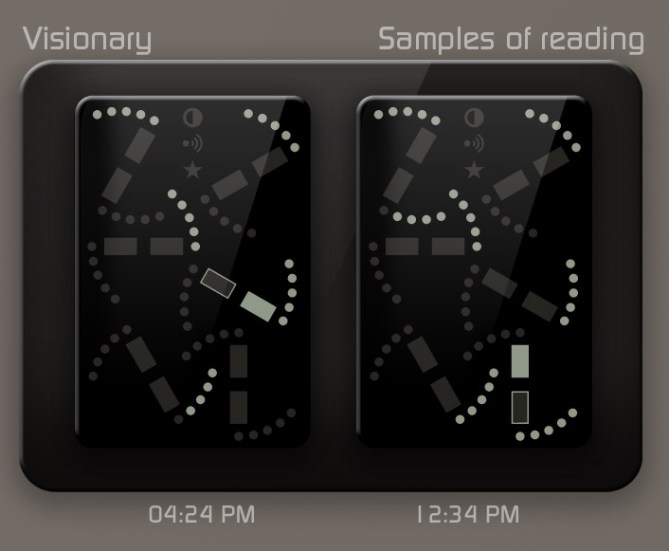
I would stand out of VISIONARY the exclusivity of the concept because it’s unique on the market, the ease or complexity of reading, its simple appearance, but with a high level of customization “high tech” that can appeal to a variety of audience.


Thanks for adding this design to the blog TF 🙂
LikeLike
Hi Jose, beautiful original watch with an easy reading, because without reading information, I understood his operation.
5*/Yes.
LikeLike
Patrick thank you for your comment and your vote,
congrats for your last concept: Koinshidensu. Good luck with it
LikeLike
Looks great. Reading the minutes might take some practice.
LikeLike
Thanks a lot dzign555. A new concept requires some practice 🙂
LikeLike
Please give me 10. Thank you.
It’s definitely one of the best ideas of all times.
LikeLike
Thank you for comment and support
LikeLike
very elegant watch, which rendering package do you use?
LikeLike
Rhino and V Ray for modeling and lighting and depending on the project also I use HDR Light Studio
Cheers
LikeLike
Me ha gustado mucho la idea y me parece genial la forma de plasmar la hora…. Es para mí el mejor de los relojes y me gustaría uno así o al menos un widget para la pantalla de bloqueo de mi Android!!!!!
LikeLike
Muchas gracias por tu apoyo al proyecto Juan
LikeLike
It took me a while to work out how to read it, but then it was easy.
When the final minute section has 4 minutes, it is hard to distinguish from 5 if there are a lot of 5s on (as with the 8:59). I found thinking about how it would have looked before deconstruction helps, and I look for the final section on that basis. Having to think like that makes this a real winner for me.
A great design – good luck and 5*/Y
LikeLike
Thank you for comment and support Nev
LikeLike
Very cool and very unique way to show analogue time! Renders are beautiful too! Fine work sir! 5/Y best of luck! 😀
LikeLike
Very kind master Pete
Thanks a lot for coment and support
LikeLike
I think the display is not something that I would wear but I like the stylishness of the face design and that what make this watch appealing to me. You can recycle this design for another watch face. 5* and good luck pal! And yes too, because I can. Cheers!
LikeLike
Thank you for comment and support Firdaus
Congrats for your Day Watcher concept a great job.
LikeLike
You can see here an animation of VISIONARY DECONSTRUCTION: http://youtu.be/t3itb1UUlCw
LikeLike
Increíble trabajo con un diseño muy innovador basándose en los reloges analógicos muy buen trabajo!!!! Sigue así:)
LikeLike
Gracias Junior, intentaré seguir…
LikeLike
this designer is always special for me. His designs seem unusual, have a special something. excellent
LikeLike
Thank you for comment and support Zoe,
you are a good friend 🙂
LikeLike
I am happy I could find how it works by myself. It’s a cool concept with that touch of elegance present in all your designs. Congratulations Jose.
LikeLike
Thank you for comment and support Dani
LikeLike
I like the overall look. I like that the buttons are not on the same side. The hours took me a lot of time to figure out. The youtube video helped a lot. Then, I realized that the order is: top-left corner > top-right > center-left > center-right > bottom-left > bottom-right > X2.
LikeLike
Yes, it is correct.
Thank you for comment and support Makk
LikeLike
I would buy.
LikeLike
Thank you all for your kind words, comments, suggestions and support. Thanks Tokyoflash for posting this concept.
See you on the next project, until then enjoy life. 🙂
LikeLike