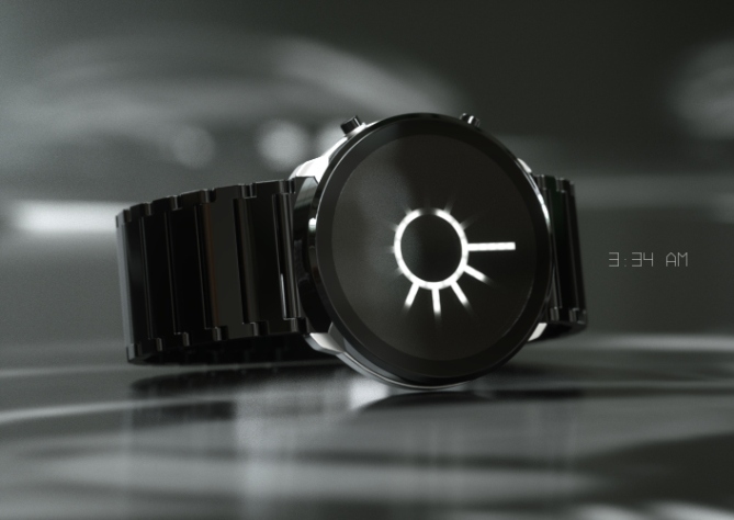
Design submitted by Firdaus from Malaysia.
Firdaus says: A mysterious way of time telling with eclipse code; this is Crimson watch design.
Despite its cryptic look, the time telling on Crimson is relatively easy to read. The eclipse ring indicates current hour and extended lights indicate current minute, all in analog +4 format. The watch material can be made in acetate (as depicted – black acetate) or stainless steel body and strap. 
People who have interest in cryptic symbolism, mystery and art would love this design.
This design can be achieved using LED technology and I believe it is suitable to fit in TF product line.


Wow your design looks absolutely gorgeous. It brings both class and style to one piece and looks ready to be made.
LikeLike
Hello Kloryc, thank you very much for your comment. I hope you voted 5/y so It would have chance to be made. Cheers and have a nice day!
LikeLike
Cool! It’s a nifty little design; easy enough to read, but unique enough to attract a little attention. But what happens when minutes == hours? Such as at 12:00, 1:05, 9:45, etc.
LikeLike
Hello injust thank you for your time commenting. At time such as 12:00 and 1:05 etc, it would look almost exactly as depicted in silver+blue LEDs version on cover page, which shows 2:10pm. I think it is still cool! Please let me know if you need more example. Cheers and have a nice day!
LikeLike
This is a watch that I would definitely like to own.
LikeLike
Me too, cheers for your comment. Have a nice days ahead!
LikeLike
Looks pretty awesome! 5y
LikeLike
Thanks awesome!
LikeLike
Once again after long time … a New Avatar …. All Da Best … 🙂
LikeLike
Hi Ranjan, what an interesting feedback I got here. Thank you for the wish, I wish everything is OK for you too, please lemme know should you need a hand (in case of design). Thank you and have a nice day!
LikeLike
Hi Firdaus, very beautiful watch, superb design, one would say that it is already with the sale.
5* and large Yes!
LikeLike
Large thanks from me too. Cheers for your support. Have a nice day!
LikeLike
Mmmm a yummy creamsun! I love this one! I might have to change a concept I’m working on 😛 But I would really like to have this beauty. The time display looks fantastic! I would like to see times like 3:15 or 6:27 and hope it still looks great, when the big beam hits the gap. I think so. 5*/YES
LikeLike
Hi Samukun, if example like 2:10 as depicted in silver+blue version couldn’t satisfy you, I’ve made one special in purple acetate for you. It’s 6:27 . I think it is cool, hopefully you’ll like it. 😉
Cheers and and have a good day. Thanks for your support!
LikeLike
: D ~~~
LikeLike
Thanks Toky for posting this design. Also thanks to voters and haters, I’m in positive mood, so all is okay!
For those who interested, I have an ultra short video animation of the display. YOU CAN WATCH IT HERE .
Cheers and have a great day everyone!
LikeLike
Stellar (hehe) work there, Firdaus. It looks like you’ve hit the sweet spot between readable, cryptic and make-able. Plus it looks really very nice indeed. =) Good luck!
LikeLike
Yeah good luck for us hehe. I like you comment about sweet spot, so sweet. Cheers for the support and good day!
LikeLike
Very Nice Fir!
For me like Anders says it really strikes the right balance between crypticness, readibility, makeability and wantability! 5ability and Yesability! 😀
LikeLike
Your comment is highly thankability! Thanks and good day or night!
LikeLike
It still looks good when the “minutes” are in the gap, like your 2:10 and 6:27 examples, but is even better when they don’t, which is a lot of the time (55 minutes out of every hour).
I would definitely want to add one of these to my watch collection, the problem being deciding which colour combination to buy. An easy 5*/Y
LikeLike
Hi Nev thanks for that insight. Yup would agree, perhaps that gap would look like special event is the series of cryptography or special message in the crop circle (such as missing link)… Cheers for the wish and have a nice day or night!
LikeLike
nice job, wat to keep it classy 5*
LikeLike
thanks pop 😉 have a nice day!
LikeLike
Cool minimal design Firdy. 5Y. 😉 Best of luck with it.
LikeLike
Cheers mushy for adding up your comment and thanks for the luck wish!
LikeLike
Nice to see a Fir design getting a well deserved decent rating for a change! Best of luck sir! 😉
LikeLike
Thanks again for your encouragement Pete, you are very kind. Friendship point +1 😉
LikeLike
Simply Stunning, I would buy 2 in multiple colors. Best of luck to FK.
LikeLike
I like the idea. The display would always be interesting. (It remind me of a concept I did, which was using a similar display, with e-paper tech, for the hour & hands for the minutes/seconds. In the near future, I’ll redo it with LCD screen)
LikeLike
Thank you everyone for comments and votes. I wish Crimson will make it to the next stage. Cheers!
LikeLike