Design submitted by José from Spain.
José says: I want to share here this new concept inspired by the iconography of smartphones, tablets, etc.

When I wake up in the morning, first thing I do, is look at the phone and see if I have any warning messages, watsups …, this practice has led me to develop this concept based on communication icons of this technology. This is CT_1 the “Comentime” concept.
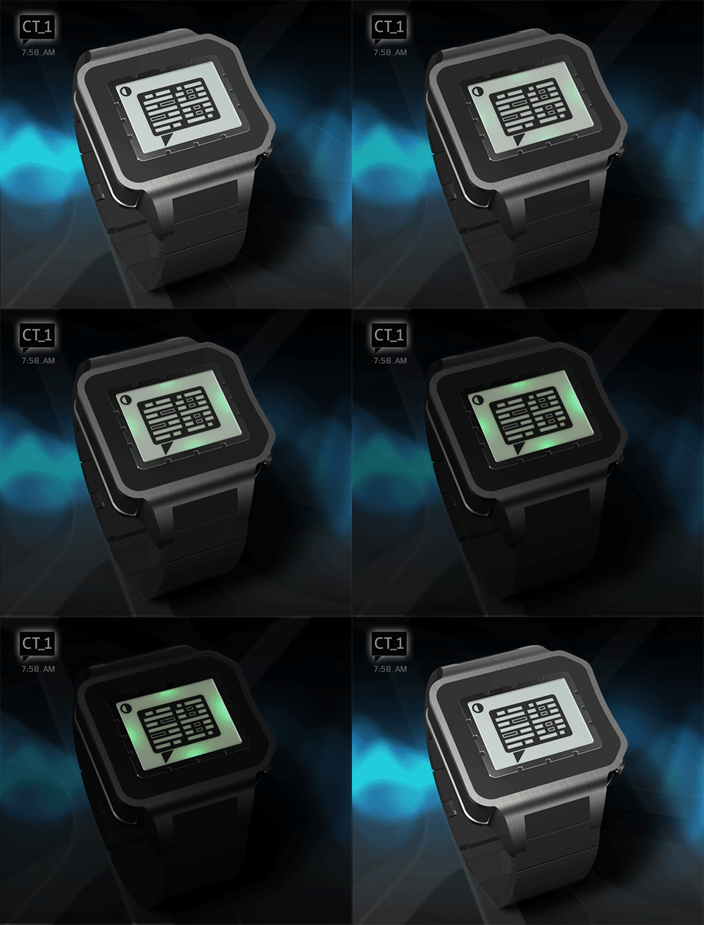
To do this, I designed a set of digits formed by two columns of parallel lines that simulate the text of a message inside a text box.

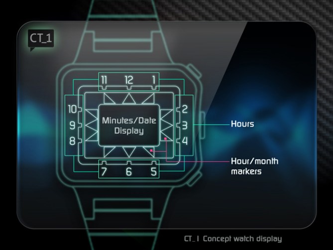
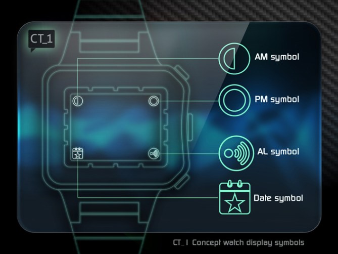
The concept is very clean and simple; the watch “comments” to you which time it is “quite literally” with a text bubble that includes minutes (using this dummy text), CT_1 may also indicate the date, AM, PM mode and alarm.
I have generated three difficulty levels for reading: hard, soft and easy according to the user preferences.

I think CT_1 can be performed with any of the technologies that manages Tokyoflash. Personally I think LCD technology is the best can run with this concept.
CT_1 may interest those who enjoy new technologies, social networks, and also those who enjoy testing their mental capacity. Regarding the finish options and combinations, you can see that there are no limitations, only have to choose.
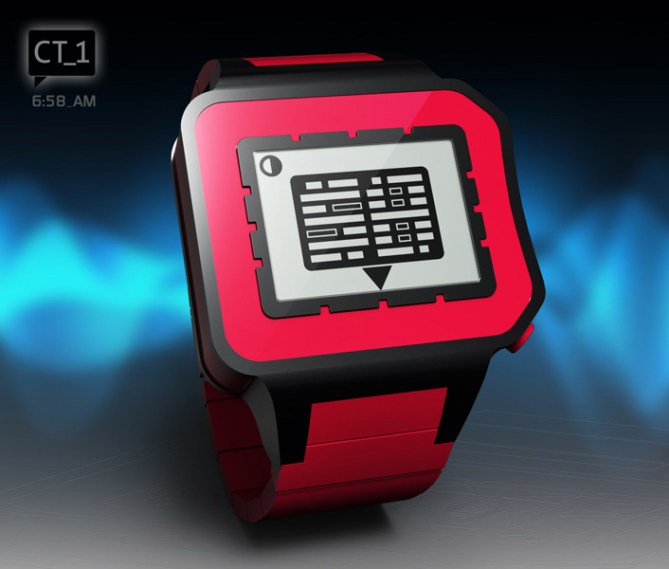
I would emphasize two qualities of this concept: simplicity, clean design and as CT_1 interacts with the user.
As usual, I really enjoyed preparing this project, I’d like it if you think worthy, and if you have time, your support and share it.
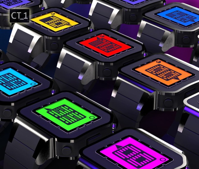



Great presentation and very cool watch, I want one!
LikeLike
OMG what a ridiculous rating we have here. This can simply have 5* YES from me…. No not because of the beautiful and professional looking rendering but the concept itself is decent. Yes there’re bunch of such concepts already but this one looking pretty different. I like the look of sleek and modern speech balloon indicates time. I’m aiming the red version. Goodluck Jose!
LikeLike
Hey Firdaus, you want to marry with whom?
LikeLike
It’s written: I Want to marry a vegan 😉
LikeLike
Ah OK!
LikeLike
José, this is a sensational design – I love it! Is this your first time? Amazing job!! I really love colourful watches, and yours is a veritable rainbow. Ignore the poor rating – unfortunately, as I’ve said before (and experienced myself), colourful watches don’t rate highly on TF, for some reason. Also, there are down-raters who keep checking 1/N in order to bring ratings down. They are really bad sports.
As for me: 5Y, without a doubt!
LikeLike
There’s much to like about this, funky colours and styling, and I really like the three display options. It looks like it’s a nice learning curve from the easy to the hard setting. Very nice images, too, as has been mentioned…=)
That said, I probably wouldn’t buy it for myself, though I know plenty of people who’d want one. I have a feeling it might be a bit too simple for some of the more hardcore puzzle-people, but it should make up for it in mass-market appeal. Best of luck!
The current score is a shame, but then this problem’s come up before and as far as I know TF can ‘sort out’ the snipers and dowraters.
LikeLike
Hi Jose, very nice work sir! I can only repeat what the other guys have said here. Great concept, fantastic renderings and really professional presentation. Couple of the images look real. Staying with the mobile phone theme the digits look like a SIM card to me 😉 . My only concern is will the digit box look as clean and dynamic when divided by all the segment lines that would be needed to show all the different time modes (LCD) if the watch was e-paper then that wouldn’t be an issue. I guess we will only know when TF make it! 😉 best of luck sir and don’t let the clearly down-rated score get you down. 5/Y 😀
LikeLike
Mixing retro with future! My favorite! 🙂 If you look in segments, the case and strap look like G-Shok, but overall picture is amazing. The best part is the complexity of watch. 5* from me and one big YES! Best of luck.
LikeLike
Hi Jose, which is important for me is the overall shape of the watch, the relative ease of reading the time (the choice of difficulties is very good), for everyday use and the choice of color (I like metal, then I am sure that should not pose problem with TF), so all these criteria are met, which means five stars and Yes.
Nice work!
LikeLike
Awesome design done by Jose. Hats of to you…. Thanks for sharing. I love led rave party products. I have good collection of led wrist watches as well as led cyber goggles
LikeLike
TF, please remove this SPAMMER.
LikeLike
Yeah, get spammer off, please! Go hawk your stuff elsewhere!
LikeLike
Gracias por marcar una vez más nuestras vidas con tu tiempo. Sin lugar a dudas demuestras tu valía en casa diseño. no dejes nunca de seguir haciendo relojes.
LikeLike
Precioso…….suerte
LikeLike
Veeeeeeery nice! This is the coolest of this semester. Hope it succeed.
LikeLike
Hola, José! This concept is kick-ass! I’ve always liked thought/speech baloon iconography, and your design satisfies the need. I also appreciate the colors you’ve used, not everyone wants to blend in to the crowd. As for the rating system, it is flawed; until TF blocks rating until you’ve posted a comment (haters have to explain their cowardly ways), I would chalk it up to jealousy of mad skills. I voted 5* anyway, so they can stick it.
LikeLike
I like the visual appearance of the colors and the numbers and the rest of the display. I’m not a big fan of the watch proportions. The frame around the display is so big and the case is a bit too block-ish. A slight angle here or there could help. But tastes are different. The display is nice. The combination of digital and analog is a good thing. The watch goes directly into the eye – it’s a cool eye catcher. The presentation is wow 🙂 Good job José, and good luck!
LikeLike
Like it very much…congratulations José
LikeLike
TF, hurry up and make this yesterday, please! :-bd
LikeLike
TOKYOFLASH MUST MAKE THIS!!!!!
77391*/5*
LikeLike
Very cool… 5 stars from me. I’ll take the blue one 😉
LikeLike
Cool graphics Jose. 🙂 I like the design a lot but not so keen on the “hard” numbers. To me they don’t really work. Anyway, I gave you 5Y. 😉 Good luck with it.
LikeLike
The overall look is very nice. It remind me of computer processors & cell/smartphone Sim card. About the digits : The Basic & the Soft are good ( the Soft is my fav ). The Hard are too hard.
LikeLike
Muy bonito, estoy deseando que se haga realidad para comprarlo.
LikeLike
Another great concept from Jose! My friend you are really getting so good at this. Tokyoflash would be silly not to produce this watch! I must say that I would run it in soft mode for the digits, but everything else is very cool!
LikeLike
I apologize because I would like to answer each one but I have not been possible. Thank you all for your kind words, comments, suggestions and support. Thanks Tokyoflash for posting this concept
See you on the next project, until then enjoy life
LikeLike