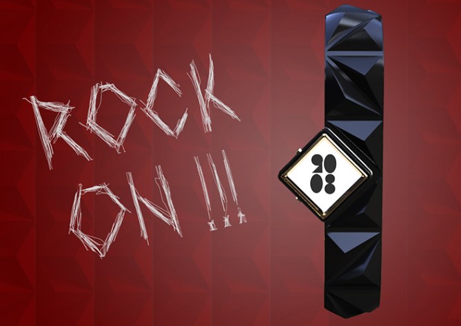
Design submitted by Igor from Serbia.
Igor says: When Rob Halford from Judas Preist wore studs in 1979. in “Breaking the Law”, he didn’t knew that his trade mark will become a one of the most popular detail ever. Especially now. You can see them everywhere so why I can’t design a female watch in that manner? Women watches are often becoming a bracelets too, part of a accessory.

This watch have basically two parts: silicone rubber for a strap and golden colored finish on case. You can stretch a silicone strap and put it on your hand. And its easy replaceable so You can change a strap color. Numbers are specially designed, inspired by geometry and aliens.


This watch is designed for wide audience. Women from 15 to 40 y.o. and everyone who wants to stand out in a crowd. Wide color choice and easy time telling and very interesting, chic and unusual.
I think asymmetric design is underrated. With it you can get a very interesting shapes. With combined trends and styles you can get a completely new design philosophy.


Looks nice Igor! Obviously I’m not the target market but I appreciate the style and who doesn’t love a little a-symmetry? I like the numbers too, very cool! They have a pop-arty look to them. Would be interesting to see them overlaid so you could see how the LCD segments would be divided. It’s not a significant detail for the concept but would be interesting and would add some realism. Nice work sir 5/Y (would consider buying as a gift) best of luck! 😀
LikeLike
Thanks Pete, You are my regular voter now. 😀 I wanted something new to make in fashion- female style, but I think it’s not that good. Judging by the grade. I need to work a lot in feminine watch design. Thanks for comment and rating. Cheers!
LikeLike
Hi Igor,
Its best to take the ratings with a pinch of salt, they rarely reflect the general consensus of people who take the time to comment and share. Some people will give 1 out of 5 just out of some strange kind of spite sadly. The comments often give a better picture of how the design is percieved. 😀
LikeLike
Thank You TokyoFlash for adding my design!
LikeLike
Hi Igor, here some personal remarks.
I like the figures and the whole of work, on the other hand the bracelet takes too much importance compared to the dial, I am not sure that off-centering is quite suitable on this subject?
I admire work in 3D and colorimetry, all that deserves a 5* and one Yes!
LikeLike
Hi Patrick, thanks for support and 5*. Female watches are very delicate topic, because if you take a look in Bvlgari Serpenti or CK watches, you can see that the bracelet is the main thing. Bracelets are in that manner bigger and eye catches them first. On the other hand, I spent equally time on display and bracelet so they can be too far of each other. Thanks again, cheers!
LikeLike
so they *can’t be too far
LikeLike
Igor, I understand your approach, then maybe your bracelet does not rotate enough in the drawings, because reducing the visible height of the bracelet, it seems to me much better? (it’s really no big deal, it’s just visual)
LikeLike
No, no, no don’t get me wrong, I’m not angry or something. 😀 I understand now that you were saying that I showed too much bracelet and no dial. Why do you think that off-centering is not suitable? I am interested because, not many people like asymmetry and I want to know why! 😀
LikeLike
(no problem, we discuss simply and it is interesting)
Did I realize that with a less long and more circular bracelet, the off-centering disturb me any more?
LikeLike