Design submitted by Peter from the UK.
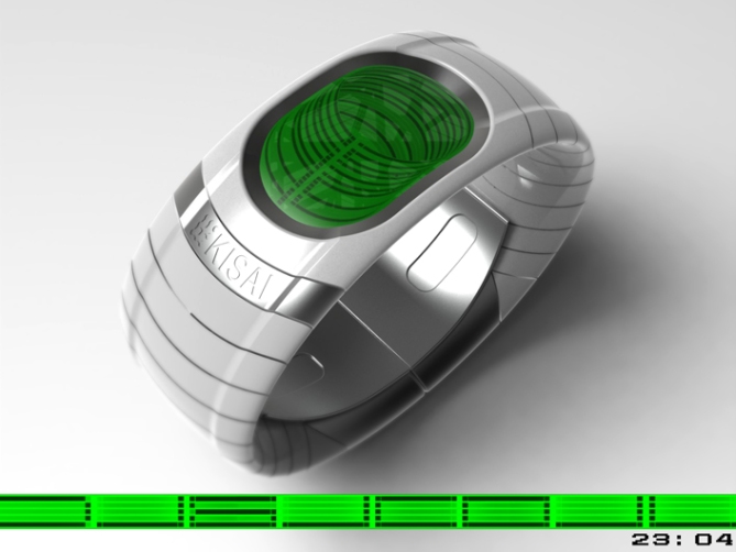
Peter says: This is “Digicoil” a evolution/mutation of an earlier design called “Digital Warp“.
“Digital Warp” featured an LCD display showing digital numbers which were warped around the centre of the display.


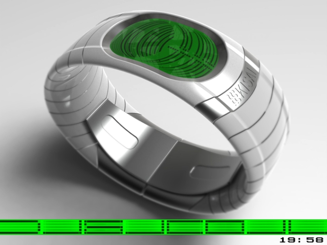
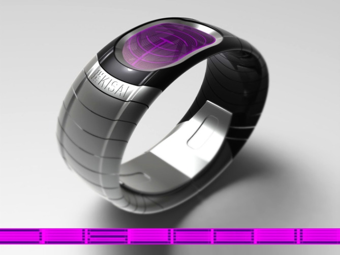
This version uses similar numbers to those in “Digital Warp” wrapped around a virtual cylinder. This gives the display a more 3D look whilst being slightly cryptic but easily read.
The times is read from top to bottom, with hours at the top and minutes at the bottom.


This watch is clean and simple with an elegant look which should make it suitable for all ages and genders. The simple time telling method should make it available to a wider audience and the backlit LCD allows for easy manufacture.
The cylindrical warped digits set this design from others. The simple clean form of the watch body puts this watch in a niche of its own.


That’s a cool way to show these clever numbers too! 5*/YES for sure. The numbers are just a bit hard to read. Not bacaue it’s difficult but because of the contrast. The simple watch geometry with the curved segments and the nicely embedded dispaly carries the Pete signature and I like it! Good luck sir 🙂
LikeLike
I thought this style of numbers deserved another outing as digital warp didn’t seem to capture many imaginations. I think some of the difficulty in reading is down to my colour choices and selected material qualities on the rendering. I used a satin finish rather than a low gloss. Which hasn’t helped in this case. Always learning! I’m glad you likey sir! Cheers! 😀
LikeLike
Cheers TF for adding this design to the blog! 😀
LikeLike
Hi Pete, great job as usual.
I have a little trouble reading the numbers, but I’m not a reference.
5 * / Yes.
With the fact, you have beautiful eyes (red “Blade”), you know? ah ah ah
LikeLike
Thanks a lot Patrick! as usual! 😉 This one is on the cryptic side plus some of my images arent the clearest. Cheers for the stars that aside! Cheers for the vote and mug shot compliment! 😀
LikeLike
At first glance I thought it’d be difficult to read, but after a couple of tries it looks like it works remarkably well. While still looking suitably cryptic, which I know is not easy to achieve…=) I really like the 3D effect in the display; heightens the look of the thing and seems very makeable. The integration between the display and case works well, too. The sci-fi-ish feel is solid, the colour options are well chosen, I think. I especially like the gradiated two-tone, I’m only miffed that I didn’t think of it first…=)
Best of luck mate!
LikeLike
Yay! Great comment sir! Yeah the digits themselves are fairly straight forward once you get your eye in. My images probably don’t help matters, they could be clearer. I’m glad you gave it time to sink in! 😉 Yeah the two tone one is my favourite too. It would work for colours as well as monochrome. Cheers for the great feedback and the luck sir! 😀
LikeLike
Hey, Pete! This is beautifully designed and executed, well done. I think the segments would appeal to me more if they were thicker, but then your display would get crowded. I do support the design though, great display/band integration (to echo Anders). 5*!
LikeLike
Hey Xian,
I think the line/segment thickness could be increased without detriment to the design. The spacing would just need to be increased to match. The 3D part (top) of the cylinder could be made shallower if needed to keep the display size similar to what it is now. Cheers for liking and the feedback sir! 😀
LikeLike
I like the numbers, Pete. I can read them with only a little difficulty (enough to keep me interested).
Only thing I would change is the colour combinations: I would prefer bright numbers on a black background. Would that work? If so, I would go for green on black.
Great design, as usual. 5*/Y
LikeLike
Yeah a bright colour on a dark background (inverted) would look great. I’m surprised I didn’t do an inverted version (I usually do) so fair comment and great suggestion sir! Cheers for the support Nev! 😀
LikeLike
This awesome futuristic wristwatch’s digits look like the Loops & Whirls of someone’s fingerprint taken from a biometric scan. Surely this should be at the front of the queue to be constructed.
LikeLike
Can’t argue or complain about this comment! 😉 I like the way you see the design! Cheers very much Andrew! 😀
LikeLike
Pete it’s a nice design/idea so I gave you 5Y. But I feel like the numbers are a bit squashed at the bottom. That’s just my opinion tho. 🙂
LikeLike
Could you maybe have 2 numbers at the top and 2 at the bottom? I know they wouldn’t go all the way round but the numbers could be bigger and less densely packed.
LikeLike
Do you mean two digits side by side top and bottom? If that’s the case, you could but you would lose the cryptic nature if the digits as they stand. The spacing and line thickness of the digits could’ve easily be tweaked which might make the display look less dense. The top part of the display could be reduced to help with the digit spacing ratio if needed. Cheers for the vote and feedback sir! 😀
LikeLike
No, 2 digits top and bottom with each pair arranged with one digit on top of the other. They wouldn’t go all the way round as they do now, but the coil shape would still be retained. Also, how about the coil appearing to pass round the back of the watch with the glass going to the edges or even slightly beyond? You’d just be left with straight horizontal lines on top where the digits are hidden. In addition, could the dots be used on their own to tell the time in another way?
LikeLike
You could make some good little digits out of the dots showing just the left and right sides.
LikeLike
I like the sound of the digits going to the edges giving the look of going all the way around the watch. Could look cool. Struggling to imagine the two digits in pairs. Sounds interesting. The dot based digits sounds cool! 😀
LikeLike
Pete here’s the pic we talked about. Hope it’s ok. 🙂 Will do a dot digit one too.
LikeLike
Here’s another layout Pete:
LikeLike
I like this one best. Could add seconds too.
LikeLike
Crikey you have been busy! 😉 they are both great suggestions! The multi colour one is very cool, id love to know if that is technicaly posible. They both would allow for smaller or less cluttered displays or twice the info with my current layout. Very nicework and great suggestions! Thanks a lot Lloyd! 😉
LikeLike
Very clever design on the numbers Peter. I really like it. The presentation of the watch is top shelf as always. 5 stars
LikeLike
Thanks a lot Murrance, im glad you likey! Cheers for the support sir! 😀
LikeLike
3.5 star rating? Ouchy! 😦
LikeLike
The numbers are not that easy to read as they might supposed to be, but the overall idea and the rendering is great. Strange rating here
A reason for that could be the missing explanation. While to Peter the decrypting seems obvious it is actually not that obvious and many people do not have time to decypher.
LikeLike
Hi Pawel, you could be right about the easy of decryption. As the creator of the digit layout it seems very obvious to me. Also as this is an evolution if an earlier design it seems easier still for me anyways. I don’t think the clarity of my images is helping either. If people do give the display time to become familiar they would realise that the digits are hiding in plain sight with no decryption needed. But like you say that’s on the basis people have to time to get familiar. Cheers for the constructive analysis Pawel! 😀
LikeLike
I’m tired with you Pete, maybe I should write this word in my sticky note and copy paste whenever you post any designs* “Me Gustaria”
LikeLike
Thank you sir, you are too kind (that is my pre-saved pastable response 😉 lol)
Im happy that is your sticky note and not “Damn that is ugly boy……my eyes my beautiful eyes……what were you thinking?” lol Cheers for the support sir! 😀
LikeLike
I prefer this one vs the “Warp” because the digits seem easier to read. I like the “slinky” look of the display. I like the black/red.
LikeLike
Cheers for the feedback Makko! 😀
LikeLike
This one ends soon, so just a quick thank you to TF for posting it here and cheers to everyone who commented and supported it! Cheers
Pete from the UK 😀
LikeLike