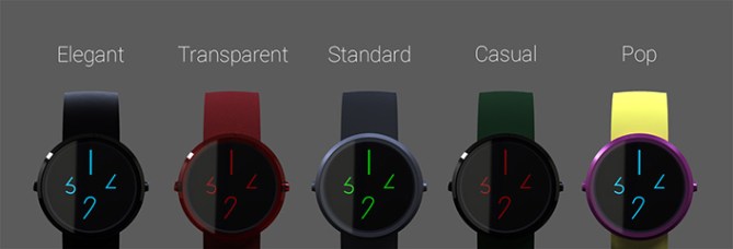
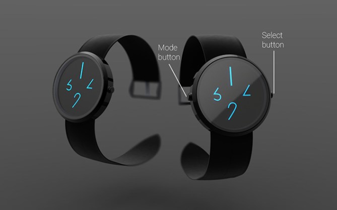
Design submitted by Igor from Serbia.
Igor says: I was searching for clean and simple design with relatively easy time-telling. Using LCD technology, I’ve come up with new arabic number design, using only parts of them. This type of watch is like symbiosis between today everyday models and future models.

Basically, this is arabic numeric system, designed to be more provocative and cleaner, using only part of the whole number. This number design helped me to make my watch even more elegant and cleaner. Also the belt is going trough watch case, so you can get minimalistic style.

This model is for wide audience. From teenagers to middle aged public, but mostly young people aged 20-30 years old. You can wear this watch from coffee shop, to sport activities, and then to office.
My design is something new, clean and fresh among the others. It is elegant, everyday and everywhere wearable. Product of very calming and subtle design but with very striking and provocative impression.


Great minimalist design and colors, would buy
LikeLike
Love the minimalist design! Been looking for a watch from Tokyo Flash that is as elegant as this one. Hope you guys put this one into production!
-Vinylville
LikeLike
Thanks Vinylville, I hope that it will go into production to! 😀
LikeLike
Cool!
LikeLike
Nice simple, clean and clutter free look. For me though, like the digits something is missing. It doesn’t feel that new or different enough for me. It would have been nice to see all the new numbers or more time examples to better understand. I imagine if I saw this watch in a shop among “standard” watches it would stand out but here on the blog it doesn’t really grab me. I gave you 5 stars for support but I don’t think this one is for me. I hope this didn’t sound too negative. Welcome to the blog Igor! 😀
LikeLike
Every comment is good and your is not too negative. 🙂 Thank you for 5* rate and support. I know this watch is not innovative by form and i like watches like MB&F, Uhrwerk, SevenFriday… because they are crazy. But this is designed for huge audience and I wanted to replace “standard” watches like Swatch etc. Thank you again and congrats for Blade.
LikeLike
Hi Igor, thank you for taking my comment with a pinch of salt! 🙂
I see what you mean. This design is very realistic, makeable and mass marketable.
I could indeed imagine it next to a swatch type of watch in a shop and this would stand out.
Its kinda semi-cryticness for the masses.
I guess the one “downside” of the blog is it is very easy to get used to seeing the more eloborate and futuristic concepts, and thefore designs that arent glitzy and covered in flashing lights get less attention.
Cheers for the congrats! 😀
Best of luck sir! 😀
LikeLike
Nice extra time examples and digit explanation BTW! 😀
LikeLike
Great design Igor. Very minimal and the digits are given a fresh twist. Definitely would buy 🙂
LikeLike
Beautiful design! Futuristic and minimal, It’s my cup of tea!
LikeLike
Fantastic work ! Definattly want one, it’s just what was i looking for, simple, fresh and cool for everyday use.
It would be a shame not to reproduce it !
LikeLike
wow!!!! bellisimoooo
LikeLike
Outstanding ! WANT ONE !
LikeLike
Hi, Igor! I like the digits, would want to see what you do with the others. Although having the 2 buttons on opposing sides is asthetically pleasing, I don’t believe that arrangement is practical; imagine holding the watch with your thumb on one side, and pressing the button with a finger on the otherside–you’ll have the most leverage keeping the opposite side clear for your thumb. I might suggest moving the buttons to 2 and 10 oclock or 8 and 4. I’m glad you’re getting 5* from some on your first try, some aren’t so fortunate. Good luck!
LikeLike
Hi xian! I was thinking about the button arrangement and the goal I was aiming was to set time while watch is on the wrist. Actually I never did it with a regular watch and that annoyed me. 😀 I understand your comment and I will try to make a different but still good arrangement. Thanks for comment! Cheers!
LikeLike
It would have been good to see the other numbers to get a better feel for how it would look. What you have shown looks good – it is simple, but that does not detract from its appeal.
Maybe sometimes it would be good to wear a watch that looks good, but is still easy to read! Good luck. 5*/Y
LikeLike
Thank you Nev. When I first saw watches of TokyoFlash, they were very interesting whit colors, lights and shapes, and basically no classic display. I wanted to create something bit simple but to stay with their design concept that i like very much.
LikeLike
I love this watch, but I think you need to reconsider the name. In English it sounds rude!
LikeLike
Now when you mentioned it, you are completlly right. Vakt is a sweedish word for guard, and I did not said it on English to hear how it will sound. The name will be changed. 😀
LikeLike
What does it sound like to you dzign, “f***ed”?
LikeLike
Hi Igor, Nice design! We are definitely looking for more designs along this line for more mainstream customers. Also with LCD we can use smaller batteries which allows us to make smaller sizes as well which is good for the female market. So this is a good direction for us as well. Looking forward to seeing more designs from you.
LikeLike
Hello Tokyoflash, thank you for submitting my work and thank you for comment. I’m currently working on one female watch and i thought that should be my next move. If you could tell me witch is the minimum thickness of an LCD watch? Only because of proportions and to know what is a size of playground. 😀 Thanks again for everything. Cheers!
LikeLike
probably 8-9mm for stainless case.
LikeLike
Very creative idea! Good job Igor! 🙂
LikeLike
Amazing job! You took something simple and made it look awesome!
LikeLike
Great design Igor! I would deffo consider buying it if it gets produced. Keep up with good work!
LikeLike
Sometimes, simpler is better… Current trend is minimalistic. Simply unique I like it!
LikeLike
Thank you Firdaus. I think minimalistic trend will be with us for a while. Cheers!
LikeLike
I like the overall look. The 1st picture remind me of the “Magic 8” ball. I like that the 2 buttons are at 3 & 9 o’clock instead of on 1 side. I would buy.
LikeLike
Thanks Makkovik for support. Cheers!
LikeLike
Absolutely fantastic. I have not seen nearly as good as a simple watch. 5 stars from me. Where can I buy it?
LikeLike
Very interesting watch indeed. The thing I like most about watches like this one is that it stands out from the rest I find here on the market. Concept and idea are very unique yet simple, and with more available bands and display options in the future based upon this watch, I definitely give it a 5 star rating. Great work, Igor!
LikeLike