Design submitted by Peter from the UK.
Peter says: I really have a fondness for LED watches and the sense of depth and mystery the displays can give you. LCD or TFT rely on the graphics or shapes of the blocks to create a feeling of depth. The trouble with deep looking displays is they tend to make for a deep watch which isn’t always appealing to all.


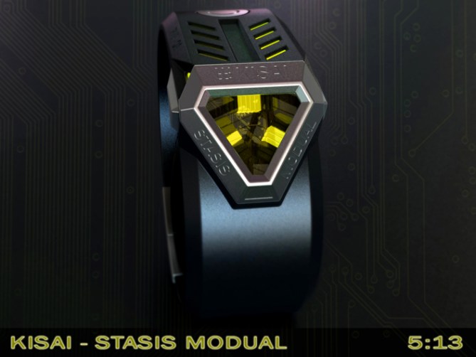
So I started thinking about a “Driver” style watch that would make enough room for the electronics and deep looking display but keep a relatively low profile. I decided I wanted to make a futuristic watch with a triangular display which looked somewhere between a robot’s face, a spaceship and a cryogenic pod…..”Stasis Module” was born.

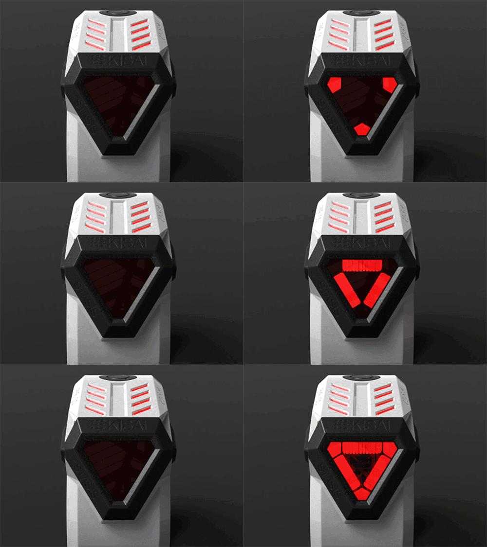
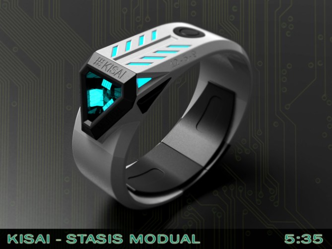
The time is told by a triangular shaped array of LEDs at the front of the watch framed by a chunky looking triangular bezel. The array of LEDs could describe the time in either 12-5-9 format of in phased cryptic looking digits. The LEDs would also be able to perform a selection of funky animations and occasionally blink as if it were alive. Ideally these LEDs would be multi-coloured allowing the wearer to choose their favourite. The case also features decorative LEDs which come on when the display is in use.


This design has a futuristic look and an engineered feel. It is chunky in its design language but small enough to fit the majority of wrists. The display has a deep and mystical look which uses recognisable formats that should make it accessible to a wider audience.

The “Driver” style layout and futuristic looks sets this design from others. The two time displaying styles combined with customisable LED colours helps the wearer stand out from the crowd.


Cheers TF for adding this design to the blog! 😀
LikeLike
Awesome design Pete! The geometry is epic and the lights are looking great. Nice time telling alternatives. Very animations. I would be happy to own this one 5*/PLEASE
LikeLike
I’m glad you likey sir! Cheers for the feedback and vote! 😀
LikeLike
wow wow wow wow…. this is a wow looking watch. Ultra futuristic watch that many people will buy without ever thinking twice… I could add lazer or projection capability on the triangle face. Awesomer 5*
LikeLike
Haha yeah lasers would be cool!! You know your are starting to sound like a bond villian with all your lasers!
You’l be attaching them to fricken sharks next and asking for ransoms of one billion dollars! lol
Cheers for the awesome feedback and vote sir! 😀
LikeLike
How about an always on?
LikeLike
They managed it with Seven so it must be possible here too! 😀
LikeLike
Bond would buy out the STORE!
LikeLike
Actually, that design could adorn a Bond villain. It could reach out and bite someone. Like the 50s poisoned umbrella tip.
LikeLike
Hehe nice, proper old school bond! 😀
LikeLike
Shut Up and take my money!
LikeLike
My most favorites words in the entire world!!!!
(well that and the phrase “that will never fit in there!” but thats a different topic entirely! lol)
Cheers for the support Jariten! 😀
LikeLike
Hi Pete, this is a watch that I saw, there is a certain time on your link. I thought she was already in production?
I vote 5 * / Yes, of course, but do I need to say?
LikeLike
You are right Patrick, this one has been on my FB page a little while. No sadly she is not yet in production 😉
Hopefully one day! Cheers for the kind words and the vote sir! 😀
LikeLike
I omitted to say that I found this watch very beautiful!
LikeLike
Yay! Thanks a lot Sir! 😀
LikeLike
omg please make this a reality.
LikeLike
Thanks a lot Inky! I hope for the same, fingers crossed! 😀
LikeLike
I want the light-blue one yesterday!!!
LikeLike
Where’s a modified Delorean when you need one? If I see the Doc I will see what we can do! 😉
Cheers for the support sir! 😀
LikeLike
OMG! Do NOT tell us you are gonna put Delorean gull-wings on a watch! ;-0
LikeLike
Hehe only if the design can reach 88mph and run on recycled fuel! 😉
LikeLike
Looking at the black and red.
LikeLike
This is a nice idea and good implementation. I like that the leds use depth behind the glass surface. The display shape reminds me of the alien tet-object from the movie “Oblivion”.
LikeLike
Yeah now you mention it is does bare some resemblance. Lets hope it doesnt try to take over the world! 😉
Cheers for the support sir! 😀
LikeLike
Props for doing a ‘driver’s’ watch, I haven’t seen one of them in a long time! I like the general style of it, it has an appealing industrial-futuristic look to it which appeals to me. The display itself I’m less enthusiastic about. I don’t know exactly why, but it looks sort of busy… Anyway, it certainly seems to be an unalloyed hit with plenty of other people, so don’t mind me…=) Good luck Pete!
LikeLike
Im glad you like the majority of it if not the display. The busy feeling might be because I put a “electronic board” look on the background of display to add to the techy/mysterious feel. Might be a bit much, maybe just a plain background would be better. Would look a little clearer etc. Cheers for the feedback sir! 😀
LikeLike
Just to clarify; it’s not really that I don’t like the display (the shape is very interesting), there’s just something about the style of it that pushes it over the edge for me… Yes, the circuit board background might be it…
Hmm, I feel an idea for a driver’s watch coming on… Where’s that sketchpad? =)
LikeLike
Maybe the LEDs are too closely packed in. Maybe if they were smaller and more spaced out it would look less cluttered. Initially it had fewer LEDs (just the ones needed for 12/5/9) but then I added the ones in the corners and one in in the centre as this allowed for the phased digits. It also allowed for a nice triangle shape which makes for better animations. So because it evolved the way it did the spacing/sizes may well not be optimal. Cheers for the feedback and good look with your sketching! 😉
LikeLike
Good Luck To You And Me :o)
5* / YYY
LikeLike
Thanks a lot Topsider! Good luck to everyone! 😉
Cheers for the support! 😀
LikeLike
Damn, Pete–I don’t remember which of your designs I said was my favorite, but this just replaced it. Fine modeling, sir! Do you hand sketch your designs before beginning to model, or do you do your concept work in software? Man, I just was designing a case in that same triangle shape but you beat me to the punch. Love the asymmetrical profile. 5*/y!
LikeLike
Hi Xian,
Sometimes I sketch, but most of the time I have an image in my head and then I go straight into modelling. Some designs stay true to the image in my head, some develop naturally in the CAD.
Sorry I beat you too the punch! I hate to ruin your day but I have another triangular design just submitted too! lol
Don’t let this put you off submitting yours tho! There is plenty of room for a few Acute designs! 😉
Best of luck with your design sir! and cheers for the fantastic feedback! 😀
LikeLike
I think the 12-9 sides would need to either have markers (3, 6 & 9 for the hours and 3 & 6 for the minutes) or separators at these points to aid reading. Looks great, though. Just need to remember not to read at the normal position on my wrist or I’d just be looking at the case! 5*/Y
LikeLike
Yeah fair point about markers or alternate colour LEDs to help with quick time telling. The spacingsize of the LEDs could also be tweaked for clarity, there is no right or wrong answer really. Hehe yeah a orientation readjustment would be needed! 😀 cheers for the feedback sir! 😀
LikeLike
The one with the black textured band looks like a coiled viper!
LikeLike
This is HOT! Pete, I ALREADY bought one of yours, recently! Gonna have to work some overtime! 😉
Seriously, very mysterious, but easy to read. Very futurist, very cryptic LOOKING. The head looks like a humongous living jewel. It could be very marketable in a variety of colors, because the design changes its personality so much with the color (if that makes any sense). For instance, as I said, the one with the textured band looks like a snake, waiting to strike. The blue and white reminds me of the good-guy troops from Star Wars. Or, maybe something clean and medical. The black and smooth looks like some slightly dystopic personal wrist machine with some other purpose than time keeping. Self-defense? Monitoring? Forgive, please, folks! There goes my imagination, again!
LikeLike
Wow Anbreen! You certainly do have an imagination! I like the way you see multiple personalities in one design! It’s very inspiring and infectious! Nice to see here on the blog! Have you considered/submitted your own design yet? I would look forward to seeing the work of your mind! 😀 cheers for the support and the comments! 😀
LikeLike
No designs from me! Strange genetic thing, opposite to my concert pianist mother– “First-class ear, but no ability to execute.” That applies to other arts, as well. A Vedic astrologer said, “Significant artistic talent, but it’s in a very tight house.” Which means, TONS of pleasure from other people’s work, but tough karma for mine. Maybe next incarnation? 😉 So, in the meantime. I’ll just be the interested consumer who walked in off the street. 🙂 For those who think what I just posted is a tad weird– It’s the California water. 😉
LikeLike
Maybe weird but very eloquent! Hehe! 😀
LikeLike
Here’s one for a yet-to-be made flick! It’s a future device for monitoring the movements of released criminals, over the galaxy. Kind of like the anklet monitor that we used in the ancient 20th and 21st c. Different color combinations signify different crimes. The jewel can be tapped for information re: parole conditions.
LikeLike
Sounds like a combination of Demolition Man, Riddick and Logan’s run! Could be a cool combination! 😉
LikeLike
Or, a blockbuster moneymaker!
LikeLike
Speaking of money, someone on ebay is offering an Intoxicated watch for a starting bid of $250, or Buy it Now at $400.
LikeLike
That’s one hell of a mark up! 😀
LikeLike
Really is. I think a few sellers buy up some of the last of a limited and post just after it closes.
LikeLike
It looks like alien watch. New, inovative and hard core. 5* rate and good luck. 😀
LikeLike
I like the way you see this design Dzigi! I thank you for your support and vote sir! 😀
LikeLike
That’s true! The deep-looking jewel could be an alien face.
LikeLike
Or the alien’s helmet 😉
LikeLike
Yes! Exactly!
LikeLike
Nice to see some new case and strap designs. I think Tokyoflash needs more interesting designs in this area. Keep up the great designs!
LikeLike
There IS quite a wealth of interesting and original stuff
LikeLike
Thanks a lot Toky! Variety can only be a good thing! I will try to keep them coming! 😉
LikeLike
Sooooo many proposed designed with traffic-stopping potential! You ‘uns are HOT! ALL of you!
LikeLike
Yeah the blog is what it is today because of all the great submissions and the people behind them. The fans and supporters also contribute an important amount. So cheers all around! 😉
LikeLike
I like the “belt buckle” look of the top part of the watch. ( where the decorative LED’s are ) & the sci-fi “movie-worthiness” look. I like that it have texts around the case. I’m not sure about the concave display. A flat display might, or not, be better. My fav is the black “textile” strap/gray case & red lights. ( pics 5/7/8 ) I would buy.
LikeLike
Thanks a lot for your feed back and support Makko! Nice colour choice sir. Fingers crossed TF see this as developable. They might well make it more suitable for you if they did develop it further. Cheers! 😀
LikeLike
Good luck Peter! This is really a cool concept. Wanna 😀
LikeLike
Thanks a lot Sam, fingers crossed this one pulls at TF’s heart strings x^^x
LikeLike
Time is nearly up for this concept so all that’s left for me to do is thank TF for adding this design to the blog and say a big cheers to everyone who voted, commented and shared this concept.
Thanks everyone!
Pete from the UK 😀
LikeLike