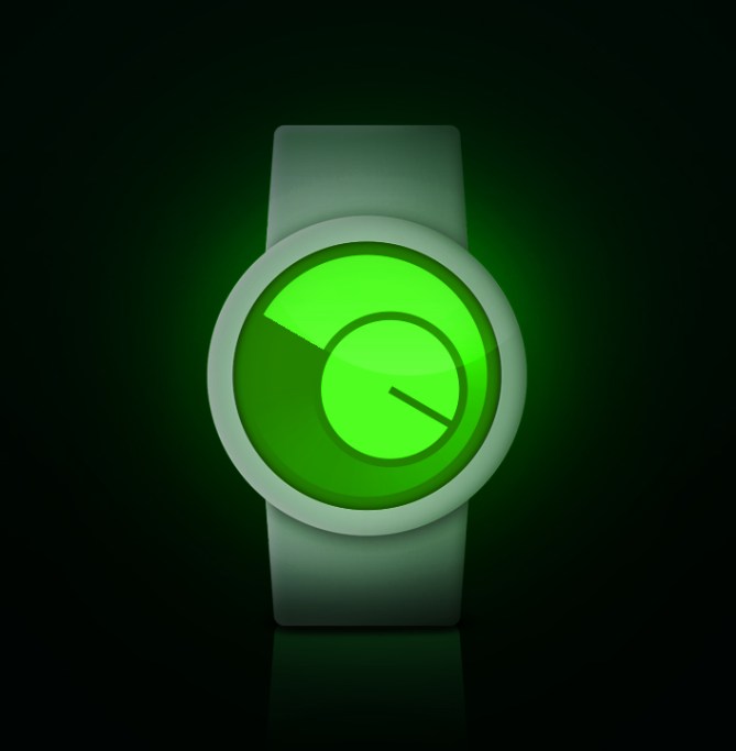
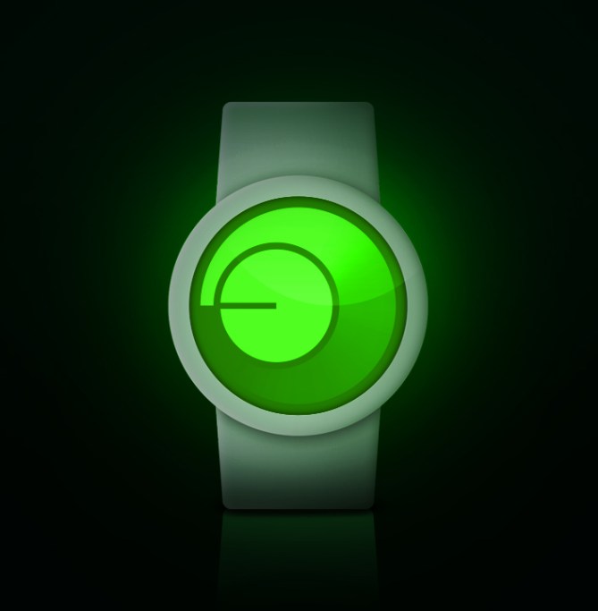
Design submitted by Dimitar from Bulgaria.
Dimitar says: This is my next design called “Ozonе”. I decided to create a simple design looking watch and after different ideas I chose this one.
It’s a watch with two different ways to display the hours. The Ozonе is a watch for those who like round and circly displays with a stylish look and a easy to read design.


It’s funny. Three days ago I sent in a similar design. 🙂
LikeLike
Thumbs up, nice watch
LikeLike
Sexy 😉 I think the combination of the gradient with the watch hand display is stylish. The presentation is minimalistic and I like it very much. 5*/YES
Honorable mention of Jordan’s Cyclops design here, which is different but shares a basic idea. Now that Robert submitted a similar design, it seems this idea is a dream of many of us.
LikeLike
Oops! You are right, I haven’t seen the Cyclops yet… 😦
LikeLike
Don’t worry Robert. I think the idea might have been thought of earlier somewhere. I believe sooner or later Tokyoflash will make such a watch 🙂
The **** were a censored cute word, not four stars btw.
LikeLike
Dear Samukun,
Probably you are right! 🙂
But the concept of my Trinary Ternary LED watch is a totally new idea, and I am waiting for its publishing here in vain almost for a month… 😦
But I am so curious about what will be the opinions of yours 🙂
LikeLike
Simple, but elegant without looking snobbish. Very nice work! Even though I think I can work it out I’d like to see a complete explanation, including minutes. Some more examples would be a bonus, but not really necessary. Good luck with it!
LikeLike
Looks awesome, and deserves a much higher score. This is the sort of thing I go for! 5y
LikeLike
I like the simple but futuristic look of this. The colours make me think of a spirit level for some reason. If this was made and turned into an LCD hopefully the segmentation wouldn’t detract. E-paper and a coloured lens might work and give the gradient effect. Or an Analogue disc arrangement might give the desired effect. Looks nice so 5/Y from me 😀
LikeLike
very simple and elegant
LikeLike
I’m sure that we’ll see such a watch in the near future, or at least a similar looking wacth. Nice work. Thumbs up!
LikeLike
I like the idea & the display. It look like 2 radars that aren’t aligned. I prefer the “hours variant 2”, because the circle is stationary. But I would prefer if it was in the top-left corner. I would have liked to have the minutes explained!
LikeLike