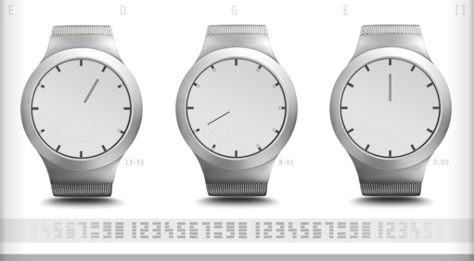
Design submitted by Pawel from Germany.
Pawel says: I found that no one has ever tried to hide the time display within the markers for minutes and hours of an analog display. After the Edge Watch, this is similar idea of hiding digital numbers in the edge of an analog face.

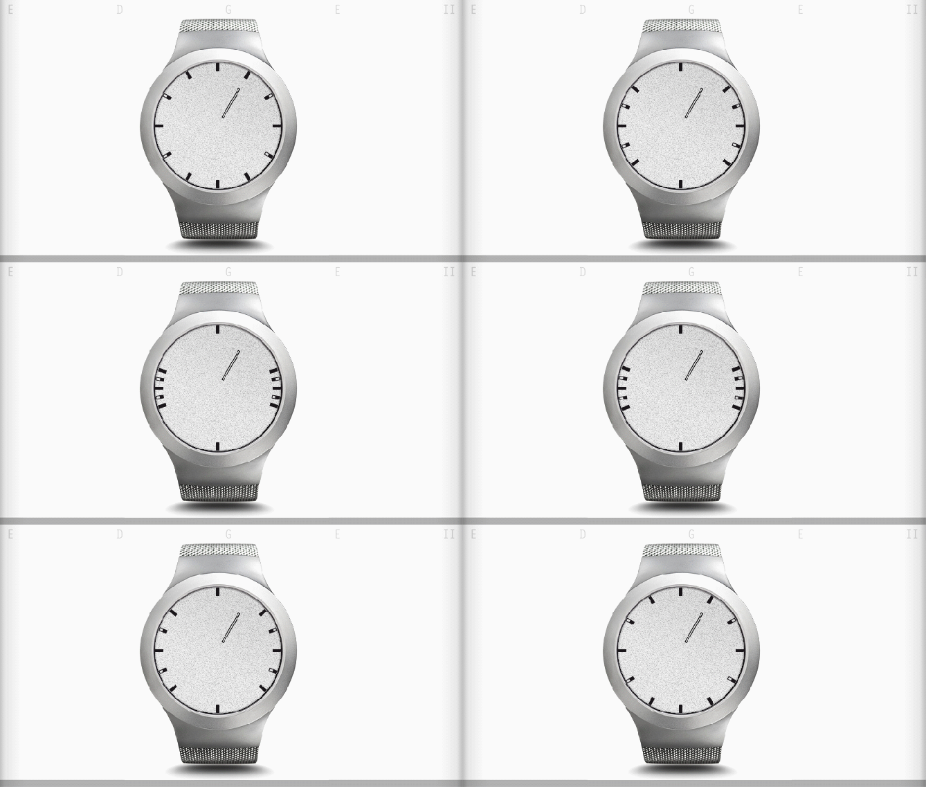
The hour hand shows hours in two modes: framed hand for a.m. (bright as day) and filled hand for p.m. (dark as night). The minutes are hidden in the hour markers. The five hour markers on each half of the display, separated by the unused markers for the 6th and 12th hour, build the two digits for the minutes (the animation explains how to read minutes). The font demonstrates the design for all numbers. The watch uses an always-on display technology.
This watch is for people who appreciate minimalism and purity in the design, loving to surprise and to amaze. It looks like regular analog watch at first, but if you take a closer look, you find that the minute bar is missing. The owner of the watch still can tell the time accurately.
This watch combines analog and digital time telling in a novel and unique way.


Nice concept! I love the idea of having the time hidden in a simple analog watch. Easy to read, yet secret. 5 and Yes
LikeLike
I love the look of this watch. Reminds me of the brand Skagen. I think reading the minutes could get frustrating at times. But I think the idea is fun. 5y
LikeLike
Its a tad on the tricky side (for me anyway) maybe if the makers/digits were a little larger it would be easier to read. A reveal mode is a must for when time is of the essence. Looks great tho and the idea is very clever. With a few tweaks 5/Y Best of luck! 😀
LikeLike
Very clever, Pawel! I’m fond of new ways to show time that incorporate traditional analog, people will take to it that much faster. Do you think the minutes would be easier to read if the markers were longer, stretching them towards the center? 5*/y!
LikeLike
Hi Xian and thanks for your support.
The bigger the markers are the less subtle their functionality as a display is. Bold markers would make the minutes more readable.
With longer markers if would be flashy that some of them are half filled, which looks strange as an analog display. To conquer that issue even with the current size, the always visible frame helps distracting from disappearing segments inside it.
LikeLike
Pretty clever plus nicely subtle. I like this one. E-paper for the win! The numbers are pretty cool, independently from how they are used in this concept. The AM/PM hour hand is also good. Nice little details combined in a minimalistic way: 5*/YES
LikeLike
Cool idea Pawel. 🙂 5Y
LikeLike
Really hard to read – I think it would take me a long time to get used to it, but definitely be worth it. I think it is both clever and very appealing. Good luck. 5*/Y
LikeLike
The overall look also remind me of Skagen watches. The minutes are cleverly hidden but are too complex. Like the original, wider bars would help, but I prefer the original.
LikeLike