Design submitted by Sam from Germany.
Sam says: “The idea for the TESSERAE watch concept came when looking at my previously submitted concepts. It is a mixture of my NEON IO and the MAZE.

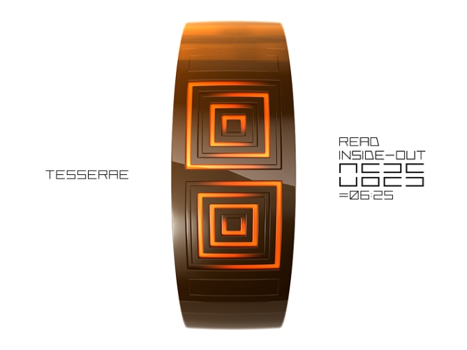
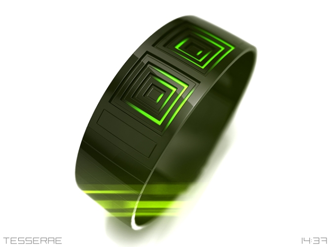
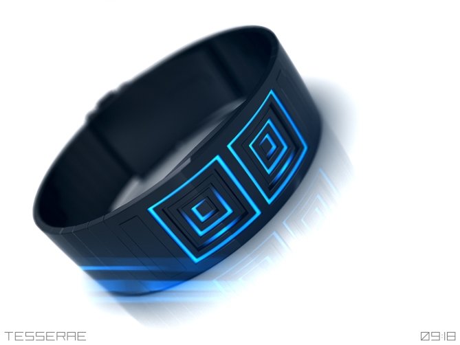
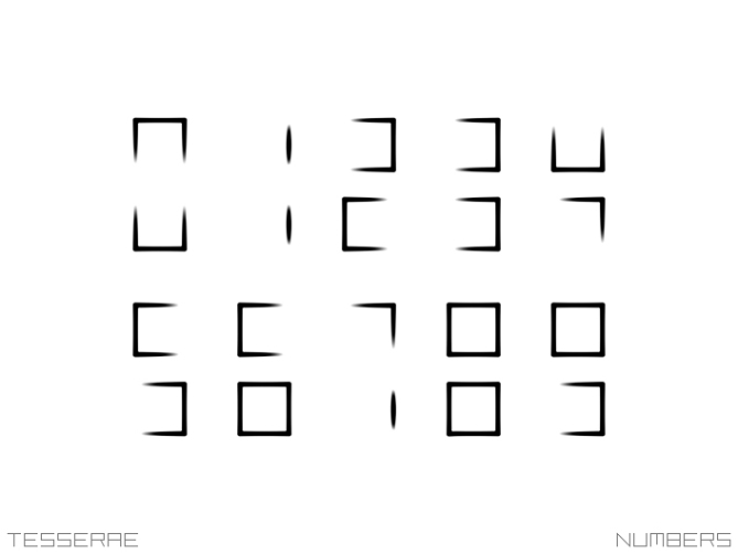
It is basically a digital inside-out time telling but this time the digits were separated in an upper half and a lower half. Positioning the several parts inside-out occurs separately in each half of the display. I gave it a little geometric feature by recessing the segments with each step they get smaller.

I let the lights fade out before they reach a corner of the square they belong to. Doing so is creating some sort of hypnotic, maze-like look which alone is quite nice to look at I think.

So the TESSERAE is a watch for arts fans and of course again for hobby decrypters. I have to add though, that decrypting is easier than it looks. Actually you don’t have to check the lower half for every number, but often enough to justify it’s existence. Now I hope you enjoy looking at the watch.”


Price?
LikeLike
Hi Edo, this is still a suggestion for a watch. If Tokyoflash makes it, I think they would try to keep it between 150$ and 200$. Wish us luck 😉
LikeLike
5 stars for the incredible way of reading the time!
I’m longing for some organic concept but this one, being pretty opposite, would persuade me in a minute.
LikeLike
That’s cool Mašout, thank you for telling and supporting! Hm… organic? That gives me an idea…
LikeLike
This is really good. Simple, yet perfectly suitable for leds underneath a diffuse lenses to achieve those shades. Very very nice!
LikeLike
You’re right about the diffuse lens. I hope this can be done… if Tokyoflash decides to make it 😉 Thanks for the comment Ninth!
LikeLike
I really liked Maze and Neon so a love child of the too was always going to be a winner for me. Works well and looks great, the height steps adds an extra dimension. Very nice sir 5/Y best of luck! 😀
LikeLike
Thank you very much Pete. When looking at the good old concepts, new ideas come and it’s fun to translate them. I’m glad you like 🙂
LikeLike
WANT. 5y
LikeLike
Köszönöm szépen!
LikeLike
very subtle but puzzling enough. good!
LikeLike
Merci bien ma petite xD
LikeLike
beautiful. breathtaking. if it could be made just like these renderings, I would buy instantly. 5*
LikeLike
Thank a lot Heather! Well you know, renderings are often idealistic. Let’s cross fingers :3
LikeLike
What are the rectangles above and beyond the face of the watch, Sam? Are they a relief? I assume this is a 24 hour watch, unless those rectangles light for am or pm?
LikeLike
Buttons!
LikeLike
Yay! Wait, let me read what you wrote up there…
Yeah indeed, that’s buttons. They can be on the side to if not possible that way, I’m open here. But sometime I like the sleek and straight design with a hint of the future 🙂 Actually I don’t have a PM indicator here. I like my watches 24h. You can imagine the hours 00, 13, 14 … 22, 23 as another level of crypticness hehehe.
LikeLike
Ha! I had meant to say ‘above and below’. Damn Buzz Lightyear!
LikeLike
Hah, I didn’t realize. You’re fun xD
LikeLike
As per usual when Sam’s responsible; stylish in the extreme. =)
The look’s great, but I have to confess I’m finding it difficult to read the center digits at a glance. The two parts are too separated by the other digits… It’s not a huge thing, but I imagine it could be irritating if you need the time in a hurry. Not that it’d be a chore to look at this watch for any length of time, but still…=)
It looks like it’d be easy to produce as is, too, which is always a plus. Great work Sam, I hope it gets made!
LikeLike
Hi Anders, thank you for your words! You mention an important point about the digits. This is why I placed the rarely changing digits inside. So the middle digit can be a 0, a 1 or a 2 (when 24h♥) and these digits can be distinguished by just one half. The second digit of the hours is still a bit tricky, I admit it. It could be easier. Could be harder =] Oh I believe that achieving the gradient effect could be a bit tough. Finding the right LED size and the right silk screen for the different squares… We’ll see. Thanks for the hope!
LikeLike
I don’t know much about watch design but I have been following the blog for a while. I think this watch is a beautiful piece. It gives kind of a Greek Key / Gaia/ Terra feeling. I have no better way to describe it honestly but I love it. The numbers would take me a couple of minutes to read, but once I had the hang of it it would be the best watch I would own.
LikeLike
Hi Josh! The good thing is, you don’t need to be a designer to find things cool or less cool. This is a very interesting way you see the watch. I see that the display is a bit challenging. I hoped that the look would bait people to learn reading the time. I believe that’s how Tokyoflash did it with their more cryptic watches that look like taken from a sci-fi movie hehe. Thank you for taking the time to comment this nicely =]
LikeLike
Another great design Sam, as with the two that inspired it – they should all be made.
The numbers do get harder as you move in towards the centre, but if I wanted an easy watch I would probably go for a traditional analogue or digital. The challenge is part of the pleasure of having a watch from TF – it’s not just how good they look. This is both challenging and stunning, so it definitely gets my vote. 5*/Y
LikeLike
Yes, exactly! The challenge is part of the deal. I’m not sure if it’s masochism haha. You’re right, if easy would be the preference, there’s another way already. If someone asks, why would one wear a hard to read watch? Fun 😀 If you have to explain the fun, then it’s already to late, just like with jokes. So glad that I found Tokyoflash. Quite the same wavelength. Nev, thank you for the comment and your support!!
LikeLike
This is really good, Sam. There haven’t been a watch which white LEDs, have it?
LikeLike
Hi Pawel, thank you. Tokyoflash made some watches with white LEDs, I can recall the Neutron, the Seven and the 12-5-9-L (which I own and which is sold out) but there can’t be enough. Ja, the Tesserae could be white too 🙂
LikeLike
Once again a nice sci-fi idea… love it!
LikeLike
Thanks for telling!!
LikeLike
I’m back from Crete and I had the idea of a watch with a maze, but Sam, the “Daedalus” German, imagined before me.
5 * and Yes, with hello Minotaur.
LikeLike
Oh Patrick, next time you’re quicker 😉 σας ευχαριστώ for your support!
LikeLike
I prefer the dual-screen appearance vs the single-screen of the NEON IO. ( which was part of my comment on the NEON IO page ) I would prefer hour on top & minute under.
LikeLike
Hi Makk, thanks for the input! Here we have hours inside, minutes outside. Hm, hours top and minute under like NEON would work well as well hehe. Definitely worth considering 😀
LikeLike