Design submitted by Pawel from Germany.
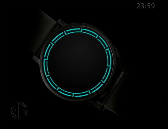
Pawel says: “For some time I was working on the idea of a digital watch display that looks like analog, exploring the possibility of placing digital numbers in the edge of an analog face. In this design I demonstrate the solution of combining frame bars with hour markers.

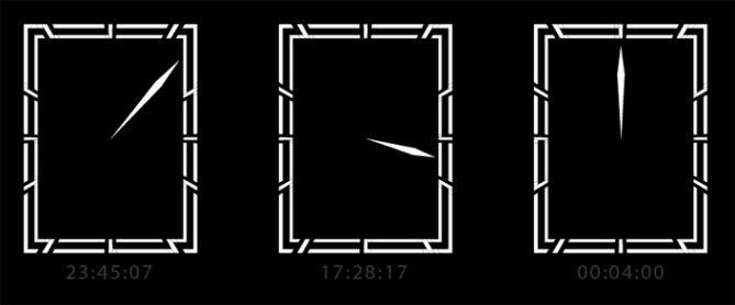
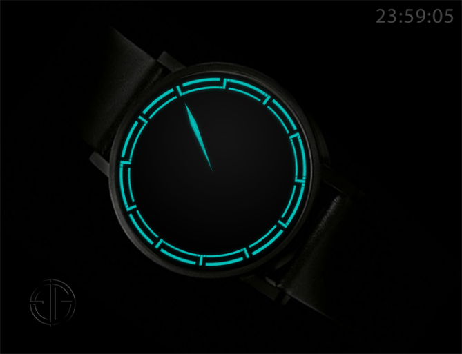
The manual explains numbers by placing them as a wrist band. This design could also be used as package design. The four digit display forms the edge of the watch face you would typically find in an analog watch. Each hour marker is surrounded by four rectangles that may disappear to create a path forming a digital number. Some of these rectangles are always hidden to create gaps between the digits, but may be used for an animation. To enforce the illusion of this being an analog display, a hand can be optionally displayed to show seconds or minutes or hours.

This watch is for people who appreciate minimalism and purity in the design, loving to surprise and to amaze. It looks like regular analog watch at first, but it has an unusual display with four digits showing hours and minutes and an optional analog hand for additional information like seconds. The owner of the watch can tell time accurately although for others it is not obvious how read the watch.


This watch combines analog and digital time telling in a novel and unique way. While not obvious to others, it is very easy to read if you know how.”


Having the humbers in the ring is pretty nice. The 1 should be cut off the middle horizontal segment – maybe just a little gap. The 0 should be full size – maybe two gaps, leaving a little dot behind that still works as hour marker. That’s not only for learning it easier but also for clearness of the display. The pure ring mode looks stylish. The additional seconds and optional analog time display is really cool. Good luck Pawel!
LikeLike
Very nice design Pawel! At first glance I did not see the digits, but when I did I realised the cleverness of the design. It’s very subtle, like someone let you in on a secret. I just hope the design is not overlooked due to the subtle-ness. Not everyone takes the time to read the explanation and understand the design. Which probably explains the initial under-rating. Very sober and sofisticated, well done and good luck sir! 5/Y 😀
LikeLike
Thank you very much, Pete, for this comment. I am pleased that you got it and appreciate the underlying idea and the effect of the design. I believe that showing number design was not clear enough. Next time I will do a better explanation.
LikeLike
Very clever digits. Good luck Pawel!
LikeLike
I like the numbers Pawel! Ages ago I thought about doing a simple 4-digit display using this idea so that the digits always looked like 8s and never seemed to change. 🙂 For some reason I never got round to doing it though. To be honest, I find the top and bottom digits a bit awkward to read. Could you maybe position them so that there are 2 on each side with no space in between? That way they would all be the right way up. Anyway, I gave you 5Y. Best of luck!
LikeLike
It’s funny that it appears impossible to tell the time because there’s no hour and minute hands. lol
LikeLike
This is really great. Trying to figure out myself, I though I have to look for the gaps… As soon as you know the trick, it is like that dalmatian illusion: if you know what to look for, it is really easy to read. I need to get used to the one and the seven, because of the bar in the middle. Anyway, I am still amazed by effect of this idea: it is love at second sight 🙂
LikeLike
Thank you for the “love at second sight” 🙂
LikeLike
This is a great looking watch design.
I do find the 1 too hard to read, as it doesn’t look like a 1, so agree with Sam’s comment.
I think the hand should only be for seconds, as the hours and minutes should be the numbers around the rim – seconds there would be impossible to read and hours or minutes shown in two ways seems pointless.
With those two caveats, I would definitely want one of these. 5*/Y
LikeLike
Having the optional hand displaying seconds would probably be the best solution, instead of introducing redundancy as suggested myself in the description.
LikeLike
Thanks for publishing the design, and you guys for your feedback and support!
I am not surprised by the controversy on the numbers one and seven. I did tried to use additional gaps in the bars but did not like the result and decided to sacrifice a bit of readability.
LikeLike
It took me a while to figure out the numbers but once I did, I’m just speechless. Definitely one of my favorite designs . 5/Y
LikeLike
The – on the 1 should be removed. The 0 could be the full/standard size. For the rectangle version I would prefer if the digits where on each side & not pass on the bottom & top parts. I like the infinite 888888 look but I would prefer wider digits. I like that the seconds hand is there.
LikeLike
~ 1 cm wide digits.
LikeLike