Design submitted by Peter from UK.
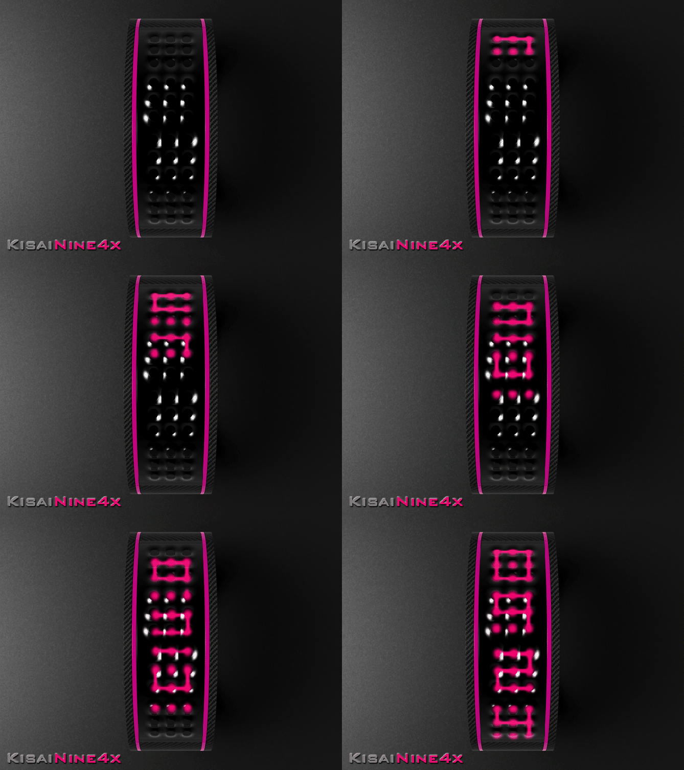
Peter says: The Kisai logo consists of 9 dots connected together with a few vertical and horizontal lines. This is a good basis for a simple LED array to create a digit . I decided to use four of these arrays to create “KisaiNine4x” (Nine meaning the number of dots per array and 4 x the number of arrays) “Strewth I can see the time from here!!” 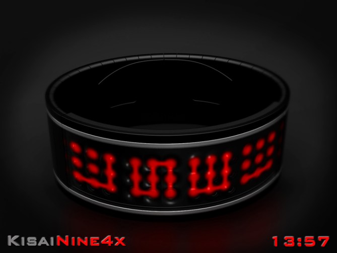
The LED arrays show a back to basics digital display. The arrays give a couple of digit style options easy/regular as well as also being suitable for showing the date in the same format.
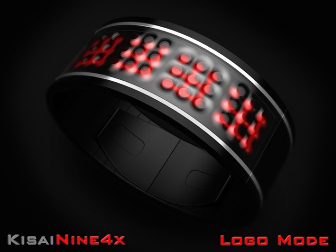
The regular mode shows all the nine dots when the numbers are displayed which gives a slightly cryptic and alien look. The easy mode hides the un-needed dots for a clearer more conventional look.
The arrays would also be able to show animations and the iconic Kisai logo.
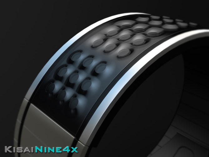
The design is simple and bold and features an embossed lens that would be very tactile.
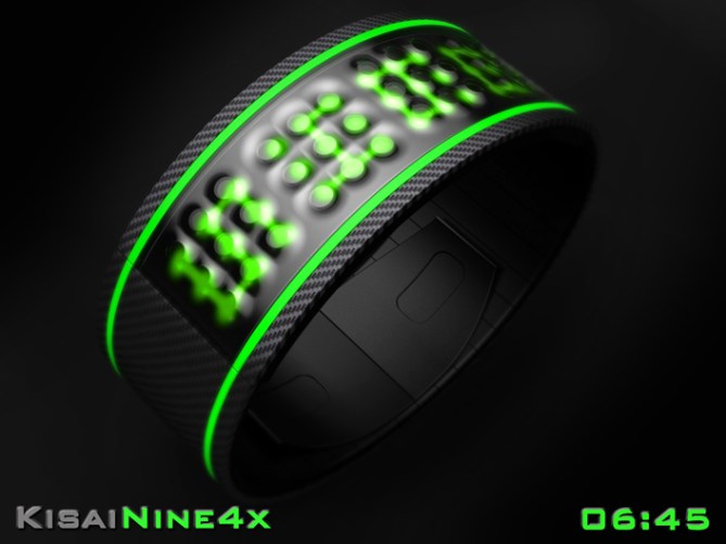
It could be available in a selection of colours from sober to cyber, this combination of qualities should allow it to appeal to a wide selection of people.

The embossed lens and bright and bold display sets this design away from others.





Cheers TF for adding this design to the blog too! 😀
LikeLike
5 * / Yes, because I do what I want!
And I love it!
LikeLike
Im very glad that you do Patrick! Fight the power!
Cheers for the vote and support! 😀
LikeLike
Cool idea! I’ve thought of something similar, so thanks for doing it first so I don’t have to…=) Nicely realised concept but I have to confess the bangle look isn’t quite for me. Still support-worthy, and it should be very easy to manufacture. Good luck sir!
LikeLike
Cheers Anders,
When I first thought about it, I assumed that it had already been done as it seemed very obvious.
I couldnt find anything too similar on the blog so here we are. I think the shape could be tweaked easily and could be more tapered into a narrower strap etc etc. I just went with the constant width as it suited my display size. Also could be just a body and seperate strap without any issues. Cheers for the feedback sir! 😀
LikeLike
Very nice. Very very nice! 5y
LikeLike
Very nice comment sir! I thank you! 😀
LikeLike
Nothing new to add master
Great job as usual. Good luck master Pete
5/Y_ 🙂
LikeLike
Thanks a lot Jose! Cheers for the vote and the luck! 😀
LikeLike
Looks good and I’d buy. You could have only dot numbers (different layout needed) and only line numbers too to create more diversion. Really nice material suggestions again and I like the simple elegance. Good luck Peter!
LikeLike
Yeah with a couple of tweaks you could double the variation. And variety they say is the spice of life! Cheers for the suggestions and the support sir! 😀
LikeLike
Beautiful connections of dots to show time in this watch
LikeLike
Thanks a lot for commenting Casio Japan G-Shock! Cheers for the support! 😀
LikeLike
What is the price of this product ?
LikeLike
Its too early to say to be honest. TF would need to pick the design and go through the development stage before prices would be discussed I imagine. Cheers for the interest! 😀
LikeLike
your a machine Pete, nice concept, like the animation
LikeLike
hehe sadly an un-reliable machine! Cheers for liking sir! 😀
LikeLike
Pete, looks nice, but wish the numbers were more original. 5Y
LikeLike
Cheers Mushy. The numbers are kinda dictated by the form of the Kisai logo. I would have to add more segments between the dots to make the numbers more unusual. It wouldn’t be the end of the world to do that as long as it doesn’t effect the outward appearance. Cheers for the feedback sir! 😀
LikeLike
OK Pete. Sorry. It is a cool watch tho. 🙂
LikeLike
No need to apologise Mushy for honest comments! 😀
LikeLike
big fan of this one. BIG FAN. 5* YESSSS! 🙂
LikeLike
Yay! Thanks a lot BIG FAN!!! BIG is most definitely better! Cheers! 😀
LikeLike
simply considerable for a purchase!
LikeLike
Cheers Fir! Short and sweet and straight to the point! So was the comment! hehe 😉
LikeLike
Clever adaption of the logo, Pete. Problem for me is that even the Regular digits are too Easy, so I wouldn’t go for it myself. Good luck, though.
LikeLike
No worries Nev, yeah it’s not the most cryptic. The number of dots that make up the logo do limit it’s crypticness. If there is a way to increase the number of dots or lines then a more cryptic mode would be possible, but I don’t know if that would detract from the logo like format. Maybe if the dots consisted of a few different sizes inside each other you could use a purely dot based mode which would be very cryptic, I believe Sam used a system like this on one of his. Cheers for the feedback sir! 😀
LikeLike
I like the “octopus suction cups” look, when the lights are off. I also like the scroll animation used when you want to know the time. However, I wouldn’t buy.
LikeLike
Thanks for the feedback Makko, I’m glad you like the details even tho its not for you sir! Cheers! 😀
LikeLike
Only a few hours left for this concept so will wrap things up by saying a big thank you to everyone who voted, commented and shared! And cheers to TF for posting it here!
Thanks everyone!
Pete from the UK 😀
LikeLike